(WIP) Natzi Nurse
started this tonight. sadly the concept image is tiny and i cant see the details it has  so im kinda guessing most of it and trying to make sense of exactly what it has and what connects to what. im also new to doing clothing so i kno this is horrible and im not familiar with zbrush yet... so anyways here it is. some feed back would greatly appreciated.
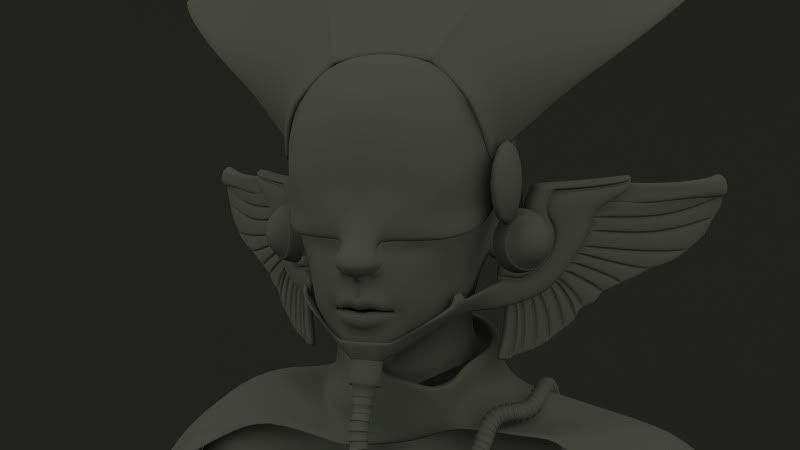
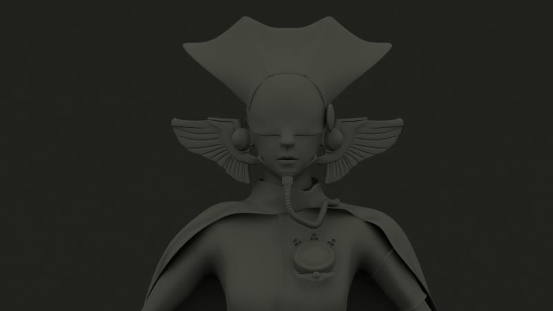
after rendering the body one. i noticed the arms had no defenition at all so i fixed that a bit. in the concept she is mad skinny tho so idk... lol
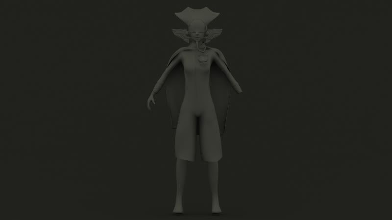
i have to bring those wings in a bit closer to the face.
here is the concept puny
puny

after rendering the body one. i noticed the arms had no defenition at all so i fixed that a bit. in the concept she is mad skinny tho so idk... lol

i have to bring those wings in a bit closer to the face.

here is the concept


Replies
you can find concepts like it on their website, just click on "Projekty plastyczne"
Her arms are definitely too skinny, especially around the wrist. Can't really crit much else for now, keep it up!
As for the model, i think you still need to work a little more in the proportions. She has a way leaner slender shape, and in the concept, even tho she is wearing that coat, she has more personality and more interesting silhouette. I think for characters, it's all about the shape over all first, and then all of the details.
But you need fix a lot of things, but start with the proportions.
- Her legs are way too short compared to the concept
- Those wings on the side of her face need to be wider.
- Arms are also too short
- hands are too tiny
- torso's too narrow compared to her head
etc...
And most importantly, forget modeling the details already, no need to model the rubber folding in that pipe, nor the wings, just lay down everything with block in geometry and work from that.
Keep it up though!
hell yea that helps! thanx lol
and yea I need to learn to block out more before details
will work on those changes tho. thanx guys
Are you doing this completely in zBrush or Max/Maya? Be careful not to rush too early into zBrush. That'sa mistake a lot of beginners do. You should resolve as much as possible in your root program before you start sculpting.
Also your renders are really dark. It's hard to make out any detail. Bump up the strength of your light a bit.
Speaking of which, do you think we'll ever get that moustache "back?"
Like, will it ever be "the charlie chaplin" instead of "the hitler"
Anyway hardkor44 is kind of sick, but i genuinely dont get what's going on with the helmet and stuff. I guess it's fairly nordic but it's also strangely jap MMORPG.