Creating Good Ground Textures and Materials in UDK
Hey guys I could use a bit of advice and some thoughts. I am currently working on an environment with my friend and we are trying to tackle laying down do ground materials.
I am aiming for a really nice path material and a good forest floor material.
The textures were taken at the park and I made them some what tillable. I would like to know how one would tackle creating normal maps and spec for these? crazybump? for example would you make normal maps for the grass or leaves? Also are there any ways/tricks to reduce the tiling in udk?
We are applying the materials using the udk Terrain Editor.
If you have any advice or other threads that have asked similar questions please send them my way! thank you!
A few of the textures:
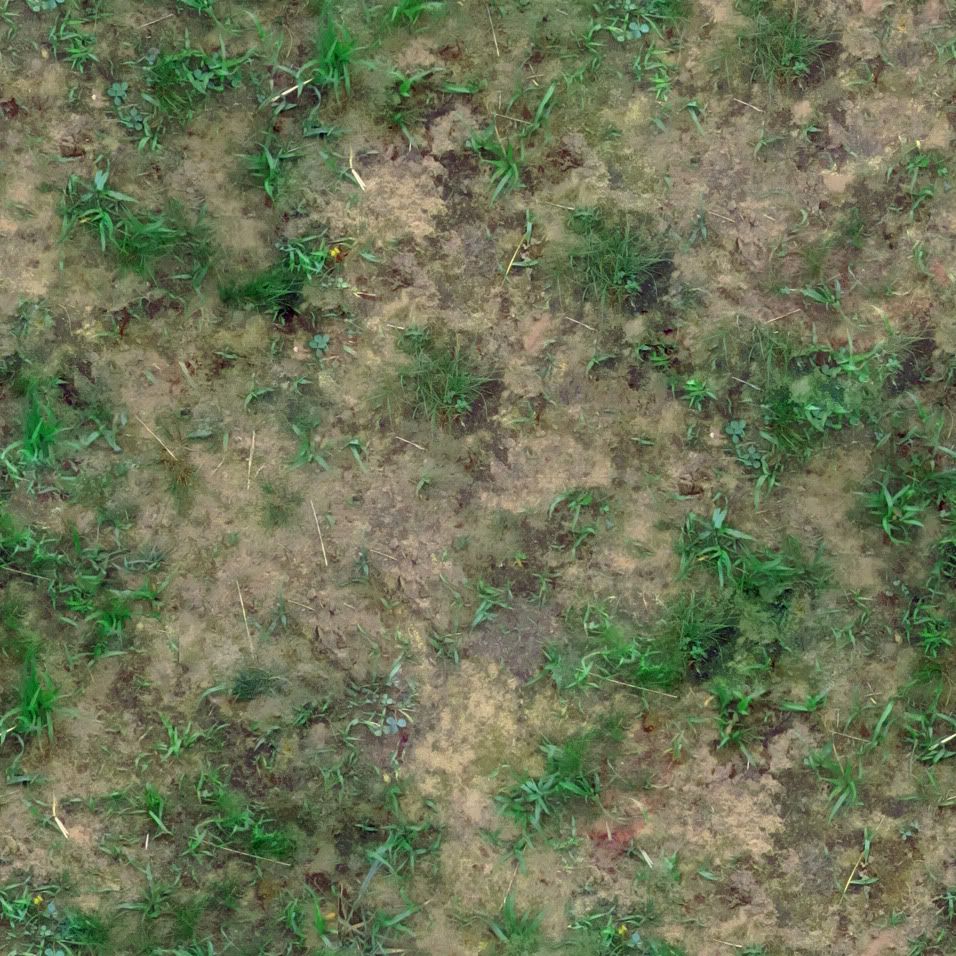
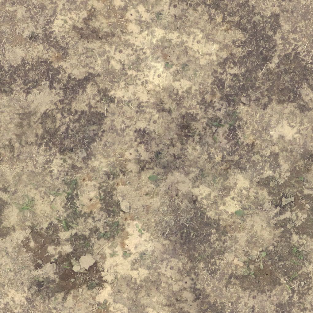
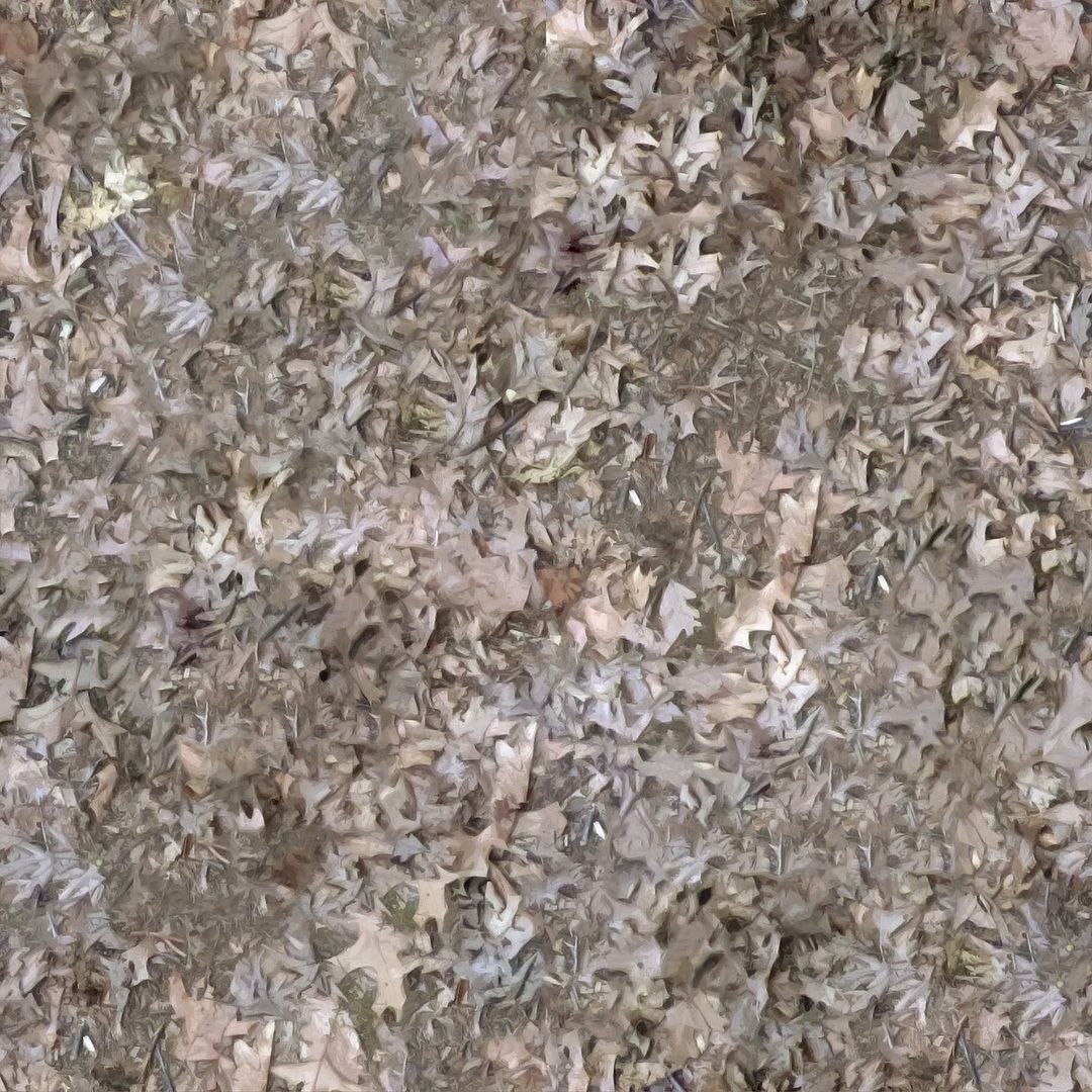
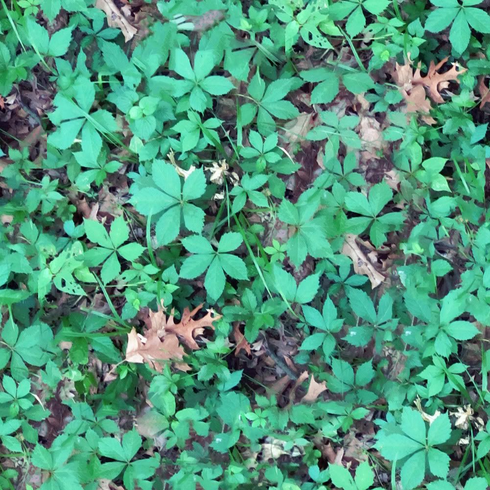
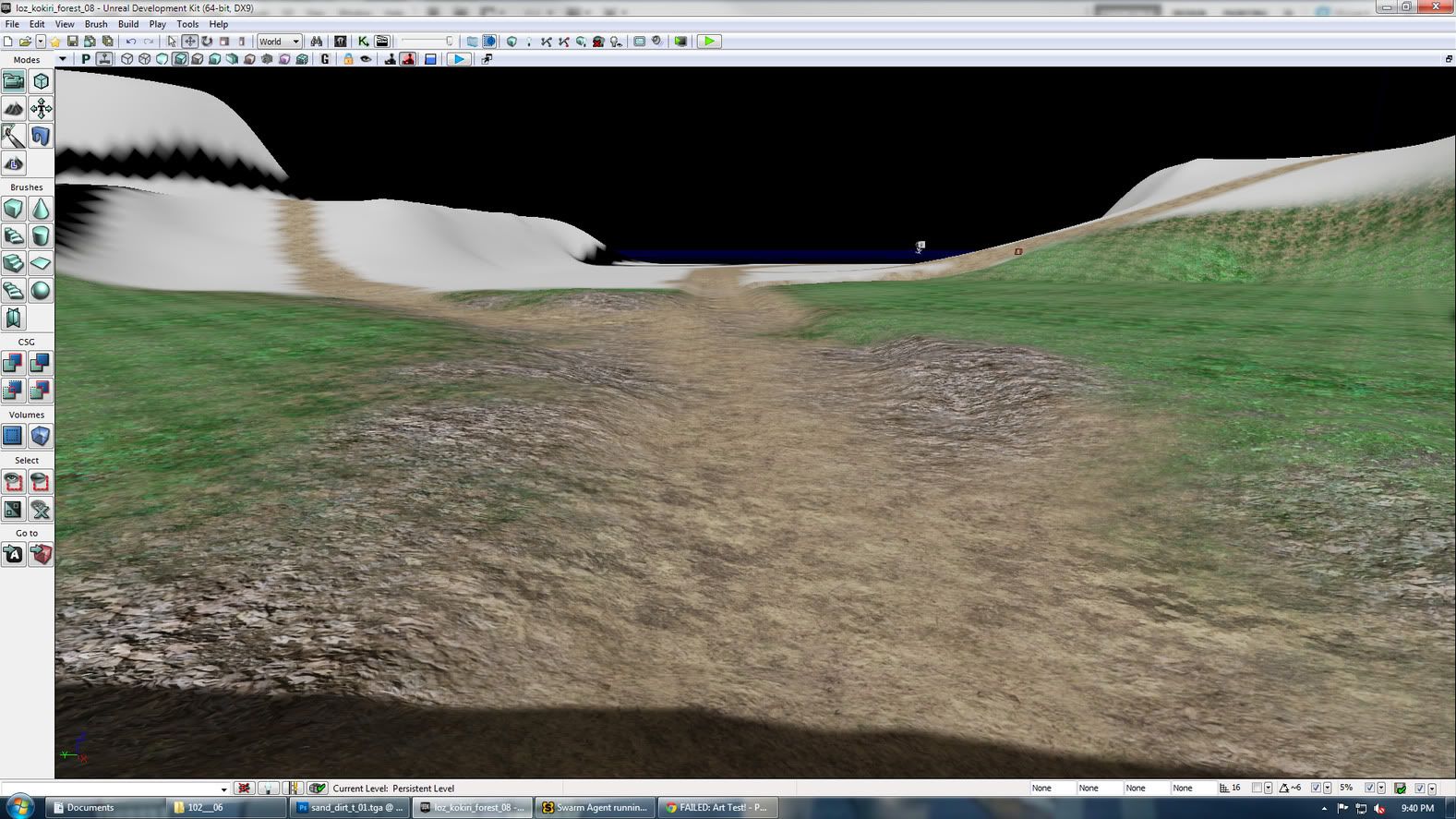
Here is where I am at:
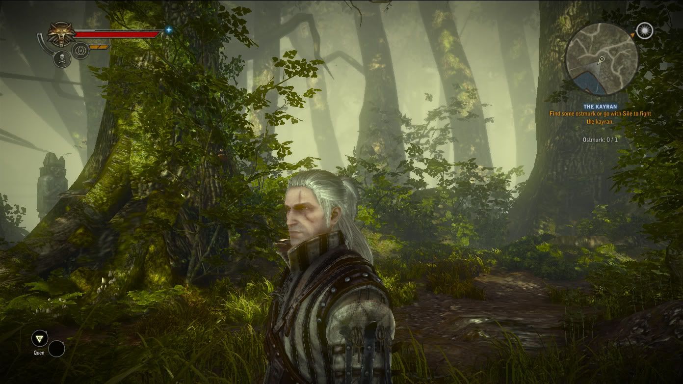
Here is where I want to be:
I am aiming for a really nice path material and a good forest floor material.
The textures were taken at the park and I made them some what tillable. I would like to know how one would tackle creating normal maps and spec for these? crazybump? for example would you make normal maps for the grass or leaves? Also are there any ways/tricks to reduce the tiling in udk?
We are applying the materials using the udk Terrain Editor.
If you have any advice or other threads that have asked similar questions please send them my way! thank you!
A few of the textures:


Here is where I am at:

Here is where I want to be:

Replies
Also what do you mean you made the ground textures somewhat tileable? It's either tileable or it isn't. I can see in those pictures you posted that you just stamped around with a soft brush which doesn't turn out too great. It blurs out a lot of the details in those parts and makes it pretty obvious that it's just an edited image. It's not that visible when it's blended in UDK but you should be more careful with that.
anyway. if you want some advice about creating good mats for your floor (read this if youre making it with a bsp):
select the textured bsp and hit f5. youll have all the best settings for tiling, uv placement, and stuff. scaling can be precisely set there.
as regards the noticeable tiling, udk has the decals system, which is a must. try to add some variation to your repeating tex with the decals. if you dont know how to use them, there are some good tuts out there. check hourences.
as for the normals, well... its always a good idea to work them, crazybump is a good starting point, but dont just tackle the result in your mat. work it. give it your personal touch. there are other normal apps that work a charm, namely nDo and nvidia's normal filter (both for photoshop). be sure to check them out.
as regards the grass, well... best way is adding foliage. alpha planes will help you with that. just remember not to leave sharp edges in your masks.
and last but not least, vertex paint. one of the most powerful tools in udk (which i still need to learn lol), lets you paint your textures adding the variety you need.
hope this helps you a little.
A trick to help tiling textures on terrain is to have 2 versions of the texture in the material, and have one of them tile much less, then use pixel depth to blend that one in at a distance. It would be something like scene depth into spheremask, then a value of 0 in the other slot, and give it a distance of like 4000 or something that looks good, then use that to drive a lerp between your two textures.
Build it in layers,
start with your dirt
then on top of the dirt, make a variation of the dirt texture, and add some grass to it
then make a variation of that texture with the dirt and grass, and add some dead leaves
then make a variation of that and add your live foliage, but avoid large plants etc, it just looks unnatural to have 1 foot tall plants sitting in a tiling texture. Think things more like weedy grass, crab grass etc.
Make sure everything is properly exposed and your brightness levels make sense, right now all of your textures range in color balance, and brightness.
If all your textures like this are consistent and share elements, it will look nice and natural when you blend them, instead of just looking like 4 random photos blended together.
Now, to avoid obvious tiling, your going to want to use foliage, grass, plants, bushes, tress, various props, buildings etc. You should never really have a large open area where all you see is your tiling texture, so just blocking out your scene is going to help a great deal.
In addition to that, simply defocusing your eye and blurring the texture should give you a really good idea of where your bad tiling artifacts are coming from. Your textures should be pretty uniform with most fine level detail, to avoid tiling issues.