Secretworld Environment
Hello,
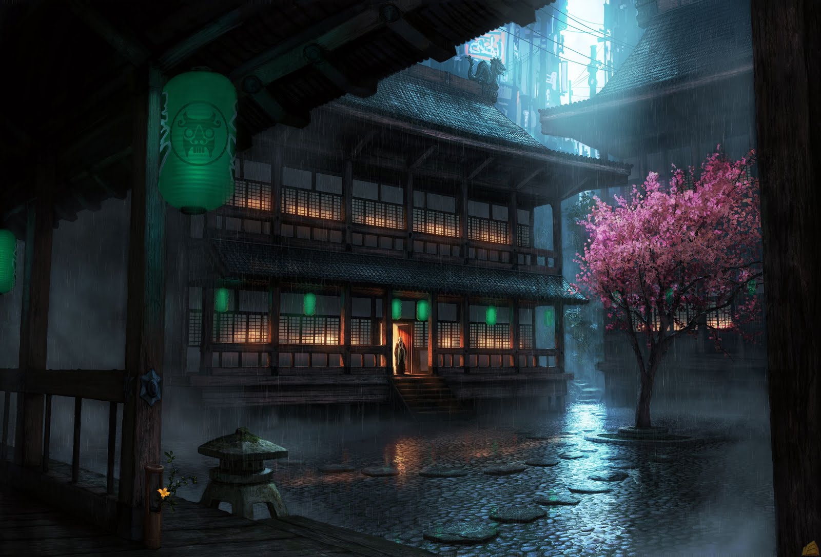
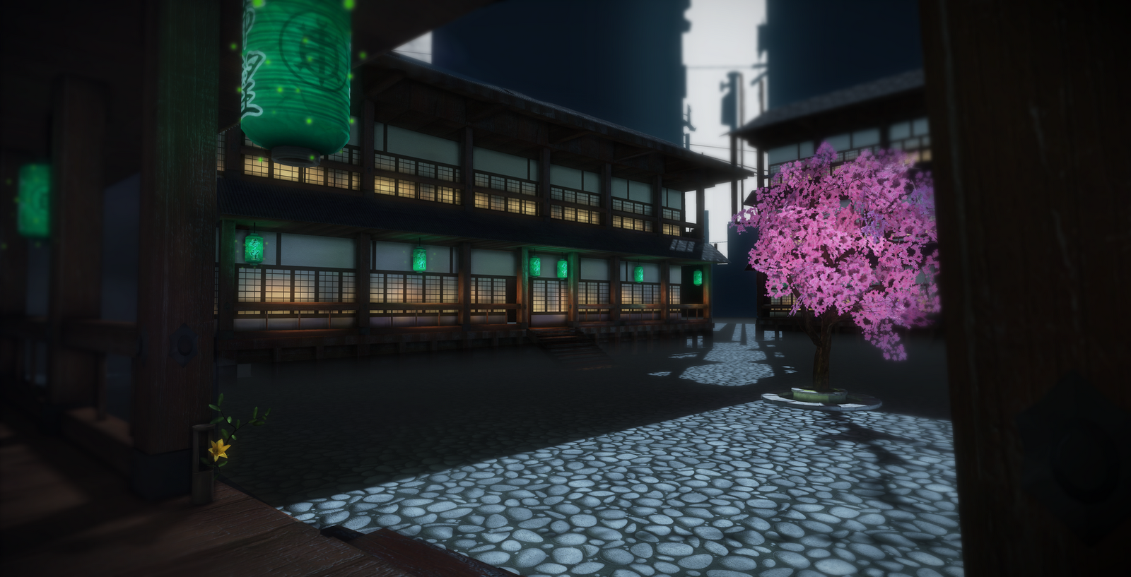
This is my latest bit of work i am currently working on the concept is from secretworld not to sure on the actual artist who made it, but here goes. Still in early development, last week or so after work. Let me know your thoughts at this early stage. Things i have noticed is the back is way to dark and the tree still needs some love! Materials need a big overhaul, but i am still learning udk, normally just render out of maya.
So first is the concept and then it is my adaption it is not the same in terms of scale and porportions but i have just tried to make a nice widescreen version


Replies
- The cobbles need to be half the size.
- the blossom should be thicken the higher it is up the tree in terms of number. show more of the lower branches. Make smaller planes for the blossom as well.
- Put some moss. darker cracks into the wood.
- Darken the ceiling and put in those cool looking beams in the foreground. Some nice detail there.
- Soften the shadows. Place in MULTIPLE light sources. There is also a reflection from the rain so bear that in mind.
- The back buildings roofs need to be higher, this is characteric of the architecture of the time.
- ....to add to that make the awning/overhang part of the roof bend in the middle slightly and the corners come up a tad.
- the lanterns look cool you ahve those spot on, but not sure about the fire flies, namely green ones.
- there is a path leading off upwards in the background, maybe inplement this.
Some good work, will like to see this when it is finished.
by making it wider you added a lot more empty space to the courtyard, which makes it feel more empty and bland.
you could try breaking up the ground a bit with some big concrete/tile slabd, even in the concept it seems a bit like a tiled texture, probably because it looks like a paintover. some larger forms could help balance the high frequency details of the courtyard floor.
cheers man.
I think changing the scale to "fit a widescreen" was a huge mistake. Like PixelMasher said, just let it extend on either side. I would say left, but yeah. Course now it really breaks up the concept.
Then it's the tree.. You have a good start but the leafs/flowers are a tad to big. And look at the concept, it got all these nice negative space under the flowers with the branches..
If you have the possibility with a dx11 card you should absolutely use that cool reflection shit going on in the new UDK..
I wish i had a dx11 card, well i do at work. I have seen some amazing stuff with dx11 so may need to bring it to work. Those reflections and the scale are the next tasks for me to sort out and as you have said the tree is pretty bad atm. I added the default udk rain as well which helps sell the piece a bit.
But thanks for the comments and expect an update in a few weeks!
Well back from a lovely holiday in Turkey, bit to hot at times in the 40s. But a nice time to relax and enjoy some quality time with the girlfriend instead of being in front of the computer allday! Had a sketchpad though and drew some cool things!
But since coming back i have worked on this a bit more and have addressed some of the comments from above still working on some like the image ration and scale, but hope this is a step in the right direction.
Also, on a side note my laptop monitor is so bright and the one i am writing this on his so dark, need some calibration here, but does it come out ok to everyone else?
Love the ground material! Just remember that the reflections and spec is much higher between the stones since it got water there. And i think you need a parallax offset on the material to. It looks kinda flat. Keep it up!
more details in the background (like the concept)
and the blossoms size seems to be off.
ZacD - Working on that tree at the moment i havent done many before, i restarted it yesterday so hopefully this new one will be better, will update tomorrow.
sltrOlsson - yeah i have added more branches etc more twisty and angled. I am still learning the udk game engine, what do you mean by blend mode and what do you mean by 1bit alpha?
PixelMasher - i have toned down those light shafts and thank you for the encouragement, love your work by the way!
Ark - all sorted
fuzzio - hey mate hows it going, what you up to at the moment?
nbac - after the tree the background will be the next area i focus on.
Thanks for the comments and an image will be up tomorrow hopefully addressing some of these issues!
Mainly worked on the tree, well i completly redid it. So hopefully you like the new one still needs some fair work on it (placement,textures and material editor). Also tweaked some of the lighting from the comments some of you have said and worked a tiny bit on the bg! Going to do some texturing over the weekend for some of the objects, mix it up a bit.
I changed the floor material a bit aswell and it seams it has lost some of its highlights, which is a shame will rework that material as well over the weekend as the floor i feel is very important!
As i had to reimport i thought it would be a good time to sort out the scale of some of the objects, especially the buildings. The reflective floor gave me a bit of hassle to redo, but it is nearly there, i am thinking i should have vertex painted some of it. I feel the rain also could do with having a few more drops.
Lighting i feel is a big improvement and talking to some people the lanterns need some work to them, either via being transparent and a seperate model in them, a more prominent emissive map and brightening up.
Feel the tree has come a long way as well and is nearly there.
Picture time!
http://www.polycount.com/forum/showpost.php?p=1382404&postcount=27
Second: The indirect lighting (in this scene that's pretty much all of it) needs to be bumped up. I have some advice with the UDK:
It looks like you are using the 'environment color' setting in world-properties to calculate the scene's indirect 'cloud' lighting. This scene's lighting is entirely indirect, thus you need to make sure the UDK takes appropriate care of the 'bounce' lighting. The 'environment color' setting works well for the average scene, but it does not calculate secondary bounces. This results in a lack of environmental realism and feel. Also judging by the scene you may be using a skylight, which is another thing I would warn against.
Instead, in scenes with a heavy emphasis on 'cloudy' or muffled lighting: use a non-dominant directional light pointing straight down, and adjust it's lightmass settings so that it has a wide casting angle (40 degrees or so). tweak the color and see what results you can get.
Hey KazoeHin thanks for the input, lighting is definatly something i want to learn a lot about. I am using a dominant direction light as the main daddy. No skylight here. Also havent even started post-processing or changing the world properties.
any plan to do some thing to the roof details?
i think the roof in the concept has more interesting shape.
anyway. well done!