Turret from Homeworld2
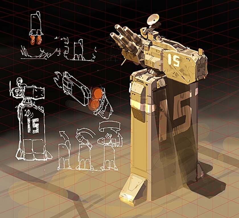
I've started to take a shot at one of the turret concepts from Homeworld2. The concept is from Aarron Kambeitz at Relic.
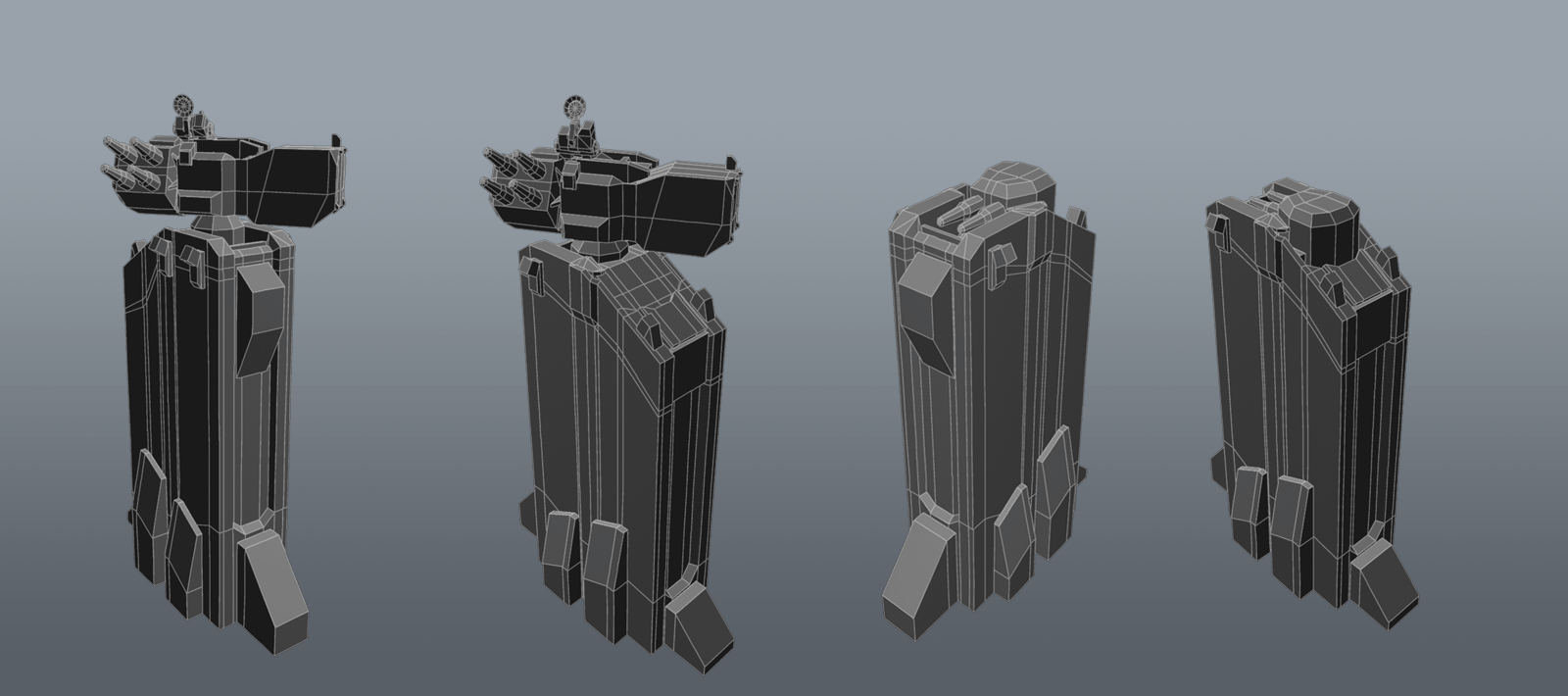
So far I've blocked out the lowpoly and experimented with the moving parts of the turet especially the unfolding mechanism.
In difference to the concept I have the gun element sticking out of the tower while the concept shows the ammo-box sticking out. That is because it was much easier to fit the thing inside the tower. The concept is kind of vague how the mechanism is about to function so I found this to be good compromise.
The geometry isn't yet cleaned up. I'm not sure if I rather should clean up everything before starting the highpoly or leave it this way because of some minor changes that probably will occur.
The model has about 2200 tris at the moment but with proper cleaning this can be lowered easily. Not yet sure about the final tri count.
I hope you like it so far.


Replies
The second picture shows different states from the animation the tower is supposed to do uppon activation / deactivation.
the third picture shows the front side of the turret when deactivated.
I'd make these cannons look chunkier, and scale up a bit that antena.
Liking so far.
@ cox:
thank you for the suggestion. I indeed scaled up the cannons a little and changed / scaled the antenna as far as possible. As far as the antenna goes its size is pretty much limited by the room the turret-base offers, as I want the folding / unfolding animation to be as plausible as possible without major intersections.
Some general information about the current update:
I've finally finished the lowpoly and did the bakes. You see a 2048 normalmap and a 512 occlusion test map aplied to the model. The final occlusion-map will be available tomorrow morning.
The model has 3770 triangles. Next steps will be, guess what .. texturing. \o/
I'm not sure with the color-scheme yet but as a first try I'll follow the colors used in the concept. In addition I'll see what I can come up with.
You poly distribution on your cylinders is very wasteful - and could be used to chamfer some more square edges instead.
eg: the barrels could start 10 sided - then down to 8 - finish as a 6.
Looking forward to the texturing!
i like it
Thank you for your feedback. I did some optimization on the barrels and the radar like beancube suggested. It saved about 200 triangles.
So here we go with the colormap. The shot only shows the normalmap and colormap applied. I just got my hands on marmoset (which is an awesome tool by the way) but I was struggling with the gloss and specular maps I had already prepared. So I decided to first get a decent colormap and then succesive work on secular and gloss features. The colormap is still wip. I need to add some wear and tear on the stripes.
Only thing I dislike, model-wise is the left "support thingy". The one with the stripes. Maybe remove one of the stripes and just have 3 evenly spaced ones?
Well my questions is , how do you go about making your low poly ? do you do high first then follow the sillouiete of the mesh (which i find difficult if its a complex shape) or low first to high!?
cheers for anyone that can help or direct me anywhere
@Disting:
Yeah I agree that the panels on the left support element are some kind of repetitive and follow no constructional logic other than breaking up the surface. I'm also not absolutely happy with them as well but they don't bother me that much to go back to change the highpoly and do a rebake. Also a friend stated he especially liked this section, so it may depend on personal taste. At the moment I just want to get this finished to start the next piece.
@DJ_Aaron:
From my experience it is much better to first do a lowpoly which should be as refined as possible. You don't need a perfectly clean and optimized lowpoly. Instead I just do a blockout and make sure that I use only quads and mindfull placed edgeloops because later on I use this block out for the first stages of the highpoly. A perfectly refined lowpoly wouldn't be that helpfull for this task as you would need to rearrange the topology to get good subdiv results.
In my last project which isn't completely finished yet I experienced the problems when doing the highpoly first without caring about the low.
I modeled shapes and forms that poorly translated to the lowpoly I later created. I had to make a lot of changes. Many hp-details needed much more lp-geometry to give a good bake than I imagined. Although I partly changed and simplified the hp (which also wasn't fun) the polycount went higher and higher. Much higher than I imagined the whole asset to be in the first place.
Anyway: I think you should always start with the lowpoly. Don't refine and clean up too much and keep it optimized for later use. Merging different elements together or UV mapping should be delayed until you are perfectly sure you will go with what you have. In my case there mostly some areas where some minor adjustments to the lp will be necessary after doing the hp. So any cleanup and uvmapping I do when I've finished the hp.
There is a problem though: While doing the lp you need to know how your highpoly will look like. The more details you know about this the easier it will be. This can be a problem when a concept (or your imagination) are not precise enough, don't show enough details or leave out certain parts of the assets. In this case you should sitt down and think about the parts and details that are missing and do some scribbles.
For this turret I had the same problem: The concept is in some areas rather vague and the backside is not depicted. I didn't make some scribbles or planed so much ahead but when doing the high poly and thinking about interesting shapes I always judged every element: Will this bake properly on my lp? How much changes and how much triangles would be necessary to accomplish this. With that in mind I didn't ran into the problems I've mentioned before. But the scribble approach should be the way to go unless you are very fast and experienced in hp modelling and thus it's easy to explore and test some shapes and details.
Looks to me there are black lines which kinda look like issues with uv/hard edges
@ Fearian: Thank you.
So here is the model with specular and gloss maps. The bottom of the radar is much too dark.
Next thing is creating some funky scifi muzzle flash. I'm not sure if an conventional muzzle flash type or something spacey blaster-ion-plasma - effect is the way to go. Also I want the unfolding animation into marmoset. So there are still some things to do.
Add some shiny lights to it or something to spice it up a bit
Great work!!
i would use this asset to present another style, go with something realistic, war colors with rust/dust/mud/and black smoke in some areas
it should be fun
take that all with a grain of salt, still a well done piece.
thank you I'm glad you like how it turned out. I'm also pretty happy with what I've got so far. At the moment I feel like considering it finshed. I did some minor touches but I'm affraid to overdo things. Most changes didn't improve the look much, nor make it worse and left me undecided.
As soon as I have the animation in marmoset I'll do final presentation shots and a video.
@ Uly:
Thanks for the input on the nuclear sign. I have to agree with you it feels not right and is a little missplaced. I've changed the sign to another homeworld logo. To have an eye-catcher in this area.
@SimonT & Uly:
Yeah the orignal homeworld was much more saturated but comparing to homeworld2 the look got a little bit of desaturation for main colors with saturated contrasting stripes and stuff. As far as I remember there are quite some ships that are dominated by a rather desaturated main color. (depending on faction)
I tested out different color setups and started with more saturated versions but it felt a little too cartoony with the more saturated ones. For example the colors from the concept didn't work on the model. I don'tlnow why but it wasn't appealing although it works great ont he concept. So i just kept changing colors until contrasts, tone and saturation of the main colors felt right for me.
@ Spitfire:
Thank you for you input. I've added some orange glowy bits on three spots to give aome additional contrast. But I wasn't sure about it. It looked cool but not cooler than before. So at the moemnt I'm afraid to do too much. The glowing pieces gave it a more fictional scifi-look and I'm with lonewolf on this one to rather follow a realistic but stylized path.
@ P442 & TychoVII: Here you go.
Some additional cleanup was done in photoshop.