Birnk was cool.
So Imma make something based on its concept art.
This guy to be precise, I believe he's called 'The Look'=
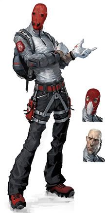
E/ current progress
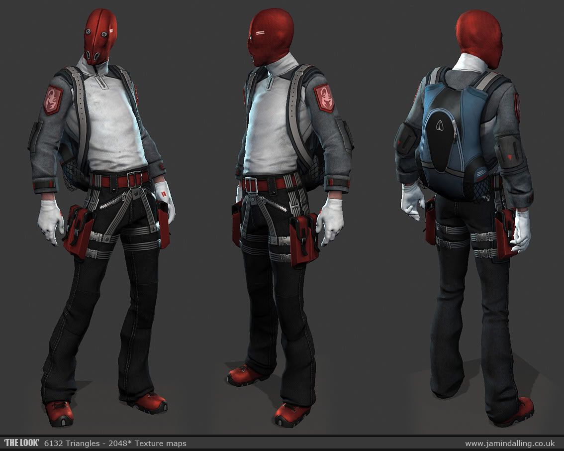
This guy to be precise, I believe he's called 'The Look'=

E/ current progress


Replies
Apart from that it looks very good.
A game made by Spalshdamage
-taller
-less bulky in the chest
-slightly larger hands
Think it looks more like the concepts proportions.. might push the height a little more after seeing it next to the prior version.
You can keep keep the muscles, he only needs to be fit, like Bruce lee for example.
Also his waist looks a bit alienish right now, It kind of reminds me of the Slim Tall guy from Aphex Twin "Come to Daddy" Music video :P.
I wish youd push the proportions even moar!!!!
Pushed the proportions more with longer torso, longer legs and slightly longer arms.
Also blocked in stuffz, not sure what the backpack should eventually look like.
Started detailing. Upper body is still early.
No crits from me
I agree a bit you'll probably have to do some minor proportion tweaking to match the Brink Style.
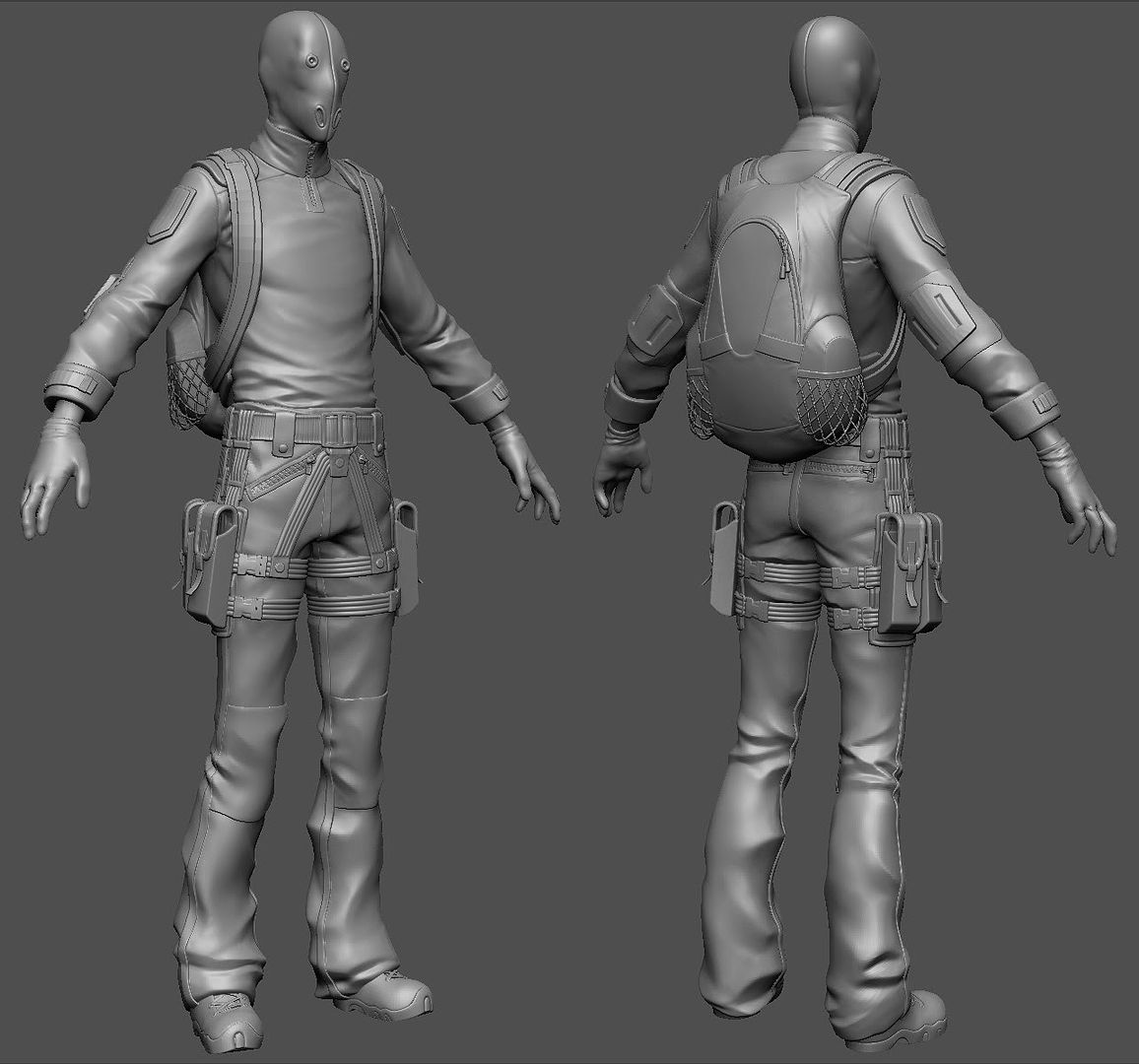
But! What interests me the most are the various straps you have on the pants, such as the belt loops and buckles. Are these all sub tools, or sculpted onto the model? They are all really well done!
If they are sculpted, what brushes are you using? And are you applying the use of heavy masking?
Couldn't help myself:
@Crazyfingers Typos suck! :poly124:
@Damytria Replied to your pm
Update! Almost done with the highpoly, just gotta do a detail pass on the last few areas.
the low res looks sick and the proximity it has to the high is sexy.
But looking at the pose, i wish his waist were tinnier than it is now....arch his back more, add more dynamism to the pose i.e. brink
again, excellent job_jamin
coming out sweet dude
Texturing isn't my strongest area... so It will take a little longer to complete to a nice standard.
I'll get around to adjusting the pose and such when I've got the textures done.
e/removed
Thnx to Kimono for material advice.
Jokes aside, this looks really cool! Great work!
Cap, I'm using xoliul's max shader and no, I haven't tried marmoset.
Looks cool though. Pretty close!
side note: It's weird to see my gym shoes in other peoples' personal projects.