Stupid, Crappy, Stupidcrap
Allo, new to Polycount here. Looking for a place to get critiques and feedback on my daily studies, and I hear that Polycount is the only game in town.
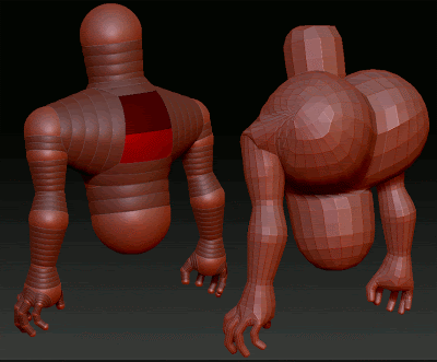
Here is 2/2 of today's Zbrush studies:

I'm sure that your keen, eagle eyes, immediately picked out that enormously ugly shoulder geometry right there? Yeah me too. See I wanted to get a better shape out of the shoulder, so I added a sphere between the torso-shoulder sphere and the shoulder-arm sphere. Kind of a shoulder-shoulder sphere, and I positioned it to fill in the trapezius area. When I switched to adaptive skin, there were strange bulges, which I tried to alleviate by adjusting the position of the new sphere. It didn't matter where I moved it, the bulge remained. So I deleted it, which gave me this:

This is just a study, so I am not uber concerned about fixing it (I'll just start another one in about 15 minutes) but I would like to understand what caused it, so that I have a better grasp of how to work with Zspheres in the future.
So does anyone have any ideas, or seen similar anomalies? Or know about how Zbrush generates the adaptive skin? Also, general critiques are greatly appreciated.
Thanks,
Here is 2/2 of today's Zbrush studies:

I'm sure that your keen, eagle eyes, immediately picked out that enormously ugly shoulder geometry right there? Yeah me too. See I wanted to get a better shape out of the shoulder, so I added a sphere between the torso-shoulder sphere and the shoulder-arm sphere. Kind of a shoulder-shoulder sphere, and I positioned it to fill in the trapezius area. When I switched to adaptive skin, there were strange bulges, which I tried to alleviate by adjusting the position of the new sphere. It didn't matter where I moved it, the bulge remained. So I deleted it, which gave me this:

This is just a study, so I am not uber concerned about fixing it (I'll just start another one in about 15 minutes) but I would like to understand what caused it, so that I have a better grasp of how to work with Zspheres in the future.
So does anyone have any ideas, or seen similar anomalies? Or know about how Zbrush generates the adaptive skin? Also, general critiques are greatly appreciated.
Thanks,