Sketchbook:Tehrobster2
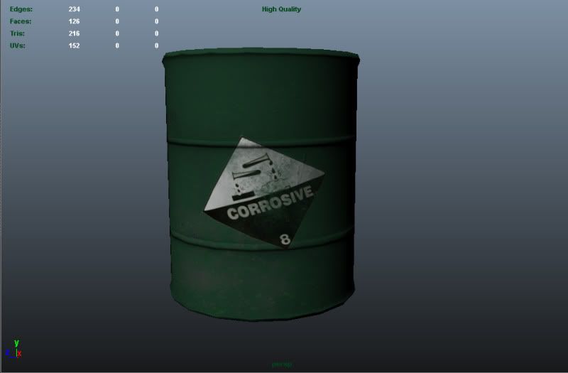
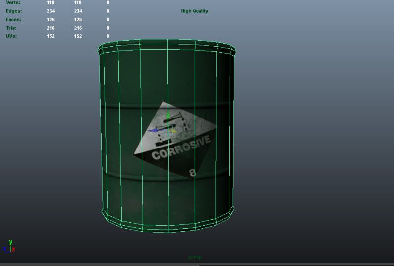
Hey guys , I will be using my sketchbook, To show of my current models and textures I am working on, and get you guys feed back and critiques on what I can do to push my textures and my models to the best that they can be. Here is what I am working on right now for a scene that I am putting together.


Replies
The proportions aren't corrert as those barrels tend to be a bit more longer, yours is abit wider than it should be. but that can easily be fixed by looking at refrence and and scaling it.
Now if you are going to want it too look good then you might want to add a specular map and render it out because that will sell it. Have a look at this image (you haven't shown the top of the barrel but you should aim for something like the top of this picture) :
This is the sort of effect that you should be aiming for (specular wise), I have taken into acount that your barrel might have paint on it and in that case you will have to think about what kind of paint it is and how or how much it refects.
On your barrel you seem to have spoltches of grey which makes me think you were trying to get a rust/scratch effect and if thats what your trying to get then you should know that paint dosent always tend to come off like that they tend to flake of. Here are some images that might give you an idear of details you can add to it and how they should look, remeber not to go to crazy with the scratches and think about where the barrel would most likely scratch.
this one is more what you might be looking for as its the same colour. look at where its rusted and notice the change in colore to the paint in those parts.
I was also thinking of ways to make it look more interesting and thought you could add little bumps like ine the picture below:
hope I gave you some good feedback :P
Keep going.