[Hand-painted] Douglas Archer
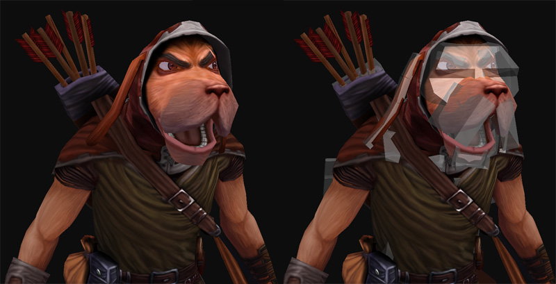
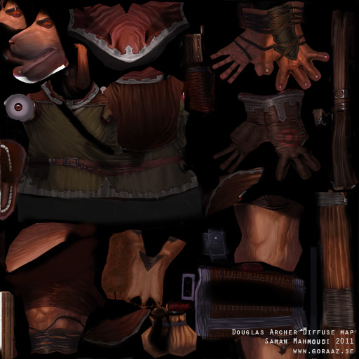
Here is a new character I've made. I wanted to make another hand-painted character so I figured a disney'ish character would be fun. This is Douglas Archer. He was once one of King John's archers until he got fed up of the King's unfair ways and joined Robin Hood and his gang. The character consists of 4726 tripolys and one 1024x1024 diffuse map. I made a pretty simple face rig as well to control eyebrows, jaw, eyes and lips. Big thanks to Shotgun for giving me really good guidance throughout this project.
Hope you like it!
Edit: I've made a video with an animation demonstrating the rig; http://goraaz.se/Animations/DogArcher-RigDemo/DogArcher-RigDemo.html
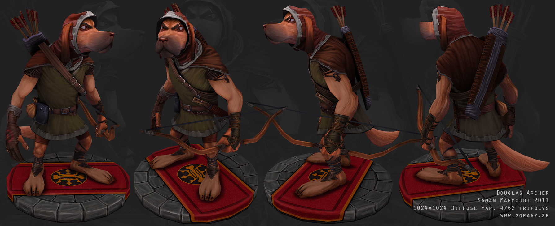
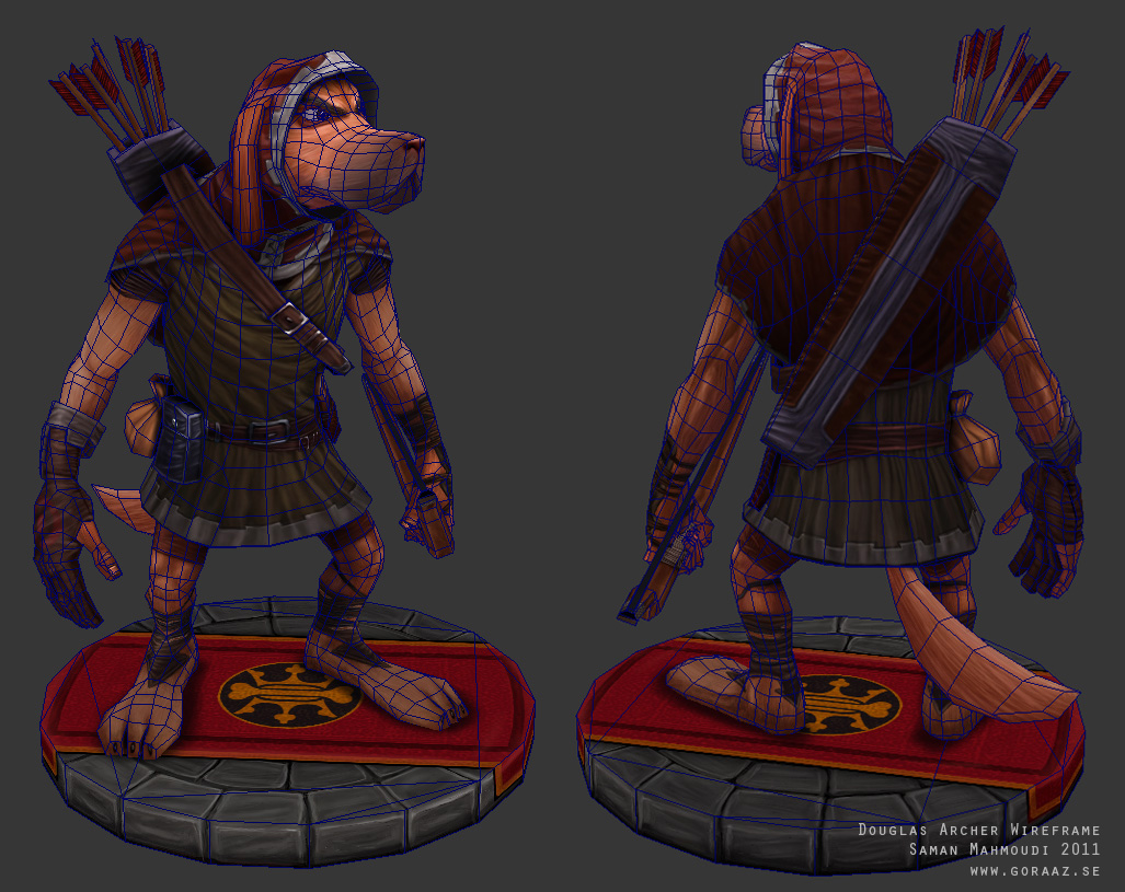
Hope you like it!
Edit: I've made a video with an animation demonstrating the rig; http://goraaz.se/Animations/DogArcher-RigDemo/DogArcher-RigDemo.html


Replies
Shotguns an awesome guy isnt he
Great work.
@oobersli: Thanks, this character was made up by myself so I never really had any intention of actually doing a character from Robin Hood. I prefer to have the freedom of being able to add and change stuff, I'd rather not mess with what's already done well by Disney
@Dan!: Thanks, man!
@Fabio Brasilien: Thanks!
@Pangahas: Thanks, man! Good idea.
@Walrus: Thank you!
@Butt_Sahib: Thanks! Indeed he is. Both a generous guy and a master
@greevar: Thanks!
@skylebones: Thanks!
@Dloud: Thanks, man!
@Jeffro: Thanks. Nice idea, never thought having him have a partner. A snake would actually be pretty cool!(Snakes in Disney movies usually have antagonist roles so a change would be good)
@Tenchi: Thanks!
@Mcejn: Crap, I accidently painted over some parts in the diffuse map when cleaning it up. I'll update it with the proper one soon. Thanks!
@achillesian: You're right, he doesn't really look like a real dog. I never used any photos of real dogs as reference material, which I probably should have. I'll look into it though. Thanks!
@duncan: Thanks, man. Yes, you're right. I went kind of crazy with the folds.
@haikai: Thanks, man. You're right as well. I'll look into the gradient thing.
@Hboybowen: Here you go; http://goraaz.se/Animations/DogArcher-RigDemo/DogArcher-RigDemo.html
The rig is pretty simple. I've used biped for the base skeleton and then I added boxes to control various parts of the face.
Wow. I thought you might have used a CAT Tool Rig when I saw the vid. Thats quite impressive actually, the rig looks fantastic as well as the model itself. Good job
achillesian's comment is good, a darker muzzle and ears would make him more convincing!
Only other thing i would argue with is the uv's. You could have packed it a little better and gotten better texture resolution throughout the whole model. next time, pack them uv's close!
@Cordell Felix: Thanks! I agree on the muzzle and ears. I'll fix that soon, just have some other things to do first. I agree about the UV's. The problem here was that some parts were removed, others were added througout the making of this model. I went back and forth to add more parts. Some parts are more or less pitch-black on the diffuse map though.
@POFFINGTON: Thanks, man! Perhaps I'll do some more characters from this universe in the future.
I also adjusted some other stuff to distinguish his face, the straps, etc. I think it's good to emphasize the overall forms and try to prevent subsequent details from overpowering it.
I made some changes, I tried going for something in-between my previous version and your paintover. Please tell me what you think;
Some other things I tried to do in the paintover:
- Toned down the brightness of the face. I think it's good to have a subtle lighting of the head to draw some attention, but yours is a little extreme in comparison to the rest of the model.
- Added a bit of a gradient to the bow just to keep it from looking flat.
- An overall adjustment to some of the saturation. Contrast isn't just about lights versus dark, but also saturated versus desaturated. Maybe that's just part of the cartooniness, but I think toning some parts down can help other parts stand out.
That's just me though, and I'm nit-picking. You could easily stop where you are now and have a fine model. :thumbup: