The BRAWL² Tournament Challenge has been announced!
It starts May 12, and ends Oct 17. Let's see what you got!
https://polycount.com/discussion/237047/the-brawl²-tournament
It starts May 12, and ends Oct 17. Let's see what you got!
https://polycount.com/discussion/237047/the-brawl²-tournament
Generic fantasy Man and woman
Howdy all! The plan for this is to make assets for a non-existent fantasy RPG that allows for character customization. So, I've made the base male and female (and any critique on them is appreciated!) and will move onto hair, armor, skin variations.. etc.
Here's what I've got so far (rendered in Marmoset):
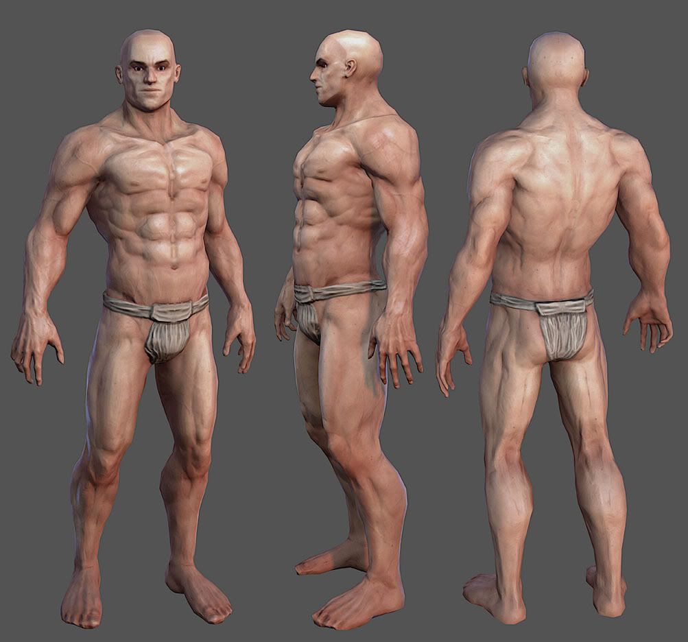
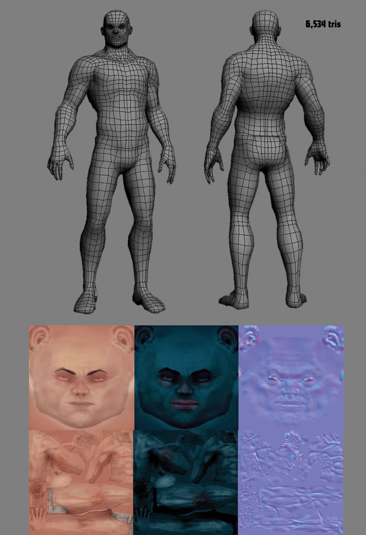
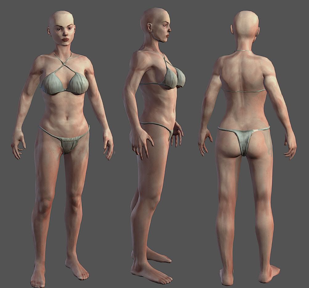
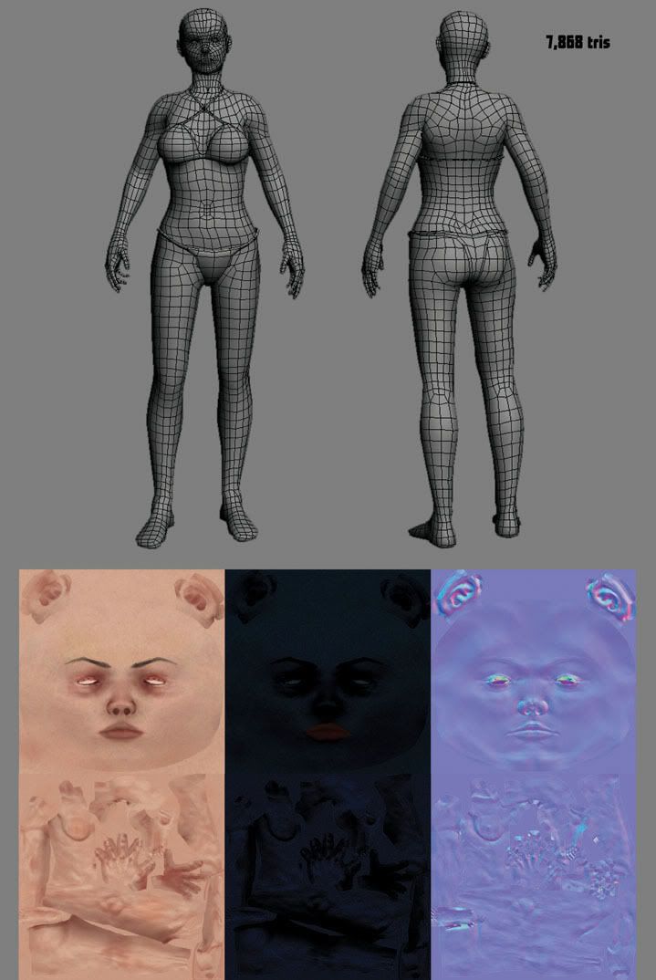
Here's what I've got so far (rendered in Marmoset):


Replies
And his pecs seem relatively small considering his build (in comparison to the behemoth of the deltoids)
Keep it up mate!
His shins should be straighter. Currently, it almost looks like his Tibia is curving backwards.
Both of these will be covered up if you're going to throw some armor, hair, wizard robes etc. on them, but I'd definitely deal with those nitpicks if I were you and I was going to show the base characters in my portfolio
Pretty good anatomy, texture is fine too, but lacks some color variation, just a little may enhance it greatly.
Try to give more tris in places that appear on his silhouete.
For that amount of tris, if well distributed you could even model his toes .
Look this:
http://wiki.polycount.com/BodyTopology?highlight=%28\bCategoryTopology\b%29
Maybe that helps.
I have a personal crit, if I may, I think the the ladies eyes should have more eyelashes! Something like this!
Congrats! Thanks for sharing these great models! Hope to see more!
Allan-p
Yes, I definitely see what you mean now. Now that you mention it, his pecs do seem pretty dwarfed by those deltoids. Thanks!
tonysladky
Thanks for the feedback. Yeah, I kept the top of the head lower-poly because I think even when I am showing this as a base character without armor I'll probably put hair on them. But, I should fix this anyway, and definitely the shin thing.
In regards to the the polycount.. yeah, I guess I did get pretty carried away. I was aiming for something that would hopefully deform really well, but seeing as how I'm not much of a rigger or animator, it probably would have been a good idea to go as low as possible and focus on the silhouette (something I need to get in the habit of paying more attention to.)
dogzer
Thanks for the paintover, definitely useful. She was looking a bit derpy previously. I definitely need to add eyelashes, and probably make her eyes bigger too.
There's supposed to be way more tonal variances. Nose should be more red. There needs to be some blue under the eyes, the guy should have more grey in the area of the 5 o' clock shadow. There needs to be way more vericose veins, and discolouration on the areas where the joints gather up (elbows), and knees.
There needs to be a LOT more pale-ness the areas the sun doesnt hit.... insides of the arms inside of the legs... (aka anywhere hair wouldn't grow) and freckles... Could go on for a while...
Spec map controls the shininess of the skin, and skin is pretty shiny (It's just not very glossy). There's an area of the face called the T-Zone, that gets way oilier. by comparison, The shininess should be nearly WHITE on the spec map. The lips should be nearly white.
fingernails should be white....
hmm.....
Here are some fantastic articles on the use of colour by the magnificent Gurney.
http://gurneyjourney.blogspot.com/2008/05/color-zones-of-face.html
http://gurneyjourney.blogspot.com/2010/04/lovell-on-flesh-tones-and-design.html
And some tips from yours truly. I come from a traditional painting background but these might still apply.
To make colours pop mix in it's complementary. Use these devices to highlight certain areas and to accentuate others. I found if I had a rather reddish skin tone all over I would complement it with a neutral green as highlights, if the base is more orange I would use blue, if yellow I would use purple.
Remember shadows aren't black, they have very subtle colour in them. Mostly cool colours to contrast the warm colours, put blues, purples,reds, greens.
In essence we always want to use colour modulation and colour temperatures to describe objects. Rather than the chromatic way of light to dark. A mixture would truly bring things to life.
A good thing to do is also figure out what this person has gone through ( Jacque Choi has listed some great characteristics that bring out a character more)
I would also try and challenge some of the conventions you've learnt like a completely solid blue spec map, what if there was subtle variation in that? (This of course is me just thinking outsite the box and I might try some of it out myself hah)
"Don’t paint a figure; Paint a person.
Don’t paint a head; Paint an individual.
Be accurate, but see beyond the surface.
Beware of pictures that are correct but lifeless.
The face is the window to the soul.
All of humanity’s greatness and frailty can be found in a single pair of eyes."
Keep it up! I'm looking forward to seeing some updates.
I did have some color variance in a few places as you said (blueish tint around beard, yellow forehead, red nose, redder joints, etc.) but I usually drop my layers where I add that stuff to an insanely low value. Maybe it turned out a little too subtle.
In any case, I'm still working on applying a lot of your feedback, so as of now the models aren't really much improved, aside from a few things. I kind of had to rush through making some armor and such, and I'm not too happy about how some of it turned out, but given my deadline (I was doing this as a class project) it'll do for now. I'll be able to polish it more after what needs to be done for class is done, so keep the feedback coming guys, much appreciated.
Here's some armor and some 'characters' I through together using some various skin variations and such I made. (images are pretty large, be warned.)
Note: I forgot to apply the normal map for the robes on that close-up of the mage in red, whoops. But you can see it with the normal applied in the full-body image.
I made the female's face a bit less derpy, still in need of some adjustments for sure, and actual eyelashes still.
Tried doing some hair and I'm really not pleased with the results.