The BRAWL² Tournament Challenge has been announced!
It starts May 12, and ends Oct 17. Let's see what you got!
https://polycount.com/discussion/237047/the-brawl²-tournament
It starts May 12, and ends Oct 17. Let's see what you got!
https://polycount.com/discussion/237047/the-brawl²-tournament
BIG update to my portfolio need critiques
Alright im going to keep it simple and to the point. im preparing for a huge over haul to my portfolio. I have been making art work on this forum for a year and some change now and am ready to polish off what I have put on my site on start looking for work. Now i have created four pieces all of which with there own pros and cons. Trying to make a 2 month cycle of me taking these pieces to the next level. I can feel you losing interest here so let me show you some pictures
theses are the additions that i want to make to my site. Please what ever changes, tricks of the trade,or ideas you could give me that would help get this work were it needs to be to land me a job it would me MUCH APPRECIATED
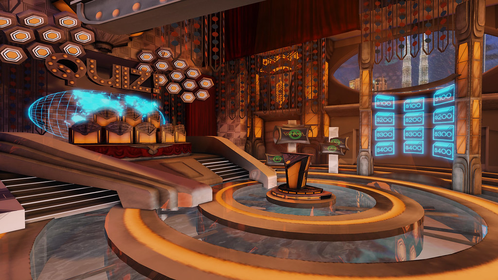
- [X-men] Dead or Live the show
original thread http://www.polycount.com/forum/showthread.php?t=82509&highlight=%5Bstage%5D+x-men
this level was done for the Brawl contest theres some crazy competition in that one. Some of the issues in this one are the flatness of the atmosphere i didn't get foggy stage lights in there like i wanted too.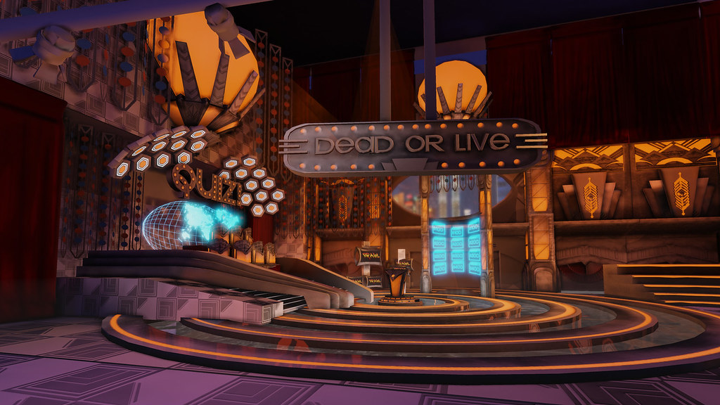
- Mega Man Redux
original thread http://www.polycount.com/forum/showthread.php?t=80039&highlight=mega+man
this one i did entirely for fun and it came out..ok but i have been told by people that this is a vista piece and does not have a playable feel to it. I don't like the textures and would like to take some new tricks i learned and take the textures to the next level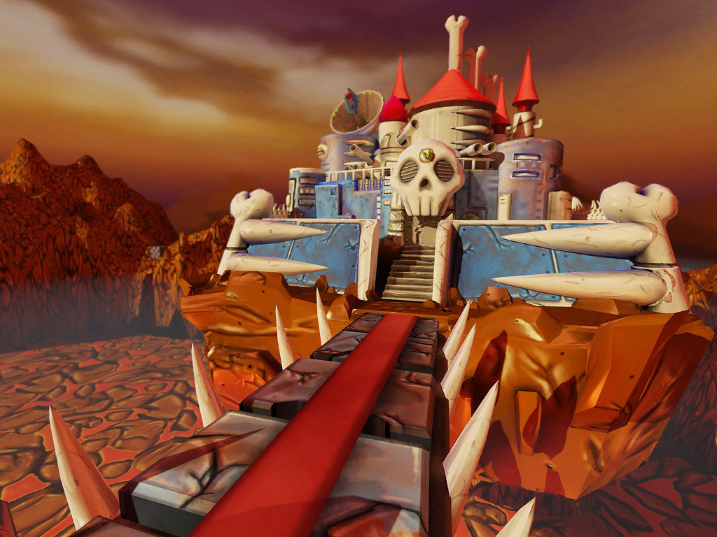
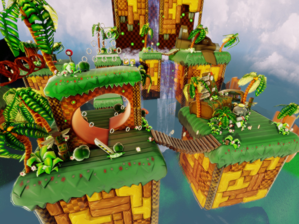
- Sonic The Hedgehog sky Chase
the original thread http://www.polycount.com/forum/showthread.php?t=74783&highlight=sonic&page=3
this is probably my favorite. i spent the most time on it and was the most exited about making it. This one will need better foliage and may be a lil better texturing. and like my other work needs to feel more playable.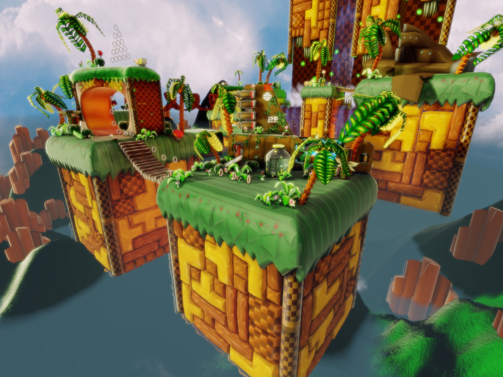
- TF2 Lil snapper
maybe you guys remember this contest. i ended up making something a bit to out there to actually be used in team fortress but was still happy with what i came up with
http://www.polycount.com/forum/showthread.php?t=73817&highlight=mobilization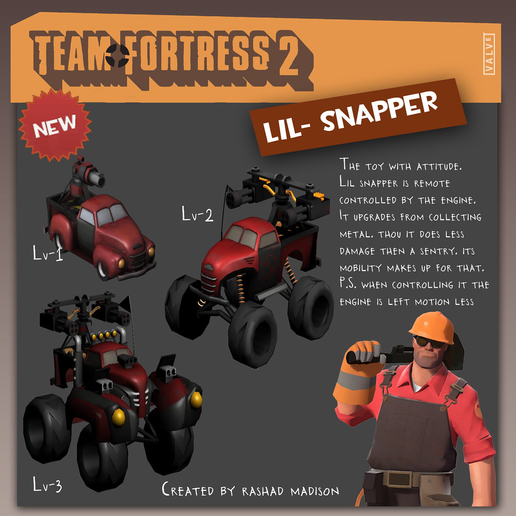
theses are the additions that i want to make to my site. Please what ever changes, tricks of the trade,or ideas you could give me that would help get this work were it needs to be to land me a job it would me MUCH APPRECIATED
Replies
2. This satellite just simply sucks needs to be remodeled
3. this rock mesh is not so bad but the texture does not fit the terrains texture. Its too shiny and does not have the painterly layers that are necessary.
4. This texture needs to be revisited just like all the rest of the texture just pointing out points of interest that shows stretching
5. These two meshes don’t place together well at all. I think I will make a mesh to go in between both of them.
6. I will be placing crows to add to the atmosphere.
7. The lava textures panning has to be slowed down and needs to look better
The polygon count of the static meshes in the level, not including terrain, is 70,000, I Was wondering how efficient is that in comparison to the every day game level in UDK. The texture space is definitely too much being at 5120 x 5120. I’m going to try to get it down to at least 4096 x 4096.
2. The sky box in this needs to pan slower and be spread out more, and also the position of the sun in this level would look better from the back shining through to the front. Then you get those god rays at an angle people can actually see them
3. The water is flat. Looks more like swamp water then water for a paradise like land. Need to work on the cube map or a decent reflection which would you go with the level
4. These are suppose to be flowers, well they suck. Either I should make them look more like flowers or put low poly static meshes there
5. this is the tornado plane that I feel had issues with the normal map and also had flaws I was trying to hide by burying it in foliage. I will build a new plane, make it presentable and allow it to in fact be the focal point of the piece
6. This ground texture sucks. I know its in the back ground but it still could use some love
7. this grass texture feels too much like plastic. There are things I like about the normal map but I think im going to have to do it over
8.the tetris like blocks look great but some one told me that the fact that i have a bunch of separate pieces instead of one flat plane with a really solid normal map is inefficient.
this Is my favorite piece. Its about 300,000 tries. I want the texture space to at the most be 5120 x 5120. Its over that right now. Some of my textures are just not efficient, a lot of my normal maps just suck (crazy bump). This is not so much as a redo but a switching out of a lot of things.