Home 3D Art Showcase & Critiques

Japanese Garden UDK

polycounter lvl 12
Offline / Send Message
biofrost polycounter lvl 12
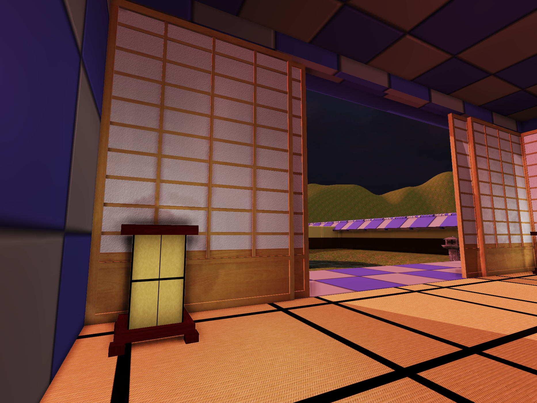
Hello! I am working on the first piece for my portfolio website. I am hoping to be a Environmental Artist once I gradguate in a a little more than a year. My goal for this project is to really improve my texturing ability so I could really use as much feedback as possible.
highres_screenshot_00008.png
fsfa.png

Replies

  • biofrost
    Offline / Send Message
    biofrost polycounter lvl 12
    Quick update, I have the tea house blocked out, the roof is a mesh but the rest besides the sliding doors are BSP brushes I plan on getting rid of soon. My other goal for this scene is to build everything that I can modular.

    highresscreenshot00009.png
  • biofrost
    Offline / Send Message
    biofrost polycounter lvl 12
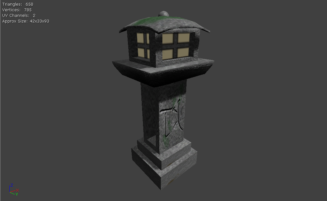
    Hmm, I may take the outside lamp into mudbox and ding it up a bit to give it some more detail to stand out.
  • polygonfreak
    The black lines in the floor looks like you painted them black in photoshop. Add some textures to it to get away from that painted black cartoonie feel. Also, I noticed that there is moss on the outdoor light, It's not that convincing. I love the sliding doors, but you may want to explore the textures on the window panes... they look really modern and that may conflict with what you are trying to convey.
  • biofrost
    Offline / Send Message
    biofrost polycounter lvl 12
    scaled.php?tn=0&server=23&filename=fsdsaf.png&xsize=640&ysize=640
    Changed up the moss a bit, for awhile I though I should take it into mudbox but really there is no need to unless I want it to look a bit dinged up.
  • LMP
    Offline / Send Message
    LMP polycounter lvl 13
    Something feel off with the proportions of your lamp, it look really similar to a lamp I did based off a ref I found on google.

    I tried to find my original ref, but could not, however, I managed to find an image with a similar piece. It's the lamp in the 5th column on the 3rd row.
    Japanese_stone_lanterns_in_Monte_Palace_Tropical_Garden-Jonathan_Grobe__Hannes_Grobe.jpg

    lmp3d-portfolio04.1.jpg
  • biofrost
    Offline / Send Message
    biofrost polycounter lvl 12
    Wow that is really similar to mine, I did change some of the proportions already. what I really need to figure out I think is how to get my moss to look better,but I am curious though, is that a ingame render?
  • Herr-Maestro
    Offline / Send Message
    Herr-Maestro polycounter lvl 18
    Yea it does seem like the moss has a raised feel off the model itself huh.
  • LMP
    Offline / Send Message
    LMP polycounter lvl 13
    biofrost wrote: »
    Wow that is really similar to mine, I did change some of the proportions already. what I really need to figure out I think is how to get my moss to look better,but I am curious though, is that a ingame render?

    Yes, that shot is from Marmoset Toolbag.
  • biofrost
    Offline / Send Message
    biofrost polycounter lvl 12
    Well this is my UVMap so far, I think I may be doing something wrong because no matter what quality of base texture I put over it, it looks really low res in maya and UDK
    .scaled.php?tn=0&server=718&filename=uvmap.png&xsize=640&ysize=640
  • marq4porsche
    Offline / Send Message
    marq4porsche polycounter lvl 9
    Don't be afraid to overlap your Uv's. Right now they all have individual uv space and thats eating your space up. Also I think you need to soften your normals and let your normal map work better for you.
  • biofrost
    Offline / Send Message
    biofrost polycounter lvl 12
    Thank you! I had been told before never to overlap your uv's but doing so is producing a much better looking texture. As for the texture it self, I need to spend some time and add moss back to it and generate a better normal map, and I suppose something for the windows of the lamp(perfect place for a emissive section)
    uvmaps.png
    screenshot0copy.jpg
  • marq4porsche
    Offline / Send Message
    marq4porsche polycounter lvl 9
    Yeah, it's looking better already. You can also grunge it up a little and add some wear and tear to the edges as well. Maybe you can also do an ao pass on it to add some lighting info.
  • clockchrome
    Perhaps it is not a problem, you may want to making "T" lines on the floor instead of "+" lines.("+" is used in the funeral)
    I made a reference image and hope you will find it helpful.
    tatami.png
  • biofrost
    Offline / Send Message
    biofrost polycounter lvl 12
    Thank you clockchrome I had no idea there was a difference between the patterns, well now I know and knowing is half the battle...(bad joke is bad...)

    Anyways I did grunge up the texture a bit, the normal map I have for the moss is not popping as much as I would like but it is looking much better.
    screenshot0copy.jpg
    screenshot1copy.jpg
  • Mr_Paris
    You need to put some more thought into your moss placement. Slapping right in the center doesn't look realistic.

    Think about how the moss would grow on the surface and look at lots of reference.

    kasuga-taisha-shrine-5.jpg

    4900090969_ed4b3e9a7a.jpg
  • biofrost
    Offline / Send Message
    biofrost polycounter lvl 12
    Seems like the moss does not grow much on the body of the lamps just the tops and bottom, I will have to make these changes after work tomorrow. Thank you for pointing that out, I feel like I keep rushing my self to get this done but its only making things worse, I just need to step back and take my time.

    EDIT: Probably should be sleeping(need to be at work at noon) but I worked a little on the side moss, I will start on the bottom later after work.
    screenshot3copy.jpg
  • biofrost
    Offline / Send Message
    biofrost polycounter lvl 12
    No photo updates today, I am just wanting to ask a general environmental artist question though. I seem to be stressing my self over how long it is taking me to get some of these assets done to the point where its almost not fun, There are so many amazing artists here and I see what they do in a day seem like it takes me a week. I was wondering if any of you guys had any tips on how to I guess get over this little hump?
  • marq4porsche
    Offline / Send Message
    marq4porsche polycounter lvl 9
    The only thing I can say is that speed comes with experience and time, pretty soon you won't even be worrying about it.
  • biofrost
    Offline / Send Message
    biofrost polycounter lvl 12
    The wood on the side is not quite lining up with the rest of the wood but I think I am making some good progress(especially considering its finals week)
    screenshot5copy.jpg
  • EMC3D
    Offline / Send Message
    EMC3D polycounter lvl 14
    You can stitch your UV's together for the floor so it seamlessly goes across the floor. It looks a bit tight at the moment, would relax some of the layout with wider gaps and what not.

    Good stuff.
  • biofrost
    Offline / Send Message
    biofrost polycounter lvl 12
    Due to other things coming up I have not been able to work on this as much as I would like but I have a little update.
    teahouse.jpg
    gatej.jpg
  • Will Faucher
    Offline / Send Message
    Will Faucher polycounter lvl 12
    I agree with the moss pattern on the lantern. Moss builds up in very specific areas, mostly where there is water/humidity buildup. Try to think of where trickling water would gather, and paint your moss there. Also, make sure you do some research on the architecture. What style are you going for? A traditional Shintoist style? Or a Buddhist style? Each have their own distinct architectural patterns, and colors. Don't go mixing the clean, natural style of the Shinto, with the bright Buddhist red paint. The styles will clash and it will lose it's authenticity.

    Keep it up, and remember:

    REFERENCE IS KEY. Especially when working on the reproduction of something that exists.
Sign In or Register to comment.