Mech Design [WIP thread]
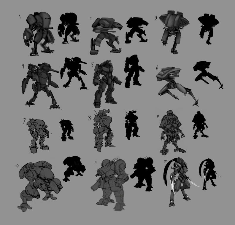
So decided that I finally want to try to tackle something with tons of hard surface elements to it, so I figured It was finally time I tried to tackle doing a mecha design.
Have done a few thumbnails, want to spend the time developing some concepts and eventually getting around to finishing up a 3d model. Haven't decided if I will bring it to a low poly game rez or try to tackle making a solid high rez digital image. I'm trying to keep it loose and just have this personal project develop organically as I go along.
Came up with a few thumbnails. Nothing is final, and the Zealot and Battletech Dragon mech are in there just because I felt the itch to draw them, so I just decided to throw them on the pile to see what people think.
Some are through wacom sketches, others through a thumbnail sketchbooks,
Just trying to have a fun time developing something that will hopefully turn into a solid portfolio piece. So any input is always greatly appreciated.


Replies
Even though I like 3 though I think it needs to be expanded upon with more sketches before moving on with modeling
Yer thought I had seen it before
10 is quite cool actually!
Lol he mentioned that this was from battletech in his post, as well as the protoss zealot from SC
4: great pose and nice silhouette. Although the design has a very high ventre of mass. But anyway it looks cool. Maybe you can do some things to its legs to make it look more steady. But without losing the agiglity the legs are suggesting. Another way to go about this could be a reduction on the body or shoulder guns. Maybe trying a design with smaller missile pods could help here.
I agree on 10 having a really strong and heavy silhouette which is the reason for me to favor it. But I dont like those bended missile pods.
8 - Breast plate is cool.
z is really cool looking but for me a totally different approach in mech design. Its more like a smaller exosceleton than a giant battle mech. I think the fact that its armed only with blades (at first glance) is supporting this impression. So if you pick z I would say find some design elements to underline the size of the machine that you have in mind.
And yeah, 11 was a slight re-design of the Battletech Dragon mech that makes it a bit more functional. (Like designing joints that would actually be able to move.)
I've always wanted to do a piece of fan art for both Starcraft and Battletech because in my eyes at least those would be my favorite properties to actually work on. Which is why I threw them up there seeing as how I already sketched those guys out and I want my next project to have some hard surface design in it.
People really seem to like #10 and 8 so I'm defiantly going to have to try to develop those a bit more, everything else is pretty across the board with a few exceptions which is nice. I myself am actually pretty drawn to 1, 6, and 7, so I'll see how I feel about developing those further. Not sure how much time I want to keep in concerting out multiple designs, so I'll probably start with #10 first and see where that takes me.
People seem to like the Starcraft Zealot silhouette as well, so I think I might have to come back to that at a later time.
Thanks for all the feedback guys. I really want the end results of this piece to be to a pretty high standard, so I really want to make sure I have a solid design before taking the project too far.
When I was sketching this mech, I took a heavy amount of inspiration from the Predator unmanned drones and kind of wanted to create a mech roughly around that concept. #1 in this line up is pretty much a further refined version of the sketch trying to preserve the predator hull shape in the body with the under slung camera. The other versions are pretty much off shoots of it to try to put some cameras up top.
Someone commented on the sloped missle launchers being a but unrealistic and unpractical so I played around with those to have some more conventional designs to see how they would look on the mech. Pretty crazy how that one feature changes so much of the feel for the mechs, as #2 to me seems almost lighter because of those tube missile launchers.
I never knew what I wanted to do with the for arms, so I played around with those as well.
So basic layout wise, what are people liking? Just seeing what works and playing around with some of the aspects of the design. Nothing final yet, but I will defiantly be sure to incorporate the feedback into the final design. Everything is still "roughed" out, so I'm defiantly going to add a bit more visual interest to some of the "basic" looking parts if I move forward with the shapes. At this point in the game though I was still just keeping it loose.
and I like the forarm and thigh plates matching, keep that theme.
I think I like the 3rd missle pod set best.
maybe put some reactive armor on the shoulders?
I'm not sure what else to say that isn't biased, since I'm making a similar mech as well...and every idea I was about to suggest is lot like what I'm already doing.
It's a pity for the zealot like concept, i loved it