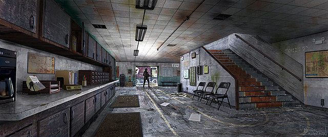
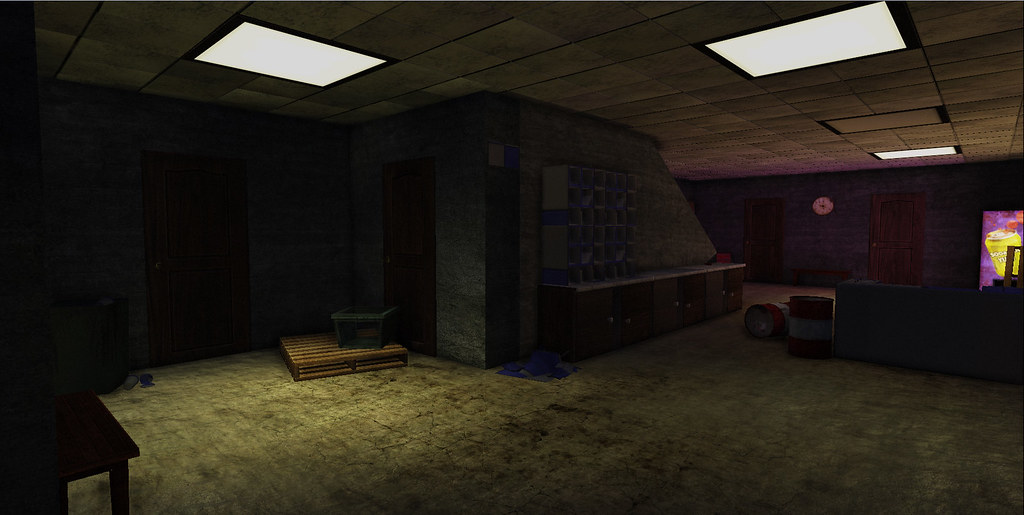
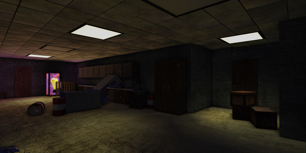
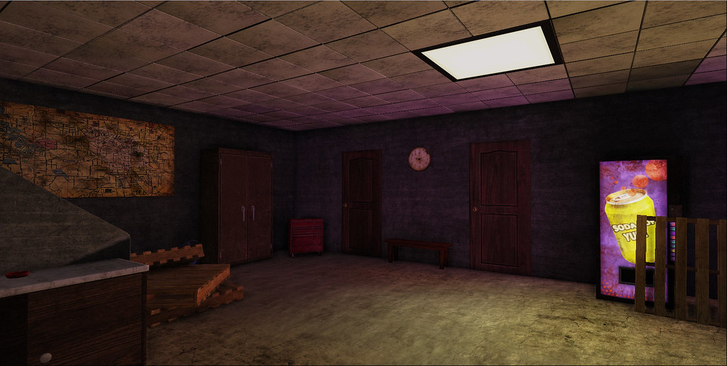
This is a scene for my senior project at school. Its inspired by a COD Black Ops concept. I'm still a noobie 3D Artist so I need all the critique I can get thank you!
This seems to be going well, If you are trying to make it match the concept exactly I would try taking a closer look at the lighting. Lighting is almost everything. It helps give the colors and the environment life. Everything seems to be really dark right now.
The roof tiles seem to be off a little. It might be just the lighting. I was dealing with that type of tiles before Here, Maybe seeing some of the troubles I was having may help.
Love the soda machine... I don't know what it is about soda machines in video games that are so awesome.
Thanks Polygonfreak I have to fix the text on the soda can to make it actually wrap around properly. I honestly think that your ceiling tiles came out nice. Maybe I have too many of them for the space. I can see what it looks like if I scale them up. And this is rendered in Unreal
cooljay, yeah I did some color picking on some things but for the majority of the assets I went with my own color scheme
Replies
This seems to be going well, If you are trying to make it match the concept exactly I would try taking a closer look at the lighting. Lighting is almost everything. It helps give the colors and the environment life. Everything seems to be really dark right now.
Love the soda machine... I don't know what it is about soda machines in video games that are so awesome.
What are you rendering this in?
cooljay, yeah I did some color picking on some things but for the majority of the assets I went with my own color scheme