The BRAWL² Tournament Challenge has been announced!
It starts May 12, and ends Oct 17. Let's see what you got!
https://polycount.com/discussion/237047/the-brawl²-tournament
It starts May 12, and ends Oct 17. Let's see what you got!
https://polycount.com/discussion/237047/the-brawl²-tournament
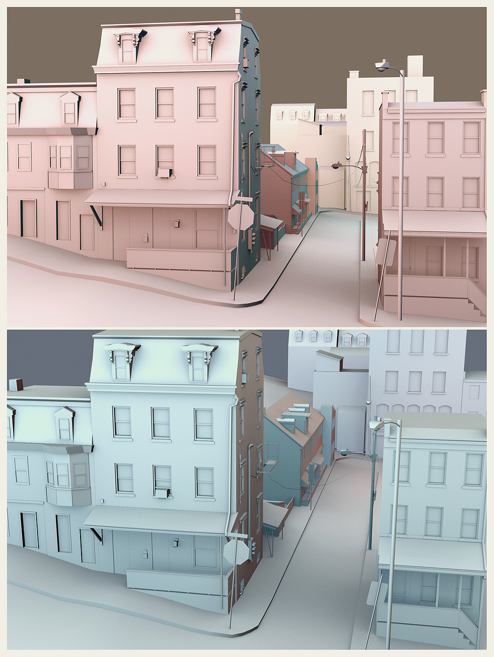
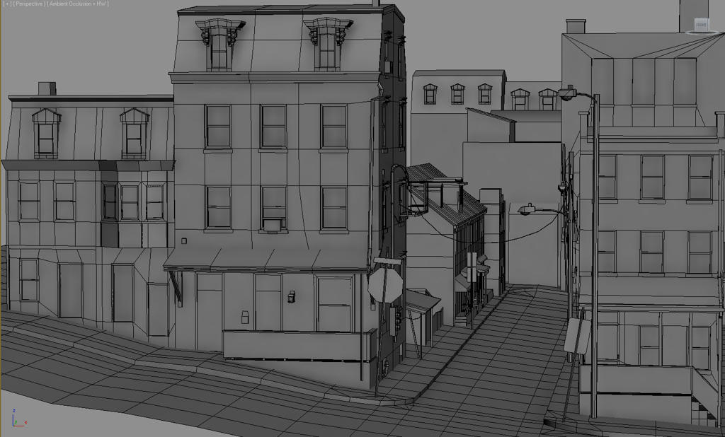
Ferry Street corner WIP
I've been coming back to this scene off and on for ages now, and I'd love to finally complete it. My right arm's in a cast from surgery for the next few months, so it seems like a good opportunity to focus on some personal 3d stuff since I can't be distracted by drawing v:
I'm sort of just modeling randomly at this point, and I haven't decided on any particularly cool compositions or camera angles to focus on, and I think that's my biggest issue with it. I haven't started high polying or optimizing anything yet since I'm still undecided on which direction to go with the stupid thing. Like, whether I want to focus on the scene as a whole, or build out a couple nice pieces in detail more fully.
Any thoughts or feedback would be wonderful, maybe I've just been staring at it too long. I want to see this scene done.


Replies
double check the size of that stop sign though.
is that gonna be your final camera angle ?
Still, its looking good
There a lot here, so you could go with several different angles. I would try to focus on one building. Try to make it interesting. Do you want it to be a nice town, an old town, a crime infested town, etc. Make that one building fit whatever theme you decide and then go from there.
Ahaha, that would be something entirely in another direction. Lots of possibilities with that one.
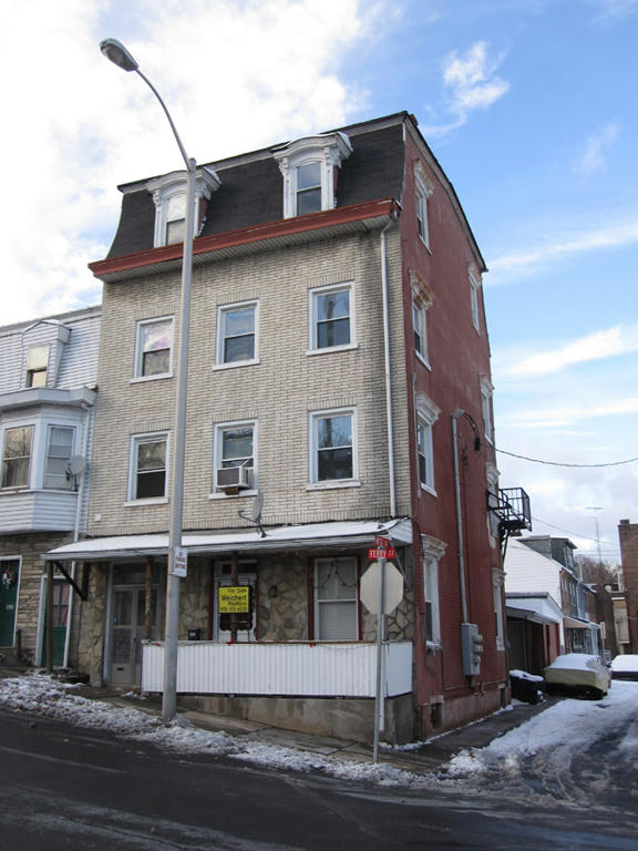
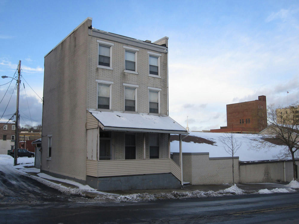
That sounds cool, I have one building I'd like to be the focus. The pictures are from my hometown where I grew up, it's a pretty bad part of town over there, but I always liked the old buildings and row homes and that style of architecture, even when it's become all run down over time.
And yeah, there's tons of unnecessary stuff going on, it's still a block in but I'll see that everything is nicely optimized in the end. Extra geometry drives me mad 0: