looking for texture advice/crits
polycounter lvl 14
morning good people of polycount, I have a request.
I could do with your help to get my texturing up to a decent standard. I'm not saying that I'm 100% with my modelling but I have a fair idea of where I go wrong and kind of know what I need to work on, but texturing draws a blank for me, I just end up throwing more layers on and screwing about with levels without really knowing what I should be aiming for......does that make sense?
Anyway if you could take a look at this character and give any feedback/advice/crits it would be very much appriciated, I really do want to improve this side of my game, especially my spec maps.....I'm pretty sure that I dont fully understand them, which is not good.
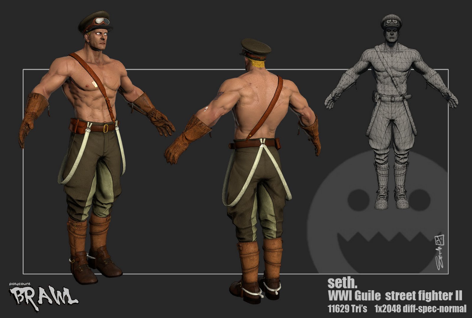
thanks in advance for any crits/comments/advice/cookies that I may recieve (especially if the cookies request works:D )
I could do with your help to get my texturing up to a decent standard. I'm not saying that I'm 100% with my modelling but I have a fair idea of where I go wrong and kind of know what I need to work on, but texturing draws a blank for me, I just end up throwing more layers on and screwing about with levels without really knowing what I should be aiming for......does that make sense?
Anyway if you could take a look at this character and give any feedback/advice/crits it would be very much appriciated, I really do want to improve this side of my game, especially my spec maps.....I'm pretty sure that I dont fully understand them, which is not good.
thanks in advance for any crits/comments/advice/cookies that I may recieve (especially if the cookies request works:D )
Replies
Where would the wear/tear be on this particular object? On the gloves it might be light on the knockles from punching people in the face. The boots might have some damage, scratches/tear from kicking people in the head. Start by giving each part of the texture a bit more love, maybe add some lighter shades where it needs to be. Maybe use the burn/dodge tool. Don't be lazy.
Honestly you're a way better character artist than me, if you get your texturing skills up to snuff you'll be awesome. Hit me up on MSN if you seriously want to get into it as well.
EDIT:
Yeah take a look at this Guile as well:
http://www.gameartisans.org/forums/showthread.php?t=7114
Great lighting matters, but an awesome diffuse and spec is priceless.
the hair doesn´t look like hair (you can see that it is sculpted like you have used a rough noise filter on teh brush and it doesn´t fit to the realistic appearance of the rest)
you could need some color variation in the face and on the ears ,the clothes and expecially the leather look really good (I would like to now how to make that o0)
TNO: yeah the eyes is mostly a modelling thing I think, I have a habit of doing stuff too wide eyed, they all look like deer in headlights....noted though, I will tone down the whiteness and see what that brings.....thanks
edit* forgot to mention good call on the hair btw......I think i was just being a bit lazy there....best fix it huh?
How about more shine, bruising, blood and dirt on his skin? This is equivalent of a brand new house and an old battered house. The old battered house looks way more interesting, so let's get some interesting detail on there. Don't be afraid to go all out and mess around with stuff. You say that you are just throwing stuff at the canvas and messing around with it. Well that is half the learning curve. Through doing that you will learn what will and won't work.
Also, I think the lighting can be improved slightly as it's making the model a bit flat. How about adding a rim light at least. That always looks great for characters at least.
Yeah dude I have skype
I love how you have some variation on the skin near the elbows- how about do this on the face- add some more blue near the chin and more red near the cheeks and nose.
The details make the difference, a little more work and you´ll have it.
chrisradsby : Chris I have added someone called Chris Radsby on Skype....if I'm lucky its you
disanski: Hey man, ta much for the crit. Its not about being better, I value your eyes on the piece, you dont need to be a master to know something looks wrong....but it helps when putting it right
jordiart : I have a few fabric overlays in there but I think that I got a bit scared of them and pulled them back too far, I will push them back out a bit and see what happens from there....oh and then detail.....I guess thats really the key here, just keep at it till it works huh?. Ta very much for the advice
wrapping up work for today soon, so I will get into PS and start actioning your crits, thanks again btw
Also, I agree with the rest :poly124:
http://www.pig-brain.com/tut01/tut01_01.htm
Rendered in marmoset... thanks for looking...back to pig_face now then.
P.S. Here are some more tuts I like to use when texturing.
http://www.horribledeath.com/tutorial.htm
http://features.cgsociety.org/story_custom.php?story_id=4678
MJackson126: brilliant feedback, thanks very much....I took onboard almost everything that you mentioned except the mud...French dirt makes stuff that actually does resemble wading through sewage so that works well. I added facial bruses and lots of extra dirt and wear on the hat, and his webbing etc... Also thanks very much for the links
Lighting is something that I am very slowly getting my head around....believe it or not the earlier shots were done with a three point set-up....I just have a habit of washing stuff out I think....must knock that on the head.
Anyway, walking away from this for a while now, I have another character on the go that needs my attention more than guile for the time being...pictures!!
as always thanks for looking.
thats all folks
The only little part i can see that bothers me is the to saturated yellow hair. Perhaps this is what you are going for.
What are you doing next
I would also like to add I think you haven't pushed your specularity as far as it could be going in places. Everything feels like it has a very equal specular level and it's not helping to define and accent your normals. A shirtless fighter could benefit from looking sweaty and oily to help sell the skin more, the leather boots would still have scuffs and shines in parts, as well as the gloves. Your pants I believe are the most successful materials. And your metals feel a tad flat as well.
A tip I got from some friends far more talented than I that I have found to be extremely successful in helping to push my own spec maps is by running the normal map through crazybump and extracing the specular map for a blending layer in photoshop. Just something I think could help in your future models. Still turned out very nice sir!
Vorge: spot on crits man, spec maps and lighting are the two things that I am trying to get my head around the most at the moment....this art lark is a bit like spinning plates...I have just picked up a book on CG lighting and will most certianly be trying your trick for the spec, I think that with both the lighting and spec I have a habit of trying to draw things into the middle too much if that makes sense.
anyway thanks again for the replies gentlemen I shall have another go at the maps