<--Alien firearm-->
Hello,
I'm in need of a critique,
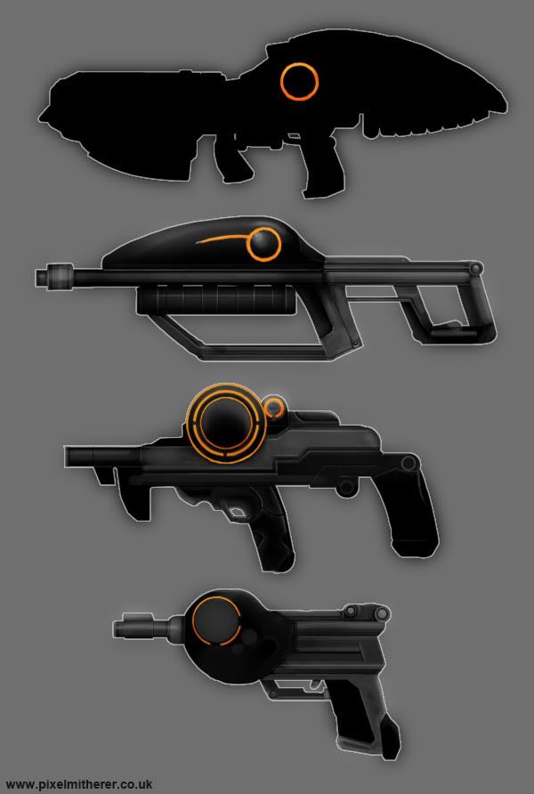
I set myself a task to introduce me into the world of hard surface modelling by creating a SciFi gun; an alien weapon with a insectoid/Cephalopoda! (Squid/Octopuss etc) influence to the design.
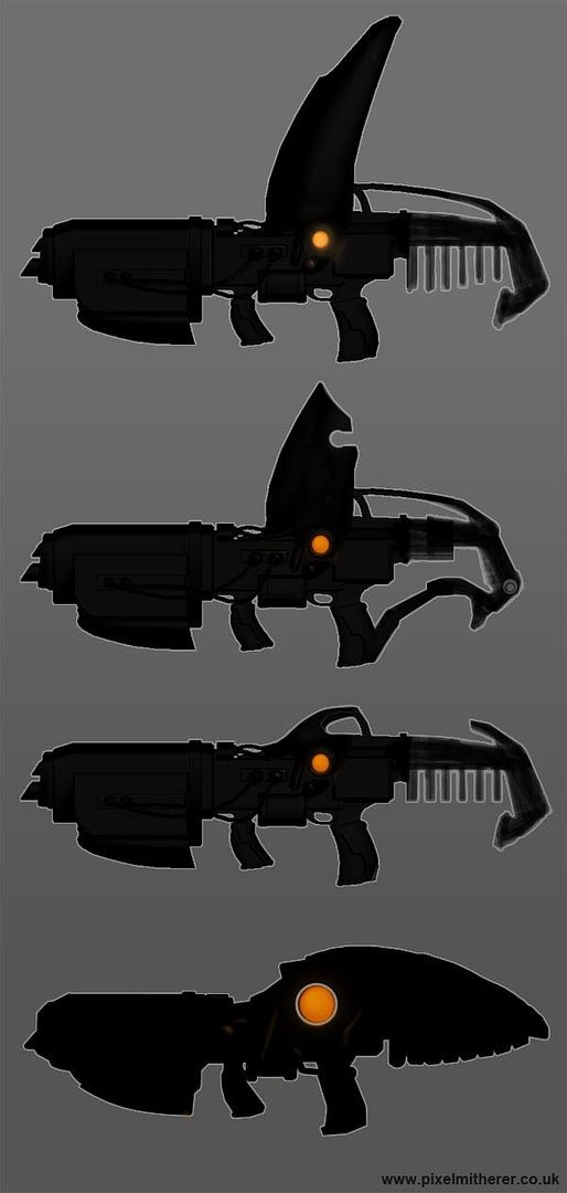
I'm still a little unsure of the design of the rear of the weapon, so working on some silhouette designs, not quite satisfied with it yet though.
Perhaps some kind of mount so it can be fired from the shoulder or from chest/waist height.
Any crits or comments would be helpful.
Cheers,
PM
I'm in need of a critique,
I set myself a task to introduce me into the world of hard surface modelling by creating a SciFi gun; an alien weapon with a insectoid/Cephalopoda! (Squid/Octopuss etc) influence to the design.

Coming up with a few gun concepts...

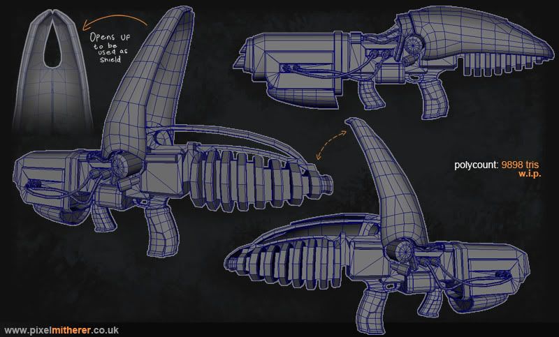
...and the first pass low poly mesh.
I started blocking out the lowpoly first, to get the proportions right. And from that I'll build the highpoly version right around it.
I'm still a little unsure of the design of the rear of the weapon, so working on some silhouette designs, not quite satisfied with it yet though.
Perhaps some kind of mount so it can be fired from the shoulder or from chest/waist height.
Any crits or comments would be helpful.
Cheers,
PM
Replies
The version with the big shell on the back and no butt looks the most alien, but I think it would make for a stronger design if you considered more of the anatomy of the aliens. I suppose it could be a very human hand, but I think it would sell the "alien" aspects more if you had in mind an alien with a different sort of gripping appendage, like a series of tentacles, or maybe they're four-armed with each side having a big, less dextrous "heavy-lifting" arm and a smaller "fine detail" arm on each side. Or even just a big insectoid/crablike claw (which would fit the shelled nature of the gun you've already got)
If you wanted to drop the alien nature and make it like far future human or create something that humans adapted from the original alien tech, I'd go with #3 but with a more framed butt like the one in #2 (but don't lose that ribbing you've got in #3. I really like what that does to its silhouette)
Yep, I had a human / humanoid alien in mind when I was coming up with the original concept. Sort of a Gears of War-esque character.
GCMP@ Great idea! But thought I'd stick to a more recognisable form at the moment. But as you described that's definately something I'd like to try for a future project.
Perfectblue@ Thanks!
And while I liked the idea of the wing/shield, it might of been an idea too far, and I might be time to remove it.
A little paintover update, worked out some of the smaller details and the colour scheme with this.
So in case you're not sure whether to keep or lose it, my vote goes to dropping it
Color concept is looking awesome too, can't wait to see more of this.
also, the edges on your high poly are much too tight for baking. they'll just alias when baked down. soften em up!