Brian Beebe's Critique Thread
Hello Polycount
I am Brian Beebe, an Environment Artist that has recently graduated college with his BFA. I'm looking for critiques of my work so that I can improve upon work. So lets get started
All of my work can be seen at my website and my blog which are:
http://www.brian-beebe.com
http://www.brianbeebe.blogspot.com/
I will also upload some work:
Demo Reel:
[ame]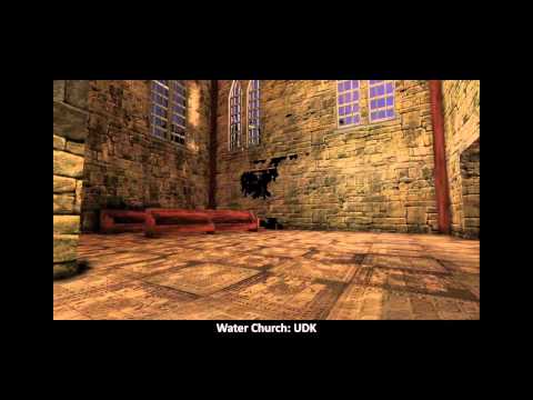 http://www.youtube.com/watch?v=SpwdBHbeaV8[/ame]
Images:
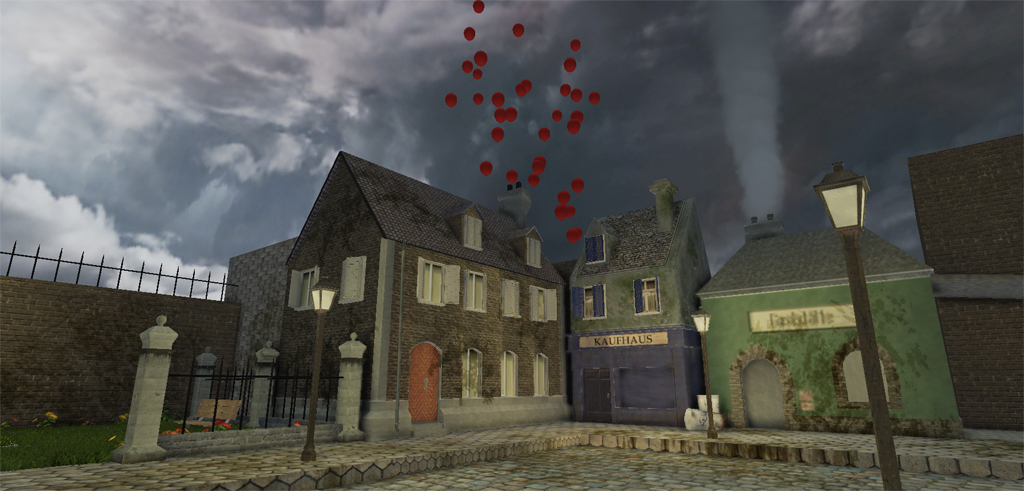
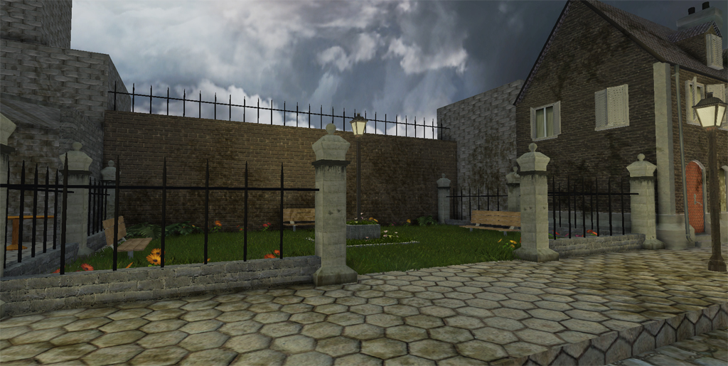
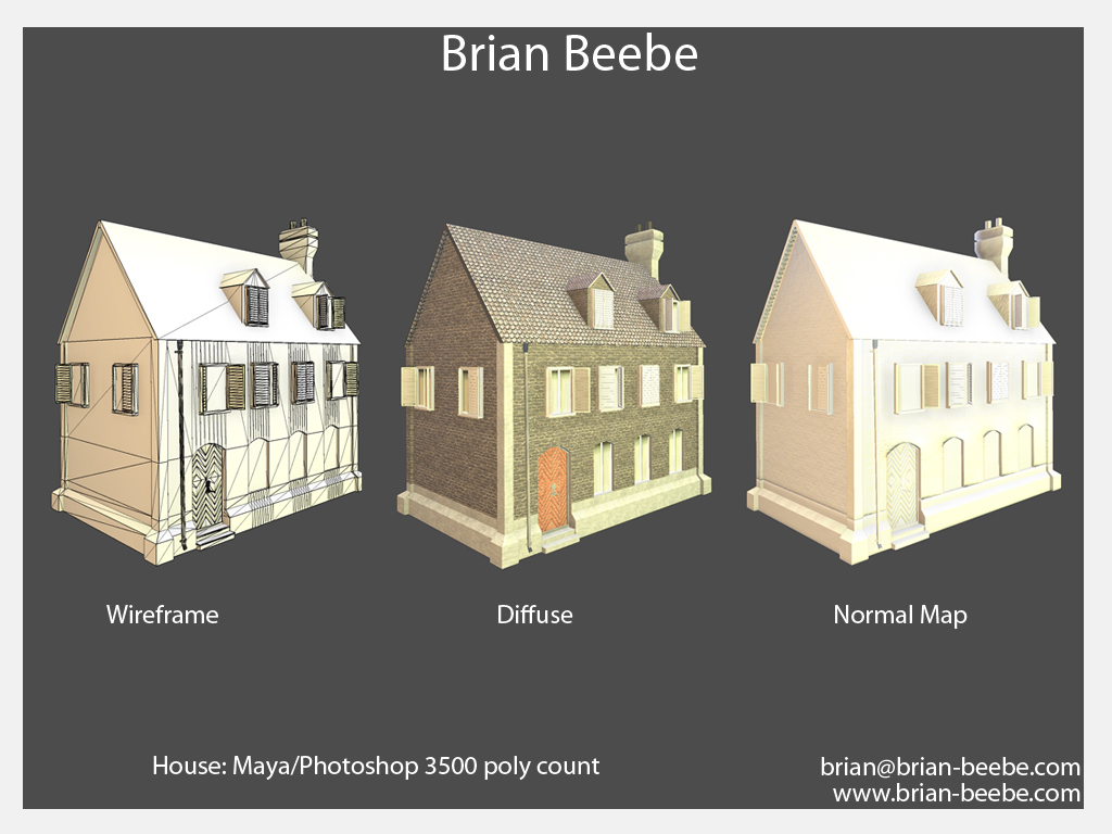
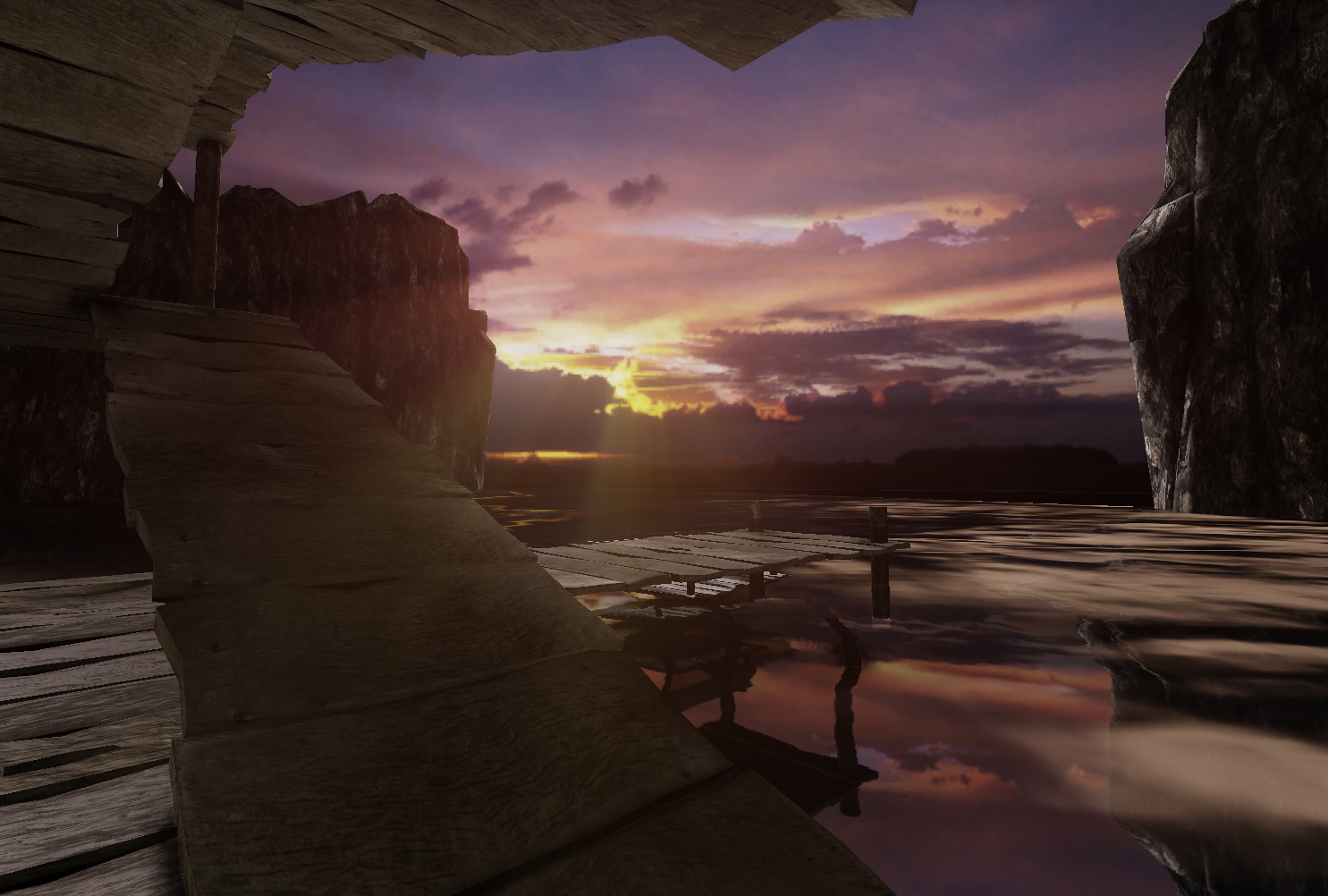
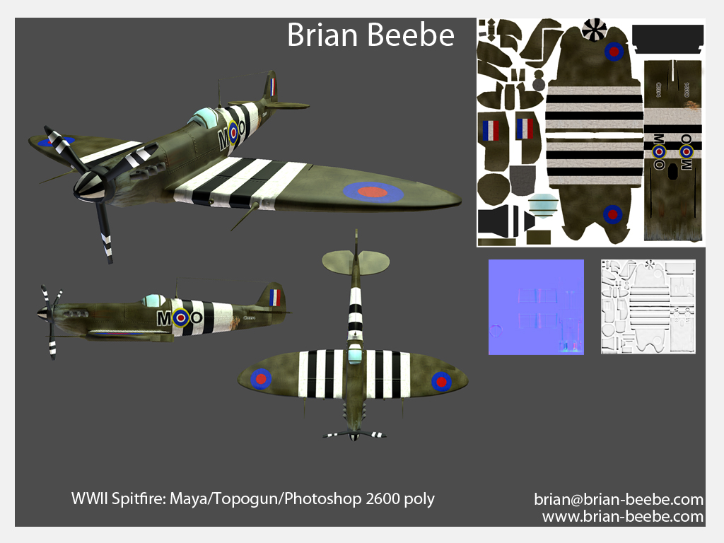
99 Red Balloons Scene
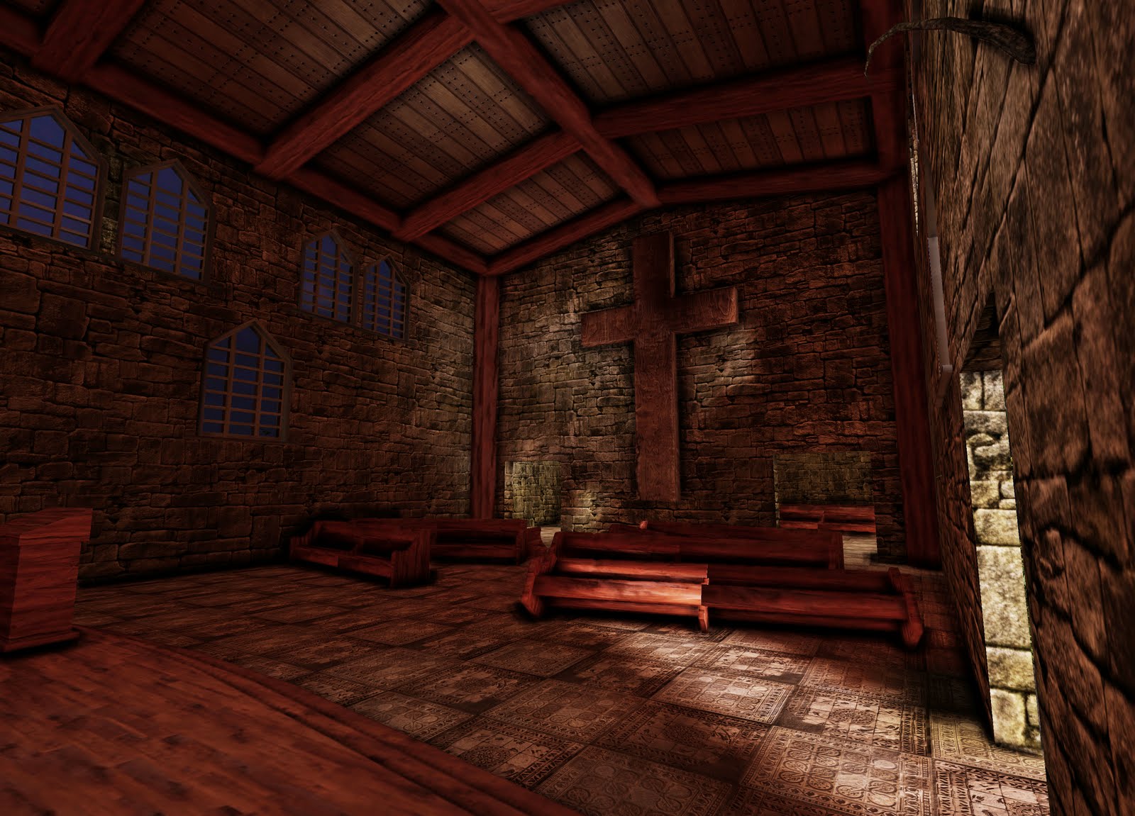
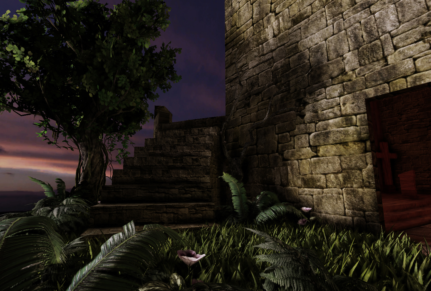
Water Church Scene
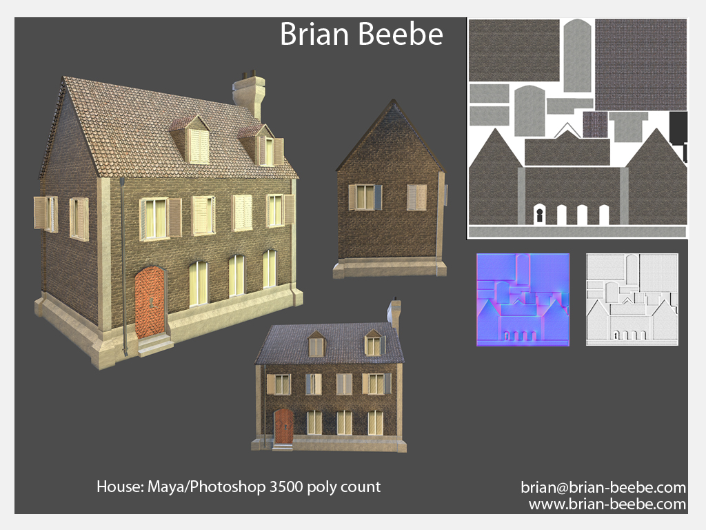
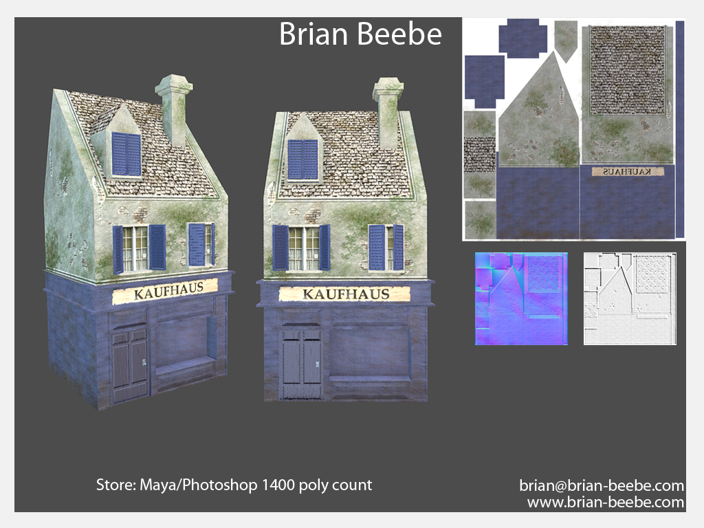
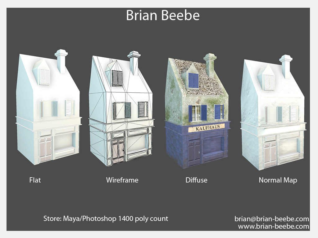
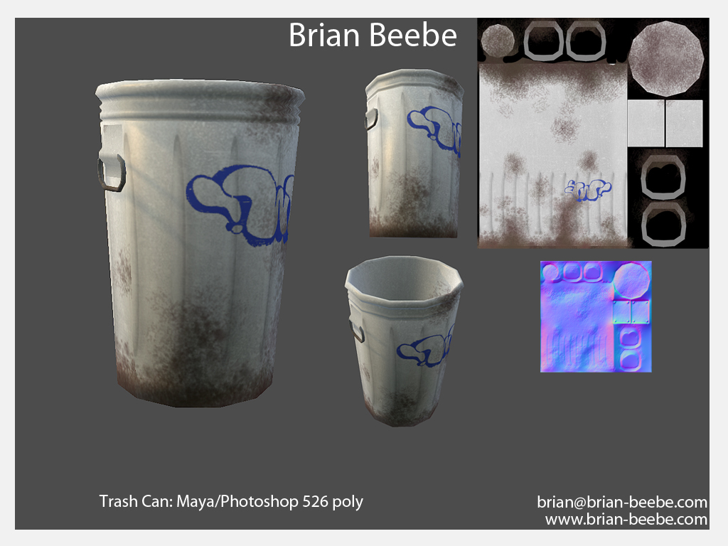
Random Assets
Please give me all the advice and critique you can. I welcome all kinds. I will not be offended if you have harsh critique, as long as it is constructive.
Thank you all,
-Brian Beebe
I am Brian Beebe, an Environment Artist that has recently graduated college with his BFA. I'm looking for critiques of my work so that I can improve upon work. So lets get started
All of my work can be seen at my website and my blog which are:
http://www.brian-beebe.com
http://www.brianbeebe.blogspot.com/
I will also upload some work:
Demo Reel:
[ame]
http://www.youtube.com/watch?v=SpwdBHbeaV8[/ame]Images:
99 Red Balloons Scene
Water Church Scene
Random Assets
Please give me all the advice and critique you can. I welcome all kinds. I will not be offended if you have harsh critique, as long as it is constructive.
Thank you all,
-Brian Beebe
Replies
The first house you posted the door texture looks wrong, especially in engine, because the dirt map texture you applied over the whole building cuts into the door. It also looks like the texture of the stones on the building is tiling right in the middle.
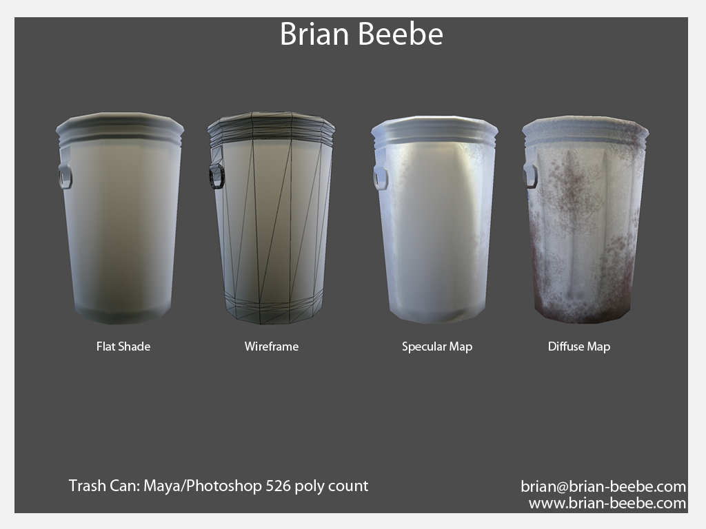
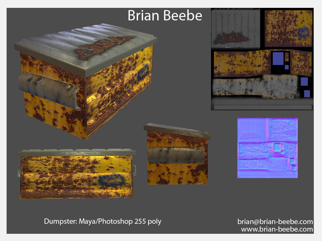
Again I am not a 3D modeling expert but the trash can poly count seems a tad high, no?
The church scene the water is reflecting way to much, it is almost like a mirror. Then also with the sharp edges again, the wood looks like it would be in game 10 years ago, not in this modern time. Last the doorway looks like you just use BSP brushes, which is fine, but a wooden door frame would make it look a million times better.
Sorry for sounding harsh, I think it would benefit you greatly to concentrate on making one really good scene instead of a bunch of small random ones.
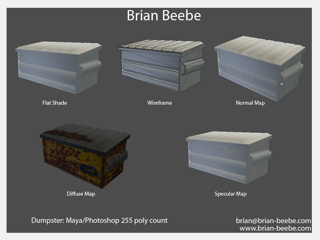
Oh also, your normal map is really messed up here, because you did a lazy crazybump conversion without really understanding what a normal map is. Model a quick highpoly for this and bake some proper normals. Doing a highpoly model for this sort of asset should take like an hour or less, so take the time to do it, you'll get a much better end result.
Now, for a more general piece of advice: Scrap all of your student work. You need to get to work ASAP creating better work than this, pay attention to the standard of quality here on polycount, and other artist's portfolios. Everything on your portfolio screams student work, and you need to start working to ditch it. All of it. This may seem harsh, but its the reality of a very competitive games industry.
Also, as we all know or learn, reference, reference, reference, reference. The more, the better. I think studying more reference photos, shapes, why things are put together certain ways, etc. will help improve your art.
Keep at it though.
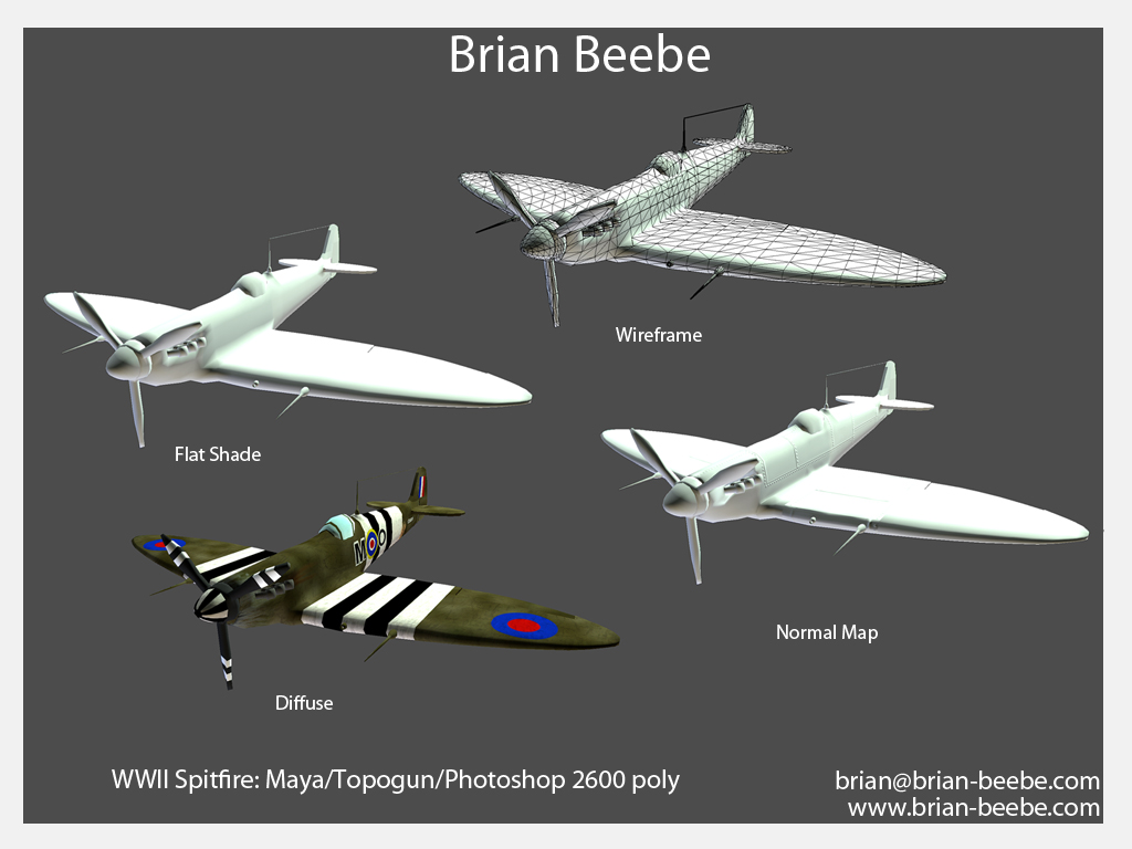
The other posters hit on the sharp edges too. There are no (or very little) 90 degree angles in nature, there will almost always be a slight taper to things. (Bevel tool in Maya or Chamfer Edges in Max help with this a lot).
The dumpster bothers me the most as the texture is almost completely unaltered from CGTextures (I know because I've used it as a base before) and the lid looks like the same paper-esque material that's suppose to read as metal.
A lot of the models look more like BSP blockouts than finished models. Look up next-gen modelling techniques like projecting normals from a high to low poly mesh. Learn z-brush or just basic high-poly creation in Maya/Max.
Texturing looks very tilely on most of the models and doesn't have enough detail that at viewing ranges it reads as either flat color or noise which does not sell the surface. A lot of artists will take feedback like this and go to the other extreme and just start throwing grunge overlays on everything. While this is okay, make sure to work your way back to the center.
The best thing that helped me with texturing (I had some of the same issues) right out of school was the Eat3D Next Gen Texturing tutorial my lead advised me to go through. It's about 6 hours long and goes through the most common material types (organic, metal, wood, etc) and helps you develop the mindset and technical skills to bring your texturing up to a pro level.
As a whole the assets look like they're from an early Quake 3 mod or something when they need to be looking probably no worse than Unreal 3 mods/assets from 2-3 years ago.
Nothing is out of reach, keep working at it and look at the resources the other posters and myself have recommended (Eat3D especially). I look forward to seeing progress.
Thank you very much
i find it ironic that the thing i choose to make look Next Gen is a 50s Diner booth xD
here is my starting Ref Page, will be making specific ones soon
The great thing about video games and 3D work is you can do what you want, so why not deck out the Serenity Cockpit 50s diner style?