Home 3D Art Showcase & Critiques

CAT scan machine..in Space!

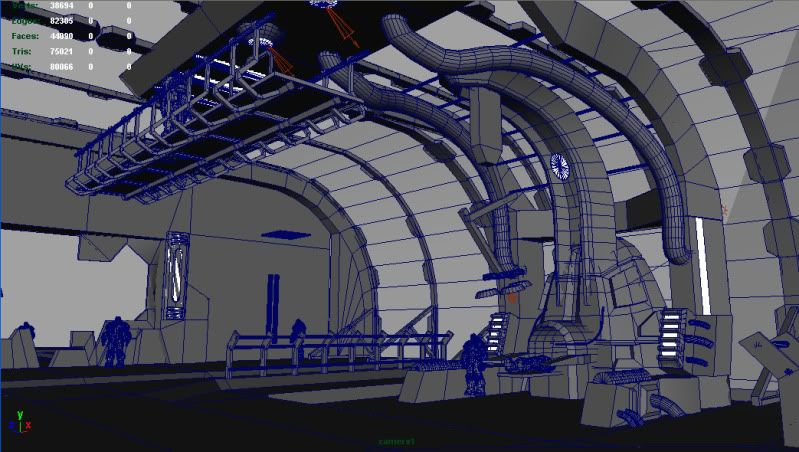
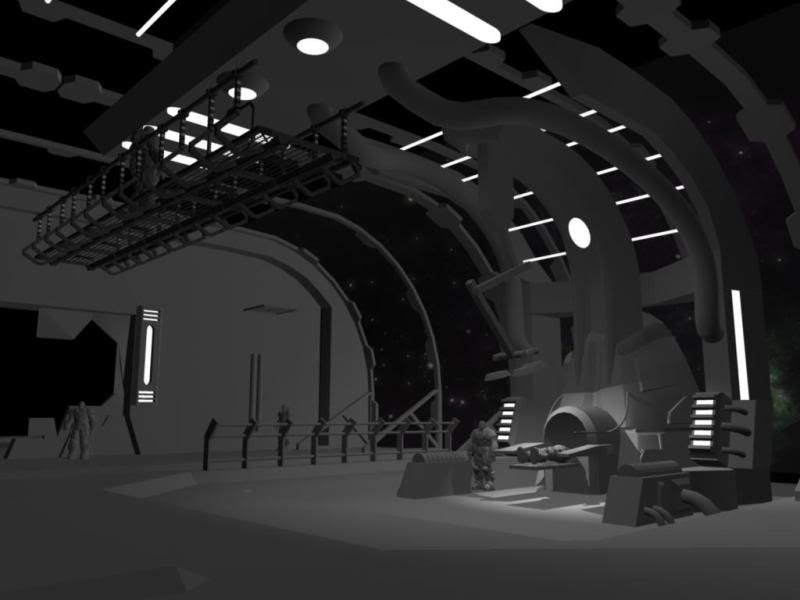
Hey PC, I have not posted any work in over a year due to long hours at a post production studio. I have decided to rebuild my environment portfolio. This is a early shot of the medical machine in space I have been working on. All comments / crits welcome.

Catwalk will continue around. I know its floating.
53.jpg
medLab_53.jpg

Replies

  • Mik2121
    Offline / Send Message
    Mik2121 polycounter lvl 9
    It's looking great!.

    If it were me, I'd add some stairs on the sides and just leave the ramp in the front, or wherever it might make sense (ie, where the cargo is being moved around).
    The ramps angle is too strong right now, unless that's just temporary (or a step, in which case it's too high, imo).

    Anyway, it's looking interesting. It needs some props laying around and maybe (maybe?!) some screens like in the airports, to give the scene some extra color besides the ambient light coming from the outside and the white lights to illuminate the building.
  • Huntard
    Offline / Send Message
    Huntard polycounter lvl 12
    Nice Start Jim! You might want to spend a little time working out the support structure for the room before going in and populating the room with complementary props. Keep it up!
  • Katori
    Offline / Send Message
    Katori polycounter lvl 7
    Inspired by Dead Space 2 by any chance? Keep up the work, can't wait to see a texture! Specularity will be interesting.
  • VikingJim
    Indeed inspired by Event Horizon and Dead Space. I have been moving some things around to get a better overall composition. I have added a new pressure lock door, placeholder pillar supports to frame the 1st shot, and some holo-screens for the observation catwalk.

    medLab_View1.jpg
    medLab_View3.jpg
    medLab_Wip.jpg
    machineBreakdown.jpg
  • Pope Adam
    Offline / Send Message
    Pope Adam polycounter lvl 11
    Structurally the window frames are improbable... with conventional technology, those windows wouldn't be able to hold the pressure without more believable reinforcement. That said, are you 100% sold on doing this thing with windows taking up 90% of that main back wall?

    Perhaps consider re envisioning those back walls, it gives you more freedom to do impressive environment modelling that could be structurally and architecturally believable, lend function to the rest of the room with organized piping, electrical conduits, built in lighting, ventilation etc. to solidify the motif of the room.

    This suggestion, however, would probably require more time in designing before implementing. If you're gonna stick with windows though, I still recommend beefing up the window frames... make them really fucking cool.
  • Pope Adam
    Offline / Send Message
    Pope Adam polycounter lvl 11
    This isn't a very good design... and if it were my scene I'd spend a few hours sketching up various different kinds of versions of this in order to get it right, but something like this

    example.jpg
  • Pope Adam
    Offline / Send Message
    Pope Adam polycounter lvl 11
    Did you gather any architectural references, or style references from existing games?
  • VikingJim
    Hey Adam, I didn't want to copy a certain style specifically, so I watched a few classic and recent sci fi movies and sketched ideas that I liked. Movies were Aliens, Dead Space animes, Event Horizon, Moon, and Pandorum. Im currently reworking the curved window wall structure from your advice. Interior design admittedly isn't my strong suit, but the room is a melting pot of the listed movies. Thank you for your help with the overall design.
    medLab_75b.jpg
    medLab_75.jpg
  • Cody
    Offline / Send Message
    Cody polycounter lvl 15
    Looks pretty cool! Good idea, and the blockout looks nice. Can't wait to see more.
  • VikingJim
  • Huntard
    Offline / Send Message
    Huntard polycounter lvl 12
    I really like the progress you are making Jim. However, you should be blocking out your scene in what ever engine you decided to use, UDK for example. That way you aren't placing your scene twice. Keep up the good work man!
  • p3r4app01
    space marine on the left in last images looks like you did a lot of
    normals-harden edges
  • feanix
    Offline / Send Message
    feanix polycounter lvl 7
    I'd agree with Huntard, you'll be saving yourself some time if you did the blockout in engine rather than in max. It'll help you spot lighting issues and other problems earlier on.
  • Papa_Austin
    Offline / Send Message
    Papa_Austin polycounter lvl 10
    hey jimmy! good to see you are getting back into your portfolio again! so do you maybe have a combination of images or maybe a mood bored to see the vibe you are kind of going for?
  • Pope Adam
    Offline / Send Message
    Pope Adam polycounter lvl 11
    Looking cool man - it looks a lot more structurally sound now. You could probably enlarge those windows if you'd like to see more out in space.

    Concerning your main machine in the middle. Do you have any ideas sketched down how you'd like the main body of that thing to look? Clearly it's just a block out right now, but before you jump in to more modeling on it I reckon you make sure you have a solid understanding of what you want it to be, before you jsut start jumping in and bevelling edges etc. :)

    very pleased with the updates jimbo!
  • VikingJim
    Hey guys, thanks for the advise! I was playing around with reducing the overall size of the entire environment today. Swapped some things around. This size seems much more realistic. Now it is a large room instead of a hanger sized area. What do you guys think? Smaller area the way to go?
    medLab_b_04.jpg
    medLab_b_01.jpg
    medLab_b_05.jpg
    medLab_b_03.jpg
  • VikingJim
    Update, Introduced ramp to the machine, canister storage area, and pillar supports
    medLab_b_09.jpg
    medLab_b_10.jpg
Sign In or Register to comment.