Home 3D Art Showcase & Critiques

Old time telephone

polycounter lvl 9
Offline / Send Message
Samfisher84 polycounter lvl 9
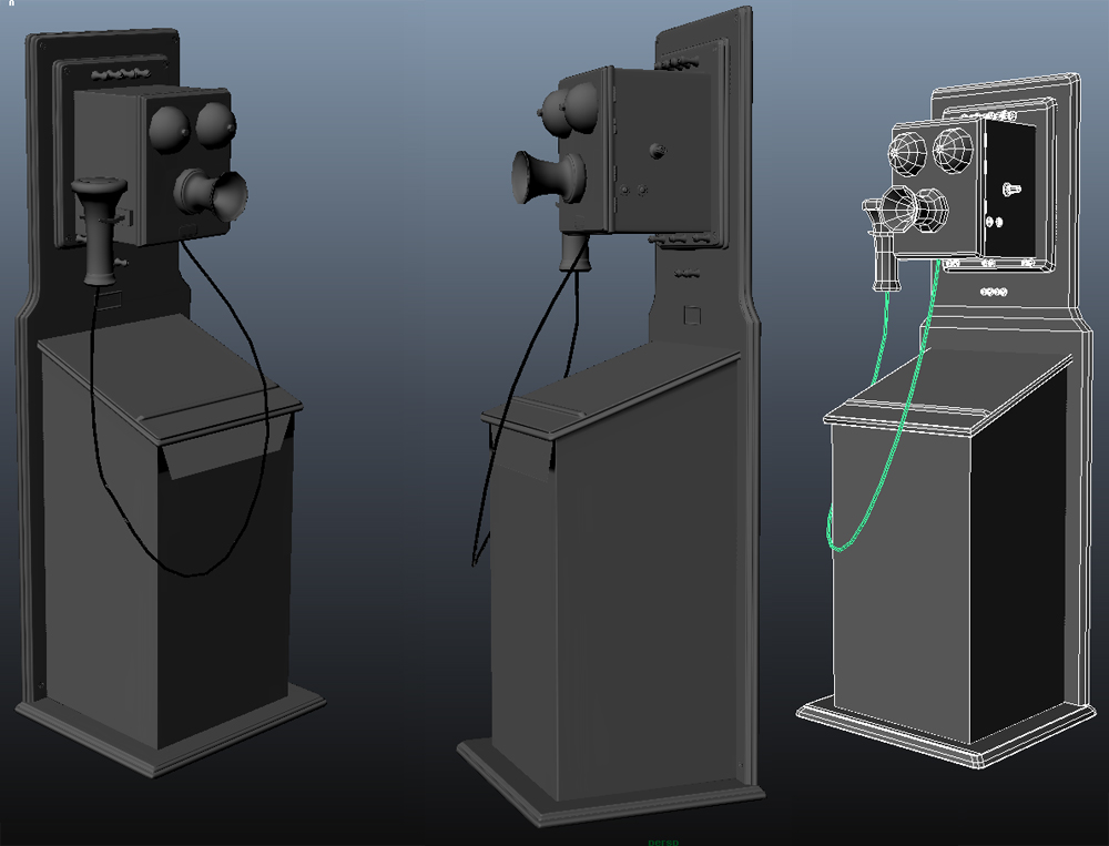
Been working on an old telephone
2048 maps
about 3000 tris

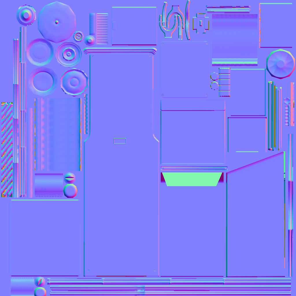
This is how far its donw. Normal bake and low poly done. The normal map isnt edited. Gonna clean it up abit due to some errors.

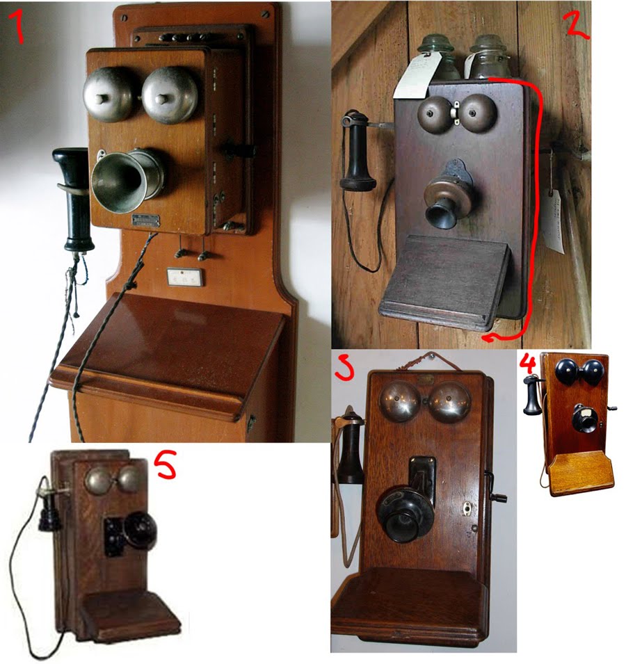
also plan on making a floor and wall with some surrounding small props.
idetelefon2.jpg

Current mesh low poly
Baked.jpg

Current normal map
diffuse.jpg

Replies

  • EMC3D
    Offline / Send Message
    EMC3D polycounter lvl 14
    Jeez 2048?! Would of thought it'd be a 512 since its a small prop with lots of texture repeating you could make use of in the UV map.
  • Samfisher84
    Offline / Send Message
    Samfisher84 polycounter lvl 9
    Mr Bear wrote: »
    Jeez 2048?! Would of thought it'd be a 512 since its a small prop with lots of texture repeating you could make use of in the UV map.


    yeah wasnt too sure about the size. Maybe 2 uvs for it would be better.
  • slipsius
    nope, 1 UV, 512. maybe 1024 if you're just focusing on learning to texture. hell, you can start at 2048 and just drop it down after. and you`ll see how the texture changes accordingly.

    But yes. just 1 map. you can optimize alot as well. all those little nobs look like they each have 20 sides to the cylinder, but at that size, you'd need maybe 8 or 10. at that size, no one will notice a difference.

    edit: just looked at the normal map more. scratch the 20 side comment. but they still look they you could drop them more from the distance we are looking at it. *Shrug*
  • Samfisher84
    Offline / Send Message
    Samfisher84 polycounter lvl 9
    slipsius wrote: »
    nope, 1 UV, 512. maybe 1024 if you're just focusing on learning to texture. hell, you can start at 2048 and just drop it down after. and you`ll see how the texture changes accordingly.

    But yes. just 1 map. you can optimize alot as well. all those little nobs look like they each have 20 sides to the cylinder, but at that size, you'd need maybe 8 or 10. at that size, no one will notice a difference.

    edit: just looked at the normal map more. scratch the 20 side comment. but they still look they you could drop them more from the distance we are looking at it. *Shrug*

    I was thinking of a second uv for a lightmap in UDK maybe
  • Samfisher84
    Offline / Send Message
    Samfisher84 polycounter lvl 9
    Been optimizing the uv and overlayed some parts that pretty much will have the same texture. Saved the bottom plate and the top of the stand or what its called as seprate shells to add ground dirt and other stuff. Optimized the knobs aswell. Also tiled all the curved edges as they pretty much are the same.

    uv.jpg

    lowpoly.jpg
  • Samfisher84
    Offline / Send Message
    Samfisher84 polycounter lvl 9
    Made a test bake and tried overlapping the edges. Ive herd somewhere that its possible but now it looks horrible.

    overlapp.jpg
  • AnimeAngel
    you can't have any overlapping uv islands when baking. It will create all kinds of baking errors. If you have normals sharing the same uv space you will need to offset them exactly 1 unit in either direction, so that they are outside the main uv area. Then do you bake and should look better.
  • Samfisher84
    Offline / Send Message
    Samfisher84 polycounter lvl 9
    AnimeAngel wrote: »
    you can't have any overlapping uv islands when baking. It will create all kinds of baking errors. If you have normals sharing the same uv space you will need to offset them exactly 1 unit in either direction, so that they are outside the main uv area. Then do you bake and should look better.

    no this is afterwards, i know i cant during baking. Now im just trying to overlap them to not get a seem
  • Mistry10
    Offline / Send Message
    Mistry10 polycounter lvl 8
    cool stuff man, i like the old telephone idea.
    are you planning on putting this in UDK ?
    btw hope to see the first pass on ur textures soon :)
  • Samfisher84
    Offline / Send Message
    Samfisher84 polycounter lvl 9
    Mistry10 wrote: »
    cool stuff man, i like the old telephone idea.
    are you planning on putting this in UDK ?
    btw hope to see the first pass on ur textures soon :)

    Yeah probably and some small invironment and some props around it. Im thinking some kind of 1930s hotel lobby where customers can use it. like this

    lord-nelson-hotel-lobby01-web.jpg
  • Mistry10
    Offline / Send Message
    Mistry10 polycounter lvl 8
    cool idea !
    IMO i think if you nail the texturing on this ( i hope you do :) ) when you should just do a real time render of the telephone on its own, like Scott did for his golfcar
    http://scotthomer.co.uk/?p=264
    its just an idea or backup plan :P
    good luck !!
  • Samfisher84
    Offline / Send Message
    Samfisher84 polycounter lvl 9
    Mistry10 wrote: »
    cool idea !
    IMO i think if you nail the texturing on this ( i hope you do :) ) when you should just do a real time render of the telephone on its own, like Scott did for his golfcar
    http://scotthomer.co.uk/?p=264
    its just an idea or backup plan :P
    good luck !!

    Ahh nice! :)
  • Samfisher84
    Offline / Send Message
    Samfisher84 polycounter lvl 9
    Not much texturing, just some wood and stuff on. If anyone know a good wood and metall tutorial im all ears!

    text.jpg
  • ayoub44
    Offline / Send Message
    ayoub44 polycounter lvl 10
    good start man , :D , here is some link can help you

    http://www.philipk.net/tutorials/materials/materials.html
    http://vimeo.com/4976913 << texturing a canon

    good luck
  • Samfisher84
    Offline / Send Message
    Samfisher84 polycounter lvl 9
    ayoub44 wrote: »
    good start man , :D , here is some link can help you

    http://www.philipk.net/tutorials/materials/materials.html
    http://vimeo.com/4976913 << texturing a canon


    good luck

    thanks ill look into those
  • Dragan
    it's getting there, but yeah if your telephone is going to be such a small asset in your scene than i would deff make it a 512x512. Great thing about it, is that you could just be reusing a lot of your materials that are in your scene as well. That same wood texture could be used on another part of the scene, but color, hue and bunch of other things could be changed ot make it look different.
    also, i think baking an occlusion pass would help pop your textures too.
    Good start though, and keep in mind of where dust stuff would settle. Those areas would be a bit darker, and would help bring your object to life.
  • Samfisher84
    Offline / Send Message
    Samfisher84 polycounter lvl 9
    Dragan wrote: »
    it's getting there, but yeah if your telephone is going to be such a small asset in your scene than i would deff make it a 512x512. Great thing about it, is that you could just be reusing a lot of your materials that are in your scene as well. That same wood texture could be used on another part of the scene, but color, hue and bunch of other things could be changed ot make it look different.
    also, i think baking an occlusion pass would help pop your textures too.
    Good start though, and keep in mind of where dust stuff would settle. Those areas would be a bit darker, and would help bring your object to life.

    Yeah it is now 512x512 and allot of the wood is tiled. And yes there is occlusion on there but its not on a uniqe uv so it looks like it does.
  • Samfisher84
    Offline / Send Message
    Samfisher84 polycounter lvl 9
    little more texturing

    tesxt.jpg
  • System
    Offline / Send Message
    System admin
    Looks great, I love old fashioned stuff!

    Texture size: I think you guys are giving the wrong impression here!

    You can always downsize and keep most of the detail but you can't upsize and still have a nice looking texture without alot of work. So it's a far better idea to start with a large texture size like 2048² and downsize right at the end, if you need to.
    I always do this so not only can people can see the textures well, it makes any future alterations that much easier to accomplish.

    If this is a single prop, I really don't see why there would be a need to downsize anyway as this seems counterintuitive to displaying an individual asset in all it's intended glory.

    Keep your pdf at full size with all layers and you will thank yourself if you ever come back to this :)
  • Samfisher84
    Offline / Send Message
    Samfisher84 polycounter lvl 9
    GCMP wrote: »
    Looks great, I love old fashioned stuff!

    Texture size: I think you guys are giving the wrong impression here!

    You can always downsize and keep most of the detail but you can't upsize and still have a nice looking texture without alot of work. So it's a far better idea to start with a large texture size like 2048² and downsize right at the end, if you need to.
    I always do this so not only can people can see the textures well, it makes any future alterations that much easier to accomplish.

    If this is a single prop, I really don't see why there would be a need to downsize anyway as this seems counterintuitive to displaying an individual asset in all it's intended glory.

    Keep your pdf at full size with all layers and you will thank yourself if you ever come back to this :)

    Yeah it is very nice to have that high tez texture. But maybe you are working on details in the 2048 texture that will never show up in the 512 cuz of compression.
  • Samfisher84
    Offline / Send Message
    Samfisher84 polycounter lvl 9
    Added some more segments on the bells and rebaked that part.


    dagens.jpg


    Mocked some simple geo for the environment background.
    mocup.jpg


    Heres the inspiration for the background. Thinking Wood panels and pillars with plants by the pillars and some type of walkway further in.

    insp.jpg
  • Pedro Amorim
    OH wait a minute this is supposed to be like a person's size?
    Cause if it's the case then, it looks way off. Way big.

    Why don't you just make it hanging on a wall?
  • Samfisher84
    Offline / Send Message
    Samfisher84 polycounter lvl 9
    OH wait a minute this is supposed to be like a person's size?
    Cause if it's the case then, it looks way off. Way big.

    Why don't you just make it hanging on a wall?

    Yeah its human size. You mean the entire phone piece or?
  • Pedro Amorim
    Yeah. If it's a human size, don't you think the thing you use to listen to, looks too big?
  • Joopson
    Offline / Send Message
    Joopson quad damage
    The door and the phone are the same height. Probably the main reason it looks too big.
  • Samfisher84
    Offline / Send Message
    Samfisher84 polycounter lvl 9
    Worked some more on the spec and such. Feels like i dont really know how to improve it more. So im just gonna start on the invironment stuff now and maybe go back later.

    Ph%25C3%25B6%25C3%25B6ne.jpg
  • Samfisher84
    Offline / Send Message
    Samfisher84 polycounter lvl 9
    Started looking into some realtime shaders (Here im using Koddeshader) and cubemaping. So now we got some reflection in the metall and wood. Tweeked the dirt some more. Got some crit that the metall looks like rock, hope its better.

    t1.jpg
    t2.jpg
    t3.jpg
    t4.jpg
  • Joopson
    Offline / Send Message
    Joopson quad damage
    That one piece of metal that you would talk into has A LOT of noticeable stretching in the texture. It's too noisy too- And the wood has a lot of jpeg artifaction, which is taking away from things.
  • Samfisher84
    Offline / Send Message
    Samfisher84 polycounter lvl 9
    Joopson wrote: »
    That one piece of metal that you would talk into has A LOT of noticeable stretching in the texture. It's too noisy too- And the wood has a lot of jpeg artifaction, which is taking away from things.

    dont know which area you refer to but if you mean the front where the hole is yeah from the side like that maybe cus it is planar mapped from the front.

    its all tga:s no jpeg
  • jeremiah_bigley
    Offline / Send Message
    jeremiah_bigley polycounter lvl 15
    So did you end up going with the 2048? Because if so... you have some issues as everything is super blurry.

    @GCMP I agree that it is easier to down res something than to make it larger... but people are looking at this from the perspective that this is for game. In this generation I don't think you would ever be given a 2048 for this type of prop.

    Now... I assume this is for building a portfolio? So something a little bit higher for your portfolio I can see. Maybe a 1024, but 2048 is a bit much for the size of the prop and what it is.
  • Joopson
    Offline / Send Message
    Joopson quad damage
    dont know which area you refer to but if you mean the front where the hole is yeah from the side like that maybe cus it is planar mapped from the front.

    its all tga:s no jpeg

    Oh god, you planar mapped it? That explains it. Yeah, don't do that. It's ok for parts of maps, or for mapping a plane, but for something like this, the stretching ruins it. Just take the time to properly map it.

    And maybe your image is Jpg, but the images you took parts from are not- I can clearly see the jpeg compression of one of the source textures for the bolts.
    Speaking of the bolts, they're pretty blurry.
  • Samfisher84
    Offline / Send Message
    Samfisher84 polycounter lvl 9
    So did you end up going with the 2048? Because if so... you have some issues as everything is super blurry.

    @GCMP I agree that it is easier to down res something than to make it larger... but people are looking at this from the perspective that this is for game. In this generation I don't think you would ever be given a 2048 for this type of prop.

    Now... I assume this is for building a portfolio? So something a little bit higher for your portfolio I can see. Maybe a 1024, but 2048 is a bit much for the size of the prop and what it is.

    No i ended up at a 512. ill probably use a higher rez next time
  • Samfisher84
    Offline / Send Message
    Samfisher84 polycounter lvl 9
    Joopson wrote: »
    Oh god, you planar mapped it? That explains it. Yeah, don't do that. It's ok for parts of maps, or for mapping a plane, but for something like this, the stretching ruins it. Just take the time to properly map it.

    And maybe your image is Jpg, but the images you took parts from are not- I can clearly see the jpeg compression of one of the source textures for the bolts.
    Speaking of the bolts, they're pretty blurry.


    its just that this way is the best way i thought possible. If you wanna get less strecth you would have to cut it up and get a seem in there.

    Yeah thats probably cus its a 512
  • Samfisher84
    Offline / Send Message
    Samfisher84 polycounter lvl 9
    the basic blocks im gonna use for the hall and a pot. Just gonna have bsp in UDK as floor and ceeling

    scene.jpg
  • Rick_D
    Offline / Send Message
    Rick_D polycounter lvl 12
    all i can see is a shocked robot face 8O
  • ayoub44
    Offline / Send Message
    ayoub44 polycounter lvl 10
    awesome work :D , keep it up
  • Samfisher84
    Offline / Send Message
    Samfisher84 polycounter lvl 9
    got some new shot on it. Going kind of slow at the moment. Thought i could have my ceeling and floor like on brushes but seems too look horrible. Or maybe use the beems in another way. The textures are far from done

    Scene.jpg
  • Samfisher84
Sign In or Register to comment.