Home 3D Art Showcase & Critiques

Prop Model: British Letterbox

andersh
polycounter lvl 10
Offline / Send Message
andersh polycounter lvl 10
Hey all, I'm taking an online class and was assigned to do this British style letterbox. I've been having trouble nailing down my hard surface objects and texturing, so any advice as I post this WIP would be much appreciated!

The ref:
2629923973_b398b4b959.jpg

Highpoly:
letterbox01-1.png

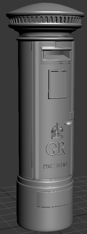
BTW If anyone knows an easy way to deal with chamfering and bending text in 3DSMax, please let me know :) The way I've been doing it seems way too time intensive...

Replies

  • Fingus
    Offline / Send Message
    Fingus polycounter lvl 11
    I would use a bend or lattice deformer. I'm not a Max user so I don't know where to find those, but I'm pretty sure that it has them. Just google it.

    Generally your proportions are somewhat off. It seems too tall and thin compared to the reference picture. Take a screenshot of your model from the same angle as your reference, bring it into photoshop and put your reference over it and toggle the visibility to easily see where you're off.

    Pretty good start. Are you going to normal map source it?
  • PogoP
    Offline / Send Message
    PogoP polycounter lvl 10
    I'd say just do the text in Photoshop. You can easily get a good looking normal map, and you can adjust your font family/size on the fly. Plus you could bake out a simple AO/cavity map too!
  • brandoom
    Offline / Send Message
    brandoom polycounter lvl 15
    Your proportions look to be a little off; Yours is much taller than the reference image.
  • jimmypopali
    I would use the same principle as this:

    http://www.polycount.com/forum/showthread.php?t=83436

    For curving text to wrap to the shape.
  • andersh
    Offline / Send Message
    andersh polycounter lvl 10
    Hey guys, the letterbox reference image I used is actually a taller one. They come in all kinds of variations. I'm away from my desktop so I'm trying my best to find a match just to give you guys an idea...

    911356_e3cea032.jpg

    As for Max's text tool, the problem is that I convert the text to poly in order to chamfer the edges. But when converting to poly, Max kindly leaves a big fat N-gon on the front face of the letter glyph which of course tears apart when bending it. So I have to go in by hand and manually cut up the N-gon so there are enough verts to bend it.
  • IchII3D
    Offline / Send Message
    IchII3D polycounter lvl 12
    I heard something a while ago that the postboxes used to be made from redundant cannon tubes in their early years. But on a more constructive note I think the main challenge of this will be to get that heavily painted over and over again look. Your model represents the sharpness of new metal. But many postboxes are over 50 years old, sometimes a lot more.
  • andersh
    Offline / Send Message
    andersh polycounter lvl 10
    So I did some work on the low poly. It's somewhere around 840 triangles right now. Any comments on the LP would be much appreciated, I got chewed out last week (partly over my crap LP).

    Would you guys add any geo for the little placards and drop box? How's the silhouette looking?

    lpPic01.png
    lpPic03.png
  • LMP
    Offline / Send Message
    LMP polycounter lvl 13
    Silhouette looks good, I was going to say that you low poly doesn't have depth of the sides of the cap cylinder, but then I checked your ref again and it's not on the ref, at least not in a way that it effects the silhouette
  • feanix
    Offline / Send Message
    feanix polycounter lvl 7
    They're called post boxes ya damned american rebel! Give us our colonies back! D:<

    EDIT: Also, loving the work, looks just like the real thing (except grey, but WIP etc)
  • Serp
    Offline / Send Message
    Serp polycounter lvl 17
    In that ref image you showed, the text and crown has a large chamfer but your text doesn't. A large chamfer will read so much better in the bake aswell.

    Also the black base of the postbox is quite bumpy, consider doing that in PS in the normal map. Or in zbrush.

    I would add some geometry for the placard and dropbox.
  • andersh
    Offline / Send Message
    andersh polycounter lvl 10
    @Serp I took your advice and added some geo for the drop box and placard. I'm glad I did!

    @Ichii: I tried to soften the edges and sculpt in the areas where paint might pool up. Not sure if it's going to turn out as intended yet...

    Got started on the diffuse map. I'll try to finish it up so I can get some timely feedback on my spec map, another area I tend to fall on my face.

    letterboxDiffuseWork01.png
  • LMP
    Offline / Send Message
    LMP polycounter lvl 13
    Your red is looking a bit cool, I'd try to shift the hue a little so it's a tad warmer. Red is a very tricky color to work with in a game setting, often it becomes too saturated really easily and it can be difficult to judge the value of it correctly because your eyes are drawn to the red.

    I've desaturated both of your refs and your model put them side by side and sampled an average of each one and painted a little swatch of each value. So, it seems that over all your red is a little to bright, and the base of it could stand to be a little darker.

    brit_post.jpg
  • andersh
    Offline / Send Message
    andersh polycounter lvl 10
    @LMP Good call, I'll make sure to levels it toward the end.

    In the home stretch:

    2011-04-17_1622.png
  • ayoub44
    Offline / Send Message
    ayoub44 polycounter lvl 10
    awesome work , i love the details ... keep it up :)
  • CJE
    Offline / Send Message
    CJE polycounter lvl 13
    You need to reduce the AO/shadow on the lettering. If you look back at your ref, you can see its an embossed detail, not something applied afterwards. That shadow gives the wrong effect. Add some edge detail in your spec so the light catches the letter, and remove the AO.
  • andersh
    Offline / Send Message
    andersh polycounter lvl 10
    Spec pass added. I added some subtle normal texture, edge map to catch the edges. I'm calling it done unless I get some disruptive feedback :)

    letterbox_specced01.png
    letterbox_specced02.png
  • CJE
    Offline / Send Message
    CJE polycounter lvl 13
    The Red paint looks very very dull. If you look at your reference, it's a very glossy paint. I would crank up the spec and add in a gloss map to get the proper highlights.
  • WillMac
    Solid prop work, try the gloss map... does Dangermouse live inside?
  • Warheart
    Offline / Send Message
    Warheart polycounter lvl 17
    The top seems a bit too round to me. They're more flat on top than that in reality. Also the corner where the top face connects to the cylinder is sharp, not beveled and round as you have it.

    Textures are starting to look nice though. Keep it up :).
Sign In or Register to comment.