Cleopatra and the Asp - nudity - 3d character
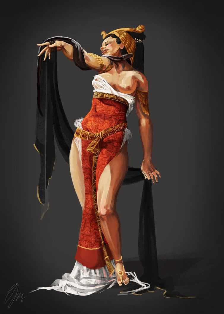
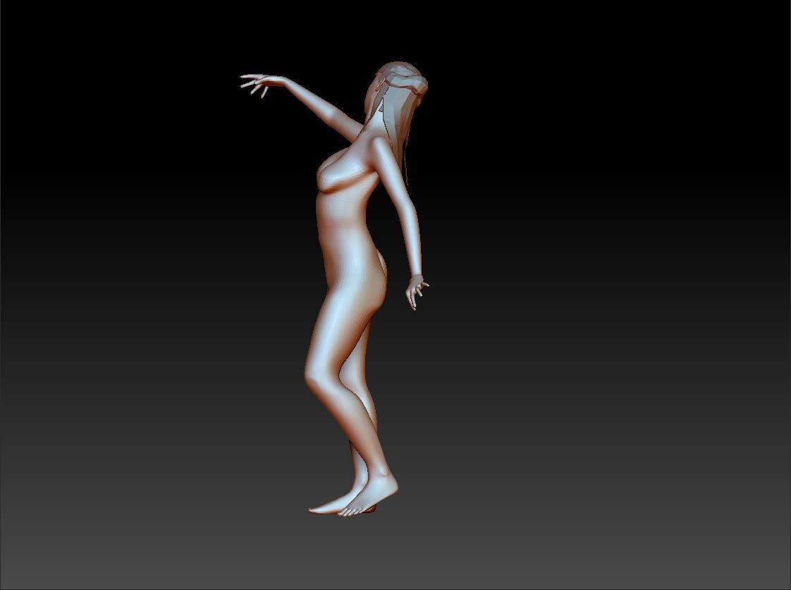
Hello again poly count this is my second project posted on here and I am modeling this concept of cleopatra by a friend of mine (check out her work here http://mie-ther.deviantart.com/).
Right now I could use some feed back regarding anatomy. This is my first human character and I want to nail the anatomy.
Thanks for looking.
concept: NOT BY ME
zbrush
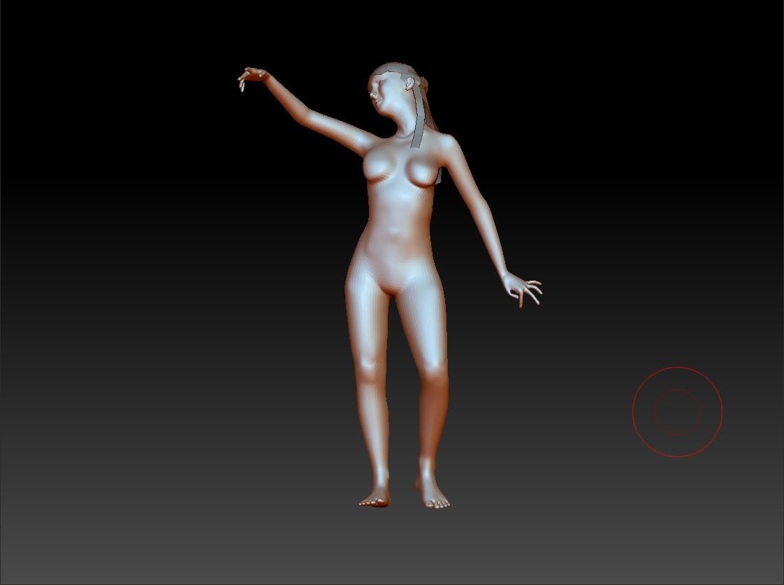
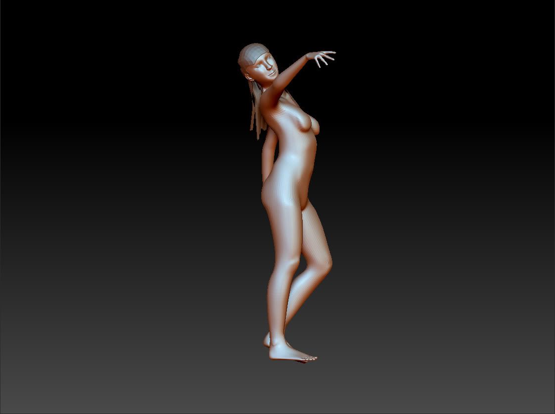
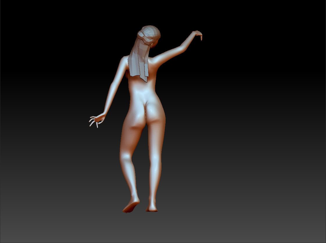
- cookies for who ever comments. -
Right now I could use some feed back regarding anatomy. This is my first human character and I want to nail the anatomy.
Thanks for looking.
concept: NOT BY ME

zbrush


- cookies for who ever comments. -
Replies
It might be better to start by modeling this in a T- Pose and then posing it once you are happy with the figure of your character. This will allow you to use symmetry as well as check your character against a number simpler references.
This helped me out a lot -
http://www.fineart.sk/photos/female/005.JPG
Obviously the body type in this image and the body type of your reference are different but it is still a good place to start.
I'm working on a female character right now (and I've made probably every mistake you can along the way) and it helped me to start by getting it lined up with ideal proportions, then making changes based on the features specific to my subject. That way you know you are at least not making any huge errors in your anatomy.
That being said what you have so far is not too bad but a step back now is going to save you endless hours of tweaking down the road.
That image is great by the way thanks for that. Also good luck on your own character.
progress...
anatomy is hard.
Oh and one more thing, the lines on the lower back muscles are looking good but i would smooth then just a hair so it isnt so drastic.
Look how voluptuous and curvy she is in the concept. Her hips jump out at me immediately when I look at the concept but they don't stand out at all on your model.
The proportions of your character are very different from the concept, much thinner and less shapely.
I would personally go back to a much lower sub-division level and re-sculpt in order to capture the major forms of your concept.
I think the breasts look a bit small compared to the concept.
I also think you should re-visit the face. The concept has a more angled, defined face than your model. I think you should accentuate the planes of the face a bit more, specially on the nose and jaw/chin area.
Thank you bonds0097 for the suggestions. I appreciate it.
also the 6 pack was more for me to learn anatomy. I figured no one was going to see it once the clothes were on. I changed it though.