The BRAWL² Tournament Challenge has been announced!
It starts May 12, and ends Oct 17. Let's see what you got!
https://polycount.com/discussion/237047/the-brawl²-tournament
It starts May 12, and ends Oct 17. Let's see what you got!
https://polycount.com/discussion/237047/the-brawl²-tournament
Malevolent Concept
Hello! I'm looking into strengthening my 2D skills, please provide some feedback! Thanks!
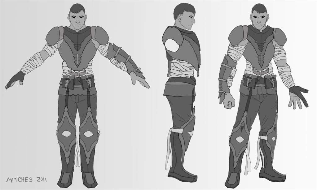
Below is an image of a character concept 'Malevolent' I plan on using in future illustrations.

Pencil and paper, scanned and tossed around in Photoshop.
Estimated - 6 Hours.
Below is an image of a character concept 'Malevolent' I plan on using in future illustrations.

Pencil and paper, scanned and tossed around in Photoshop.
Estimated - 6 Hours.
Replies
Thanks! The bandages have alot to do with his character description. I will be posting his backstory when I have time to complete it. As far as the knee pads go, the reason for them being 'oversized' is that the Malevolent doesn't have any leg armor (besides his 'pants'), also, they are more of a religious accessory.
I'm glad you like the theme! Yes, I agree, his hands are huge (I didn't even notice it untill you pointed it out). I still struggle with illustrating hands. I understand what you are talking about with the knee pads. You can see in the side view and the pose that it isn't a connector fusing his legs and boots. Maybe it's my line work that is deceiving you? Either way, I will redesign them and make a few different knee pads untill I get it right. Thanks for the responce!
I hate your fat neck cleavage.
- iconoplast
I fixed his hands! Let me know if it still needs some working on.
I made a version with smaller knee armor... It didn't look so right. I didn't even bother posting it.
I will be working on several new concepts for the knee pads tonight. Stay tuned! I do appreciate your critiques.