[STAGE] Super Gem Fighter, Tessa's Den, christermime
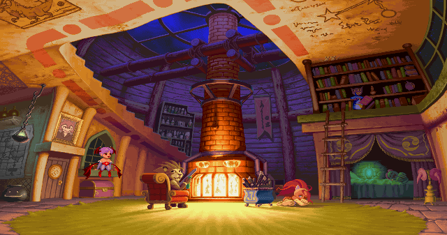
Hi all- I'll be working on making Tessa's Den from Super Gem Fighter (Or, in the US, pocket fighter).

I want to take it in a more realistic direction, focusing on the chemist side of Tessa's character, rather than the magical side. The scrawlings on the walls/ceiling and magical bits will be replaced with more science-based writings and objects like beakers, formulas, etc.
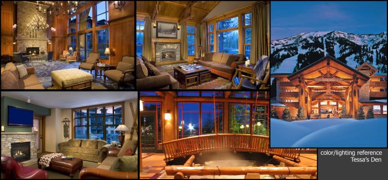
However, I want to keep the general layout and color scheme capcom has going on in this image, but push the cool blue outside/ warm orange inside contrast possibly further.
Here's some reference for what I'm thinking with the color/lighting. Going to start block out asap.

Replies
Here's a shot of the floor asset with just diffuse-
Thanks for the comments and feedback! I agree that there should be brighter lighting in the scene. Right now I'm trying to achieve that through getting the moonlight to be a little bit stronger, but I think you're right that additional light sources could help. I'm not sure what to make them though, maybe lanterns, or some more mystical light sources as seen on the bed in the original scene (although I wouldn't go for green.) I've been trying to get that shadow on the ground to be more diffused, but I haven't been able to crack it yet. It's coming from a dominant directional light in UDK. If anyone has some info on this, I'd really appreciate it.
Here's an update of the scene right now
And a screengrab out of maya of the log wall asset with just diffuse on-
Going to be working on the fireplace (and fire), support beams, and flags up next.
tweaked some lighting things and added in flags as well.
Things should progress quicker from here on out!
@mitcHELL
Thanks for the compliment
The horizontal wood and chimney stone textures have too much variation in bright to dark levels, creating a tiled, noisy look unbecoming of the big shapes being used in the meshes. These appear to be off-style from the other textures which read cleanly. It's possibly due to just being too dark or some noisy overlays. A levels adjustment could be enough.
Don't be afraid to start getting technical inside UDK. Glowing fires, particles, light beams, the future.
Also noticed almost all the shots are different angles, and the current doesn't really have a fighting play area. Might be worth nailing down that camera angle.
I'll take another look at the noisier textures as well, it may just be that I painted in the darks too dark on those assets.
As for the different shots, I've been trying to take shots that highlight the most recent work, but I do have a master angle in UDK that I want to take the "final" image with.
Still having issues getting the light shafts to look right, so they're currently left out of that screen.
Also changed the contrast on some of the textures, especially the wood. I think that really helped there, so thanks for all your suggestions.
The lighting is still very contrasty, maybe you should boost the lightmass bounce factors like environment and diffuse. Or just check that your environment color isnt black.
Keep it up
Currently sculpting the chair!
Here's a quick lighting adjustment. You don't have to squint to see your art.
http://img690.imageshack.us/i/sodark1.jpg/
The floor is also noticeably tiling. The stone slabs in the original ref are HUGE in comparison. A floor of this age and scale would be flattened much more by traffic and gravity. Also look at the scale of the depth and gaps between them. Walking on this would be treacherous let alone fighting.
Might also be worth posting larger images. oh yes.
as always, the feedback is really appreciated... helping me push this in a better direction.
and working on the scene as well
Just wanted to ask you a little thing about the lighting: Do you actually have an outside light source shining through the roof window? Because initially you've started out with the chimney light but it's not the light thats build the ambiance in the room.
If not you should probably get yourself some sufficient moonlight and then adjust the chimney light to create a proper brightness and color contrast.
Good luck with that!
And just one minor thing from me: Fill point lights kinda made sense back when lightmass wasn't around, but now it just might be that you're over complicating things just to make them look not so good. Instead of placing artificial bounce lights I suggest you go to View->World Properties-> Lightmass and try fiddling around there to boost you secondary bounces and color them if you need to.
and them in the scene (high res!):
Going to add in books to the shelves (and strewn certain places on the floor, in addition to making another pass at the lighting tomorrow. Goodnight!
Thanks to all that helped me + critted!