The BRAWL² Tournament Challenge has been announced!
It starts May 12, and ends Oct 17. Let's see what you got!
https://polycount.com/discussion/237047/the-brawl²-tournament
It starts May 12, and ends Oct 17. Let's see what you got!
https://polycount.com/discussion/237047/the-brawl²-tournament
Rural House Environment [WIP Concepts]
Hi, I started my new environment project for a 3rd person psychological horror game but it has been later changed to a 3d environment showcase.
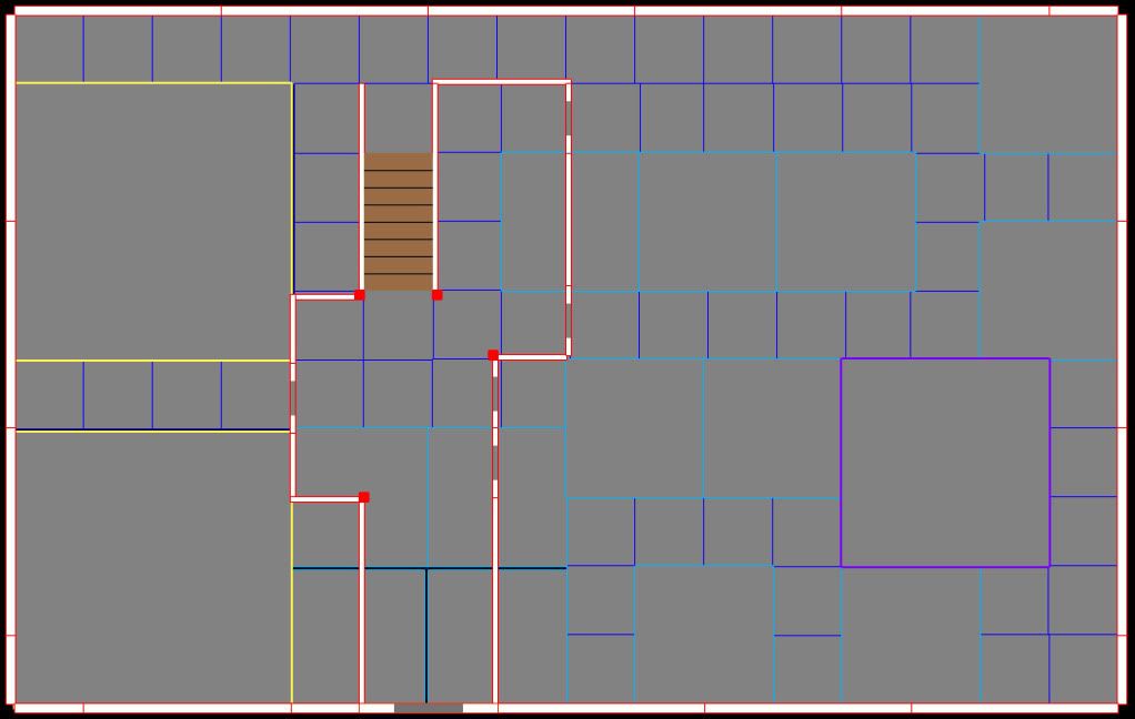
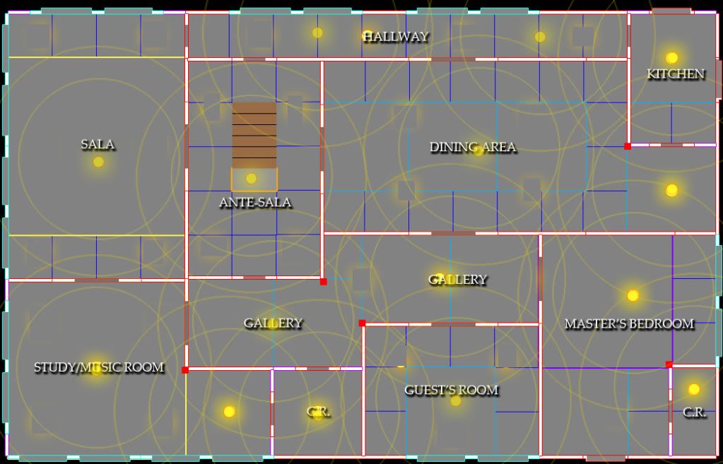
Here is the new floorplan of the house I whipped up.


The floorplans was based on Old Colonial Houses in the Philippines.
Comments and Crits are welcome.
Here is the new floorplan of the house I whipped up.


The floorplans was based on Old Colonial Houses in the Philippines.
Comments and Crits are welcome.

Replies
Vector design my team member created that I can use as an alpha.
The textures are still WIP. still struggling creating a decent texture.
Crits are welcomed.
are you using BSP for the walls and floors? or meshes?
I'm sure anyone of you can help me become a good artist. Crits are welcomed, Thanks.
I'm using modular pieces for the walls and stair pieces. I'll later post some screens showing modularity of the environment.
Crits are welcomed, Thanks.
What grid size you used and how the pieces fit onto it?
Edit: yea i didnt read i just looked at the pretty pictures. now i know that thats what ur going for haha. sorry.
Also, is it the renderer or is it the spec on your last asset presentations that's making it look so shiny? I think the wood could use a little less of it unless you're trying to go for that new wooden plank look on it but it would still need some tweaking. Other than that this is gonna be pretty awesome I feel ><
I like how the lighting makes everything feel soft.
Your props are coming along well...I really like the clock.
One thing about this scene though...the atmosphere doesn't really make me think "psychological horror." The colors are just borderline cozy looking to me.
Maybe try playing with your light a little more to see if you can make the atmosphere a little more creepy.
I did a quick little paintover, just to see what a different mood would look like.
http://i81.photobucket.com/albums/j203/white99stang281/Sample1_georgesokol_paintover.jpg
I used a lot of blues and greens..makes it a little more eery. The red light coming through the door is supposed to give you the feeling that you aren't alone, and that there is something seriously creepy going on beyond those doors. I may have missed the mark there
@nevets I used 8 3ds max units for this project. I divided and planned the modular pieces in photoshop by using the grids.
This is my personal technique in planning modular interior like this.
I created simple representations of the modular assets and snap them to the grid so that the floorplan and the level will be the same. This might be time consuming but this saves me from pulling my own hair.
@alberto, thanks for the crits, I'll experiment on the lighting.
@gsokol (sorry forgot to change my first post) I'm disappointed that this project is no longer a game but a environment showcase (lack of time). I'm going to try to play more with the post process effects and lighting. Thanks for the paintover I'll definitely use it as a reference.
Thanks for the crits/comments