[STAGE] Street Fighter III - 2nd Impact : Sao Paulo "Sean's Stage"
Hey guys, getting to this party a little late but I will be working on this scene with James (Xtremepenguin) and we will be using the latest version of UDK.
Here is our idea...

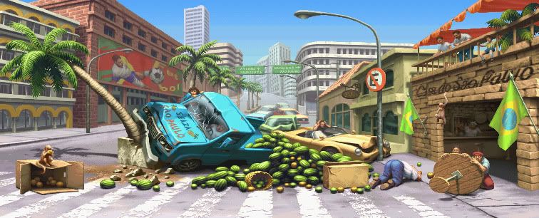
We want to bring in a futuristic aspect that will blend with the current environment without making the scene set too far in the future, hopefully its going to create some interesting results.
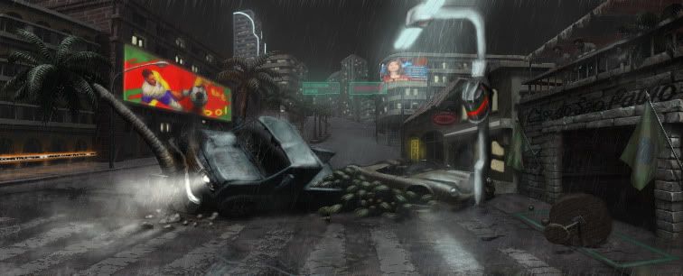
Here's a quick paintover to get an idea of how we want the scene to look, progress shots coming soon...

Here is our idea...

We want to bring in a futuristic aspect that will blend with the current environment without making the scene set too far in the future, hopefully its going to create some interesting results.
Here's a quick paintover to get an idea of how we want the scene to look, progress shots coming soon...

Replies
Here is out mood board
Here's a quick update with the truck which I quickly positioned to get a rough idea of how I want it to look in the final thing.
We have also begun some very basic UDK work and started creating the buildings which we will show you soon!
fearian - Cheers man!
stfu_donny - I agree, we are going to have a little play with the lighting in UDK to make the fighting area the main focus.
We are gradually replacing the placeholder stuff with assets so it's slowly starting to get there.
The final image is going to have a lot more lights in the background with more neon signs and screens etc just like this one...
The scene definately needs more atmosphere in the lighting to bring it to life, so we will play around with this as we add the various lights and emissive props to get it just right.
I'm hopefully going to have the truck finished tomorrow and then I can concentrate on pumping the other assets for the scene so stay tuned...
PEACE!
Ok so I have tweaked the lighting for a little more contrast, but I probably wont fiddle now until most of the stuff is in. We have also been continuing to create more assets for the scene... who knew, so here's some WIP shots of a couple of buildings for your viewing pleasure.
Still a lot to do but hopefully you guys can begin to see it coming together!
If you guys have any thoughts on the colours or lighting please let us know ,we are still playing with them to get a good look
Ok, so since the last update the texture's have been optimised, some of the shaders have been tweaked a little and more assets have gone in.
Here's a few images of the scene and the second car xtreme is working on...
Still quite a lot to create and get into the scene... if only I had time for a monkey from the original conept.... but for now... sleep!
Hopefully I will be able to show you a quick video of the effects moving in the next update.
I would make the rain a little more prominent as its looks a little misty and sort out the reflections on the road, as they look a little straight.
Also, it would be a shame to have the neon sign so far away when it could add some really nice visuals to your scene. Maybe consider moving that closer to the camera?
So below are our final submissions, overall I think it turned out quite well, we kept true to the original concept as well as bringing in a pre futuristic spin on it.
This was a fun project that we both learnt a lot from and enjoyed competing in, hopefully you guys like the scene as well and maybe throw a few votes our way