The BRAWL² Tournament Challenge has been announced!
It starts May 12, and ends Oct 17. Let's see what you got!
https://polycount.com/discussion/237047/the-brawl²-tournament
It starts May 12, and ends Oct 17. Let's see what you got!
https://polycount.com/discussion/237047/the-brawl²-tournament
BaSS Adaptation Environment - Advice Needed [UDK]
Hey folks!
I'm currenlty working on a little project. The aim is to recreate some of the environments from Beneath a Steel Sky within the UDK (in 3D), focusing on capturing the visual style.
I've already done one little test where I attempted to use Hannes Appell's technique (see this video: [ame=" http://www.youtube.com/watch?v=PPaH8oIJd7g&feature=related"]here[/ame], interview here) though it wasn't really successful. One of the problems is that Appell used the high quality remastered backgrounds of the Monkey Island Special Edition. Unfortunately, the only backgrounds I can find are the original low-res artwork. In addition, the hand-painted backgrounds by Dave Gibbons are locked away somewhere. Add to that some of the perspective techniques in the BaSS artwork and, well, it gets a little complicated.
So I've decided to approach the scene in a more familiar manner. Here's the scene in question:

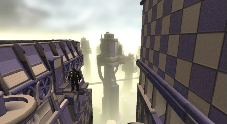
And here's my initial blockout:

Note, I just put the fog and skybox in to gauge the potential effect, the colour is off there. I also did a little playing around with the Post Process chain for the same reason.
I've attempted to make as many modular assets as possible (fans, vents, skyscrapers etc). The skyscrapers are actually split into four parts so I can fill out the skybox a little more. Bare in mind I'd also like to create areas of the environment you can't see in the original artwork.
I feel like I'm nearly ready to continue, but before I do anything else I'd like to hear any thoughts or critiques you may have. The more faithful I can get it the better. The thing thats really killing me is the perspective, though I can't really see any ways to avoid it without deforming the meshes or warping the entire scene.
Thanks for reading!
I'm currenlty working on a little project. The aim is to recreate some of the environments from Beneath a Steel Sky within the UDK (in 3D), focusing on capturing the visual style.
I've already done one little test where I attempted to use Hannes Appell's technique (see this video: [ame="
 http://www.youtube.com/watch?v=PPaH8oIJd7g&feature=related"]here[/ame], interview here) though it wasn't really successful. One of the problems is that Appell used the high quality remastered backgrounds of the Monkey Island Special Edition. Unfortunately, the only backgrounds I can find are the original low-res artwork. In addition, the hand-painted backgrounds by Dave Gibbons are locked away somewhere. Add to that some of the perspective techniques in the BaSS artwork and, well, it gets a little complicated.
So I've decided to approach the scene in a more familiar manner. Here's the scene in question:

And here's my initial blockout:

Note, I just put the fog and skybox in to gauge the potential effect, the colour is off there. I also did a little playing around with the Post Process chain for the same reason.
I've attempted to make as many modular assets as possible (fans, vents, skyscrapers etc). The skyscrapers are actually split into four parts so I can fill out the skybox a little more. Bare in mind I'd also like to create areas of the environment you can't see in the original artwork.
I feel like I'm nearly ready to continue, but before I do anything else I'd like to hear any thoughts or critiques you may have. The more faithful I can get it the better. The thing thats really killing me is the perspective, though I can't really see any ways to avoid it without deforming the meshes or warping the entire scene.
Thanks for reading!
Replies
Previous post still applies, especially if you have any pointers regarding the perspective, or should I just ignore it and continue?
I've still got a lot of work to do. I'm thinking about remaking the foreground assets as they're a little too low-detail for my liking. In addition, I'm testing some of the shadow and AO options as I'd like to tint it to match the shadows in the artwork. I should hopefully have some previews of that in the next update.
Thanks for reading, suggestions and criticisms are always welcome!
Cheers!
I thought about rebooting BaSS more than once
Whats with the film grain? I'm not really digging that.
Oh and yeah, sorry about the grain. I'm a sucker for playing around with features
Other things still left to do include tidying up the skybox, properly finishing the foreground assets and sorting out the rooftop.
Anyway, enough chatter, here's some work-in-progress shots:
Feedback is always welcome, no matter how harsh!