[UDK] The Lighthouse
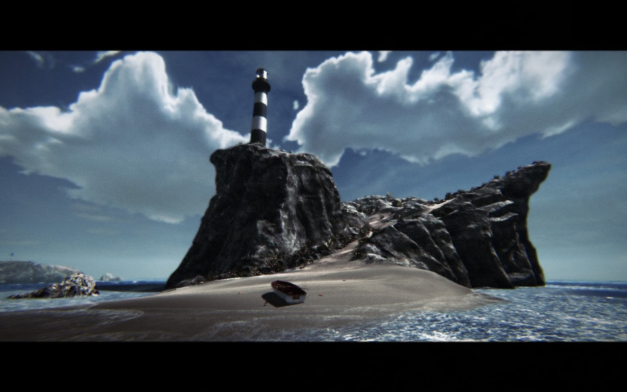
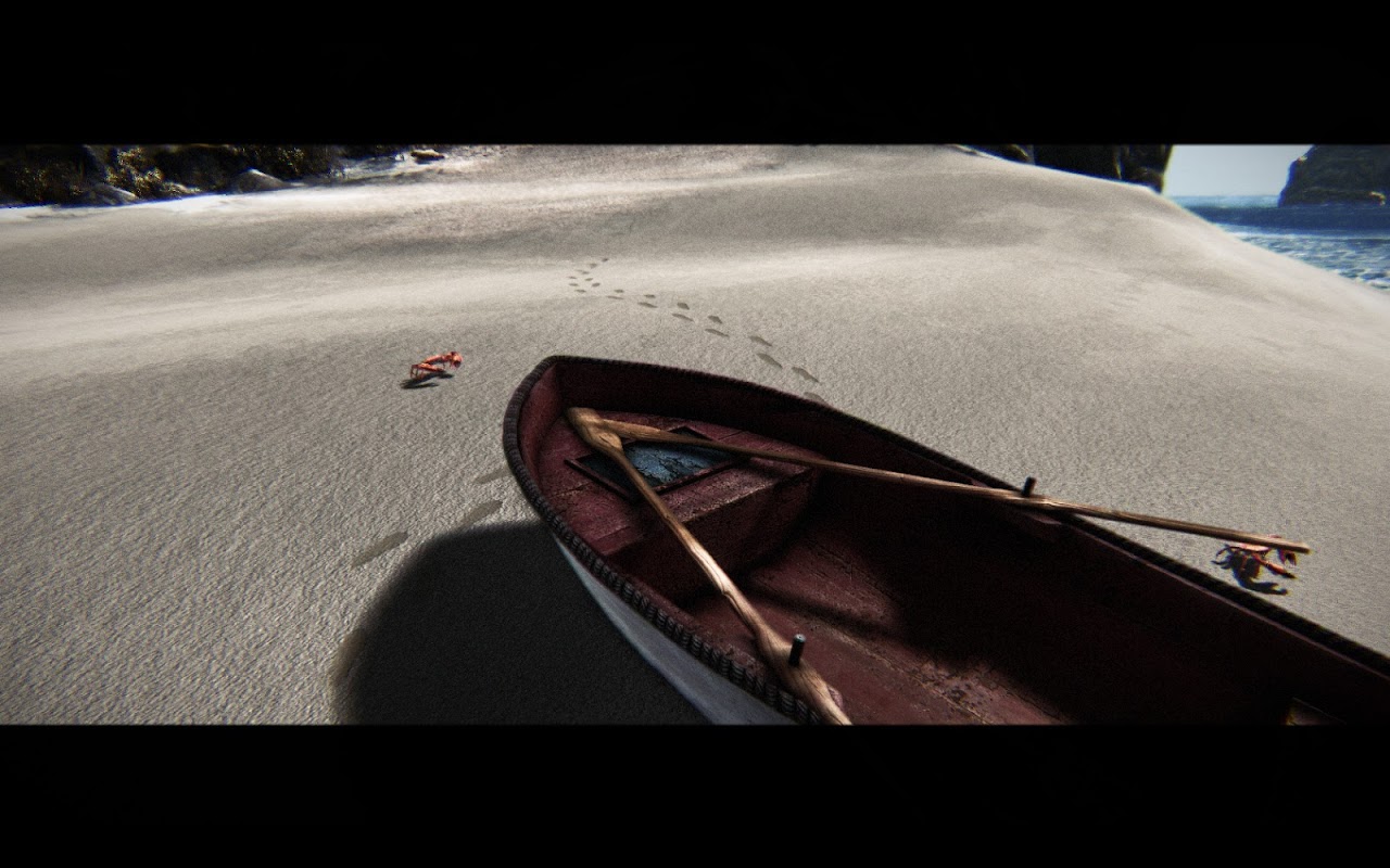
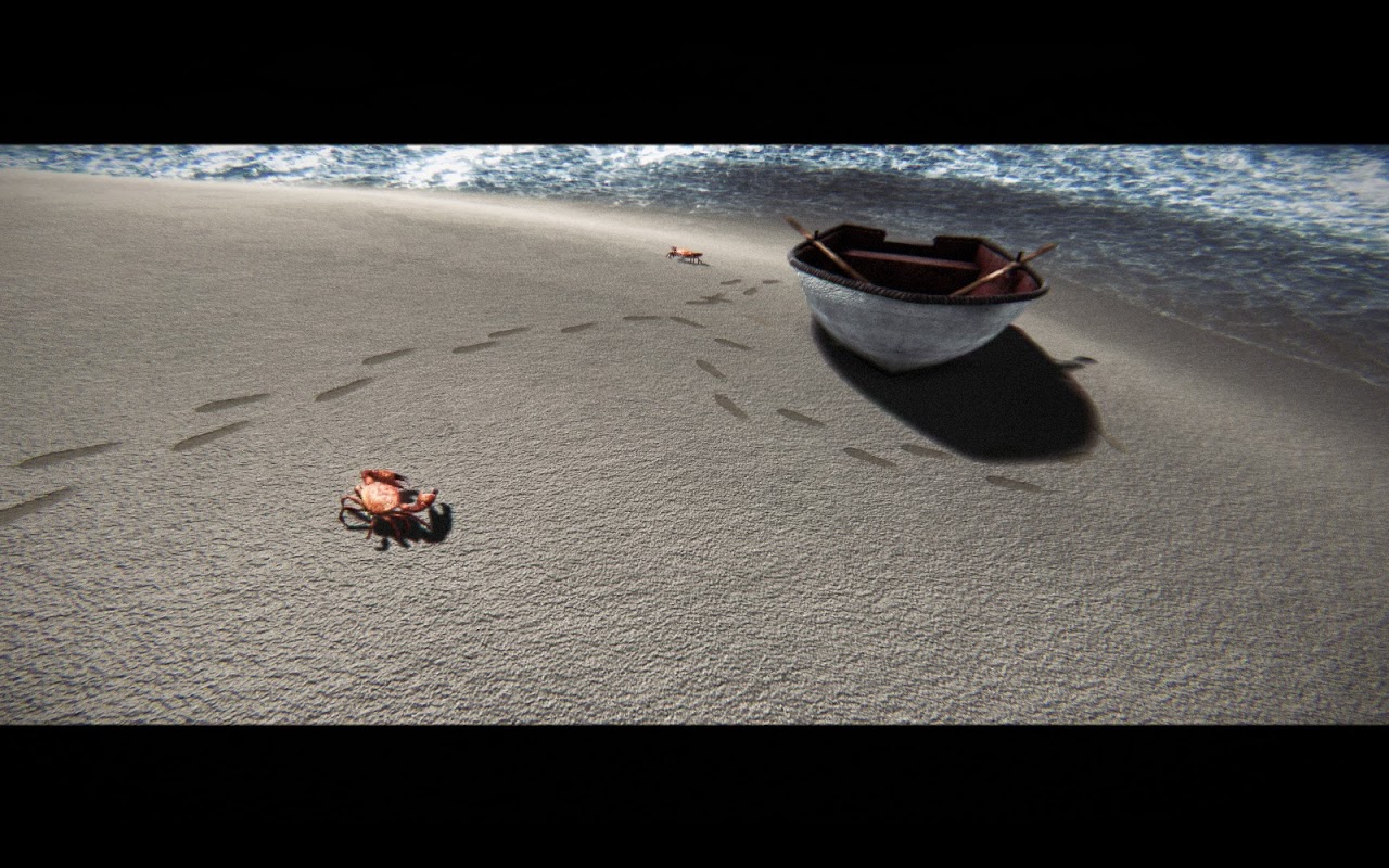
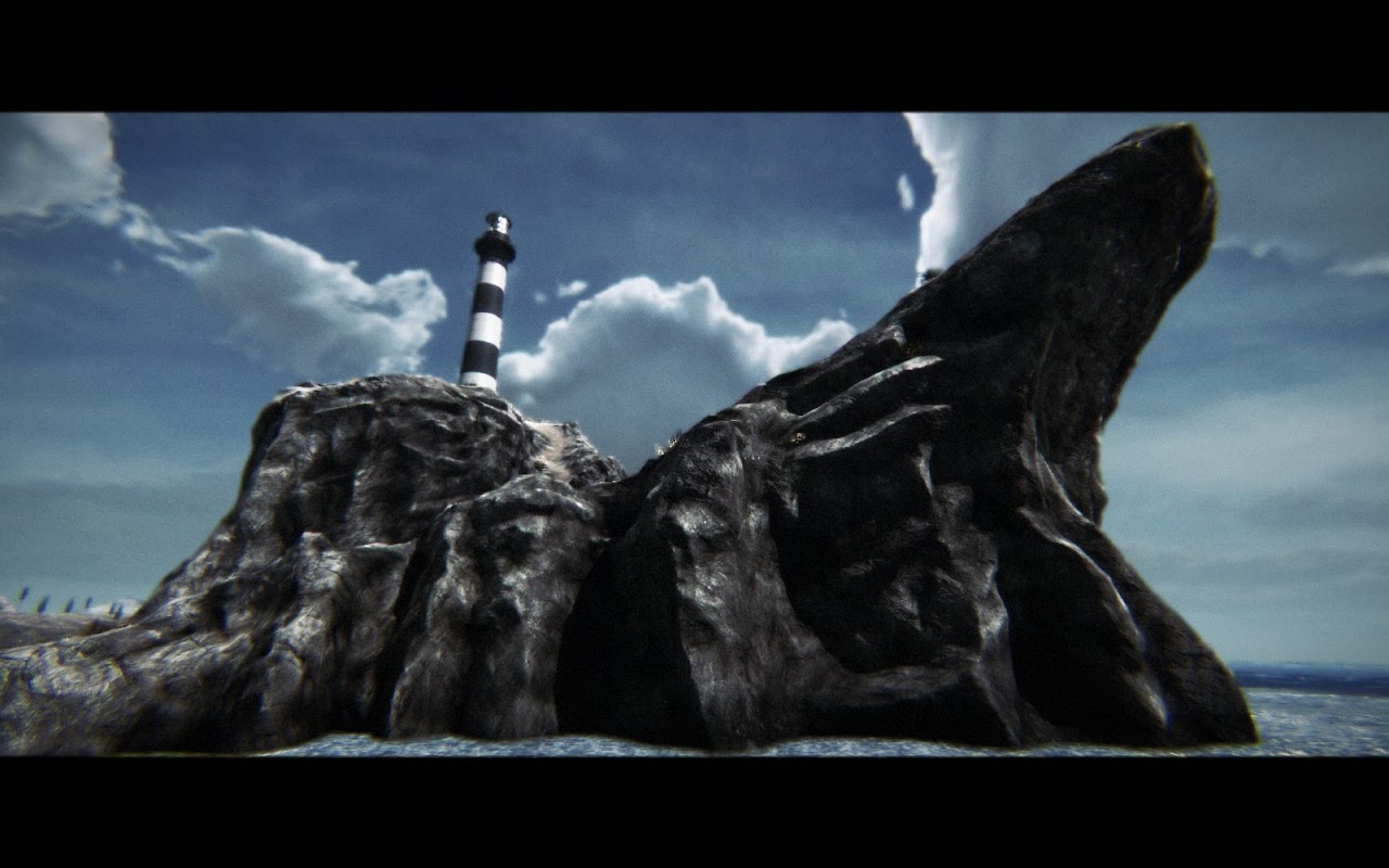
Here is my last personal project, a small rocky island with a Lighthouse on the top.
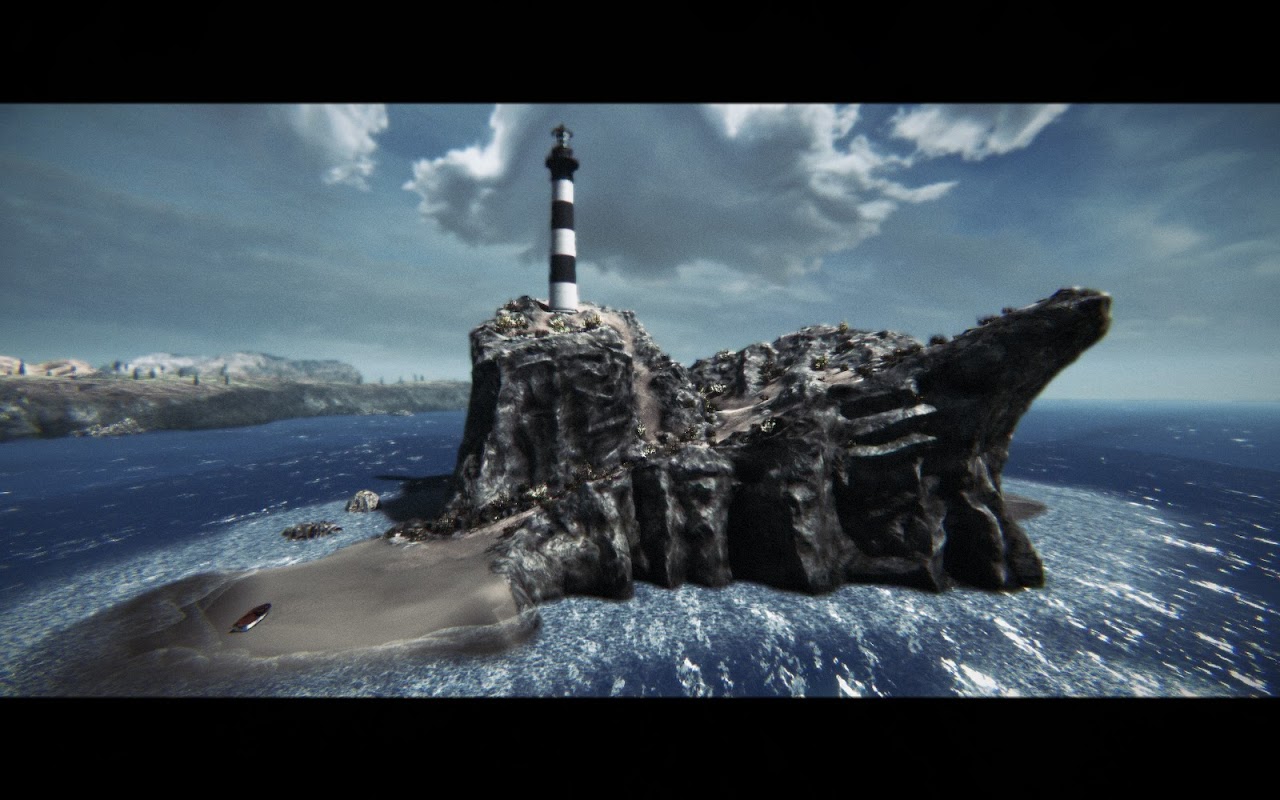
[ame="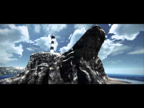 https://www.youtube.com/watch?v=Z5rUYgSRzgw"]Youtube Video[/ame]
Vimeo Mirror
More development info here
I made the whole scene except the crab. I also made all the postprocessing from scratch with hlsl.


[ame="
 https://www.youtube.com/watch?v=Z5rUYgSRzgw"]Youtube Video[/ame]
Vimeo Mirror
More development info here
I made the whole scene except the crab. I also made all the postprocessing from scratch with hlsl.
- Cross Processing
- Bleach Bypass
- Custom DOF
- Custom SSAA
- Lens Distortion with chromatic aberration
- Custom tonemapper with controlled eye adaption
Replies
Maybe you could create this same day scene transition into a night scene? With lights and boats and such, would be cool, Just saying, good work!
I've seen your shader/post work on the UDK forums quite a bit, and the progression of this piece in particular.
The audio is great. Its not a cliche subway or sci-fi corridor. You've obviously got a great handle on post effects and general prop/enviro modeling.
I really like what you've put together here. You have a lot to be proud of!
Now, in true Polycount fashion, I'm now going to tear it apart a little. I like to think strong constructive criticism is the highest compliment we can offer fellow members, as it shows we gave the piece a lot of time and consideration.
The caustic light you've got on the cliff is way too strong, and projects way too high up the rockface. It should attenuate to nothing after just a few feet above sea level I'd think.
The normal/noise you've got on the sand looks too strong. Tone it down a little. Let your diffuse do more of the work there.
The plants are shimmering/aliasing like crazy! Almost every shot they are in (farther than a few feet away) is just a noise of pixely mess wherever there is a plant. You may want to take some steps to resolve that somehow. Maybe an LOD version that has no alpha or limits its usage.
Your scene is called "The lighthouse" yet you aren't really presenting or featuring it as well as you might. Show us the entrance/doorway. Maybe an interior? I agree that a night scene would help sell the "lighthouse" bit as you'd be able to show a massive dynamic rotating light beam, some fog, etc. The purpose of a lighthouse after all is to be seen at night.
Keep us updated!
I agree with you in every point. Just that i think im not going to work anymore in that scene, hehe. At least for a while ^^
Thank you!