[WIP] Lighting project (Film Noir/fantasy Thriller)
Hi guys
I was wondering if people could help me. I'm in my last year of university and for my final year project I am doing a lighting project by recreating chosen lighting styles without the use of post process.
I'm using 3DsMax as that is the program I am most comfortable using. I already have some progress renders and renders I hope are good enough to use I would just like peoples opinions on how to improve the lighting based off the styles.
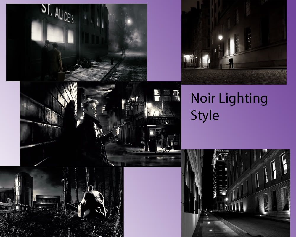
The first style that I am working on is Film noir. Sin City is the main inspiration behind it, I have been checking on other forums at other peoples work and have found some images that I wish to aim for. (I'll find them and post them up with the correct references)
I was wondering if people could help me. I'm in my last year of university and for my final year project I am doing a lighting project by recreating chosen lighting styles without the use of post process.
I'm using 3DsMax as that is the program I am most comfortable using. I already have some progress renders and renders I hope are good enough to use I would just like peoples opinions on how to improve the lighting based off the styles.
The first style that I am working on is Film noir. Sin City is the main inspiration behind it, I have been checking on other forums at other peoples work and have found some images that I wish to aim for. (I'll find them and post them up with the correct references)
Replies
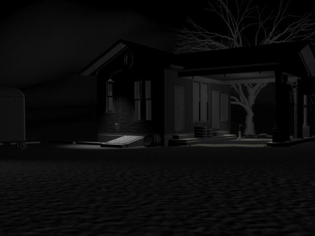
1. without effects
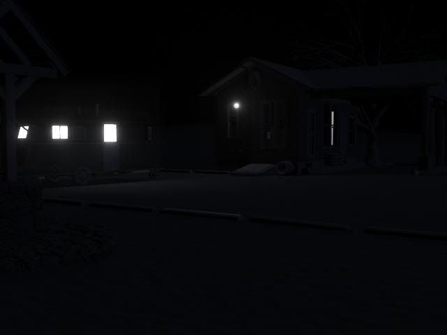
3.With fog
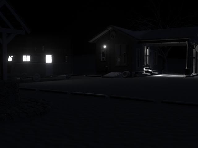
5.With blackened fog
I'm just asking which renders are more to the style I am going for and what other things I need to do make those particular ones better. I have less than 2 weeks to do this. The render times have eaten away at the work-flow.
So you are saying I need to sort out the reflectivity on the caravan?
*edit
Right I have taken most of the images out. Also the resolution im using is widescreen which was advised by my tutor. Its the volume light that messes the render time in the fantasy.
Film noir is ok for render time.
I hope you've looked at or have time to look at Film Noir Reader by Alain Silver and James Ursini it's got some essays on visual motifs and composition that would help you.
The only trouble is it eats up render time so before I go back to it I'm trying to get enough info on what I need to improve it. I have 8 days left to get good enough renders out to use in my project, I can always discuss why I haven't reached objectives if the renders.
Ill check out those essays you have mentioned
The advice that has been given to me is that I need to fill the gap on the right hand side, lower the density or greyness of the fog and add some rim lights in by the grave stones, the tree and the character model.
Where in the render should I be looking at with the silhouettes specifically?
I want to add some more illumination to the right hand wall in the hallway to stick with the theme other than that I can really see myself what else could work. Like I said not got long to improve them.
Looking back at the FM stuff I need to sort the fog out around the tree on the right by the well.