Hack 'n' Slash Browser Game
Hello!
I decided it would be a good idea to make a seperate thread for this...
I and two others have started work on a new web browser game, heavily influenced by the gameplay style of torchlight. You will play as one of eight characters (four male and four female options) each with their own unique abilities. You will fight in teams against waves of all kinds of creatures that lurk in the dark using your different abilities to aid other team members and progress through to harder waves. At the end of each game you will return to a lobby type area where you can talk about what went badly/well, you will also have a chance to access the shop to buy new items (armor and weapons) with the points you gained from completing the previous wave of monsters.
We are planning to make this into a facebook game, and let players group up with their facebook friends easily. Naturally, not everyone has facebook, so we will also be releasing a none-facebook version, in which you will be able to team up with randomers (we may make an IP host feature so you can play with friends using the none FB version too).
Our eight characters will share the same base meshes (female mesh and male mesh) they will differ from textures. We are doing this to reduce the file size of our game (different meshes for each + different armor for each would just eat up space we can't afford to waste). Because of this there will only be a few armor meshes; Male Heavy, Male light, Female Heavy, Female light. The different amour classes will depend on their textures.
Without further adue:
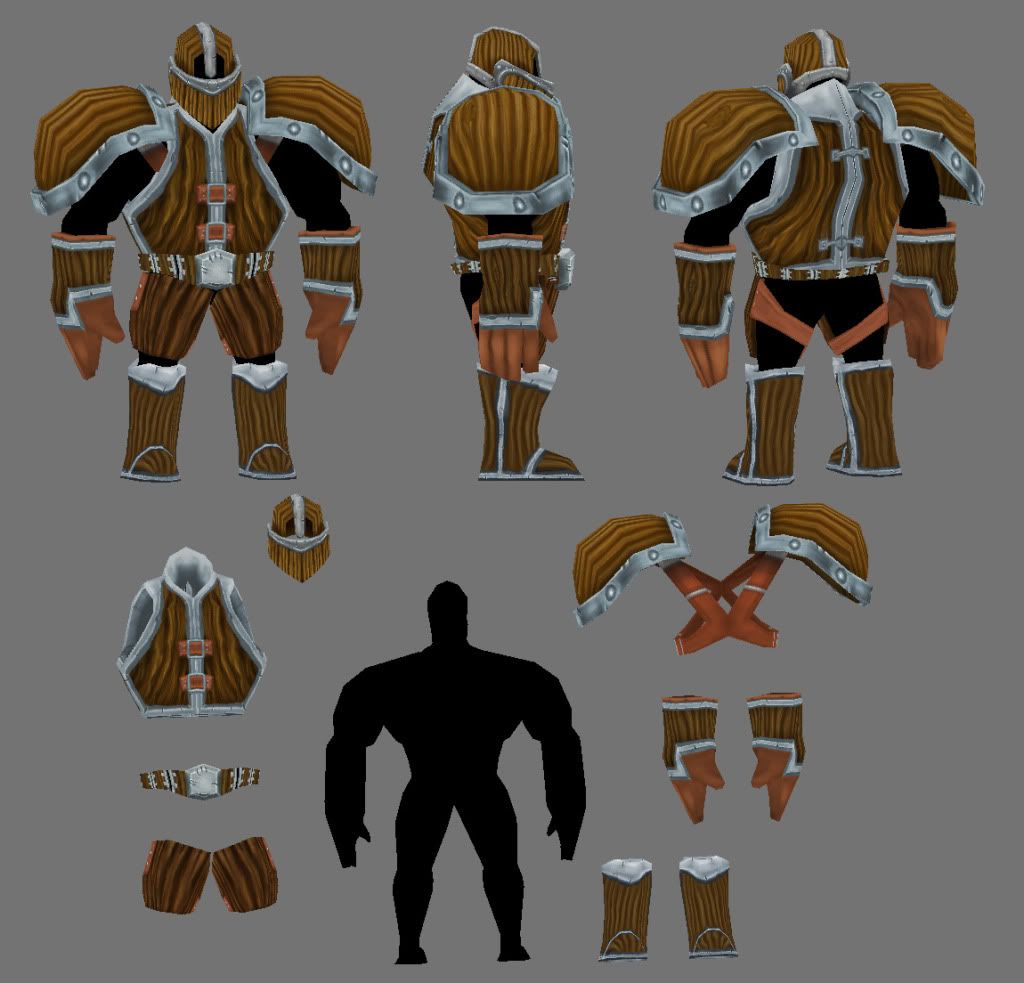
The first of seven "Heavy" armor sets, this will be the lowest level of armor - wood. (female version still to come)
None of the characters have been designed yet, apart from the basic shape of each. Our concept artist has done a few sketches for base clothing options. We like the first two, however we are not too keen on the 3rd
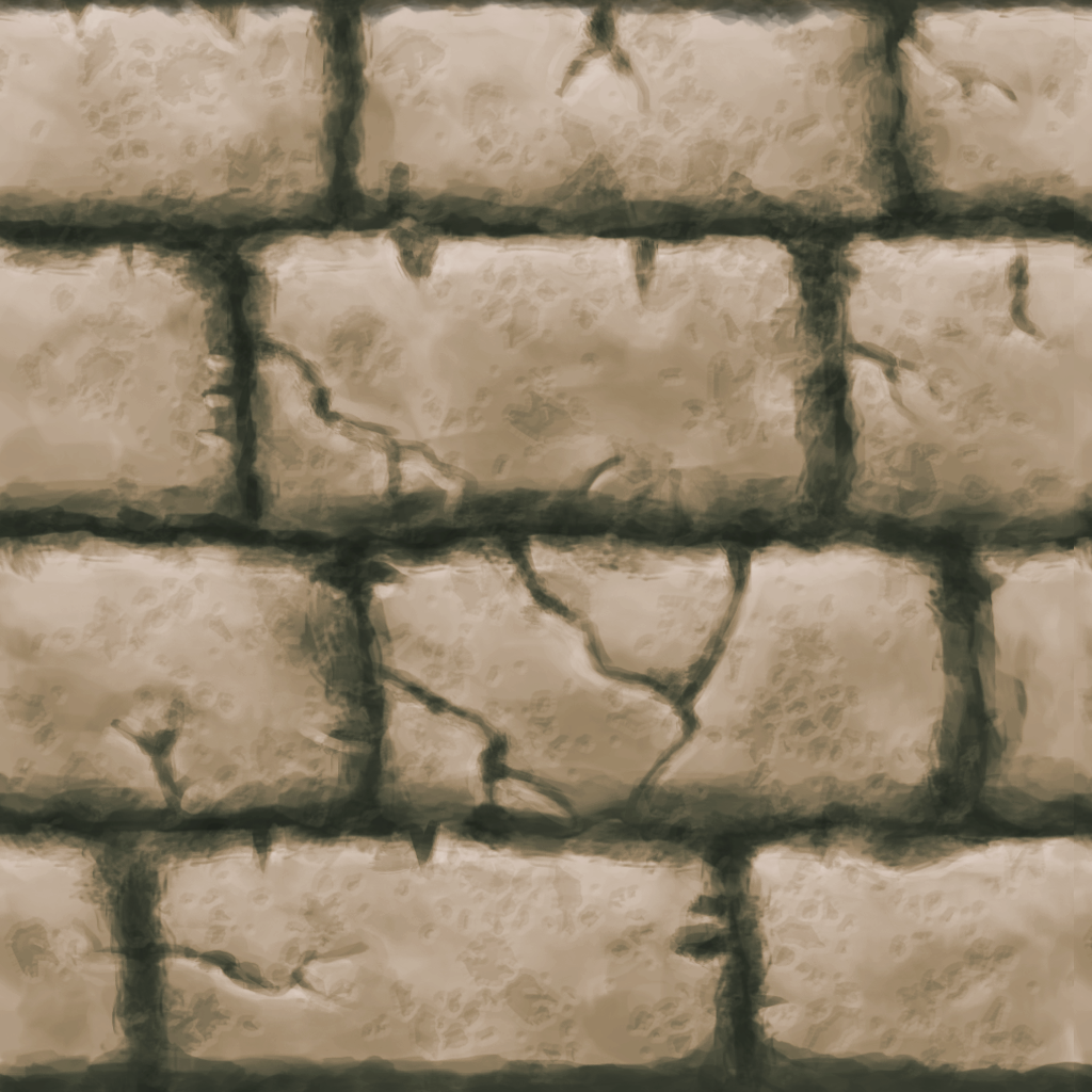
I also did a stone texture last week, there is a couple of parts that give away the tiling (like the big crack) so i'll need to fix that.. But this is it so far:
(crap, its a huge image, sorry!)
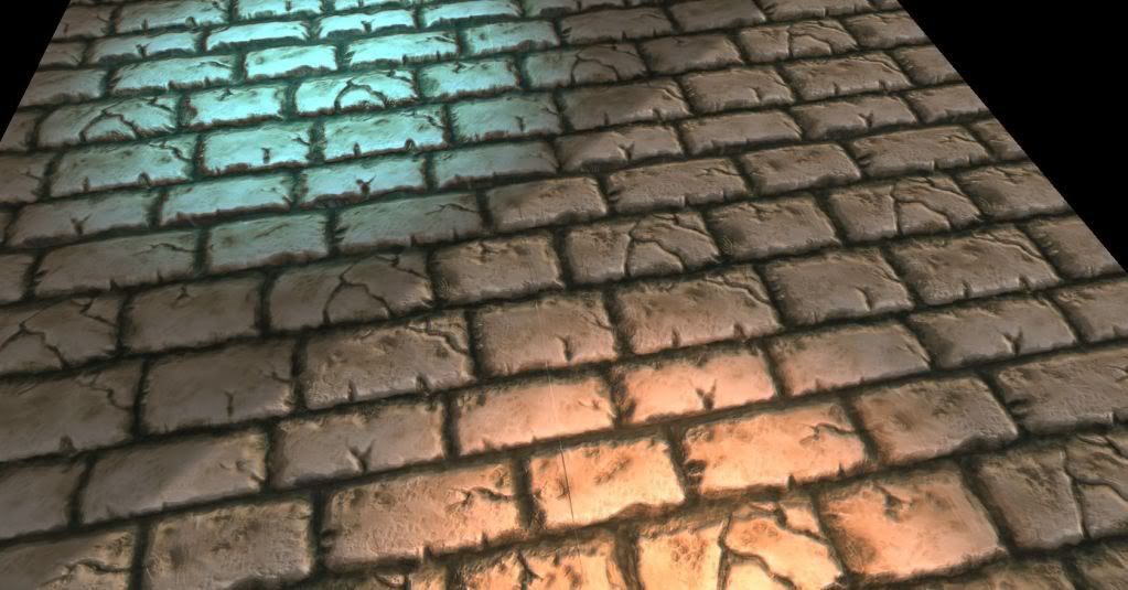
And a test shot of it inside Unity, Please ignore the big line down the middle, seems im not pro enough to unwrap a plane....:
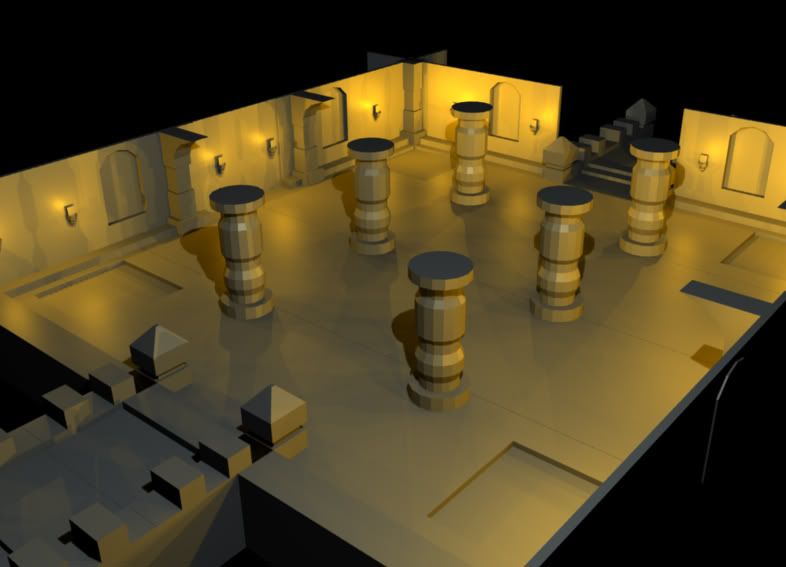
Last but not least, some modular parts for building the environments, first of many...
More to come!
Thanks for reading
I decided it would be a good idea to make a seperate thread for this...
I and two others have started work on a new web browser game, heavily influenced by the gameplay style of torchlight. You will play as one of eight characters (four male and four female options) each with their own unique abilities. You will fight in teams against waves of all kinds of creatures that lurk in the dark using your different abilities to aid other team members and progress through to harder waves. At the end of each game you will return to a lobby type area where you can talk about what went badly/well, you will also have a chance to access the shop to buy new items (armor and weapons) with the points you gained from completing the previous wave of monsters.
We are planning to make this into a facebook game, and let players group up with their facebook friends easily. Naturally, not everyone has facebook, so we will also be releasing a none-facebook version, in which you will be able to team up with randomers (we may make an IP host feature so you can play with friends using the none FB version too).
Our eight characters will share the same base meshes (female mesh and male mesh) they will differ from textures. We are doing this to reduce the file size of our game (different meshes for each + different armor for each would just eat up space we can't afford to waste). Because of this there will only be a few armor meshes; Male Heavy, Male light, Female Heavy, Female light. The different amour classes will depend on their textures.
Without further adue:
The first of seven "Heavy" armor sets, this will be the lowest level of armor - wood. (female version still to come)

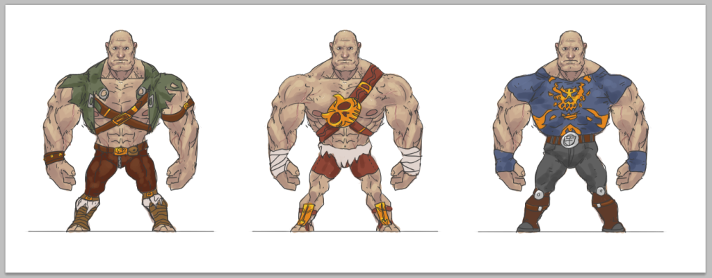
None of the characters have been designed yet, apart from the basic shape of each. Our concept artist has done a few sketches for base clothing options. We like the first two, however we are not too keen on the 3rd

I also did a stone texture last week, there is a couple of parts that give away the tiling (like the big crack) so i'll need to fix that.. But this is it so far:
(crap, its a huge image, sorry!)

And a test shot of it inside Unity, Please ignore the big line down the middle, seems im not pro enough to unwrap a plane....:

Last but not least, some modular parts for building the environments, first of many...

More to come!
Thanks for reading
Replies
The armor is cartoony like and the stone looks semi-realistic.
I really like the looking of the stone, i hope you are going for that approach
The style we are aiming for is highly influenced (much like the game play) by torchlight, where the environment is done in a handpainted-realism way (more or less) and the characters take on a much more cartoony styling. Once the armour is ingame and lit i imagine it wont be too far from the stone texturing but with a more colourful/cartoony styling.
Glad you like the stone ^_^
We will be doing some tests of everything rendered inside the engine very soon, so we'll see how it all blends together. If your right, and there is too much contrast, changes will be made.
Thanks for ya crit!
just reduce the uv's on the texture itself down like .98 on the scale and you should be fine.
Finished up mr naked man, did some basic block in clothes, however i over wrote the PSD like an idiot!:
he's 650 tris incase your wondering.
Few sketches for pillar, corner stone and door...
Models for pillar and corner stone (wip):
Should have some Unity screenies to show soonish and some more environment shizzles.