Peer Critique Bump
polycounter lvl 7

The inspirational image is not mine but can be found http://www.oirm.org
 This image has been resized. Click this bar to view the full image. The original image is sized 2102x2154.
This is one piece I am putting into my portfolio. I am in the process of fixing the stretching issues and the ground texture. Any other feedback on this piece would be most helpful.
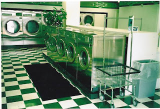
This is another piece that I am putting into my portfolio.
Things that I am fixing :
The floor texture - as the tiles appear too high up.
Textures on the the dryer and washer models to give them a bit more or a grunge look as the scene is not "Too Clean"
The lighting as it looks way too blown out in some parts of the image.
Any other suggestions are most welcomed on this piece as well.

The inspiration image is not mine and can be found http://the4onerun.blogspot.com/2010_12_01_archive.html and it was Posted by Michael Valliant.
Thank you all in advance for you suggestions and help.
Edit : this thread was created in order to give my peer critics a chance to give extensive feedback on my work. Thank you guys again.
Replies
First things first, one thing you may want to do with these peices is to add some images showing a wireframe overlay of the 2 scenes- this will help other forum members give a better critique on the technical aspects of the scenes.
Also, it's worth stating whether these scenes are designed for handheld consoles (nintendo DS, PSP, Iphone for example) or current generation (playstation 3, Xbox 360, current spec PCs). This will also help with giving out critique. Also it might be worth grabbing the textures and displaying them so we can check on texel use or whether unwraps are
I'd reccomend that you take a look at the inspriation image for the first scene and take a look at the roof- there's a lot of detail in it, and 2 rows of tiles and the corners are chamfered using a long tile that runs from the top to bottom. This isn't being used in your scene, which is something that pops out straight away. Which is a shame as the rest of the scene does capture the essence of the reference image quite well.
Modelling wise it looks okay, everything looks like what it's representing, and scale wise, looks about right though it feels quite tall... (personal opinion). One thing that would help polish the building some more is to put in the roof supports that are in the underside- at the moment the roof is floating, which makes the building lose solidarity and the corner tiles mentioned above.
The textures for the roof need addressing and the upper wall texture is quite blown out- either down to lighting or there's not enough detail in the texture to show the brick detail.
The lower wall has tiling issues, it seems stretched (guessing this is one of the things you mentioned in your post)- I think they need to tile at least twice the amount horizontally and another row in height too at least.
For the second peice, I would say go back and look at the inspiration image- there are details on the walls, such as the bordering that runs around the top of the wall and a plant sat on the washing machines in the foreground. Details like this will help make the scene feel more alive and interesting.
The washing machines in the foreground look fairly well detailed overall although they don't have the reflectiveness of the reference picture. You can fake the refections on the texture if environment maps can't be used by either creating the reflection details in your 3d package and use a render from it. Then add it in as a layer over the texture and tweak the blending mode until you get the desired effect.
You could also do something similar with the floor, but use the ceiling texture instead of the render, but keep it really faint.
The washing machines in the background do let the scene down at the moment, they're lacking detail and don't really read that well detail wise - don't be afraid of adding another texture for them whether it's cropping one of the machines from the photo and either tweaking it to suit the scene or have it as the base layer and build your own one on a new layer so you have a reference at hand at all times.
The floor texture has some weird lighting going on with it, as though it's quite lumpy- also it's not quite checkered, which again is a detail that jumps out straight away.
Overall I'd say that these peices look like there's potential, especially the first scene, and there are some nice details, such as the props that are both outside and inside the hut, but you need to keep looking at the reference and take note of the details on the larger areas, such as the walls, rooves, and floors.
Good luck with making the tweaks and I'll keep an eye out for updates as it will be good to see how these 2 scenes shape up