The BRAWL² Tournament Challenge has been announced!
It starts May 12, and ends Oct 17. Let's see what you got!
https://polycount.com/discussion/237047/the-brawl²-tournament
It starts May 12, and ends Oct 17. Let's see what you got!
https://polycount.com/discussion/237047/the-brawl²-tournament
[Portfolio] Kris Fancsali, Character Artist
Hello everyone, I am 21 and graduated with a degree in computer animation from Full Sail back in 2009. My portfolio was honestly not as robust as I would have wished it were after graduation or as focused on games. My demo was geared towards film more then anything else so I have been planning and working on my gallery to show off work that fits for video games. I tend to get distracted while working on my own with ideas for other models, which has lead me to having more half finished models then finished. I am taking steps to kick this habit, like entering the Brawl contest, and want to be moving forward with a strong plan so I can churn out model after model.
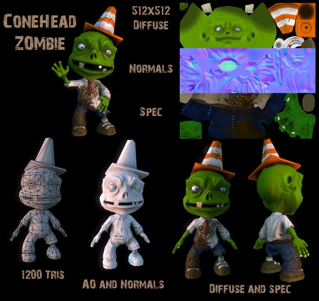
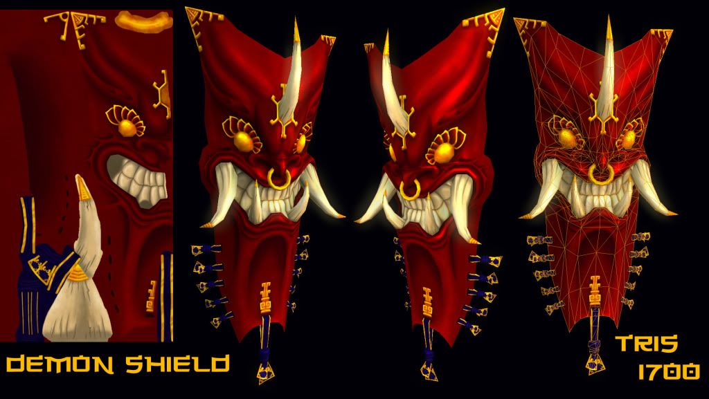
I need my portfolio torn apart. Let me know what is good, what studios like to see, so I can make more, and what is bad so I can stop wasting time on that type of work and take it down. I have been working on making a varied body of work. Work ranges from low poly models with only a diffuse and spec, like in World of Warcraft, to models with normal maps sculpted using Zbrush.
Be as honest and as brutal as you need to be, I can take it. Here is the link to my gallery on my website and I attached a couple models to let you know what your getting into. Thanks for spending the time to check out my portfolio and giving it a critic.
http://www.krisf3d.com/gallery.html


Replies
Ok, seriously, here's my suggestions for your portfolio:
- You don't need to write "Finished 3D models", a portfolio should only contains finish 3D models and no wip works (so I would get rid of it or maybe put them on a blog).
- I don't think you'll need a link section, people are going to hire you, not the others
- For the title at the top, instead of "3D modeler", "character modeler" will be more precise for recruiters
- Not sure if it's a good idea to put a home section, since your home section is the gallery. Also, your demo reel is already at the bottom of the gallery so I don't think you'll need the home page.
- Your wip works doesn't look bad at all, you should consider to finish them.
The biggest thing out of that would be the flash site part of it, but I felt it could help for you to see the whole thing anyways. Your lightbox application is way too slow for me, try to display the images away from this, there are other versions of lightbox which run MUCH faster than this one, this one resizes then loads and it is just taking so long to look at your images that i find myself closing out before even taking a glance. Check out fancybox and some other variations on lightbox, try searching "fast lightbox" in google and see what you can come across. If you don't want that then perhaps try out a solution which doesn't require this type of gallery at all, simpleviewer is nice too though because it preloads all of the images for extremely fast browsing of pieces.
TLDR; don't spend a month learning to make flash websites, i learned and have now found that knowledge to be useless - or at least for folio sites in most cases.
As far as the work goes, the largest thing I see wrong with your portfolio is that alot of it seems like padding.
Outside the anatomy drawings and self portrait, you can safely get rid of most of the 2d stuff. And then work on replacing them with further studies in the same vein, or in zbrush.
The ones you have show you have a pretty good starting understanding of anatomy and proportion, it just needs some refinement
I would also get rid of most your environment models, as I'm assuming you want to be more of a character artist. At most I'd keep the Chinatown and/or the Hangar, as Chinatown shows off your lighting and texturing abilities, and the Hangar is a good example of your modeling.
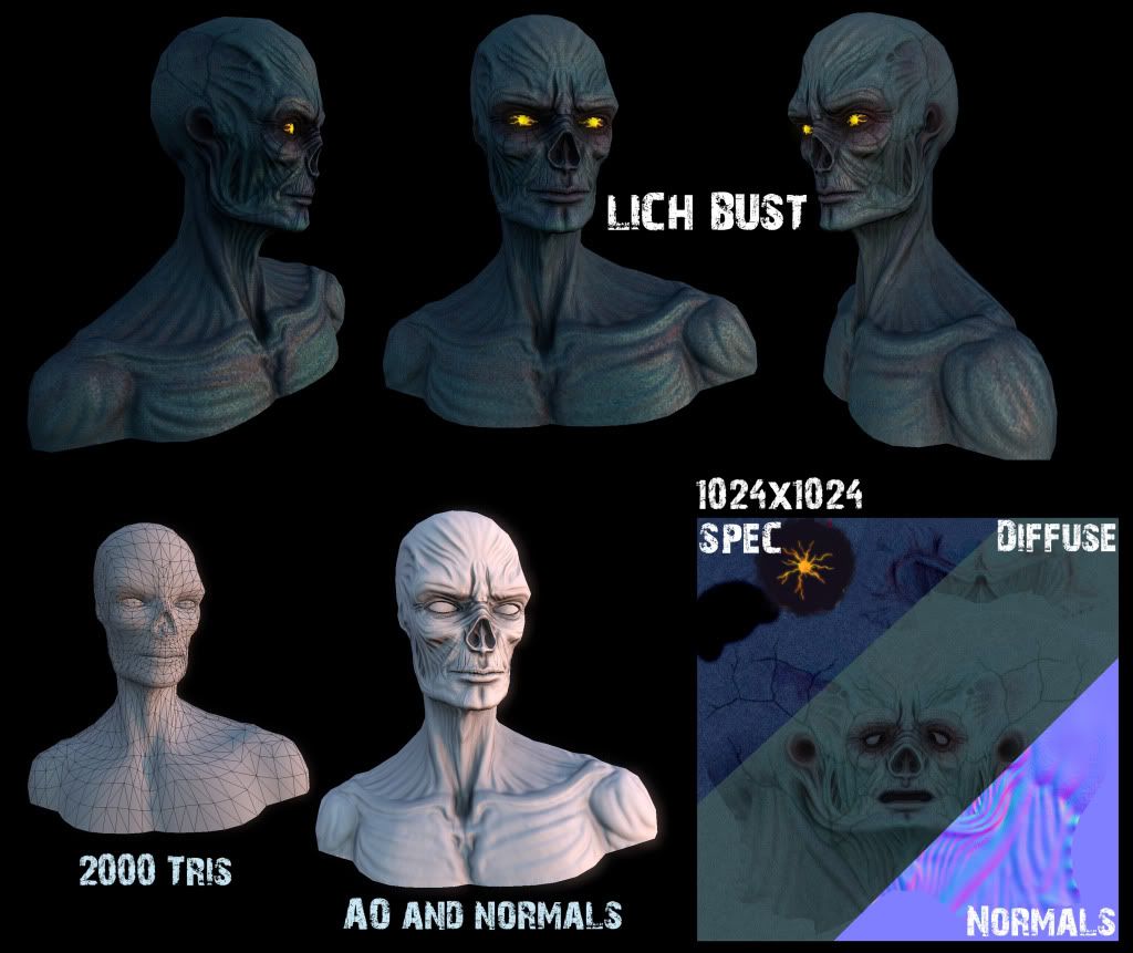
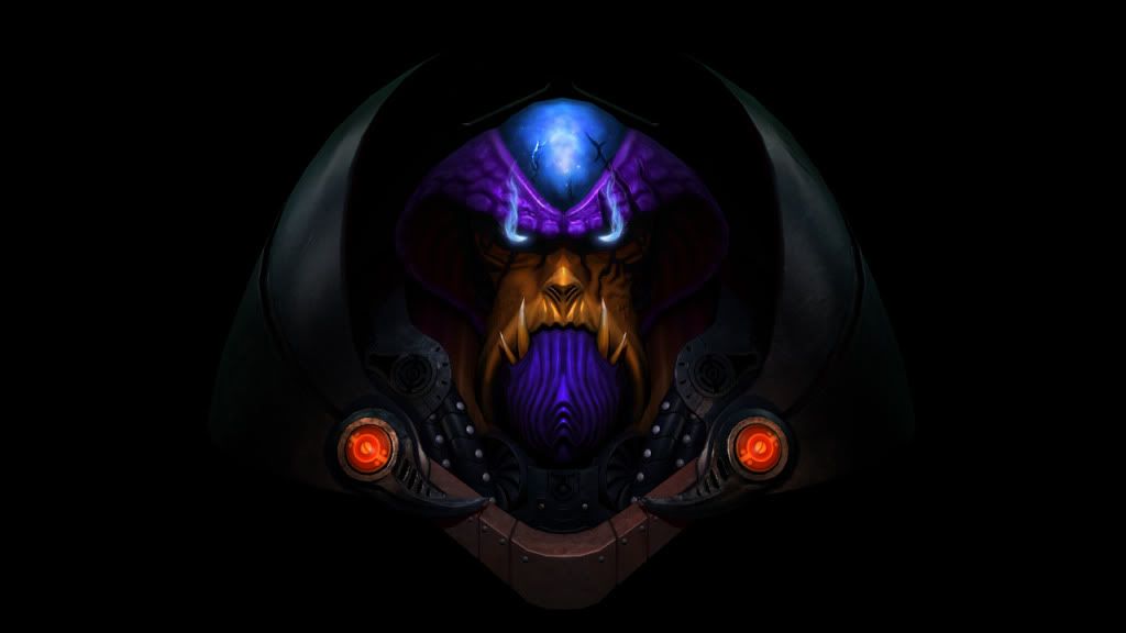
I think your character and creature stuff is good, but not quite professional level yet. I think your strongest pieces are your mage (which shows off some pretty good hand painting skills), the lich, and your gladiator helmet (even though it's unfinished, it still looks great, and that thumbnail is deceptive on what you'll be seeing.)
For most everything else, I think you'd benefit from posting the project you're most excited about finishing on some forums for critiques