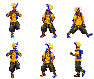
[FIGHTER] Fatal Fury, DUCK KING, JMYoung
Here's my idea for Duck King. I imagine him as a walking dance party with flashing lights and such. Will probably throw a graphic eq and sub on his back. If it's not clear in my drawing, his t-shirt is a force field/holographic(with jersey mesh pattern), so it will move and bend with his arms as opposed to being static armor.

Latest:


Latest:

Replies
Good luck. Looking forward to more updates.
Hopefully someone will comment and let me know if I'm heading in a crazy direction or not.
Are you talking about the "t-shirt" part when you mention not liking the clearer parts? Or the clear parts on his gauntlets?
Concept looks good to me for the most part, but I don't quite agree with the high waistline of the pants. I also think he looks a tad sombre and serious for Duck King, but I trust you'll be able to take care of that later on in the process.
Here's a blockout and paintover of a rough head sculpt. Still got to noodle a bit with proportions and shapes on the blockout. Open to crits!
Keep it up
where is his little yellow chick? you should do a plush key chain or something.
I think in the final model, if you get some kinda of movement in the forcefield then it might read better - like a noise or wave perhaps.
Those parts will really be great for extra lighting on your colour.
Good luck with this
uk_resistant - Agreed. I've got a lot of ideas on how I'd like to animate all the glowing bits, but we'll see if I get around to that. I typically use marmoset to present things, so I'd probably have to switch over to UDK to do nice animated textures effects. Regardless, I'll be taking a look at other games and movies and how they illustrate forcefields to get a better look. I kind of cobbled the concept together.
Jeremy - I see what you're saying about the shirt.
Here's a rough blockout of the back to nail down shapes and angles:
I'll take a look at making it larger.
Cool looking concept there.
Not too much to add, just refining shapes and lines on his vest piece. I'm somewhat tempted to remove the shoulder pieces that stick out, but I like the added visual weight and that they kind of match the mohawk. Also, I like that they add more lights.
Will hopefully finish up most of the hard surface bits and get started on sculpting this week.
Sweet work mate, I really like the clean torso design, nice chunky shapes
which is a little weird but I am sure you can make it work. I look forward to more.
Will probably do a paintover once I get the high poly done to get a better idea of what it should look like. If you guys have some cool reference pics, send 'em my way!
As for the mohawk, I'll take a look at the size. I promise.
That's totally awesome, doesn't sound bad to me.
I got busy with life stuff, applying for jobs, art tests, etc. I'm back to work on it now, and I think I'll probably move onto sculpting out his head/body and pants just to move myself forward. I don't want to get bogged down in hard surface stuff too much. I decided his feet needed some yellow to balance out the rest, so I added shoelaces in a similar manner to his wrist pieces/watch. I imagine them as holograms inside glass pieces, so I'd like to get sort of a 3d effect to them.
I've played around with making his hair significantly larger and really didn't like the results.