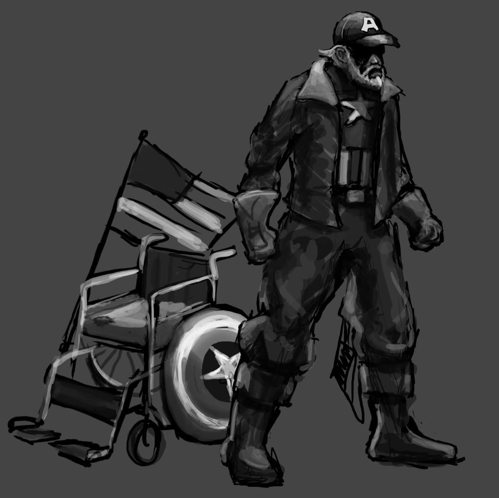
The Cap as a grizzled and homeless war vet. I really want him to have a wheel chair with his shield attached to one of the wheels. I was thinking of going the Lt. Dan rout and losing both of his legs, but then i remembered that this is a fighting game and he would probably need to be able to stand.
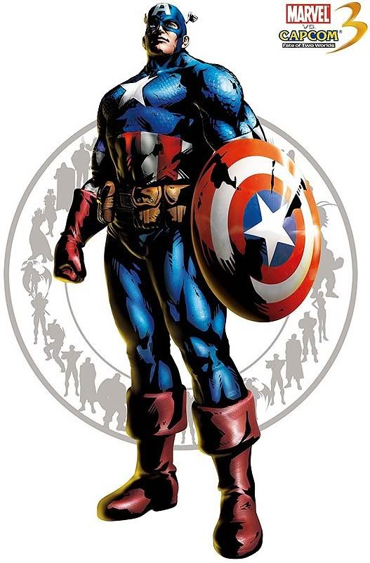
But that wheelchair is gonna cost you lots of polies! ; )
True. I thought a wheel chair would be a clever way to incorporate the shield, but you're right about it using up some major polys. Do you think I should drop the chair?
You can totally have him legless, Xavier fights in a wheelchair in X Men Mutant Academy 2. Plus if you cut the legs youll have plenty of polys for the wheelchair.
i think drop the chair, make the shield his bum sign, saying he's a vet and anything helps type thing, or have the sign on the inner portion of the shield. an idea to help incorporate it.
edit* modeledcitizen makes a good point though.
You can totally have him legless, Xavier fights in a wheelchair in X Men Mutant Academy 2. Plus if you cut the legs youll have plenty of polys for the wheelchair.
there is your solution! You'll be able to keep the wheelchair which is important asset, and the handicap will because more obvious with clipped/rolled pants. Hard to find some refs tho, I would've liked to give you a link but I don't really know what key words to look for.
Ok, so here are a few more ideations that i whipped up using your guys' ideas. 1 is the original concept. 2 has one leg while using the shield almost like a cane or crutch. 3 is kind of Charles Mansonish. He's rockin the big travel pack as well as a sign taped to the front of the shield and a prosthetic leg. 4 is the original with no legs at all. I was wondering what works with each of these and what I can pull from.
lmao! They are all good, but if Id have to choose I'd say 3. "Will serve country for food" Priceless XD!
Make sure his costume isn't too hidden by a vest or something so that we recognize him in an instant.
Awesome. If you go the wheelchair route, consider putting some beef [mass] and horsepower on that thing. Maybe he could do stunts from the arms like a gymnast on parallel bars.
Voting for numero 4. Also, the few things the captain has on that original suit are boots, gloves and shield, which you're already incorporating, but I'd suggest keeping the little head wings in mind as well. Just one more thing that makes him quickly recognizable.
Wow Matt. Great to see you on board with this! I'm going with the mass vote and picking #4, with the wheelchair; I kind of want to see him use prosthetic legs, but if he has stumps, maybe he could shoot patriotic confetti out of them when he wins....too much? o_O
Voting for numero 4. Also, the few things the captain has on that original suit are boots, gloves and shield, which you're already incorporating, but I'd suggest keeping the little head wings in mind as well. Just one more thing that makes him quickly recognizable.
I had the head wings in mind when I created his hair around his ball cap. It's most prominent in the first drawing. I'll be sure to push it even more though, maybe even just literally putting the wings on his hat or something.
Here's what I've got so far. The colors definitely help push the whole "captain america" vibe. I didn't include the wheel chair in this sketch but I think those are pretty self explanatory. I was thinking of maybe having his boots hanging on the side or back of his chair or something. I'll probably wait to see how many polys i have left over.
Like i said before, I wanted the hair tips behind his ears to kind of resemble the wings Captain A wears on his head. Not too sure if that works for that idea or not. I was also hoping the shadow from his hat brim would create the same kind of outline Captain A's mask usually makes (only showing his nose and mouth) but ya.
are you using zspheres to sculpt this one, I mean painting with zspheres?
It makes things 20x easier
the shift+a method?
Yes. I used zspheres to make the overall shape, but now I've converted it to a skin and am sculpting off of that. I'll have to take it into 3Ds Max when it's done in order to retoppologize it. I do find it makes things a lot easier.
I think your right about the hair behind his ears working as the wings. It may not be as quickly recognizable but it'll save you some polys and the more you look at it the more obvious it gets. I also support the shield on the wheel idea so long as its removable for one or more attacks. If you're worried about the hat shade line on his face or it doesn't look like it'll work he can just have some dark blue face paint or something. I think it would be funny to see the paint miss the wrinkles in his face.
I like that face paint idea. I might have to play around with that when it comes time for texturing.
I modeled the chair today. It's already at about 3850 tris. The only thing it doesn't have are the hand brakes. Not sure if it needs them. I still need the shield and the American flag (although I might drop the flag if I need the tris). I also think the wheels could use some more edge loops to make them rounder, but I'm afraid to crank up the poly count any more.
I was thinking though, instead of putting the shield on one of the wheels, why not prop it up in front of him on the foot holds? (since he doesn't have any legs taking up that space).
The chairs looks good and I dont think it matters too much where the shield goes, front or side. Im guessing there are a few polys on there on the inside of the wheel rails for instance, that you probably couldnt see nomatter what. Those could go. Maybe cut a loop on the inside bottom of the armrest rails where you cant really see curvature anyway. You know what I'm sayin? Do people without legs really need those front foot holder support things?
Ya, the inside faces I cut a lot away. There's actually a loop down the middle that I'm getting rid of as soon as I don't need the symmetry any more. It's pretty efficient in that sense. For the most part.
I don't know if the leg holes help the balance of the chair or not. I'm not an expert on wheel chairs, but I think they kind of help the look. I'm not sure. They might just help it look more complete.
So, i totally thought we had until the 17th of May to do this, so I'm not as far as I should be at all. I'm more than worried that I can get this done in the next three weeks. But, at the very least I am in the right mindset now, so I should be getting more done faster. I HAVE A LONG WAY TO GO STILL! :O
Thanks to everyone who has given me critiques! There can never be enough of that
Alright guys, I'm racing against time here. I have the high poly and low poly models completed. Although, I have a little over 2000 tris left over (and that's even including double-sided polys) Maybe I'll have enough to make hand brakes on the wheel chair now. Or else make the wheels more round....
Still not sure if I'm going to be able to finish in time. I'm unwrapping now and plan to have the textures close to, if not all the way done by Sunday at the latest. Then I can rig, skin, pose, light, and render all before Friday!
There are probably a few things that I could tweak on the model, but honestly, I don't have time to fix a lot. If anyone has anything they think could be changed or have any ideas on how to use the remaining 2000 tris, feel free to speak up.
The character model is standing at 5303 tris. The chair along with the flag and shield are at 4629 tris.
Cool idea, I recommend using those 2,000 tris to add more geo to your character, particularly around his joints. Also, the silhouette of your high could be re-created more in your low-poly, namely his upper sleeves. Your poly distribution in the props could use some work. Are you planning to deform that flag at all? If not, it can be just 2, maybe 4-6 tris. The shield could also be triangulated a lot towards the center and cut some polys to throw back into your character.
Yes, I went back and moved some things around on the upper sleeves. I didn't really notice how flat they were until I posted that render. The flag is also planned to deform and animate. I could probably use even a little more polygons depending on how I rig it....
For the shield, do you mean take all of the polys in and collapse them into one central point? Because that's what I had originally but someone said it could be "efficient" or something so I bridged it all over.
AS long as there's a few more loops on the joints now, I would say focus maybe on the collar just since it looks kinda welded down but if it doesn't bother you then forget it. For the texture I'd suggest some kind of color or design breaking up the flatness of the jacket, or maybe 2 possible diffuses one with and one without jacket graphix. Also, keep in mind that paint over the face idea, maybe just an eye area or something.
Well here's what I got so far. I have officially run out of time LOL. I have work tomorrow, but I have all Thursday to finish up the textures, rig and render this mother. Honestly..... I think I can pull it off.
AS long as there's a few more loops on the joints now, I would say focus maybe on the collar just since it looks kinda welded down but if it doesn't bother you then forget it. For the texture I'd suggest some kind of color or design breaking up the flatness of the jacket, or maybe 2 possible diffuses one with and one without jacket graphix. Also, keep in mind that paint over the face idea, maybe just an eye area or something.
Also can I see a closer high and low of the head?
I do think the collar looks ok for right now. I think the previous render was a bad angle maybe? But I don't know. I'll look into trying the paint idea if I can get the time, but I'll have to wait on the close up renders until after I rig him and stuff
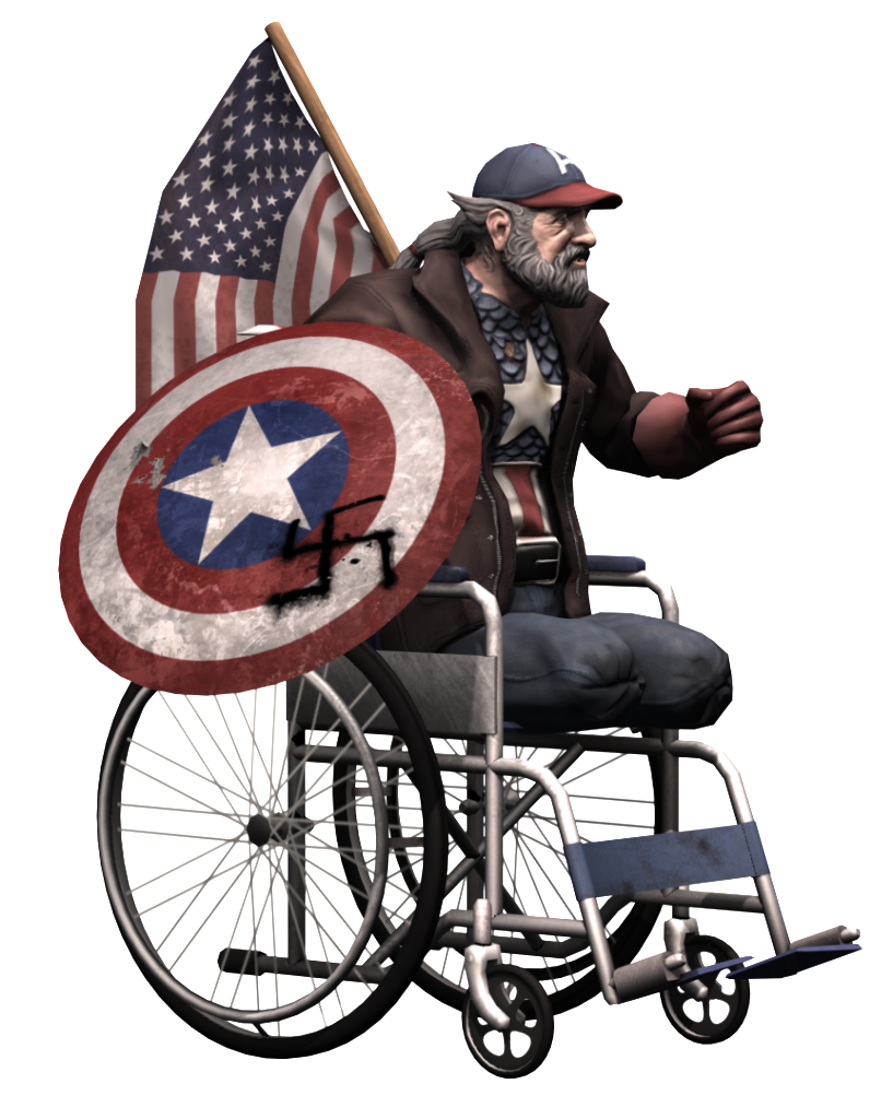
Alright, folks. I'm finished with this thing. I've changed all I wanted to change and everything else can be dealt with after the contest. I don't think this is the greatest thing ever.... but it is what is is. I'm actually surprised I got it done in time after thinking I had 2 more weeks to finish it.
But now I gotta decided which "beauty shots" to go with. I'm going to post them all here, if you guys wanna say which you think are the strongest. Unless I can post more than 2.... then I guess I won't have to worry. (the pic above is the comp image)
Thank, Laz. I wish I knew what imaging hosting place didn't resize images. I also wish I knew when they are going to open the thread for submitting entries because I have to work today and might not get a chance to enter until later...
This is so wrong:) I actually feel awkward just giggling at it
fantastic reimaging though.
Good luck, man! And don't worry about not submitting into the final submissions thread in time. I'm pretty sure that won't disqualify you, 'cause you circumstances are very understandable.
This is so wrong:) I actually feel awkward just giggling at it
fantastic reimaging though.
Good luck, man! And don't worry about not submitting into the final submissions thread in time. I'm pretty sure that won't disqualify you, 'cause you circumstances are very understandable.
Replies
But that wheelchair is gonna cost you lots of polies! ; )
True. I thought a wheel chair would be a clever way to incorporate the shield, but you're right about it using up some major polys. Do you think I should drop the chair?
edit* modeledcitizen makes a good point though.
there is your solution! You'll be able to keep the wheelchair which is important asset, and the handicap will because more obvious with clipped/rolled pants. Hard to find some refs tho, I would've liked to give you a link but I don't really know what key words to look for.
Good luck
Thanks!!
what an interesting direction you've taken him lol
Make sure his costume isn't too hidden by a vest or something so that we recognize him in an instant.
GR88888t work.
Make him "Sam-Elliot'ified" too XD
I had the head wings in mind when I created his hair around his ball cap. It's most prominent in the first drawing. I'll be sure to push it even more though, maybe even just literally putting the wings on his hat or something.
Thanks for the feedback!
Like i said before, I wanted the hair tips behind his ears to kind of resemble the wings Captain A wears on his head. Not too sure if that works for that idea or not. I was also hoping the shadow from his hat brim would create the same kind of outline Captain A's mask usually makes (only showing his nose and mouth) but ya.
On to modeling!
My previous concepts show the wheel chair I'm planning on modeling next. With his shield as one of the wheels.
But i like your idea! He could eve fly around on it somehow. That'd be pretty funny actually.
It makes things 20x easier
the shift+a method?
Yes. I used zspheres to make the overall shape, but now I've converted it to a skin and am sculpting off of that. I'll have to take it into 3Ds Max when it's done in order to retoppologize it. I do find it makes things a lot easier.
I like that face paint idea. I might have to play around with that when it comes time for texturing.
here's a little bit of progress
I was thinking though, instead of putting the shield on one of the wheels, why not prop it up in front of him on the foot holds? (since he doesn't have any legs taking up that space).
Ya, the inside faces I cut a lot away. There's actually a loop down the middle that I'm getting rid of as soon as I don't need the symmetry any more. It's pretty efficient in that sense. For the most part.
I don't know if the leg holes help the balance of the chair or not. I'm not an expert on wheel chairs, but I think they kind of help the look. I'm not sure. They might just help it look more complete.
So, i totally thought we had until the 17th of May to do this, so I'm not as far as I should be at all. I'm more than worried that I can get this done in the next three weeks. But, at the very least I am in the right mindset now, so I should be getting more done faster. I HAVE A LONG WAY TO GO STILL! :O
Thanks to everyone who has given me critiques! There can never be enough of that
Still not sure if I'm going to be able to finish in time. I'm unwrapping now and plan to have the textures close to, if not all the way done by Sunday at the latest. Then I can rig, skin, pose, light, and render all before Friday!
There are probably a few things that I could tweak on the model, but honestly, I don't have time to fix a lot. If anyone has anything they think could be changed or have any ideas on how to use the remaining 2000 tris, feel free to speak up.
The character model is standing at 5303 tris. The chair along with the flag and shield are at 4629 tris.
Yes, I went back and moved some things around on the upper sleeves. I didn't really notice how flat they were until I posted that render. The flag is also planned to deform and animate. I could probably use even a little more polygons depending on how I rig it....
For the shield, do you mean take all of the polys in and collapse them into one central point? Because that's what I had originally but someone said it could be "efficient" or something so I bridged it all over.
Thanks!!
Yourve got alot of work to do boyo!
the low poly? or all together
Also can I see a closer high and low of the head?
I do think the collar looks ok for right now. I think the previous render was a bad angle maybe? But I don't know. I'll look into trying the paint idea if I can get the time, but I'll have to wait on the close up renders until after I rig him and stuff
Alright, folks. I'm finished with this thing. I've changed all I wanted to change and everything else can be dealt with after the contest. I don't think this is the greatest thing ever.... but it is what is is. I'm actually surprised I got it done in time after thinking I had 2 more weeks to finish it.
But now I gotta decided which "beauty shots" to go with. I'm going to post them all here, if you guys wanna say which you think are the strongest. Unless I can post more than 2.... then I guess I won't have to worry. (the pic above is the comp image)
comp shot, 3, 2, 1, 4, 5
honestly youre comp shot is your best pose, and i would be tempted to use it as a beauty shot also.
2 made me laugh the most, so that is why it ranks so high.
3 does the best job of capturing captain america (although it is dead on from the front...)
i dont like 4 because the back isn't as interesting as the front.
1 looks good, but i just dont like it as much for some reason.
awesome job though finishing this. it turned out awesome, and is easily one of the better re-imaginings in the contest. cripple fight!
also, whichever image host youre using, it;s resizing your images to 1024x640.
fantastic reimaging though.
Good luck, man! And don't worry about not submitting into the final submissions thread in time. I'm pretty sure that won't disqualify you, 'cause you circumstances are very understandable.
Good luck!
ended up logging in at work :P
thanks for the comment though