Home Contests & Challenges Archives

[STAGE] Pocket Fighter, Dhalsim's Toy Shop, UBU

ubu
polycounter lvl 7
Offline / Send Message
ubu polycounter lvl 7
Hi this is the first Polycount Comp i have entered but could not resist having a go at this. The Toyshop from Pocket Fighter.
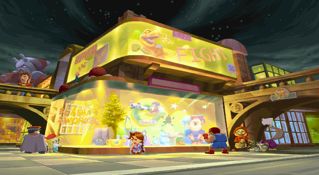
PF_Dhalsims_Toyshop.png

Based on the shape of the building i wanted to do it in the style of Edward Hopper with reference to Nighthawks

Nighthawks.jpg

Hopefully this is ok, it is a bit abstract but it is what jumped out at me!

Replies

  • chibidani
    I think that is an amazing idea! I'm excited to see this! A down & out toy shop in muted colors would be a great take.

    Good luck!
  • ubu
    Offline / Send Message
    ubu polycounter lvl 7
    I have put together some ref for this. Nighthawks was painted in 1942 so I figured this it would make sense to look at the architecture and lifestyle of the time for inspiration. I am think of using the high line overhead railway for the bridge sections.

    3590050_orig.jpg?1300750676
  • ubu
    Offline / Send Message
    ubu polycounter lvl 7
    I have also made a mood board of Edward Hoppers work to get a feel for lighting and tone. I would like to make this piece have a painted feel if possible.

    744230_orig.jpg?680
  • ubu
    Offline / Send Message
    ubu polycounter lvl 7
    This is my first Blockout. Basically I want a similar layout to the original Pocket fighter level but with 1940's New York architecture and furniture. This is not a true depiction of New York as it has to be fudged to fit the concept but I have added a High-line like rail road (which was running in the 40's) with a tram on it (pink box). I am planning on having a Hopper like diner (Dhalsim's Diner) as the centre piece with some homage to some of Hoppers other work thrown in as well.

    7567259_orig.jpg
  • EMC3D
    Offline / Send Message
    EMC3D polycounter lvl 14
    Great re-imagining! I can't wait.
  • Gannon
    Offline / Send Message
    Gannon interpolator
    This has so much potential for awesome if you can capture the essence of the painting. NO PRESSURE. GO GO GO.
  • ubu
    Offline / Send Message
    ubu polycounter lvl 7
    Cheers Guys. I have been mega busy so hopefully will get change to do some more on this at the weekend. I have decided to make the diner exterior modular also but not sure how far i should push the hand painted aspect
  • Sebeuroc
    Offline / Send Message
    Sebeuroc polycounter lvl 13
    Great idea, I love it! I'm excited to see where you take this.
  • Mr_Mout
  • ubu
    Offline / Send Message
    ubu polycounter lvl 7
    I am soooo behind on this but here is a small update!

    This is still very sketchy and there is loads more lighting to go in yet so i am doing this very broad brush stokes at the mo. However i thought i would have a look at some lighting stuff early on as i am tring to create something that invokes the colour pallette of an Edawrd Hopper painting if nothing else.

    This is my first very basic lighting test on the Diner section. I wanted to try out postprocessing with Look up tables (LUT) to break up the linear nature of the lighting and make it something more painterly ( at least from a colour point of view). Tried to make the light bright in the brightest areas but low contrast in the shadows. The light has a redish fall off in the brightest areas and green in the darker parts.

    This was textured grey in udk and i have painted over the meshes (in PSHOP) to get an idea of what it should look like with colour applied (so no texturing done at all). The modular section's lightmaps are a bit screwed and I have made the Diner bigger as well. I am thinking of going back to a non modular solution at least for the diner. It was a nice idea but i dont want to wrangle with it for no good reason.

    The top is roughly the angle it will be viewed from. The bottom is the view similar to the NightHawks painting for ref (door is over bright)

    4848665_orig.jpg?630
  • ubu
    Offline / Send Message
    ubu polycounter lvl 7
    My current blockout in UDK, i have started working up the diner exterior and decidde to drop the modular building approach. It seemed like overkill and more work than needed and time is against me. I have left this pretty dark and have toned down the initial lighting as i want to add more artificial lighting to fill the scene. I changed the direction of DD light to accent the detail in the diner exterior more. Added a tiny bit of DOF and also hieght fog. Still lots to do though. I need to cap some stuff on the diner because I am getting light bleeding out where i dont want it.
    2853299_orig.jpg?685
  • ubu
    Offline / Send Message
    ubu polycounter lvl 7
    Pushed up the brightness on the lights to get more overspill onto the pavement (closer to the toy shop colours also). Changed the camera to something closer to the original. I also put a basic sky in.

    8155279_orig.jpg?632
Sign In or Register to comment.