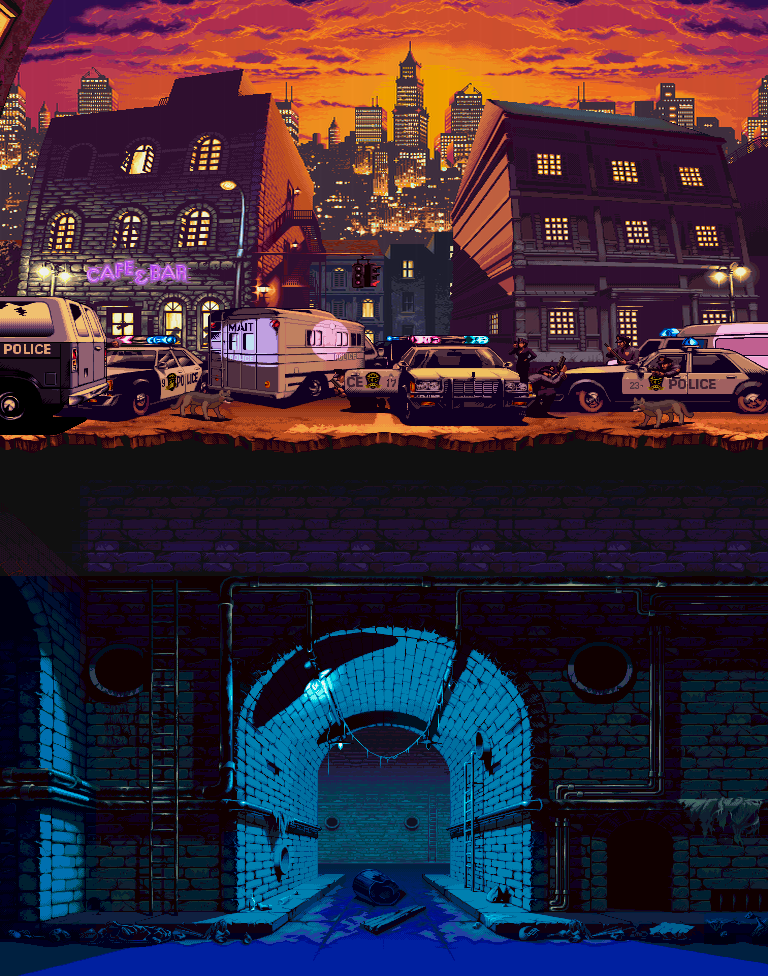
[STAGE] Xmen vs Streetfighter, Manhatten
Just reserving my spot.
I want to use this competition as an exercise in speeding up my workflow and learning new tricks to get things done quicker at work.
Im planning to do a reimagination of the top half of the stage "manhatten" from Xmen vs streetfighter, but with a 1950s "world of tomorrow" vibe.
Expect a retro futuristic take on the scene and some more reference images once I am at home and not at work.

Replies
Here is a quick reference board, just highlighting some elements.
A little more on the scene.
The setting is a 1940's/50s world of tomorrow world, which will be something of a little alternative history.
In design, it will be quite similar to the style of the Batman and Superman animated series - a classic feel for modern things and being a homage to an era rather then a direct recreation.
This will mean there will be police blimps and more general airbourne activity; the city in the background will be retro futuristic; The cars will be somewhere between the above classic designs and something more flash gordon rocket like (fins and points).
The cars will likely get a reference board to themselves.
At this point I will want to just get a police car and a police van to instance but Id also like to get a unique car in there - something more like the bottom right image (probably for a private eye or something to that extent).
As mentioned before, this is mostly a exercise in speeding up work flow and learning new tips, tricks and tools to get the job done quicker without compromising quality.
As a result I might talk about how I did certain things and id encourage anyone to share any ways they tackle certain things as I'm all ears about new work flow methods.
*edit*
This will also the first time I will be using UDK, which I have been planning to pick up for sometime. I'v had experience with other engines and I'm told UDK is easy to pick so this should be too much of a problem.
The texture style will be a hand painted realism. I don't want to rely too much on gritty overlays, so whilst it will have a look of realism, it will have a hint of stylisation too or at least not too noisy.
Next step:
Block out and getting view points sorted.
Cheers
I also added some search lights and did a quick post in photo-shop just to convey some atmosphere. Im not sure if this is the vibe im going to go for just yet, I plan to do some thumbnail paint overs to try some colour themes.
Next step (as above) : Try some colour paint overs, and try to nail a day/colour theme.
This piece could be absolutely insanely awesome. I'm looking forward to the progress.
I have tried to go for a cross between a normal search light and a ray gun, hence the wings and the rings.
@ Wester.
Yeah the perspective is a hard one to crack. I think the cars will be bigger anyway, but that might make the buildings small. I took some liberties with how far the character is from the cars so that might be part of it.
Maybe I will pull the camera out a little too. I wanted to get more skyline in really, so maybe that's the way forward. This way I can make the buildings slightly taller because Im worried they seem too small.
That said, if you got any ideas let me know.
Cheers for the comments folks.
-Adam
you good? Not entering Brawl?
*edit*
Just saw your post. Awesome!
Keep it up
The search lights are going to have stands now or be raised somehow so that's why they are floating.
I also replaced the basic blockout elements with work Id done more recently.
Below is a quick model just for form of the car. I wanted to get the shape more finalised before worrying about edge flow etc. Still more details i want to get in, but I will save that for that for the actual final model.
Finally, a little texture work I did one evening, diffuse and Normal.
It had to be done
Needs more world of tomorrow fins!