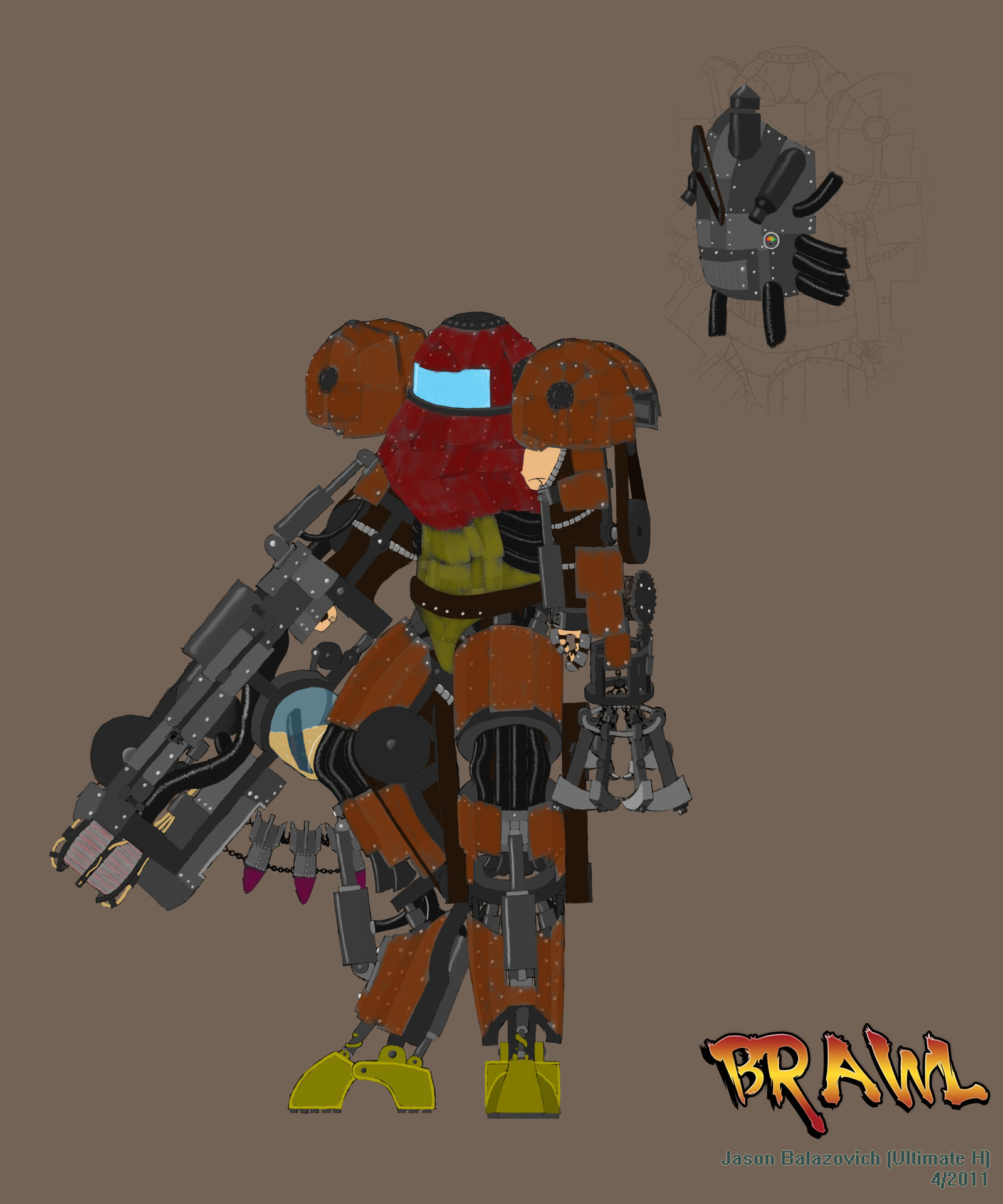
[FIGHTER] Super Smash Brothers, SAMUS, Ultimate H
Current Progress:

Up next: Starting the actual Model!
Hello, new guy here.
Thought I'd make my first thread a WIP thread for this competition. I'll be working on a reinterpretation of Samus from the smash bros. series. My interpretation is more of a question: "What would Samus look like if her armor was designed in the past, specifically in the Victorian era." So basically, a steampunk/steam powered power suit.
Image of original character:

I look forward to this competition, and wish luck to all who participate.
-H

Up next: Starting the actual Model!
Hello, new guy here.
Thought I'd make my first thread a WIP thread for this competition. I'll be working on a reinterpretation of Samus from the smash bros. series. My interpretation is more of a question: "What would Samus look like if her armor was designed in the past, specifically in the Victorian era." So basically, a steampunk/steam powered power suit.
Image of original character:

I look forward to this competition, and wish luck to all who participate.
-H
Replies
I will be doing a futuristic Mario from Super Smash Bros
Good luck
Just taking a quick look, I'm feeling the general shape of the lower portion of the first one, while using the upper arm of the second one.
The main idea is that the cannon, instead of shooting out energy, condenses the steam into a ball of ice to be shot out. I want at least one tube connecting the cannon/arm to a pack that's going to be on the back.
Let me know what you guys think
-H
Did a quick clothes concept for what she'll be wearing under the armor. I know its not technically Victorian style, but I'm deciding to have the style be based loosely off steampunk, rather than rigidly adhere to it.
I didn't really detail, since this is going to be mostly covered by the armor anyways. the most that will be seen is the stomach area, and at the joints.
let me know what you think.
-H
http://cghub.com/images/view/87047/
hah yes that is boba
-H
Took a little of the style from that link and added to this. The coloring on the cannon, as well as the "decals" are going to be worked on. One idea I'm toying with is that the coloring would look like she hand painted it on, kinda like what's depicted on some mercenary stuff.
The upper arm is going to be redesigned, right now its basically just an attachment point for the cannon. I think tomorrow I'm going to do up some quick concepts for the main suit.
'Til then,
-H
My idea as of right now is that the shoulders will actually be a furnace and water tank, to be fed into a contraption on the back that would be used to create the ammo for the cannon.
Comments, suggestions are what I am looking for. Does it look cool, does it look terrible, is it boring? I want to know.
Thanks
-H
what would Samus look like in a big bulky steam powered contraption. That thing would be huge right! it would look kinda like a mech in my mind.
Did some quick proportion sketches, I think i'm liking the leg design of the last two, they feel more mech-ish than the other ones. Gonna have to think about it on the cockpit design though. I want it to be very obvious that it's a mech, while still keeping the same kind of shapes her original suit has.
I'm thinking, maybe make the torso and head about the same height as a person, but make the arms and legs beefy and heavy. Looks like i'll have to do some more sketching :poly121:
as always, C&C are what i'm lookin for
Thanks.
-H
Like 1 Recognizeable as samus, 4 Scale and wieght, and 6 the silhouette is neat.
Also I love that you took the mech idea seriously but if you could bring back the scale.
Like Steampunk would be big. but I feel she would still fit in the main part. and still could move the limbs.
I would take a good look at ironman bacause I saw a lot of was good looking stuff. be carefull though one site almost gave me a virus.
I think what I'll do is have her legs in the legs of the suit, but have her arms either on the very inner edge of the arms, or just tucked snugly into the upper portion of the torso.
I'm definitely thinking heavier weight and using the silhouette of number 6. I think I'll do an inside to out sketch of whats currently on my mind.
-H
The green is the physical body position.
Once I'm set on the mechanical portions, I'll add the plating that will cover some portions. There will still be some parts that are exposed.
Her left arm will actually be a slight spin-off of the grapple beam, just instead of it being electrical, its more of a claw on a chain. I'm thinking this tool could also be used in hand to hand as a sort of flail.
Not sure how much can be gleaned from it, but I feel it is at least a step in the right direction.
As usual, C&C would help a ton.
Thanks
-H
Whatever the case, I sorted out a couple areas that were concerning me, and slapped on the armor plating. Decided to also do a quick color pass to get a better scheme of what's what, what's made of what, etc.
Lengthened the front half of the feet since if she tried taking a step forward, it would just fall instead. Also decided not to gripe too much about certain areas, since they ended up getting covered with armor as well. Lastly, I decided to go back to my original scheme for the cannon.
Let me know what looks good, and what needs some attention.
Thanks
-H
Current Concept:
all of the grayish-red is pipes and tubes that are attached to the armor plating.
The bottom barrel on the cannon is the missile launcher. I'm thinking of changing the loading mechanism for it, seems a little too restrictive.
Not sure how to make it look more clunky, so some suggestions would be very helpful
Thanks
-H
Current Design:
I still need to beef up the backpack, as well as add thrusters to it for speed boost. As for the rest, I'm quite happy with it now, will add color once I'm done with the line work on the backpack. After I'm done with that, I think I may finally be comfortable starting the block out.
I purposely took my time with the concept since the more time I spend figuring out the details now, the less time I have to think about it while actually doing the modeling.
Let me know what you guys think
-H
And here's the pic:
-H
I, personally, think it would be cooler to see a few big, thick chunks of metal (e.g. one or two chunks for the breastplate, one for each shoulder pauldron etc.) that look like they've been hammered into shape by a blacksmith. Maybe riveted onto a frame, but not all those little panels.
Unless, of course, they're hatches that house gadgets like bombs, but I'm currently not feeling like they have that functionality.
Any idea how this suit Morph Balls and drops bombs?
Cool concept, will definitely be keeping an eye on it!
I had originally thought of doing the heavy plates, but thought they seemed too "clean" for steampunk, but I guess if I can get it to look hammered and hand painted, i could get it to look right.
as for the morph ball and bombs, it wasnt really in my plan to have that functionality, but I could probably whip up a quick idea, perhaps some plates that fold along that back, and when she curls up they fan out to create a sphere
@protomd: Yeah, i kinda figured, since samus was already kinda futuristic and mechy, why not take a step back in time instead?
Thanks for the comments guys. I thought I had the blockout figured out, but I think I'm going to mess with just a couple things to try and get the plating to be more solid as well as try out a couple shapes for those morph panels (I'm seeing something along the lines of them being draped along the back).
Edit: another idea that just came to mind is a makeshift cape that would have some sort of rod slid through some pockets that would cause it to form into a sphere shape, may mess with that one as well.
-H