Home Contests & Challenges Archives

[STAGE] BURNING RIVAL, Sharvo

keyframe
Offline / Send Message
Sharvo keyframe
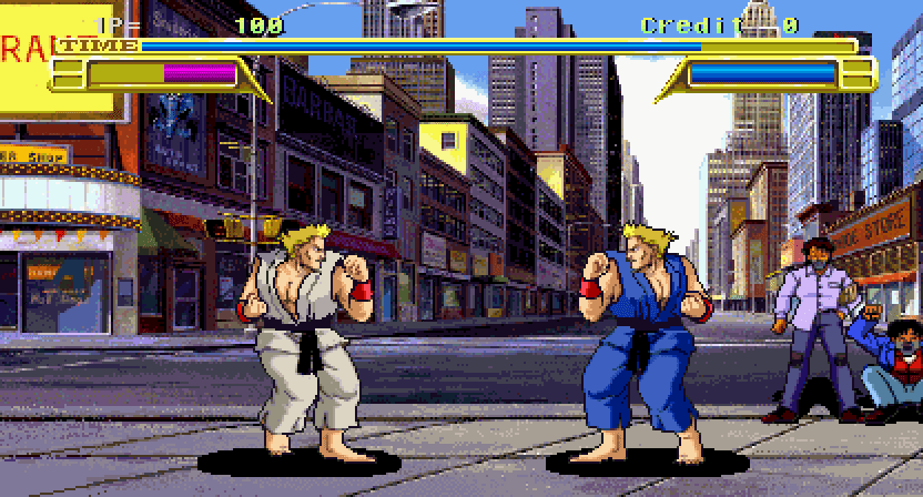
Burning Rival is a 1993 fighting arcade game developed by Sega, it was released exclusively in Japan in July 1993. I chose it as I only really know the capcom, marvel, guilty gear kind of games. So i looked at the lovely list on wikepedia and found this one.

The level I have chosen is below, I am thinking of maybe changing to an I Am Legend sort of style I always wanted to do a piece like that film and this may be my chance to do it. The only other way of adapting it was going to be a sort of day after tomorrow sort of thing you know the scene with the ship in the middle of the street and all that snow.

What do people think, would appreciate the input.
17570.jpg

Replies

  • ArminChaudhry
    Offline / Send Message
    ArminChaudhry polycounter lvl 7
    yes nice i would love to see a apocalyptical style.

    Its a heavy amount of work btw ^^
  • Sharvo
    Offline / Send Message
    Sharvo keyframe
    yep it is a fair bit of work, but as i said i always wanted to do a scene like this one, so hopefully this will spur me on and it will be a big challenge! I am currently in the block out stage for this. The majority of the far away buildings will obviously be low poly and the most detail will be at the front buildings, props and other bits of bobs!
  • Sharvo
    Offline / Send Message
    Sharvo keyframe
    Well due to some external issues i have decided that this will be a bit to much in the amount of spare time I have, so I will now be doing Blancas Stage from street fighter, i will be keeping it the same in terms of floor, 2 buildings, a tree and a snake. However, the style will be futuristic/sci fi and I havent decided if it will be clean texturing like Portal for instance or a bit more grimey Halo/Vanquish but below is the stage....

    imagesCA62EPF7.jpg

    Here is some refrence I will do a mood board and show a concept later on, but for now here is a taster in the direction I am going, I have started modelling it as well, so thats all good!
    vanquish-new-screens-2.jpg

    shell-exterior-Futuristic-Shell-House-with-garden-design.jpg
  • Caser
    Offline / Send Message
    Caser polycounter lvl 10
    As a big fan of the Halo saga, I can only say... BRING IT ON!

    Looking for the concept!
  • Sharvo
    Offline / Send Message
    Sharvo keyframe
    Hey not much to add, I dont have internet where I am living at the moment as I have just moved and at work, we dont have access to usb ports. But this is a lil concept of a barrier that will be between the fighting area and the homes in the background. This is my first ever go of concepting assets in photoshop. So let me know what you think, I know its any a side of the barrier support, but just wanted opinions on stuff i could add to it?

    conceptBarrier.png
  • Sharvo
    Offline / Send Message
    Sharvo keyframe
    Hey people, I was able to get to a computer with a usb, here is a floor design i had. Still dont know which way to dake this project clean or grunge? I am more swayed by the clean approach to things, but will see how that goes if i dont like it i can slap a grunge map on everything lol. This is just a normal map and a base colour map. I just added the grunge in photoshop to get a feel.

    floor.png
  • Sharvo
    Offline / Send Message
    Sharvo keyframe
    Well, I went with the clean approach and I keep changing ideas in the work, which I think is a good thing to do, they may only be small tweaks, but they all help.

    I had some problems baking normals etc from home, my software is not happy, but there are ways round that. So here is a lil updat the first image was what i had at first and the second is where the floor is at the moment. I have started other areas but there isn't enough to put on here yet. I think i will change those patterns on them and they look to big at the moment! Lighting is no way near final and no post process effects yet!

    brawl001.png
    brawl002.png
  • Sharvo
    Offline / Send Message
    Sharvo keyframe
    Well here is the latest it is moving on very slowly, but a small update currently working on the textures for the barrier and modelling the tree in the middle, which is going ok. Looking at the udk trees for refrence and real trees as well. These are first pass textures at the moment.

    Water is an area i am not to sure of yet looked at hourences tutorials on water so may adapt them a lil bit!

    Lighting is a dominent directional at the moment, may look at post process soon especially fog, dust light shafts.

    street%2Bfighter.png
  • S2Engine
    Offline / Send Message
    S2Engine polycounter lvl 10
    Looking nice so far, I like the barrier holographics a good bit. Definitely get a HeightFog in there (Content Browser > Actor Classes > Info > HeightFog) to help hide the bottom of the skydome. There are also some great water materials that ship with UDK that you can use as placeholders and learn from as well.
  • r4ptur3
    Offline / Send Message
    r4ptur3 polycounter lvl 10
    nice work so far! would like to see the tree you are talking about!
  • Sharvo
    Offline / Send Message
    Sharvo keyframe
    Well, a little bit of an update. Doubt i will finish for the competition been tied up with work and my house, but an update none of the less. I also did a paintover on it to see where i want to take it let me know if thats a good direction.

    But things to do model interiors.
    Model yacht.
    Model branches, rest of tree.
    Background city.
    Maybe cliff on right?
    Caustics on building.
    Lighting.
    Post processing.
    Fine tune textures!

    Lots to do!


    latest.png
    latestPaintover.png
Sign In or Register to comment.