Home 3D Art Showcase & Critiques

[Portfolio] Alec Moody - New layout and content- now with homefront work

AlecMoody
ngon master
Offline / Send Message
AlecMoody ngon master
Hey all. Homefront released this morning so I can finally put up my new portfolio website.
www.alecmoody.com

Quick preview:
3.jpg
1.jpg
4.jpg
2.jpg
3.jpg

Replies

  • chadabees
    Options
    Offline / Send Message
    Nice work! That jeep looks really really nice!
    Really love your portfolio site by the way.
  • JDinges
    Options
    Offline / Send Message
    JDinges polycounter lvl 18
  • AdamB
    Options
    Offline / Send Message
  • polygoo
    Options
    Offline / Send Message
    polygoo polycounter lvl 17
    Looking awesome Alec
  • Racer445
    Options
    Offline / Send Message
    Racer445 polycounter lvl 12
  • StefanH
    Options
    Offline / Send Message
    StefanH polycounter lvl 12
    great work. wasnt the trailer already posted?
  • jimmypopali
    Options
    Offline / Send Message
    That's some hot models. Care to show any breakdowns?
  • seth.
    Options
    Offline / Send Message
    seth. polycounter lvl 14
    yum......! great stuff Alec
  • Jeff Parrott
    Options
    Offline / Send Message
    Jeff Parrott polycounter lvl 19
    Great stuff man!
  • Stromberg90
    Options
    Offline / Send Message
    Stromberg90 polycounter lvl 11
    Sick work, really love that hummer you did :)

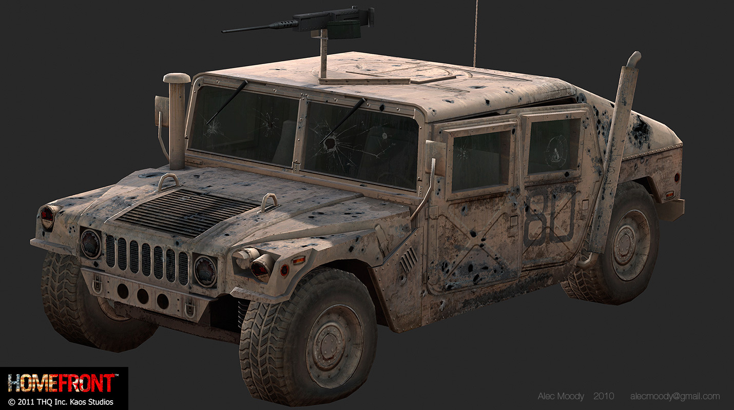
    On second thought the gun mount on the hummer looks really simple, it might be like that in real life as well, but it just stood out to me.

    Also when looking at another piece I have a small critic.
    I think the part in the red "square" I drew, could use some more depth, looks really flat atm, maybe it could use some geo, instead of only normal mapping.
    hcrlX.jpg

    Definitely bookmarking your site ;)

    (Sorry, if you did not want critic in this topic)

    Edit: Would be nice if you could post the texture flats on your site:poly121:
  • chrisradsby
    Options
    Offline / Send Message
    chrisradsby polycounter lvl 14
    Awesome xD!

    EDIT: Really really nice renders! Absolutely love the tank, gorgeous piece of work.
  • Envart
    Options
    Offline / Send Message
    Envart polycounter lvl 6
    Really great work. Your textures look brilliant and the uv map is really efficient. Awesome stuff.
  • ae.
    Options
    Offline / Send Message
    ae. polycounter lvl 12
    Amazing work ALec!
  • Jet_Pilot
    Options
    Offline / Send Message
    Jet_Pilot polycounter lvl 10
    how did you make your 2 spherical HDR panoramas?
  • AlecMoody
    Options
    Offline / Send Message
    AlecMoody ngon master
    Thanks guys.
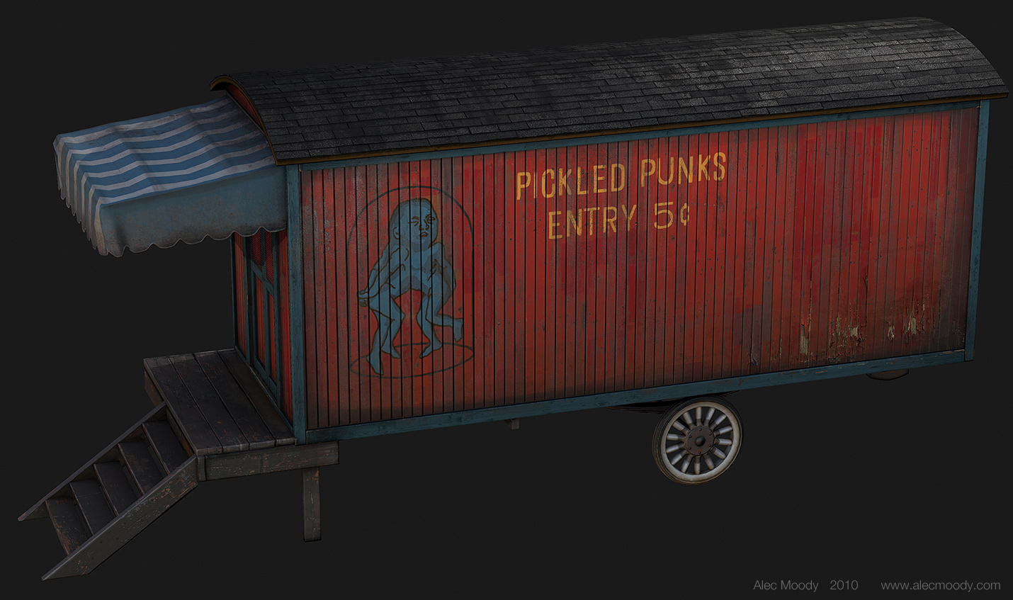
    StefanH: Yeah I posted the trailer back in January

    Jet_Pilot: I shot bracketed 360 panos since the quality is much better that doing it with the mirrored ball technique. I think they are 7 brackets and 8 camera positions.

    Is the layout working for everyone? no major issues? How was the load speed? I built the website months ago and have tested it locally a lot but haven't been able to put it online.
  • Jungsik
    Options
    Offline / Send Message
    Jungsik polycounter lvl 6
    your new site pwns...@_@
  • Shogun3d
    Options
    Offline / Send Message
    Shogun3d polycounter lvl 12
    Some great stuff for Homefront. Congrats :)
  • R3D
    Options
    Offline / Send Message
    R3D interpolator
    Whoa, whats the texture size used for that carnival trailer?
  • Snader
    Options
    Offline / Send Message
    Snader polycounter lvl 15
    In short:
    -everything on your site is huge, why?
    -work towards 1280x720 (works on 3 times as many devices)
    -large images and text add nothing
    -work is nice


    The site is rather huge. It won't display properly (gives vertical scroll) on any screen below 1500 pixels wide. This means that on roughly 4 out of 5 devices you'll get an undesirable experience. I get you're aiming for professionals in a desktop environment, but I would seriously advise you to consider some way(s) to make it work better on average screens. If you've got experience with CSS you can probably figure some things out yourself, if not - ask me, I'm pretty good at making stuff flexible.
    statowlscreenres.png

    One thing that really bugs me is that you use rather huge 651² thumbnails, but still seem incapable of getting the object in it. This is because of 2 main reasons: it's too big, and it's improperly framed. For instance, if you move over the truck a bit, create even the smallest amount of negative space on the right, it'll make the image much calmer. What's more - rendering images that large doesn't even benefit in most cases, in fact it generally detracts. I can see the individual pixels on the grille's star symbol,I can see the jaggies on the wheels, it's not beneficial to the image.

    The about page also has overly large text. It's good you use something bigger than the standard 10 or 12 point for better legibility, but 22 pixels is a bit excessive for block text. I don't see a good reason to use images for the text, it kinda wastes space and it's not flexible.
    Lastly, http://www.alecmoody.com/Images/anchor_2.gif has some nasty dithering. And the image doesn't need to be that big either.

    The photography is sorta meh. The diver looks cool, but the plant ones are rather bad and uninteresting. Personally I don't think 2 cool photos warrant a special section.

    Your 3D work itself is ace though, not much to crit. Here's a few nitpicks though:
    -BFV flares don't need such detailed caps, flat tops would suffice
    -BFV 'wheels' could reduce loops towards the center
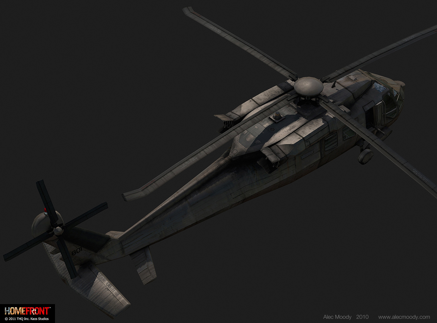
    -chopper has some illogical drips in places, most notably the windows
    -tanker has onviously photosourced headlights, but handpainted tail lights
  • Mistry10
    Options
    Offline / Send Message
    Mistry10 polycounter lvl 8
    great work man !!!
  • Mike Yevin
    Options
    Offline / Send Message
    Mike Yevin polycounter lvl 11
    im going to agree about the overall size of the site. im running 1920x1200 and the site almost touches the edges of my browser window. also i would suggest minimizing the vertical size of your thumbnails, right now i can only see 2 thumbnails fully and a sliver of the second row. i would expect to see at least 2 or 3 rows on my resolution but that might be personal preference. other than that i think you should add a little color to the layout, just to keep it from being overly monotone. again, this is just preference.

    the work is great, ive seen your stuff around the forum for sometime now and im always impressed. i've been meaning to check out homefront, the work you did for that is awesome. keep it up
  • AlecMoody
    Options
    Offline / Send Message
    AlecMoody ngon master
    This means that on roughly 4 out of 5 devices you'll get an undesirable experience

    Oh please. In practice my website works on the vast majority of users machines that I actually care about. The website doesn't become difficult to use until you drop below 1440x900 and it works awesome on iphones

    I'm fixing the dithering on that image though

    thanks for the other comments all. I will get some more breakdowns and texture flats on there this week.
  • tda
    Options
    Offline / Send Message
    tda polycounter lvl 16
    Great work dude, and i really dig the layout. Nice and simple with maximum art pimpage :)
  • Snader
    Options
    Offline / Send Message
    Snader polycounter lvl 15
    I think you're missing the deeper meaning of my post. WHY is it that big? What's the benefit?
  • AlecMoody
    Options
    Offline / Send Message
    AlecMoody ngon master
    yeah I got it and I realize that I might have sounded a little rude. I like big images and I designed the portfolio so that it functions somewhere between the single page art dumps (like paul pepera or adam bromell's sites) and a website with thumbnails and hierarchy. Basically all my work is exposed on the first page in a way that lets you get a really good look at everything and then with very little effort you can move into the sub galleries. I would have done a single page design as I like how effortless they are to look at, but I think if you have more than 3 or 4 images for an asset those layouts can become really cluttered.

    Edit:
    also I like to imagine that the big text is me shouting at everyone who views the page
  • Serp
    Options
    Offline / Send Message
    Serp polycounter lvl 17
    I like it big. Even now on my small laptop at home it still works well. And the textures and everything is great, even up close.
  • Snader
    Options
    Offline / Send Message
    Snader polycounter lvl 15
    Actually, your thumbnails don't let me get a good look at the work. They feel badly cropped.

    I'd make sure the objects you're showing fit better in the frame, like so (pretend the scaled/stretched images are from an angle that would fit like so):
    alecmoody2011.jpg

    Also, don't misunderstand me when I say 'aim for 1280'. By no means I want to tell you not to design for the appropriate target audience (which likely uses 24 inch 1920x1080). I should've clarified that I think you should, simultaneously, aim for backwards compatibility. A simple solution would be to have the images be 50% of the screen width, with a maximum of the current 651 and a minimum of say 580. This way, smaller resolutions (down to 1280) would have a wee bit of clipping or resizing (depending on your choice), but no scrollbar. Something more complex would be a solution along these lines: http://dl.dropbox.com/u/448525/Website_experiments/Flexible_Scalingboxes.html.

    Again, keep your focus on the important people, but don't forget about the little guy.

    And personally, I think it's a BAD IDEA TO YELL AT FUTURE EMPLOYERS!!! RAAAGH! *cough*
  • XRevan23
    Options
    Offline / Send Message
    XRevan23 polycounter lvl 15
    Really great work, and I like the layout simple and big....:thumbup:
  • sverbeek
    Options
    Offline / Send Message
    I love everything except for the photos, I would say take those out of there as they really aren't providing any benefit.
  • viv
    Options
    Offline / Send Message
    viv polycounter lvl 9
    good job, really good skillz dude :thumbup:
  • SamCom
    Options
    Offline / Send Message
    Real minor nitpick, but the title/header for all of your Homefront pages have "feelance". Is that supposed to be freelance?

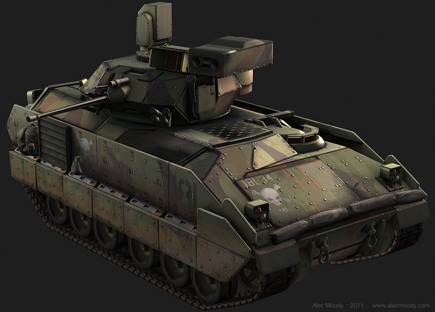
    Awesome work, that Bradley is sexy!
  • AlecMoody
    Options
    Offline / Send Message
    AlecMoody ngon master
    yes it should read freelance. Thanks for catching that.
  • AlecMoody
    Options
    Offline / Send Message
    AlecMoody ngon master
    I just made an update with more texture flats, fixed the dithering, and fixed the typo.

    itismario:
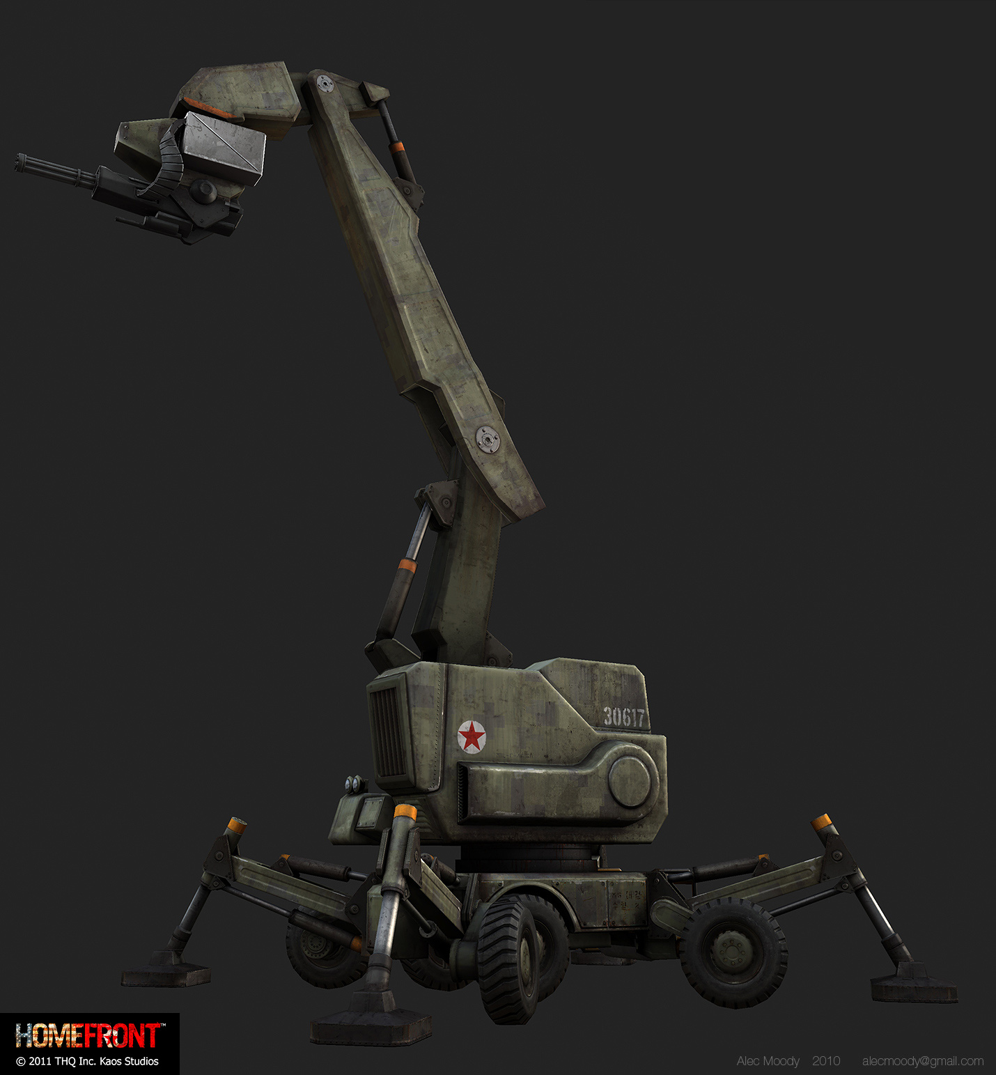
    Most of the homefront vehicles don't have a high poly source. The client wanted height-map normals for quick turn around.
Sign In or Register to comment.