Home 3D Art Showcase & Critiques

WIP Environment FABLE

Vital70
polycounter lvl 7
Offline / Send Message
Vital70 polycounter lvl 7
So, i started an assignment for my grad reel, that was to take a piece of concept art and model it out as quickly as possible, basically how it would be in the industry, rather than just doing something i wanted to based on my own concept.

I was then assigned a piece from Fable, being that my strengths are more like Dante's Inferno and God of War style modeling and texturing, I wanted to learn hand painted and stylized, which was my weakness.

So here are the models, just wondering how this is coming along, i wont show all of them, just a general strength of them, game content later, and then some of the hand painted textures.

Thanks for the critiques ahead of time, want this level to really shine.

Overall Screen of Level
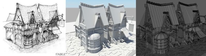
shots.jpg

Breakdowns
wood.jpgwalls.jpgexterior.jpg


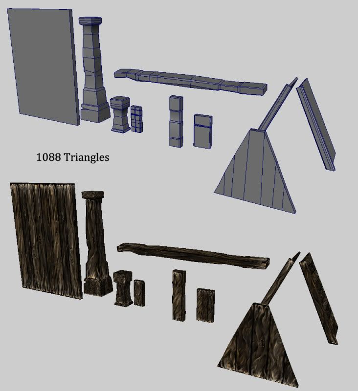
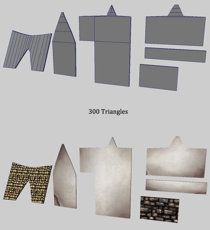
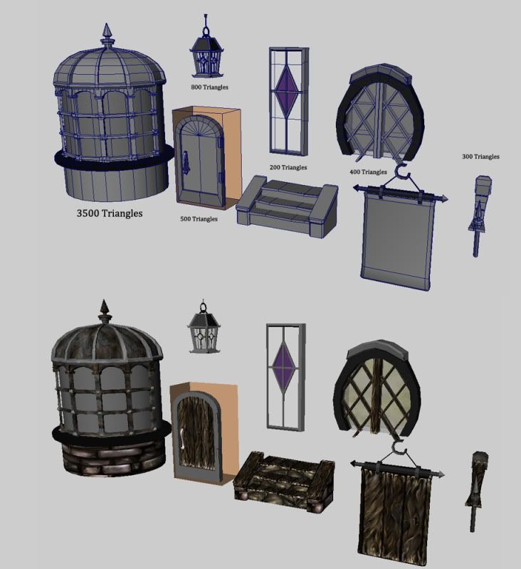
Textures Hand Painted
textures.jpg

I have not FULLY optimized the polygons, that usually comes at the end, but they are roughly where i want them.

Point is to get these into engine and build an entire city from them (under progress)

Replies

  • Rojo
    Options
    Offline / Send Message
    It's looking good. Initial impressions: the concept art is stretching vertically, but the model is stretching horizontally. The bay window is too wide, and the placards are hanging further down near the doorways, which says the buildings aren't tall enough.

    The wood texture seems excessively swirly, which is okay but may just scale it back a little, otherwise is starts to look like cloth. Stone walls are pretty awesome. Try not to stretch your UVs so much.
  • ariofighter
    Options
    Offline / Send Message
    ariofighter polycounter lvl 13
    I really like your textures, but to me the more I look at the wood the more I see fur. I know its a stylized wood, but that's just what my mind goes too.
  • Vital70
    Options
    Offline / Send Message
    Vital70 polycounter lvl 7
    I really like your textures, but to me the more I look at the wood the more I see fur. I know its a stylized wood, but that's just what my mind goes too.

    Ya i had a hard time balancing out the two, from not having a plain style of painted wood to it being too stylized, anyway you know how to fix this

    @Rojo - It was hard getting the scale of the buildings from the concept art and having everything be so repetitive based, it looks a little more accurate in engine. Ill also move the signs up when i get to that in game, and in maya. Same question to you though as i posed to ariofighter, how can i scale back that hair like feel on the wood, i got that critique from classmates as well.
  • Snader
    Options
    Offline / Send Message
    Snader polycounter lvl 15
    Looks like you have some huge priority issues and a lot of wasted polygons. The main wood element(which is also the largest) is 12 triangles [p.s. you actually only need 2 if you only see the outside of the buildings] but the smallest wooden piece is, what, 250 triangles?

    There's also no need for the roof triangles to have so many horizontal/vertical cuts, seeing as it'll intersect with the shingles anyway.

    The sign lacks structural credibility. It looks like there's nothing holding up the center plank, and the 2 small sidestrips are rather silly.

    Lastly, obviously tiled roof texture is obviously tiled.
  • Vital70
    Options
    Offline / Send Message
    Vital70 polycounter lvl 7
    Snader wrote: »
    Looks like you have some huge priority issues and a lot of wasted polygons. The main wood element(which is also the largest) is 12 triangles [p.s. you actually only need 2 if you only see the outside of the buildings] but the smallest wooden piece is, what, 250 triangles?

    There's also no need for the roof triangles to have so many horizontal/vertical cuts, seeing as it'll intersect with the shingles anyway.

    The sign lacks structural credibility. It looks like there's nothing holding up the center plank, and the 2 small sidestrips are rather silly.

    Lastly, obviously tiled roof texture is obviously tiled.

    That big piece is used as porches too, so it needs both sides, also, im lost on what you mean by priorites, do you mean just because its a smaller object it should have less than others?

    The roof doesnt need as many on the sides, but it does need it for the cut in the middle of it to fit the window slot.

    And ya, i have no defense about that roof texture lol.
  • vcortis
    Options
    Offline / Send Message
    vcortis polycounter lvl 9
    You're using way too much black in your textures. You need to bring up your dark values by at least 20% and add some color to them.
  • Vital70
    Options
    Offline / Send Message
    Vital70 polycounter lvl 7
    skayne wrote: »
    I like that one of your textures is a complete rip off of the tutorial done by JFletcher :/. I don't think that tutorial was meant to be used in that kind of way lol

    And like vcortis said, way too much black. Use color man, even in the tutorial your basing your textures off of, I see no black

    http://www.polycount.com/forum/showthread.php?t=71942

    :( I based it off a tuturial, it was my first texture learning how to hand paint, I'll watch the blacks, didnt know it was something that was bad.
  • jimmypopali
    Options
    Offline / Send Message
    I suppose it's just recommended you try to use that technique to come up with your own designs, not so much take the tutorial and use the result in your own things.

    But it could be a grey area.
  • Vital70
    Options
    Offline / Send Message
    Vital70 polycounter lvl 7
    Updated some props for the unique break up of the level

    props2.jpg

    props.jpg
  • Vital70
    Options
    Offline / Send Message
    Vital70 polycounter lvl 7
    I suppose it's just recommended you try to use that technique to come up with your own designs, not so much take the tutorial and use the result in your own things.

    But it could be a grey area.

    Okay, ill remember that, i guess if i have time ill go back and redo it to make it varied.
  • sketch81
    Options
    Offline / Send Message
    Hey dude, it's looking good and in time will look even better. The leaves on the tree are too big and are almost as wide as the tree trunk. I'd recommend scaling them down and adding a few more of those alphas to the tree.
    What tri count have you set for the entire scene?
  • Vital70
    Options
    Offline / Send Message
    Vital70 polycounter lvl 7
    sketch81 wrote: »
    Hey dude, it's looking good and in time will look even better. The leaves on the tree are too big and are almost as wide as the tree trunk. I'd recommend scaling them down and adding a few more of those alphas to the tree.
    What tri count have you set for the entire scene?

    I was actually thinking that about the leaves, glad to know I wasnt just weird, that it is off,

    to be honest, i originally set out to have less than 30k unique, which i beleive i had up until the newer props started getting modeled, i will have to check what its at now.
  • sketch81
    Options
    Offline / Send Message
    No problems Vital70, I'm glad I can be of some help. Looking forward to an update :).
  • evilblah
    Options
    Offline / Send Message
    evilblah polycounter lvl 18
    I really like the fence and grass that you did! Looking forward to seeing this all together. The roof shingles have me a little concerned because of how bright they are but I'm sure when it is all together it will look great.
  • tda
    Options
    Offline / Send Message
    tda polycounter lvl 16
    The technical aspect of the modelling was covered well by snader, to add to that i'd say your house looks wider than the one in the concept, and not quite as tall. The concept is also very loose and whimsical, wheras your model is much more rigid and square. There's a lot of curved lines and an overall tapered look in the concept that you're missing out on, the corresponding lines in your model are all straight with no curvature. A prime example of this is the sweeping curved C shape that those rounded tiles on the top of the roof make, yours is very much a flat V shape. The house in the concept is also much wider at the top than it is at the bottom, a common characteristic of medieval buildings, whereas yours is the same width all the way up. Try and work some of these points in and i think your model will benefit a lot.

    As for the textures, the wood doesn't look like wood to me at first glance, it's more like a thick satin material or some kind of shiny, oily fabric. I think the blacks are too black and the whites are too white. Try chilling the levels out a bit and making the values more harmonised, then aim to to describe the wood swirl and grain with colour and saturation and not as much value. Basically echoing Victor's point here. Speaking of which, he has a great example of hand painted wood on his website too, really nice (shameless plug?) http://victorcortis.com/painted

    As for the new stuff, it's looking more like photoshop filters now than hand painted. This is likely to break up the visual coherence of the level when they're put side by side with the stuff up top.
  • Vital70
    Options
    Offline / Send Message
    Vital70 polycounter lvl 7
    tda wrote: »
    The technical aspect of the modelling was covered well by snader, to add to that i'd say your house looks wider than the one in the concept, and not quite as tall. The concept is also very loose and whimsical, wheras your model is much more rigid and square. There's a lot of curved lines and an overall tapered look in the concept that you're missing out on, the corresponding lines in your model are all straight with no curvature. A prime example of this is the sweeping curved C shape that those rounded tiles on the top of the roof make, yours is very much a flat V shape. The house in the concept is also much wider at the top than it is at the bottom, a common characteristic of medieval buildings, whereas yours is the same width all the way up. Try and work some of these points in and i think your model will benefit a lot.

    As for the textures, the wood doesn't look like wood to me at first glance, it's more like a thick satin material or some kind of shiny, oily fabric. I think the blacks are too black and the whites are too white. Try chilling the levels out a bit and making the values more harmonised, then aim to to describe the wood swirl and grain with colour and saturation and not as much value. Basically echoing Victor's point here. Speaking of which, he has a great example of hand painted wood on his website too, really nice (shameless plug?) http://victorcortis.com/painted

    As for the new stuff, it's looking more like photoshop filters now than hand painted. This is likely to break up the visual coherence of the level when they're put side by side with the stuff up top.

    I wasnt sure if i could translate the whole small bottom to bigger top eprsona that the building was trying to convey, maybe i can work with it in engine to see how it goes.

    As for the textures, thanks for elaborating on what exactly needs help, ill see what i can do.
  • Vital70
    Options
    Offline / Send Message
    Vital70 polycounter lvl 7
    Thanks Evilblah

    I need to make a new roof texture, but i have no idea what to base it on, but I agree, something needs to happen there lol.
  • Vital70
    Options
    Offline / Send Message
    Vital70 polycounter lvl 7
    heres the newer wood textures, and the new roof texture, the wood texture with the red thing is just for a break up on a crate.

    Untitled-1.jpg
Sign In or Register to comment.