hand painted props ...learning
Here are some pics of the props for a fantasy theme, All work was done with Blender, GIMP and MYpaint in Linux.
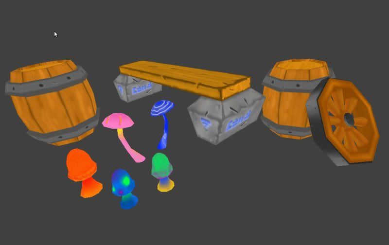
in the game engine:
and
Also I have learned to shorting my time on modeling at least twofold and how to utilize better in a 256x256 uv map, here is an example :
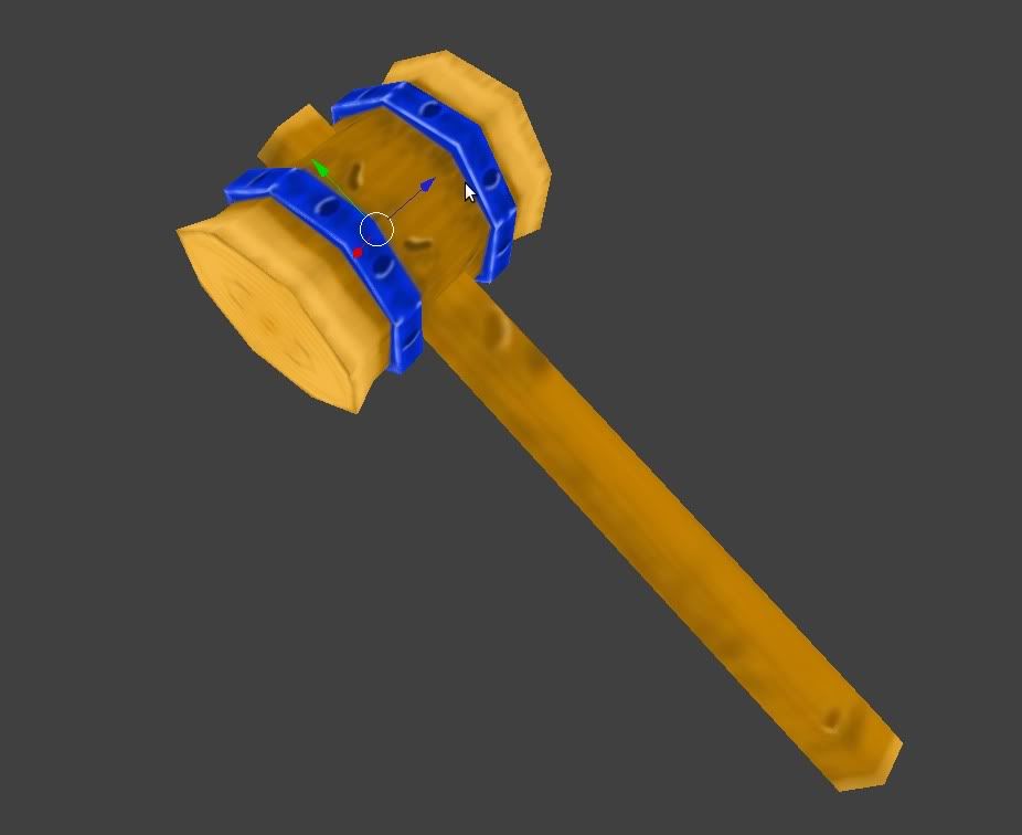
it is not detailed but it is wip...
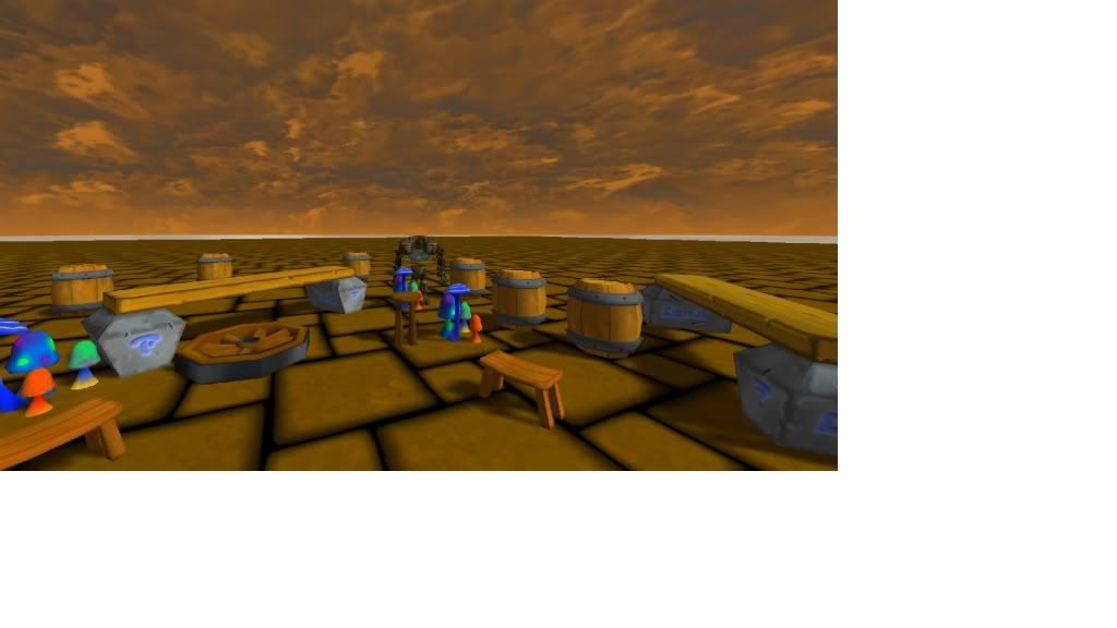
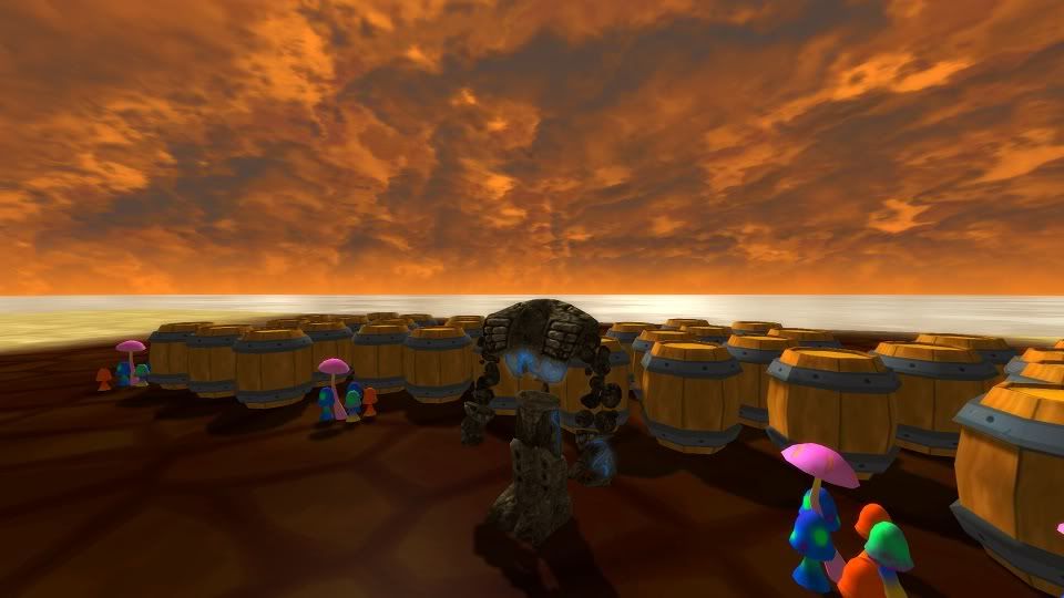
in the game engine:
and
Also I have learned to shorting my time on modeling at least twofold and how to utilize better in a 256x256 uv map, here is an example :
it is not detailed but it is wip...
Replies
Your Bench(?) has dark edges, when really they should be highlighted, even if its meant to look worn, the fresh wood inside the plank would be lighter then the outside as it hasn't any dirt on it. So lighten up those edges! The same goes for the stone blocks supporting it.
Also, don't be afraid to paint some spec onto your objects, the metal for example, around all those little dents you can put a light grey/white spec.
I think your barrels also need a more contrasted grain, it doesnt read well from far away (just looks light orange with no details).
Hope this helps, look forward to seeing more!
http://browse.deviantart.com/?qh=§ion=&global=1&q=how+I+see+color#/d31xj5t
@Shaffer: Yeah, they may be a bit saturated, but I want them to be a bit colorful, I will tone them down, and read the color theory based on your link, thank you.