Getting ready to graduate
polycounter lvl 7
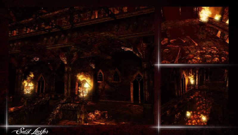
So i have an environment, which was actually my first environment but re-done lately, I am throwing it on my reel because its my favorite out of my levels, but I still believe i can make it better, i would love some critique on how to really push this environment. All modeling texturing lighting rigging and animation are done by me, from concept art to finish.
Models were done in Maya 2011
Painting done by hand via PSCS5 and Zbrush
Engine Work done in Unreal Developer Kit
Time was about, originally 6 weeks, edited later for another 4 weeks
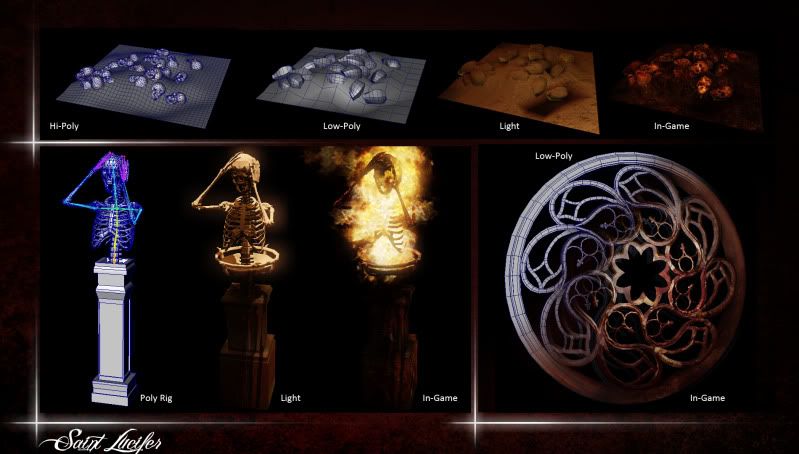
I would note the unique polycount, but i am actually not sure where in the new UDK browser it is, fail on my part I know.
Thanks in advance.
Level In Action
http://vimeo.com/19668786
Stills
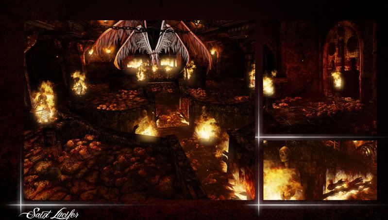

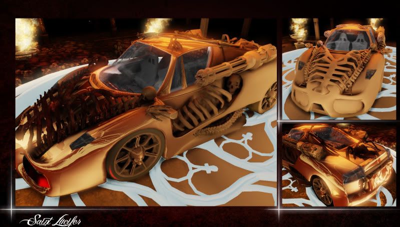
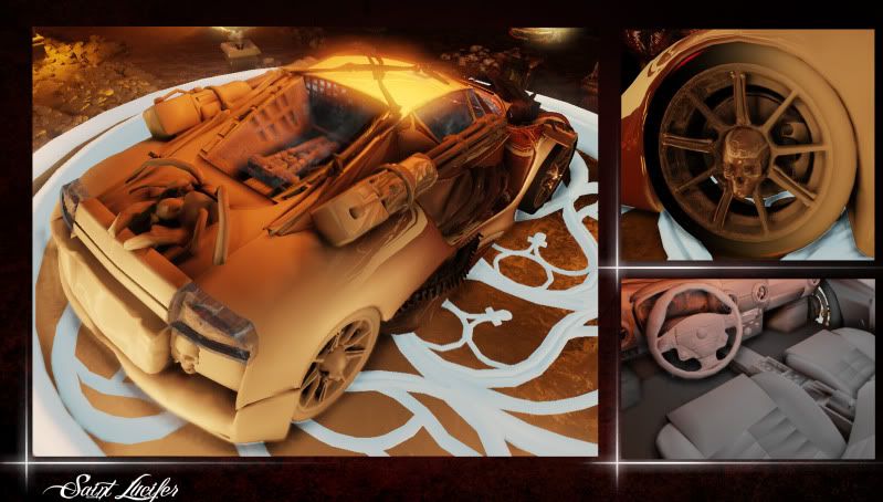
I have the car in there for absolutely no reason other than the fact i made a car for an angel...who flies...dont judge me
Models were done in Maya 2011
Painting done by hand via PSCS5 and Zbrush
Engine Work done in Unreal Developer Kit
Time was about, originally 6 weeks, edited later for another 4 weeks
I would note the unique polycount, but i am actually not sure where in the new UDK browser it is, fail on my part I know.
Thanks in advance.
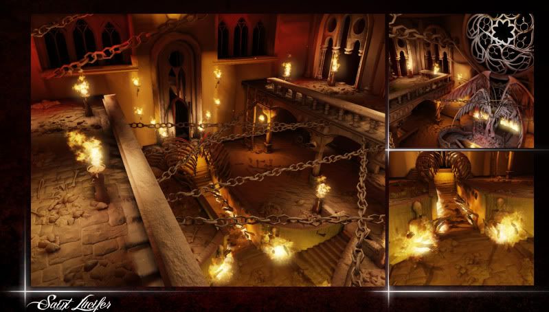
Level In Action
http://vimeo.com/19668786
Stills
I have the car in there for absolutely no reason other than the fact i made a car for an angel...who flies...dont judge me
Replies
On the other hand I love the animated stuff going on, and the level ideas. Reminds me of good times on painkiller.
-As far as the presentation of your images go, I think that the red noisy background and the bright X's aren't doing much but making it harder to tell where the image stops or pulling your eye to the bottom left.
-As far as the font goes, I would change it to something plain and simple. Yeah, it may not be nearly as badass, but its much easier to read eh?
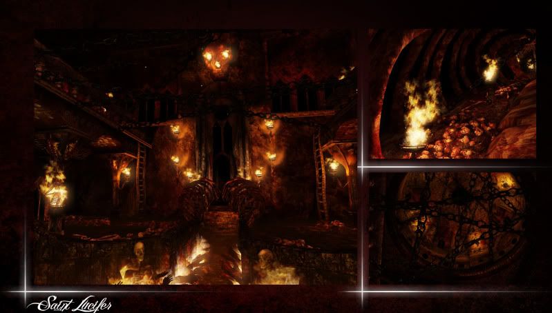
-Like others have said, I think there should be something in there to break up the red and black a bit. Some shattered stained glass I think would do the trick, and it even looks like you've got some prime places just waiting to be filled with the stuff like above the archways. If you're feeling really bold, even above the angels throne in that circular shape.
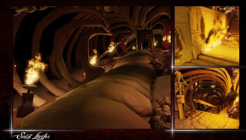
-One last thing that kinda bugged me was the animation for the writhing skeleton pedestal. I LOOOVE the idea, and you've almost nailed it, but there's a noticeable jump in the animation that you can see at 1:10 and even a bit in the next shot at 1:18. It may be a looping problem? I'm not sure, but make sure to fix that.
Other than those things, keep on truckin buddy. You're sitting on a pile of gold.
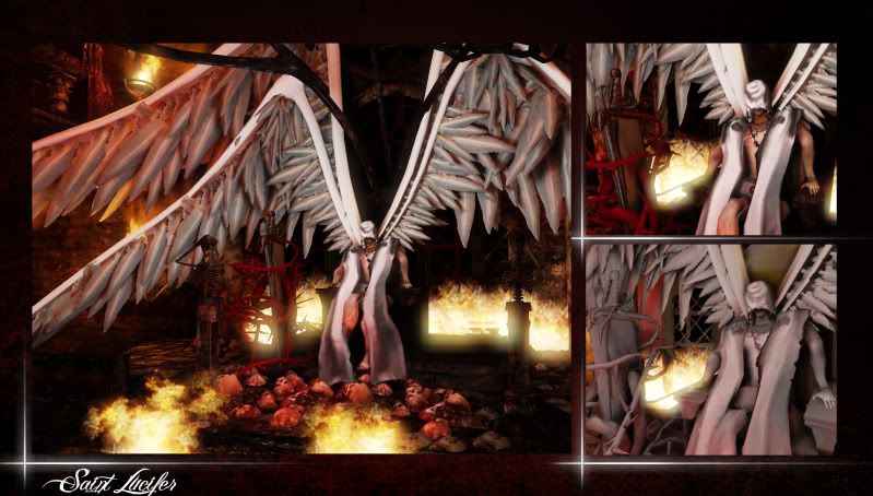
First thing, get rid of the car. It feels really out of place and distracting. If you think it's good enough to present, present it somewhere else.
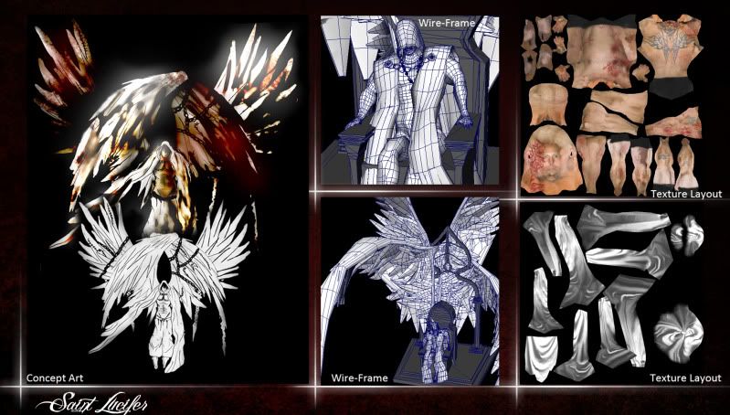
Your models are really faceted, even though you're putting an unnecessary amount of tris into most everything that you're posting wires of. Your wing feathers are interpenetrating to beat the band, and it's distracting to look at. I'd either seriously rework your character model or get rid of it as well, you have some terrible deformation going on, and the posing is really awkward and static. The hands in the hallway before the throne look very tacked on as well, and would benefit from being attached to the wall as a set piece. The animation for the skeleton is jumpy, it looks like the hand jumps around during your animation.
I don't know what's going on in your final lighting build (read: not a UDK user) but your build before textures looks a lot more interesting and easier to look at than the final build. That said, Your lighting needs work. I understand that it's supposed to be Hell and all, but the monochromatic, high contrast lighting isn't helping your presentation at all.
Last thing I'll comment on is that I would not show your texture sheets in their current state. There's a ton of wasted space, along with what looks like an unintentionally overlapped shell on your robe sheet.
You put a lot of work and time into this, a few things need tightening up, and you need to be more selective in your presentation.
First off thanks for all the feedback,
I know i need to work on my presentation skills, most the time i just rely on video to convey whats going on, so I will definitely rework how the images are being displayed.
Any recomendations on what to fill in those empty spots, i feel like its already starting to get really overly cluttered?
I have been for life of me trying to figure out WHY that jump is there, but something keeps happening to the animation on the fly through.
Thanks for the critique, little less confident in my level now lol, but thats good, it means i need to get better.
I should have predicated that post on saying that car is not in the same level, i have no idea why i posted it actually, its just a separate model and level entirely, just correlated in nature.
How can i break up the contrast without really overall lighting the level? I there any tactics post processing to do this, or do i just need objects that will break up this for me.
ALot of these textures are tiled, should i show off that instead of the uniques?
The character I have never really been sure of how i felt about it, I like it more based on the break up it has to offer the color scale in the level.
Oh and how i fix the hands looking more tacted on Der Hollander
Awesome,
So it seems i have a checklist of priorities heres how im going to go about fixing them
Radii of lights increased to lighten up the darkest areas, possibly also reduce the intensity of flames to even out the contrast.
On main back window, do shattered stained glass window with various color to further break up color.
Possibly add in some type of tabard with a color hanging from low arches.
Add something in to make the arms seem more attached rather than just plopped onto the wall
Granted i have time between my other levels i need to fix and finish, im going to go over Lucifer himself, and possibly fix the animation on the skeleton
I wanted the ground to slightly reflect and have a better sheen to it since its blood, the original floor piece stretches beyond the 0-1 scale and the texture itself isnt tiled, so in order to have the piece reflect, will i need to rescale the objects uv's into the space and repeat the texture itself, and then multiply that by the reflection, is there some way to add in a reflection without doing that
http://udn.epicgames.com/Three/Lightmass.html#Making lighting noticeable
If I am to understand this correctly, by upping the amount of bounces based in lightmass, the lights will effect more of the area with lighting better?
at this url: http://udn.epicgames.com/Three/Lightmass.html
Go to the following section:
Getting the best quality with Lightmass > Making lighting noticeable > Diffuse Maps
Sorry, lighting is definitely my weak point in understanding.
Try opening some of your diffuse textures in photoshop and see what the histogram looks like, and compare it to the sample histograms that Epic shows on the page that LMP linked to.