Home 3D Art Showcase & Critiques

The Guardian - Enviroment

polycounter lvl 8
Offline / Send Message
toxic_h2o polycounter lvl 8
Hello everyone, this is my first post here on polycount, I'm am still very new to 3d game art and I hope to learn a bunch on this project. Please help out a noobie with ideas, tips, and tricks! With your guys expertise and my determination I'm sure to have awesome end result. Also be honest if it looks like crap tell me I can take it.

background: An alumni from the university I currently attend works at blizzard and is throwing a monthly contest for the students at the university as a motivation method. This is the project I want to use as my entry. The only requirement is readable textures. However I'm terrible at texturing and shader stuff so it should be interesting.

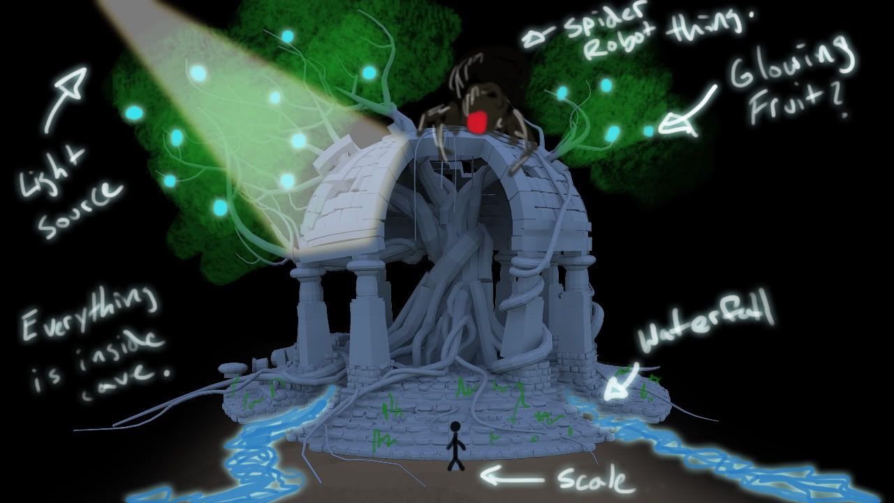
Heres my intial idea a gazebo with a tree growing out of the center(possible tree of life?) I want it to look ancient, very much inspired by dtschultz "Tree Temple"(http://www.polycount.com/forum/showthread.php?t=79237). I would also like to create a spider/tick robot "guardian" to contrast the ancient stone structure and plant life. I'm planning on taking most of the components into zbrush to get some nice normals.

Dead line is April 4, hopefully I finish. :/
Again ideas and comments are always appreciated!
Thanks for browsing! :D

Idea for scene.
idea.jpg

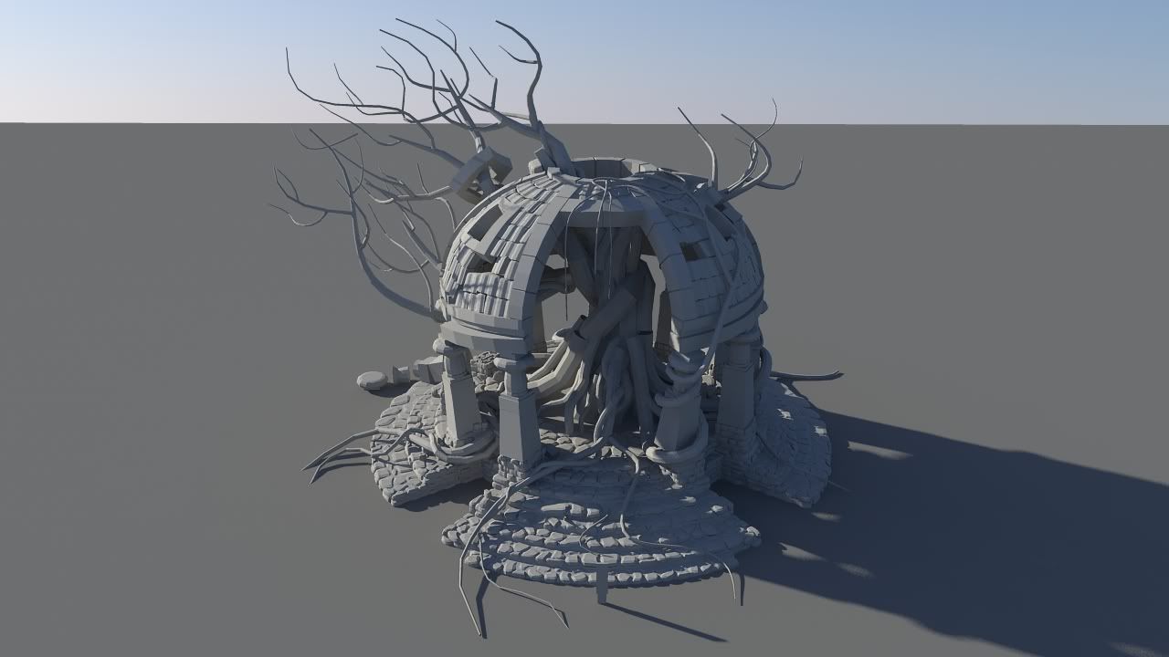
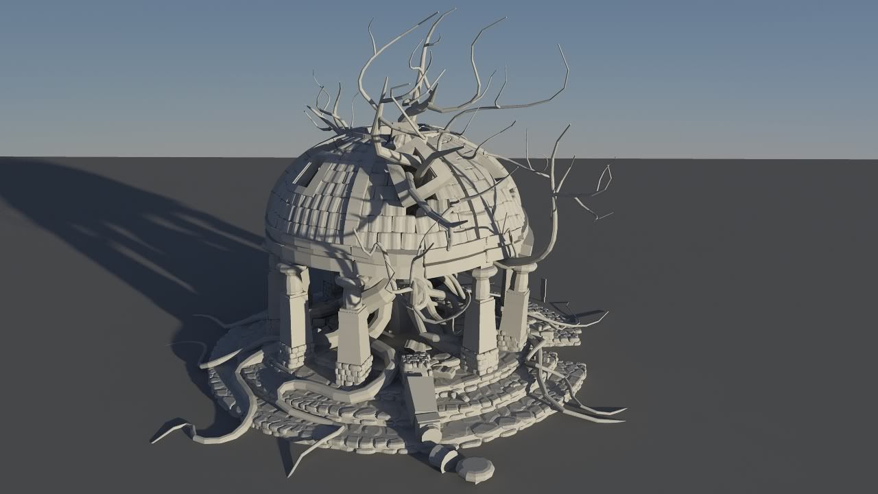
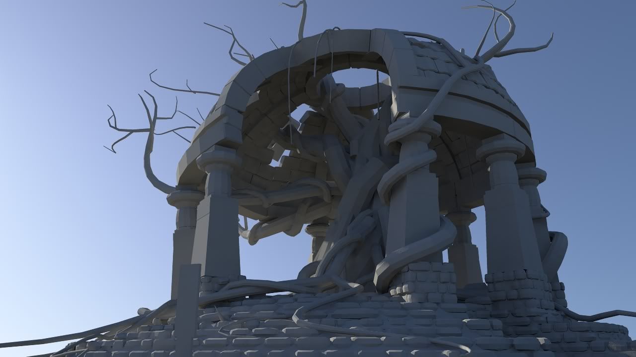
Some quick test renders of what I have now. (rough base)
1-1.jpg

2-2.jpg

3.jpg

Replies

  • mkandersson
    Offline / Send Message
    mkandersson polycounter lvl 7
    Looks really good so far. I like the idea as well. Though your pillars need some more love in form of shapes imo.
    They are a little boring now. The rest is sweet. Especially the trees interaction with the rest of the geometry. Love it.
  • sltrOlsson
    Offline / Send Message
    sltrOlsson polycounter lvl 14
    Is your plan to lift all of this in to zbrush? It will be ALLOT of work for you. I would say, model like 4-5 stone blocks with well thought details in them, reduce them in decimation master or meshLab and then place them in you scene.

    Same goes for the ground stones and the pillars.

    Think aobut you UVing before you start clutter up you scene. I'm thinking about that tree. It will be insanly painful to UV that in this stage.

    Good luck! :)
  • toxic_h2o
    Offline / Send Message
    toxic_h2o polycounter lvl 8
    sltrOlsson wrote: »
    Is your plan to lift all of this in to zbrush? It will be ALLOT of work for you. I would say, model like 4-5 stone blocks with well thought details in them, reduce them in decimation master or meshLab and then place them in you scene.

    Same goes for the ground stones and the pillars.

    Think aobut you UVing before you start clutter up you scene. I'm thinking about that tree. It will be insanly painful to UV that in this stage.

    Good luck! :)

    Hey everyone thanks for the comments! The pillars are based off the pillars in the elephanta caves in India. Thanks for the block idea to, i think I'm going to do that.

    IMG_8608.jpg
  • evilblah
    Offline / Send Message
    evilblah polycounter lvl 18
    I really dig what you having going already! One thought on the spider robot concept is to maybe have it fit with the scene by adding in some kind of armor that looks like classic architecture, like Shadow of the Colossus style. Arches and curves and then under these 'plates' there is mechanics and stuff.

    Keep it up though! Digging it.
  • moose
    Offline / Send Message
    moose polycount sponsor
    good to see you posting here Nick :) Sorry i've been failing on getting back to you, but it looks like you've been iterating a lot (all of my feedback was generally a version behind where you were! haha). Its clear you have landed on something great!

    I like this version a lot more than the previous iterations! You should be able to get some cool looking normals with what you have going now, those cobble bricks & rooftop areas should process really well, and read well. The trick will be how modular you UV the low poly so you can get the most texture res out of it.

    As for texturing & Zbrushing - i wouldn't push it too tooooo far. I really like how all of the forms are easily readable and defined, adding a lot of surface detail & noise may muddy up the design. The textures could be taken a long way using the AO bake methods you were doing before on previous versions, but with bigger, broader strokes of color instead of the detailed bits that were happening.

    Personally, i think the spider/robot idea is a little too much, turns a solid piece of architecture and design into something that just doesn't seem to mesh together.

    This piece has really come a long way!
  • toxic_h2o
    Offline / Send Message
    toxic_h2o polycounter lvl 8
    Hey guys I'm having some normal trouble(im still really new to this stuff) I'm baking my maps in xnormal at 1024X1024, when I apply the maps to the mesh some weird things happen. lines that should be shadows are coming up as highlights and I'm also getting some odd pixelation around the crevices(see images). I could really use some help/advice. Thanks!

    normal map
    normal_map_1.jpg

    test render with ambient occlusion
    normals_1.jpg

    test render without ambient occlusion
    normals_noC_1.jpg

    low poly and high meshes
    wire_1.jpg

    wire_hi_1.jpg
  • toxic_h2o
    Offline / Send Message
    toxic_h2o polycounter lvl 8
    I figured it out just forgot to change it to tangent space normals. epic FAIL.
  • toxic_h2o
    Offline / Send Message
    toxic_h2o polycounter lvl 8
    Finally an Update... Im learning udk for the first time so that has kept me from working on the actual project. Finished texturing the pillar, there is allot id like to change but due to time I really need to finish.

    If anyone has any texturing advice I'll be sure to apply it moving forward with this. Here are some screen shots of the pillar.

    Untitled-2.jpg

    Untitled-1-1.jpg
  • DDuckworth
    Offline / Send Message
    DDuckworth polycounter lvl 6
    Glad you figured it out, the pillar is looking pretty nice, however i gotta say that unwrap you did on the roof is pretty insane and wasteful unless you have other pieces of the building in that same map too?
  • Matroskin
    Offline / Send Message
    Matroskin polycounter lvl 11
    why wouldn't u do regular tileable texture for that dome piece?
    Doing that unique unwrap is definitely more risky to get errors, highly inefficient texture usage, takes more time and not something how it would be done in real...

    U could just spend some time to make a tiled texture sheet for those stones - nice and flexible ;)
  • PixelMasher
    Offline / Send Message
    PixelMasher veteran polycounter
    Yea I totally agree with matroskin. You could still use some highpoly pieces to make a tileable texture set that you could use all over this piece, I think people think doing a highpoly means each piece has to be unique, when in most cases having 3-5 awesome tileable textures and a couple trim sheet textures enables you to make an entire environment that feels cohesive because its all using the same texture set. also its way faster than making everything unique and you can make a ton more stuff.

    cool design on that piece, reminds me of the naughty dog environment artist art test.
  • toxic_h2o
    Offline / Send Message
    toxic_h2o polycounter lvl 8
    Thanks for the responses, I am redoing the uvs on the roof, those were layed by uv master. I wanted to do a few quick and dirty tests with the normals.

    @pixelmasher I actually want to go low poly with this set, so I'm guessing the roof has to be one piece to be efficient?
  • pbot
    Yeah everything is looking great so far, the one critique that I have is that edge of the columns is looking a bit too straight. For example the edge of the third column from the left is too straight, I think it should reflect the nooks and crannies of the stone.
  • elitewolverine
    or if your set on doing the roof in that manner, do a 'sphere' unwrap so it unwraps as a circle as if your looking from the top down.

    i think tilable might be the way to go for you right now.

    but if your happy with the results meh go with it.

    like your pillar, looks good
  • toxic_h2o
    Offline / Send Message
    toxic_h2o polycounter lvl 8
    Here todays update, started to put some of the objects together to get an idea of how it is looking. The textures need major work. :( Stuffed to many pieces on one texture map, need variation, noise, muddy, etc, but im giong to finish up creating the rest of the pieces(laying out uvs, high poly, low poly, baking) and come back to the texturing last. OMG so much to do and so little time, I have about a week left.
    :(

    anywho thanks for looking.


    test_1-1.jpg

    test_2-1.jpg

    test_3-1.jpg
  • snow
    Offline / Send Message
    snow polycounter lvl 8
    I really love this scene, how'd you go about modeling the tree?
  • laim1991
    This is look really good :) instantly reminds me of shadow of the colossus, has such an epic feel to it, can't wait to see the tree incorporated
  • toxic_h2o
    Offline / Send Message
    toxic_h2o polycounter lvl 8
    Update: Theres a tree now and I made two more unique pillars for my gazebo to make it feel less like copypasta. The pillar normals need a bit of touch up but Ill take care of that tomorrow. Wish I had more time to spend on my sculpts. :( oh well next time. The normals look good though on the tree low poly.

    @snow: In maya(I'm not comfortable in max yet) I extruded along a curve a bunch of times to created the tree shape. After combining all the parts I retoped the tree using nex's maya plugin. Then I brought the tree into zbrush and used poly cruncher to make the low poly.

    Untitled-1-2.jpg

    tree.jpg
  • toxic_h2o
    Offline / Send Message
    toxic_h2o polycounter lvl 8
    Well the deadline is here, only a day left. Due to time my idea changed a bit. I Have a little more tweaking to do and then I'm calling it done. So ready to move on to something else. I'm pretty happy with my progress seeing how this is my first attempt at game asset art and the udk editor. :)

    gazebo-1.jpg

    note how the lens flare and god rays hide my bad modeling and texturing. :)

    Untitled-1-3.jpg
  • konstruct
    Offline / Send Message
    konstruct polycounter lvl 18
    damn dude- I`d say you should keep going. I understand that you want to move on, but I feel this has some potential to be even cooler.
  • Nemlet17
    I agree with konstruct. Even though it's due tomorrow (well today) , still work with it. Your original concept was awesome and it would be a great portfolio piece.
  • toxic_h2o
    Offline / Send Message
    toxic_h2o polycounter lvl 8
    Thanks for the comments I might come back to it once i have a bit more knowledge on the whole process. I made so many mistakes working on this I'd like to start something fresh from the beginning.
  • toxic_h2o
    Offline / Send Message
    toxic_h2o polycounter lvl 8
    Woot "finished" the scene thingy. Thanks guys for the responses! Look forward to posting more work here soon! Feel free to give any last thoughts or comments.

    click the link below to view more screen grabs:

    http://s443.photobucket.com/albums/qq151/toxich2o/3D%20Modeling/Hunters%20Contest%202%20Final%20ScreenShots/

    final_19.jpg

    final_17.jpg
  • ZacD
    Offline / Send Message
    ZacD ngon master
    What? You're done? it looks good, but its lacking a lot of polish, it just looks like a first pass, the steps need a lot of work, and some of the other textures are pretty bland. But the scale and the composition of the scene looks great.
  • Alberto Rdrgz
    Offline / Send Message
    Alberto Rdrgz polycounter lvl 15
    Dude, this is far from done i would really take the time to polish this.
  • toxic_h2o
    Offline / Send Message
    toxic_h2o polycounter lvl 8
    I do like the concept so I might come back and redo the scene later when I have more experience, but for now i am done with it.
  • samcole
    Could you link where you got that retopo plug in for maya?
  • toxic_h2o
  • samcole
  • Will Faucher
    Offline / Send Message
    Will Faucher polycounter lvl 12
    What? That's it? This scene has so much potential! You took a completely different direction than I expected. I say keep going. Doesn't matter if your assignment is over, keep working on this! It's just lacking so much sex-appeal. But with a little more elbow grease, you can make this scene stand out like crazy.
Sign In or Register to comment.