The Forgotten Temple
polycounter lvl 8
Hello everyone, My name's Jon. It's my first time posting here and hopefully I'm welcomed with a loving embrace paired with a light sprinkling of rainbows and sparkles. Now that that's out of the way...
I've wanted to take on my first post-grad project so I found a concept by Adam Baines @CGHub:
http://cghub.com/images/view/36070/
I decided not replicate the scene entirely because there were a few unknowns, and I wanted to have a little creative freedom in some of my choices. Regardless, I still glance at the image to make sure my composition is meeting the direction of the concept.
I'm going to skip my sculpting, modeling, and process pictures (though I have a bunch if anyone cares) and cut right to my most recent UDK grabs. This will be our starting point, though I've been working on the piece for about a month.
Here's the grabs:
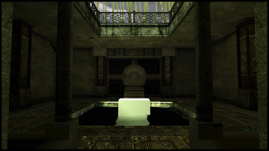
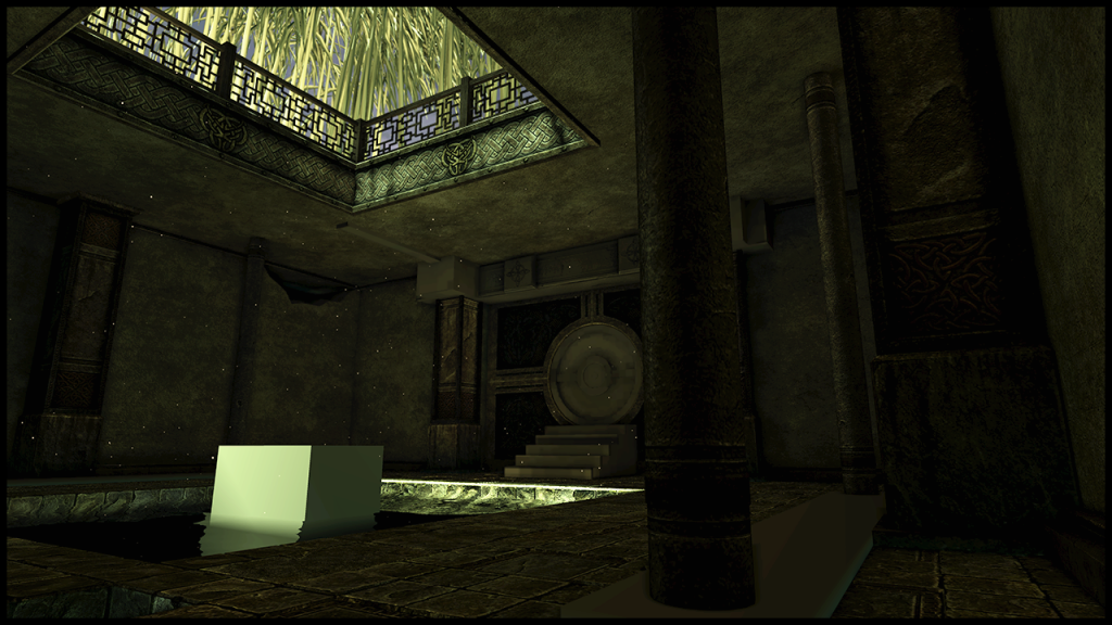
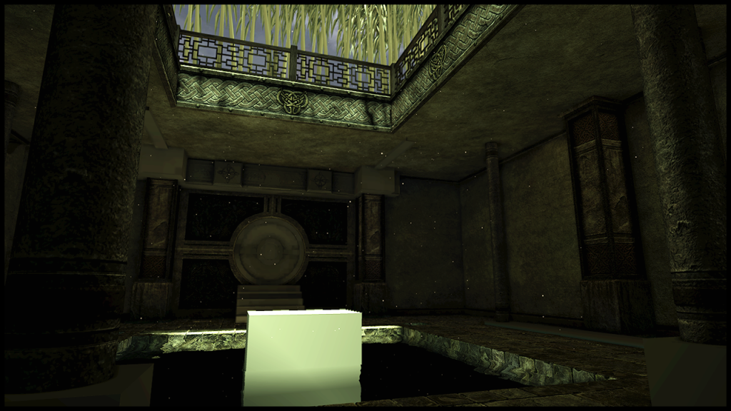
And now a delightfully bulleted list for your viewing pleasure:
-The Skybox is a UDK placeholder
-The Water pit is a UDK placeholder
-The bamboo is a Maya Paint Effects placeholder
-I still need to texture/normal map a good handful of pieces.
My main concerns/inquiries:
-I really want DRAMA in my lighting. Right now it's heading in the right direction but not quite there. I'd really like to see a bit more contrast; brighter hotspots and darker shadows. It's a tight space and GI is making it tough for me. I've spent a lot of time tweaking bounce and intensity settings. Maybe someone can suggest a new scheme/set-up, or give me some ideas for tweaking.
-I plan on making the water green and mossy like the concept. Complete with lilly pads.
-The walls are a bit...square. Granted, they are like that in the concept, but it's a bit...square. I plan on vert painting, adding decals, and also adding the roots coming out of the corners. I think that should break it up enough. Any other ideas on that?
-I want to add foliage everywhere. Vines up the walls, grass peering through the floor tiles, leaves falling in from the top. This thing is forgotten and upkeep isn't really one of it's strengths.
-Perhaps the biggest concern is the focal point. In the screens above I have a stand but nothing on it. In the concept there's a statue. I mocked a statue up (really quick) and threw it in the scene. I don't know if I like it. Also, I don't know if I'm going to like working on a "character" sculpt for a long period of time. Here's a grab with a mock statue:
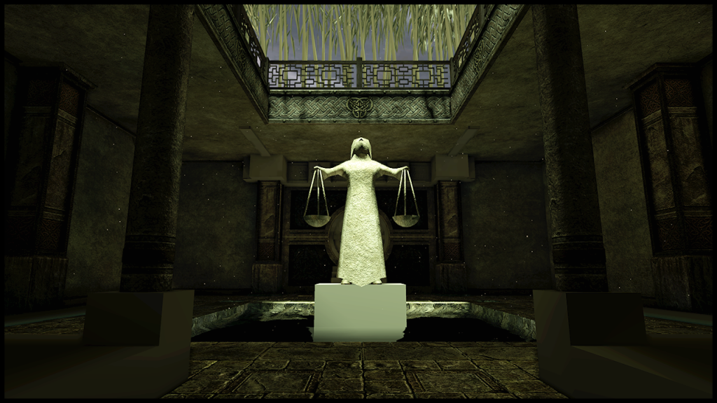
Do you all like the idea? Should it not be there? I feel it draws the eye quite a bit (but it's supposed to, it's a focal point). I'd really like to hear what you think I could try here. I want people to focus on my environment art. Maybe something else entirely? A fountain?...
If you read all that, pat yourself on the back.
~Jon
I've wanted to take on my first post-grad project so I found a concept by Adam Baines @CGHub:
http://cghub.com/images/view/36070/
I decided not replicate the scene entirely because there were a few unknowns, and I wanted to have a little creative freedom in some of my choices. Regardless, I still glance at the image to make sure my composition is meeting the direction of the concept.
I'm going to skip my sculpting, modeling, and process pictures (though I have a bunch if anyone cares) and cut right to my most recent UDK grabs. This will be our starting point, though I've been working on the piece for about a month.
Here's the grabs:
And now a delightfully bulleted list for your viewing pleasure:
-The Skybox is a UDK placeholder
-The Water pit is a UDK placeholder
-The bamboo is a Maya Paint Effects placeholder
-I still need to texture/normal map a good handful of pieces.
My main concerns/inquiries:
-I really want DRAMA in my lighting. Right now it's heading in the right direction but not quite there. I'd really like to see a bit more contrast; brighter hotspots and darker shadows. It's a tight space and GI is making it tough for me. I've spent a lot of time tweaking bounce and intensity settings. Maybe someone can suggest a new scheme/set-up, or give me some ideas for tweaking.
-I plan on making the water green and mossy like the concept. Complete with lilly pads.
-The walls are a bit...square. Granted, they are like that in the concept, but it's a bit...square. I plan on vert painting, adding decals, and also adding the roots coming out of the corners. I think that should break it up enough. Any other ideas on that?
-I want to add foliage everywhere. Vines up the walls, grass peering through the floor tiles, leaves falling in from the top. This thing is forgotten and upkeep isn't really one of it's strengths.
-Perhaps the biggest concern is the focal point. In the screens above I have a stand but nothing on it. In the concept there's a statue. I mocked a statue up (really quick) and threw it in the scene. I don't know if I like it. Also, I don't know if I'm going to like working on a "character" sculpt for a long period of time. Here's a grab with a mock statue:
Do you all like the idea? Should it not be there? I feel it draws the eye quite a bit (but it's supposed to, it's a focal point). I'd really like to hear what you think I could try here. I want people to focus on my environment art. Maybe something else entirely? A fountain?...
If you read all that, pat yourself on the back.
~Jon
Replies
Alright. I like where this is going!
I've made some minor changes since the last post, mainly trying to break things up a bit. Still have some work to do, but I have a start. Improvements from last time include:
- Elevating the reflecting pool and the surrounding layer of stonework (to improve flatness and add variation).
- Added a rough pass of some foliage overtaking the floor stones, mainly grass planes and a couple random leafy shrubs poking through some of the cracks.
- Added a couple small trim pieces, capping the pillars and around some floor elements.
- Modeled a stair enclosure complete with incense burning bowls and I completed the hearth above the door as well as the model and texture for the ceiling supports that branch off from the door.
- Added some roots coming out of the left wall cracks and also broke one of the entrance pillars to show some of the age of the temple.
- I've been trying to tweak the lighting some, but the shots don't really reflect it. Mainly I was trying to get a bit of a brighter impact area from the outside lights but let the bounce light dissipate quickly for a dramatic/mysterious feel.
Here's a couple recent shots and a couple model sheets I did for my website.
I'm having a few issues too. One of them is illustrated in the image below where lighting information on a set of stones is really odd. I have a gentle spotlight pouring in on the scene, then a directional for that sunlight punch. The directional is touching the problem area of stones and I'm not sure why it's being lit so weird:
Also, I've got some subtle light shafts that are not showing up in the screen grabs. I didn't think they were too crazy, but seeing the scene without them makes it feel naked. I've got the shafts coming from the spotlight and I've heard there could be problems with that showing up in game view. Any solutions?
Also, I made my grass emissive. I know, stupid right. It's practically glowing. When I had the material set up normally, it was just too darn shady to see the foliage growing. Is there a way to in the material editor make the material only accept like a certain percentage of lighting info? Any help here would be cool, I'd like to see the foliage but not have it glow toxic green. Also, I was testing Lily pads, and they were blowing out in the water because of the strong directional light. It would be nice to figure out a way to make meshes react to light differently.
Going from my PC to Mac is making these images really different. I know there's a gamma issue, but I'm having to level these screens and they're getting nasty. Any suggestions on fixing the transition between the 2 operating systems?
Still need to model and texture and break up stuff.
I write too much, sorry. Any help and suggestions and comments would be great! Thanks,
~Jon
And actually, I've not yet fixed the lighting issue, but I think I'm going to try using light channels/linking to try to kill some of the harshness. I'll try to get a new shot of the results for people to look at soon.
Razgriz - I wholeheartedly agree with what you're saying about the break up in scene color. Most of my texturing (stonework) has been slight variations of browns, yellows, greens, and grays. I wanted all the stone to feel like it came from the same place, but you're right about the scene lacking bits of contrast. As you've stated, there is a central section where light pours in over the water and I'll be replacing my placeholder cube with a fountain. I'll be very selective and careful with my color scheme so as not to continue the trend of texture coloring I'm on. I also planned on making the round door a bronze, and I also liked the gold idea too. Those are my two next big steps so stay tuned for the results and we'll see if we can't tweak a bit more.
Should have a small update today or tomorrow.
~Jon
Modeled a quick concept to see if it was something I liked. Here's the result. You don't have to tell me the modeling is bad, I spent 15 minutes on it.
Essentially the dragon heads are holding up the main fountain bowl, their "bodies" are under the surface of the water, and their tails stick out at the corners with lamps dangling from them.
I think the idea is kinda neat, any suggestions or things to keep in mind if I approach this?
Is this dumb?
Love Always,
~Jon
Your roots/vines need a 5 hour energy drink. Just more out of control action with them.
The grass is too short. Make it unkept and out of control.
Light shafts coming down too!
The fountain could work. I would maybe make the body area stick up above the surface as well as the tail/head. Kinda like:
Jeff - Will be taking all of your advice, great points.
I'll buy a 6 pack of 5 hour shots, and get a little crazy with the roots. I saw you had a ruined temple looking environment on your site. How did you go about your roots? ZSpheres? Modeled? The big ones I made are ZSpheres and I have some smaller ones I added recently that are just 4 sided modeling in Maya. Also, I plan on pushing the grass too. Light shafts are already in place with dust particles sifting through them. Having a bit of problems getting them to show because they're coming from a spotlight. I may have to make it a Dominant Spot? Will also have parts of the Dragon body coming out of the water too, nice suggestion.
I've been on a small vacation and today I'm back starting to work on the fountain. I didn't really know the best way to start, so I decided on ZSpheres. Thought I'd just retopo when done. Here's my basic shaping with the reference I'd like to get close to:
What do you all think of the start? Any suggestions or techniques?
ZSpheres and character modeling aren't exactly my forte, but I feel that with a bit of help from some people mixed with solid texturing that will sell the piece as a statue I should be just fine.
~Jon
The smaller roots were made from extruding from a cube in Maya then smoothing once. I had to reduce some by hand. But all in all that worked out really well.
The dragon looks pretty solid for a start. Definitely use ZSketch on top of the spheres to get more details in the base. You should look into using Topogun 2 to do the retopo and the bakes. It's pretty amazing in the little time I've been using it so far.
It's been quite a while since I last posted on this thread. I had a pretty significant art test that took a lot of my time and energy and ultimately, took me away from this scene. Upon completing the test, I came back to this environment to continue working. However, taking nearly 2 months off from working on this piece had really taken a toll on my motivation. There were a bunch of issues and things I wanted to re-do. So instead of being overwhelmed and getting nowhere, I decided to revamp things to hopefully light that fire under me that I once had. I've been tweaking textures, adding my spec maps, re-doing materials, and even re-doing models where necessary. Below is my reworked ground with new spec map and bump offset material:
The next big step was to rework the walls. Originally they were essentially cubes, flat walls with tiling textures. I planned to add decals and texture blends but in the end they were...flat. So I redid them. Here's the result:
Then I got the other assets imported, trims, pillars, and the round door area. I put some placeholder speed trees in the garden above for the visual effect I'm hoping to achieve. Here's most of the scene elements back into the scene. Again, there's still some placeholder models and textures (mainly the round door).
**Here's where I'm at now. I just did a few screen grabs to show you some of the challenges I'm having with the lighting. All of this is rough so keep that in mind. The results aren't drastic, and actually don't look too bad here but I need a greater amount of control.
The first image is just the interior lighting. it's moody, and mysterious. The 2nd image is what it looks like when I turn on the directional light above the scene. I have the directional light only hitting the meshes on the exterior using lighting channels, while the interior light only hits the interior elements via lighting channels as well. What you're seeing in this 2nd image is close to the feel I'm looking for...
However, in the final image you see that after I rendered the 2 lights together the directional light is still pumping lots of light into the temple interior. I have it's indirect scale all the way to 0 so I know that it's bounce strength is non-existent. However, my world properties has 1 bounce and I'm wondering if that's what's allowing the directional to hit so strong on the inside.
I don't want to be at the mercy of global illumination here. I need a solution to get the lighting outside how I want it, and the lighting inside how I want it. They need to play nicely and now they're not. Are there better ways to make lights exclusive other than lighting channels? Are there any other solutions?
Some help here would be great,
~Jon
I have a spot light coming into the interior. It's using lighting channel 2 and all the meshes on the inside are using that same channel. For the outside, I'm using a directional light going into lighting channel 1 and all the meshes out there are linked by using 1 as well. I like the look of shot 2 like Addieo said but when I bake I guess the world properties bounce of 1 is bouncing the light even though it's exclusive to certain meshes. Dan, I do like the look of shot 3, but I'd like to balance it with the 2nd one. The 2nd shot is much more mysterious, but it could be lightened up a tad so if I could get a happy medium I'd be set. I do plan on maybe doing some very light caustics, but the water is going to be murky, mossy, filled with lily pads and a big focal point fountain piece that would dull the effect to some degree.
I'll try to get some updates your way soon. I appreciate the replies and again, if anyone can help me with light exclusivity more or has any other ideas, I'd appreciate it.
~Jon
I'm still rather new to game art, so take what you will from the information. I hope this sheds some light into my workflow on this project, and more importantly, how I texture things...
http://jcricreate.tumblr.com/
Thanks in advance for checking it out! I'm always down to talk shop so if anyone has any feedback or thoughts or maybe even ways we could make this process better, I'd love to hear anything!
Should have a scene update in the next day or two.
~Jon
I think your scene is heading away from where it should be. It's getting murkier and murkier, where I just want to see the whole thing light up with all kinds of yellows and greens, on a bright summer day. If not, you really might want to think about adding multiple lighting sources (torches, orbs) on the inside, because all of the hard work you put into your assets is completely lost in a shade of drab green/grey. Just my two cents.
Oh, and good luck on the Art Test!
Lighting V2 - Still a work in progress but things are more visible. Still looking for contrast.
Dragon Water Statue - Still a work in progress, has a temp texture.
Grass - Started adding the grass into the scene, peeking through the cracks.
Ground Debris - There's a few rocky chunks and stones, I want more and will add soon.
Bamboo - Added the temp bamboo back into the scene, the trees took away the asian vibe.
Broken Fence - I broke the right fence in preparation for a crashed limb through it.
Ceiling Supports - I spent time on something you can barely see. Oh well.
Lily Pads - These are temporary UDK meshes, but gives the visual I hope to nail.
To do - Lots. I still need to replace a couple temp models and textures with their real life counterparts. I'd also like to add a few meshes in the upper garden. I was thinking about a stone garden lantern (pagoda). Maybe some walls behind the bamboo forest (as if there's something back there. Then I'll be adding my roots coming through the walls, vines hanging down, more debris and leaves on the ground. I also will be re-doing the water to make it look murky and mossy.
Here's a quick concept I did for the focal fountain some time ago:
When I came back to this project, I was having a hard time motivating myself to finish my dragon sculpt. I'm not a huge character guy, but I'm familiar with the process. I had left off in ZBrush with Z Spheres followed by my Z Sketch. However, I just didn't have the patience to continue working on a "character" when what I wanted to do was to revise my models and assets in the scene. Enter my pal, Jesse. Jesse took over my sculpt while I started revising my models and textures in the scene. He took my ZBrush file and in a matter of days had the piece re-topo'd and low-res'd.
Here's my work on the dragon:
And here's Jesse's work:
I got an AO from the sculpt and quickly made a test texture. I'll be spending more time on a better texture, but for now it has the stone look that I'm after. Without further-ado, here's where I'm at in the scene:
Question: I originally wanted a bowl fountain on top of the dragon heads. I placed it in the scene...I didn't really like it. My thoughts were to revise the look of it. I still plan on doing the dragon tails with the hanging lamps. What do you guys think about the fountain? Should I go forth with the idea or try to revise the look, or not do it at all?
Thanks for reading,
~Jon
Other props : lamp holders, torch's, a skull or two, veins of course, etc.
This is just my two cents i may be wrong but it may inspire you :P