Updating my port
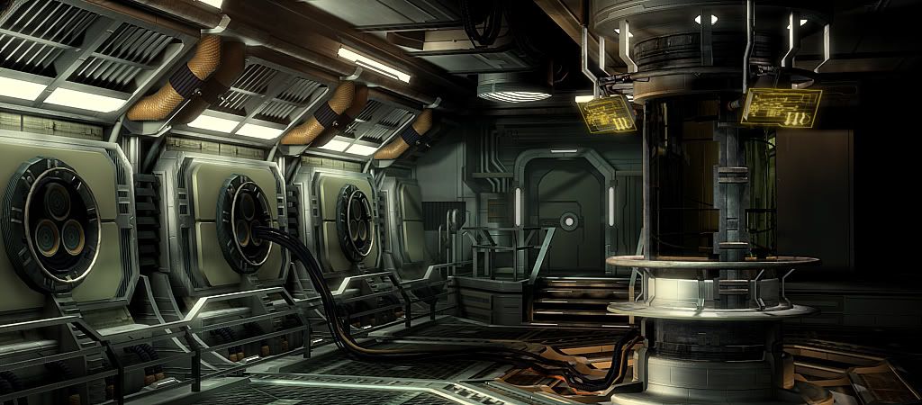
Haven't made any real updates to my portfolio in a couple of years since I started working in games. I'm finishing up a couple of scenes that I've been inspired to do lately, and plan on making a few more within the next couple of months.
Please feel free to either high-five or bitch-slap me. All projects are still considered WIP so all suggestions are more than welcome. Thanks - adm

I can put up wireframes later, but this is about 50k tris, 4 tileable 1024 materials.
There are still some areas that are not yet textured (below the clone chamber, a few panels back by the doorway etc)
edit - most recent image

Please feel free to either high-five or bitch-slap me. All projects are still considered WIP so all suggestions are more than welcome. Thanks - adm

I can put up wireframes later, but this is about 50k tris, 4 tileable 1024 materials.
There are still some areas that are not yet textured (below the clone chamber, a few panels back by the doorway etc)
edit - most recent image

Replies
Also, this entire thing is 4x1024x1024 tileables? So only 4 tiling textures? What?
Looks great, but I wanna know more!
seriously though, I like this- it's nicely modeled, color separation is on point, lighting contrast etc etc. I think it's cleanliness is setting apart from how most people would handle this subject matter. Can't wait to see it finished.
If you want nit-picky, something about the whole thing feels a little miniature.. might be the height/thickness of the railings or the cables... maybe the doorway? i'm not totally sure.
I'm glad u left some areas clean, it's a hard decision u pulled it off. The colors/lighting are fantastic, especially the displays. win.
Keep it up!!! :thumbup:
Also, I think I'm going to port this in to UDK and see what kind of lighting I can get away with in there... Max lighting is cool and all but I think UDK is gonna be the way to really get some buzz outta this piece.
So thyanks for the kind words so far. Leave any crits if you see fit... even if you think it's a small detail, my work is never done and I'd love to continue to iterate and improve this mother. I've got another scene that i haven't finished that's similar to this one that i'll be getting back in to soon as well and posting updates within the next couple weeks.
Looks amazing BTW, the envy pains are coming back...
Looks awesome, has a concept-art feel to it for some reason.
Looking forward to more!
edit - fixed the link
I had the same problem with photobucket, so i changed to imgur.com works great for me.
Looking at the other pictures you have posted in this thread, it looks stunning, as others said it has a concept art feel to it.
Wondering if you have ported it to UDK, i hope you did
and just wondering if anyone else is bothered by that door in the back? every time i look it and i wonder why it isn't lined up with the steps... i want to know whats beside the door that's so important that the steps go up in between the two instead of leading straight to the doorway, not saying it looks bad or anything lol your scene in whole looks great, that's just something that seems to catch my focus every time i look at it
As for the door not being in line with the stairs you indeed are correct!
Needless to say I have found a new background and inspiration, thank you.
yea i wouldn't invest too much time into it, looks pretty mint already, your first piece is coming along beautifully - and now you speak of a third???
mannnnn cant wait to see that one unfold !
Its a space/sci-fi scene, but everything in it seems so banal & generically industrial...not at all futuristic or spacey really.
I think we've got higher tech looking spaceships right NOW. I had to notice the windows looking out over a planet to even tell it was a spaceship and not an earthbound foundry/military base/factory.
It seems you've constructed it almost entirely with geo & re-use of tiling textures, and I understand this is common practice in enviro art, but its really letting you down here.
I think spend a bit more time on the design. You've clearly got the skills to execute well. Maybe team up with a concept artist from work?
The more I mess with the scene the more I find there is to do.
One thing I don't like very much is the right side of the composition, it's just an empty pitch black space. For some reason my eyes keep getting dragged to that area, and that's very annoying. I think you could fix that by placing a dim spotlight illuminating that wall. Would make the general composition more uniform imo.
Keep up the good work!
should be fine if your just throw some warm light like you got in the forfront there with a console or crates for interest, or maybe even a 2nd door.
only suggestion I would add is that piece of fog clipping into the pipe right in the middle of your image - there is possibly a better way for it to interact with objects.
try messing around with the DepthBiasedAlpha node as seen near the bottom of this page:
http://udn.epicgames.com/Three/VolumetricLightbeamTutorial.html
might work, give it a shot!