Have you brought it into ZBrush (or Mudbox) yet? You could make some really nice normal maps in there and then those NM's could give you ideas for your texturing process. Here is a nice set of textures from the sidescrolling game contest a while back.
I like to keep it around and look at how he did the textures to give me some ideas.
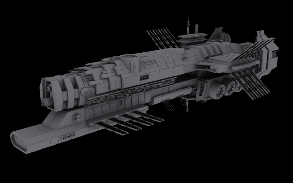
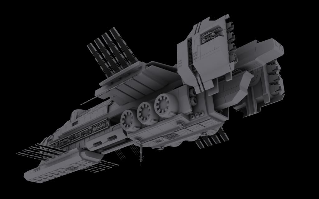
I really like the silhouettes of these two shots as well.
Keep up the good work!
Impressive. It may just be me but I am having a hard time judging the scale of the ship. You have a lot of large areas of the ship that seem very plain and flat from this distance in comparison to some of the highly detailed smaller areas.
Very cool ship you got there. Its nice to see some original scifi ships. Endless rehashes of startrek and starwars ships can only tide me over for so long. (scifi-meshes.com ..oh god so many trekkies):D
I personally feel that the scale is pretty evident from the details you've added. The tight pockets of detail make this ship seem fairly large. 1.5km long or so im thinking. And with textured lights and other details, the scale will become more evident i'd think.
The strongest parts of this ship design wise have to be the main hull ridge and the engine pods at the rear. Both follow a consistent scheme of surface angles and details.
The weakest parts of this would probably be the extended command bridge looking structure. Your offset of it from the main axis is a nice touch, and reminiscent of aircraft carriers, but the shape doesnt follow any of the other forms of the ship. It looks added on almost as an after thought. Perhaps consider wrapping it in armor that is integrated into the main hull, the layered armor at the front of the ship is a nice enough design cue to repeat elsewhere.
Nice start. But that color render do not really show ship details, it's to dark and/or textures just missing details. You should consider more flashy windows on ship, plates, communication arrays, canons etc. Afterall it's spaceship it doesn't need to be realistic, just to look cool.
Replies
I like to keep it around and look at how he did the textures to give me some ideas.
I really like the silhouettes of these two shots as well.
Keep up the good work!
Awesome work, i cant wait to see it textured
I personally feel that the scale is pretty evident from the details you've added. The tight pockets of detail make this ship seem fairly large. 1.5km long or so im thinking. And with textured lights and other details, the scale will become more evident i'd think.
The strongest parts of this ship design wise have to be the main hull ridge and the engine pods at the rear. Both follow a consistent scheme of surface angles and details.
The weakest parts of this would probably be the extended command bridge looking structure. Your offset of it from the main axis is a nice touch, and reminiscent of aircraft carriers, but the shape doesnt follow any of the other forms of the ship. It looks added on almost as an after thought. Perhaps consider wrapping it in armor that is integrated into the main hull, the layered armor at the front of the ship is a nice enough design cue to repeat elsewhere.