InCognito update
At uni I am currently working on a comical spy game set in 1981. I wanted to show some progress on the games intro. This is an MI6 office for "Professor Steambolt" who is the creator of our main character, the spy robot known as Cognito.
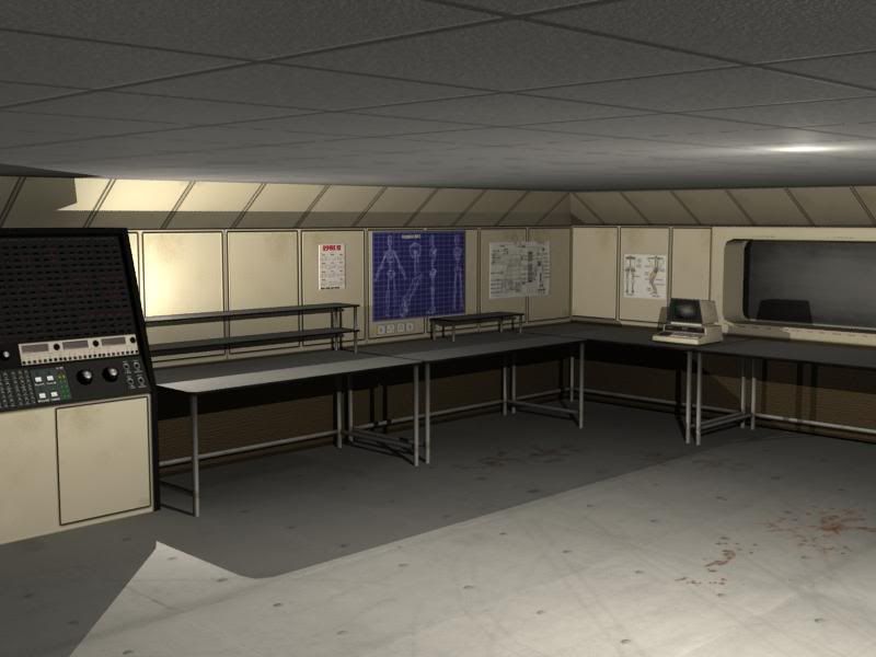
I would show you our intro animatic but our university website is down as per usual...you pay these fees aye?
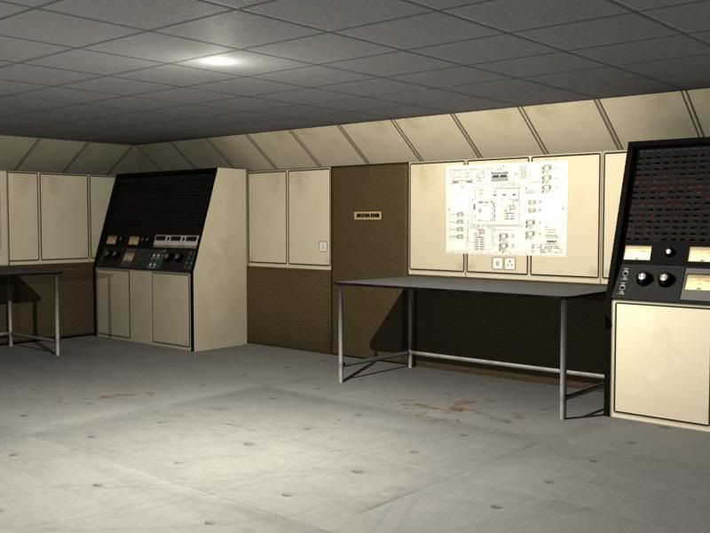
This first shots are the initial stages of laying out the room. It was going to be a very pokey broom cupboard sized room but we now have a new character known as "Toot" is a small robot made out of a train whistle on a segway and his soul purpose is to serve Steambolt with tea so we needed lots of room for him to zoom about. note the tea stains on the floor.
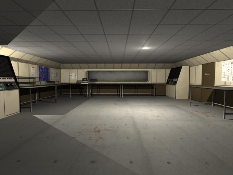
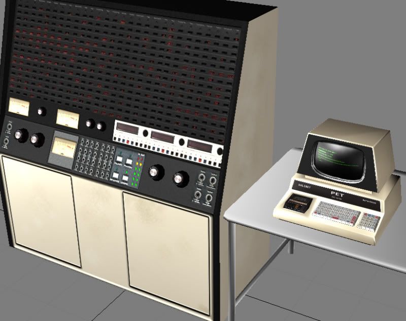
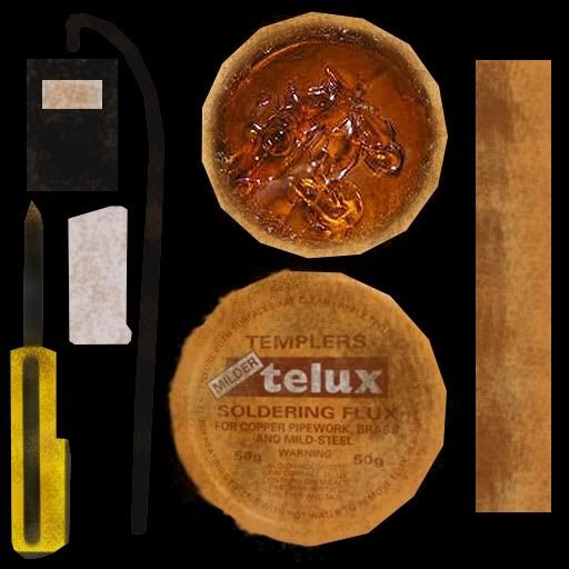
Many of the texture sizes have to be kept small, mainly 512's because this room will not only be used in the intro but also serve as an interactive menu for the game. All the assets that you see in this max environment have been created in away that it can all be transported into UDK later on.
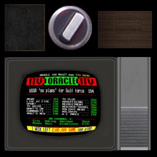
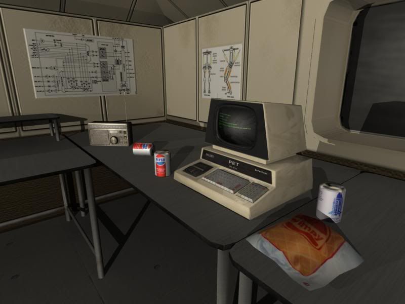
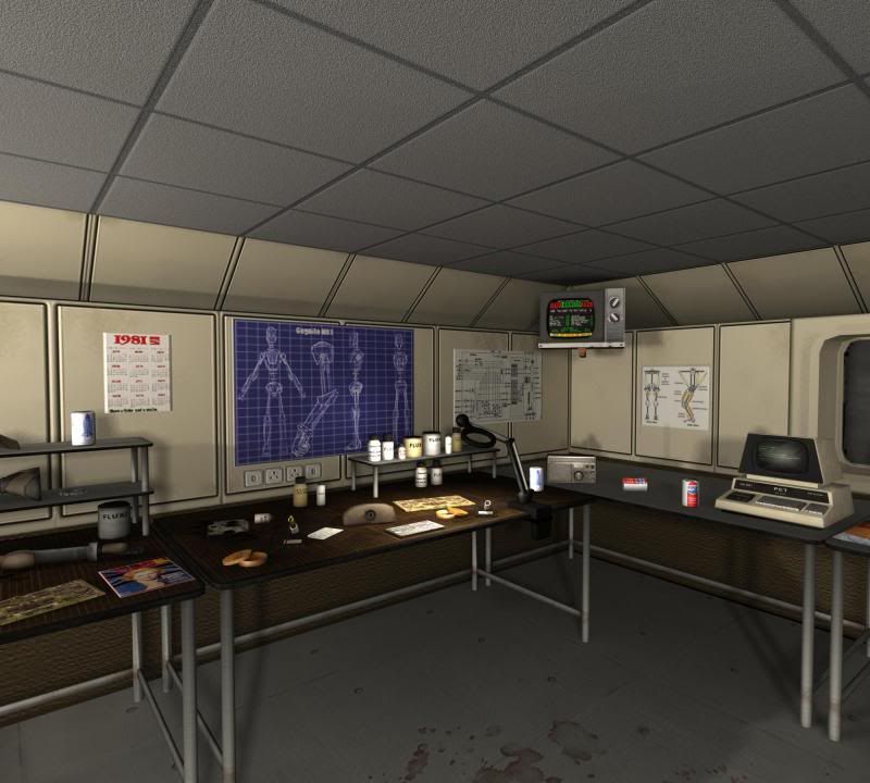
Here is the latest shot of the desk where Steambolt will sit. He will be soldering in the game menu and reading a paper in the intro. He's meant to be the quintessential British eccentric who works in a mess and never cleans up his lunch. Because this is meant to be 1981 I have tried to put in as much date accuracy as I can for example the pepsi cans have the 1978 to 1982 design but with a 1981 special featuring the first shuttle launch graphic on the back. The time magazine featuring Thatcher "Britains fighting lady". The TV also has the old teletext service "oracle" which was replaced by normal teletext in 1991. I am thinking of putting some news papers in that feature things like the Royal wedding.

I would show you our intro animatic but our university website is down as per usual...you pay these fees aye?

This first shots are the initial stages of laying out the room. It was going to be a very pokey broom cupboard sized room but we now have a new character known as "Toot" is a small robot made out of a train whistle on a segway and his soul purpose is to serve Steambolt with tea so we needed lots of room for him to zoom about. note the tea stains on the floor.


Many of the texture sizes have to be kept small, mainly 512's because this room will not only be used in the intro but also serve as an interactive menu for the game. All the assets that you see in this max environment have been created in away that it can all be transported into UDK later on.

Here is the latest shot of the desk where Steambolt will sit. He will be soldering in the game menu and reading a paper in the intro. He's meant to be the quintessential British eccentric who works in a mess and never cleans up his lunch. Because this is meant to be 1981 I have tried to put in as much date accuracy as I can for example the pepsi cans have the 1978 to 1982 design but with a 1981 special featuring the first shuttle launch graphic on the back. The time magazine featuring Thatcher "Britains fighting lady". The TV also has the old teletext service "oracle" which was replaced by normal teletext in 1991. I am thinking of putting some news papers in that feature things like the Royal wedding.

Replies
Why would textures stop with tweaking of the lights? We are trying a few styles at the moment with lighting but none of the team are excited about over doing the level of light in this room simple because Steambolt always works a solo night shift.
Improvements to the lighting setup may help.
A big part of the research for how tech offices looked in 1981 was from the end of the movie ET and everything there is the "brown mess".
I turned off the ceiling light and trying it more with desk lamps which I need to model. The lighting can't be for the benefit of 1 camera angle as the menu will include the whole room.
This is the kind of look I am after
http://www.google.co.uk/imgres?imgurl=http://notaniche.com/wp-content/uploads/2009/11/Prank-New-Office-Guy.png&imgrefurl=http://notaniche.com/nice-prank-for-a-new-colleague-on-his-first-day/1644/&usg=__rXiJqyFvh8zKyDLbWOJ0RKM0y90=&h=352&w=960&sz=482&hl=en&start=32&zoom=1&tbnid=6JLNvy2yRClNtM:&tbnh=69&tbnw=187&ei=KnxyTY2DN9eK4gao7IjpDA&prev=/images%3Fq%3D80s%2Boffice%26um%3D1%26hl%3Den%26safe%3Doff%26gbv%3D2%26biw%3D1280%26bih%3D899%26tbs%3Disch:10,700&um=1&itbs=1&iact=hc&vpx=807&vpy=674&dur=423&hovh=136&hovw=371&tx=189&ty=81&oei=GnxyTZvbLou1hAewxN08&page=2&ndsp=35&ved=1t:429,r:26,s:32&biw=1280&bih=899
Notice the contrast between darker and lighter areas in your reference image.
I would suggest start over, from global/upper lights to the lower ones. Check your Ambient Light settings depending on the renderer used you might have something going on there.
Here is a quick paint over. What is really noticeable to me is the ceiling area and the area under the desks.
Try to add some color to the ceiling either via light or texture.
Tweak your lights one at the time. No need to delete them just turn them off and set it up one by one.
Uploaded with ImageShack.us
You could maybe model fluorescent lights on the ceiling to help break up the repetition in the textre. At the moment it seems a bit too plain and it really stands out.
The height of the ceiling also looks fairly low. If you stood next to the pc, your head would almost touch the ceiling. I might be wrong, but use any primitive shape with a height of 1.80cm and check how well it fits in the room.
All the best, I will continue to check out your progress.
Cheers, how about air vents on the ceiling tiles to break it up? does anyone know if air con was around much in 1981?
I checked the height against Cognito which is a robot the size of a UT3 character about 90 units, his head was in line with the bottom of the TV.
Ok I tried modelling some vents for the ceiling tiles and for this shot I have imported Cognito to display how the main character will fit in the room height wise.
I guess the question is what are you trying to convey with your room?
Because he's an unusual character in an unusual setting we didn't want a conventional room especially since its a spy game.
The research contradicts a lot of that plus it wouldn't match the characters its not James Bond. I think its inaccurate to compare it to an old folks retirement home because they are about comfort, big chairs and house hold furniture and don't have tech equipment everywhere. When you look at the decor of the 70's brown is the dominant colour, especially in Britain and since its 81 a lot of what's left over from the previous decade would still be around.
Take a look here the decor of the time is not pretty and that's what I am after, the more brown the better http://weburbanist.com/2009/05/05/its-terminal-a-dozen-scenes-of-early-office-computing/
Right now, all your assets look really flat. Does anything have spec maps? Your textures look very plain, as if you've spent no time on them and just found them online, except for the blueprint. Your composition is uninteresting, and you've evenly spaced all of your props. You should try to clump stuff together, add some variation. Most of your props are very small also. Add some larger stuff.
Your vents on the ceiling don't look like vents, they look like lights.
Can you post some wires, textures, and UV layouts to some of your props? If we know how you've built things, it will help us in offering suggestions for improvement.
I wouldn't worry too much about lighting right now, but one thing that makes a difference is adding color to your lights. I suggest making the light around the little bottles a more yellowy/orange color, and the other background lights more of a blueish color. Subtle though. You also need light fixtures in your scene. The lights can't just come from nowhere.
You mention a lot of the objects are small but this is only a very small part of the room, The way its going to work as an interactive menue is you are the robot who will be sitting in a swivle chair in the middle of the desks, you look to these messy desks for setting, look to the wall with the briefing door to start the game, the room enterance to exit and the the window is just void but would have been used for multiplayer if this was a full game.
Just to make it clear the robot "Cognito" doesn't drink tea lol, just Professor Steambolt.