Diablo inspired - game art

polycounter lvl 13
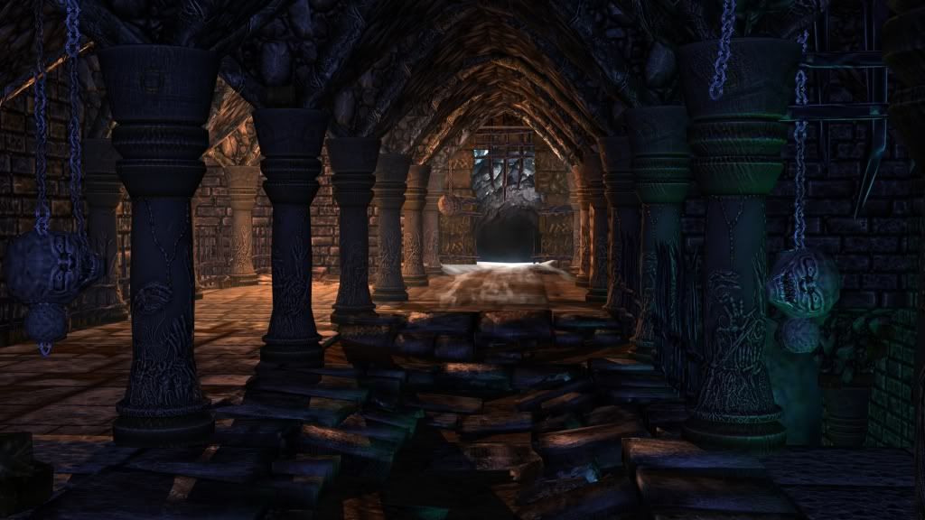
Hey folks!
First post.. I visit the site and read the forums religiously. Im currently working on this for future Demo reel. Inspired by diablo 3, I wanted to create a portion of a game enviro that has multiple assets that can be used modularly. This is the scene so far.I will post individual items shortly. No photo sourcing was used, all textures are from sculpt and paint. Please Crit!
Latest Up!
Replies
I must be tired because at first glance, I swear that said "piece of shit" :poly142:
anyway....
OtrickP, there seems to be a lot of room for improving this scene. The textures need a lot of work, but I like the mood you are going for here. Maybe instead of piecing it together as an environment like this, why don't you show us the assets individually, so we can figure out some ways for you to improve them. Then you can make the transition to creating an environment like this.
you say you are new to 3d now, how long have you been focusing on 3d?
diablo rules and your shit rules too!
Appears the shadows are there, but the falloff and and lighting could use some work.
I think the ceiling comprised of "stone" appears really busy and noisy, making it difficult to make out what it is. The floor tiling also appears to be a bit blurry and soggy. Colours in the textures look to be a bit too rich, make sure you keep the textures a bit more subtle and rely more on the lighting to colour your scene.
The details on the pillars are also interesting, but every pillar has them and once again, is introducing more noise to the scene, making it difficult to settle on its form.
Its great you're thinking modular however, its a good practice especially for environments so you're on the right path, it's a matter of time and keep pushing those textures. Don't rely on sculpting too much. Good luck!
ZacD - can you be more specific plz
Mrturtlepaste - thanks for that, i'v been working with 3d for a year. Ill post the individual assets this weekend.
Its still a wip, i hope to get more help by the forums!
Dont be shy to cut it up!
It was also hard to settle on a color scheme that dident seem to be verydark or bland.
I think these hard dark shadows are making the props look busy as the shadow affects the contrast to the spec very harshly.
Also, we can kind of tell that there is the main light source (the torch on the wall) but if you look at the pillar that is closest to that torch, the light and shadow are on the wrong side. The shadow is FACING the light and the light on the pillar is where the shadow would be.
It looks like some lighting and shadow options.
I would completely get rid of all lights currently in the scene and start from the start. Get the main light source in first, then if you want to simulate some bounce light, add some small ones in and turn the shadows off.
I hope this helps and I hope I made some sense.
Also where the roof meets the pillars they don't look like they match at all, try and get a shape that fits, overall the pillars are such a different look than the rest of your scene, from the color to the details, perhaps a little hue adjustment would help them fit in a little better.
DD - Im working on cleaning it up, I need to get an overall likeness to the scene instead of thinking "these are bricks, these are stones and dirt" more so how they would affect each other. Ill try to tie the pillars in better, i do agree that they look very out of place.
I remember the first time I encountered the "butcher" ..would like to encorporate more hellish gore
Here's some changes I made:
Turbosmooth that is one hell of a paintover! Sheesh!
Still pushing the lighting...
Getting better though. The lighting / mood is getting there.
- Increase the intensity of the orange corner light, desaturate it a bit.
- Decrease the distance of the orange light to make it more of a light in the corner rather than a light for the entire room.
- Try to mimic some radiosity bounce lights (check the paintover) to help give the scene more contrast.
- Brighten the ambient lighting a bit. Too dark. Try to push it as a blueish/purplish color.
- Try to push the green light from the steps a little more -- not the light at the bottom of the steps but the one that casts onto the main floor. Increase the intensity but have a low cast distance. Try to lessen the green light on the bricks too.
Some of the dull lighting seems to come from the lack of specular maps. Once the stones gets some proper spec maps it'll really pop, especially in that back left corner.Just my humble opinion, I believe it will be awesome piece soon