UDK DM level WIP
Hi.
I'm currently working on a small Death Match level in UDK and I've come to the point where vision gets kinda blurry.
While I know where I want to go with the level, the general design of it is just too square, especially the rooms inside.
Now mind that this is the first level I've ever tried to build and that I'm more experimenting with the visuals of the environment rather then focusing on balance. (But any comments on that are welcome as well )
)
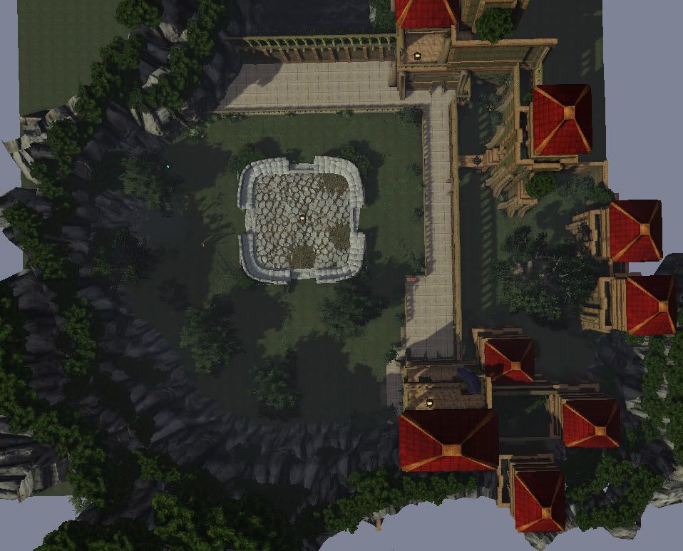
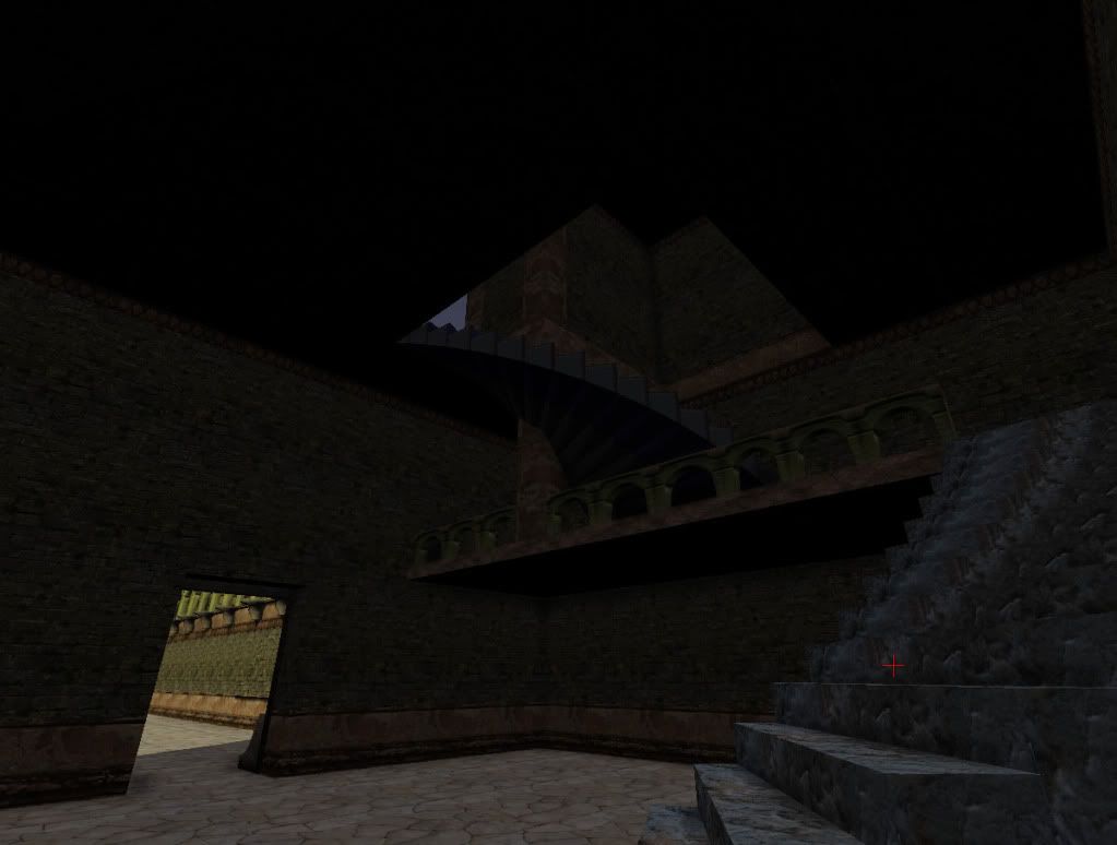
Now I haven't really started working on the interior as you can see, but the plan is to add pots, torches and some benches in there, as well as some wall decorations. But what else? How do you break up the squareness of a room?
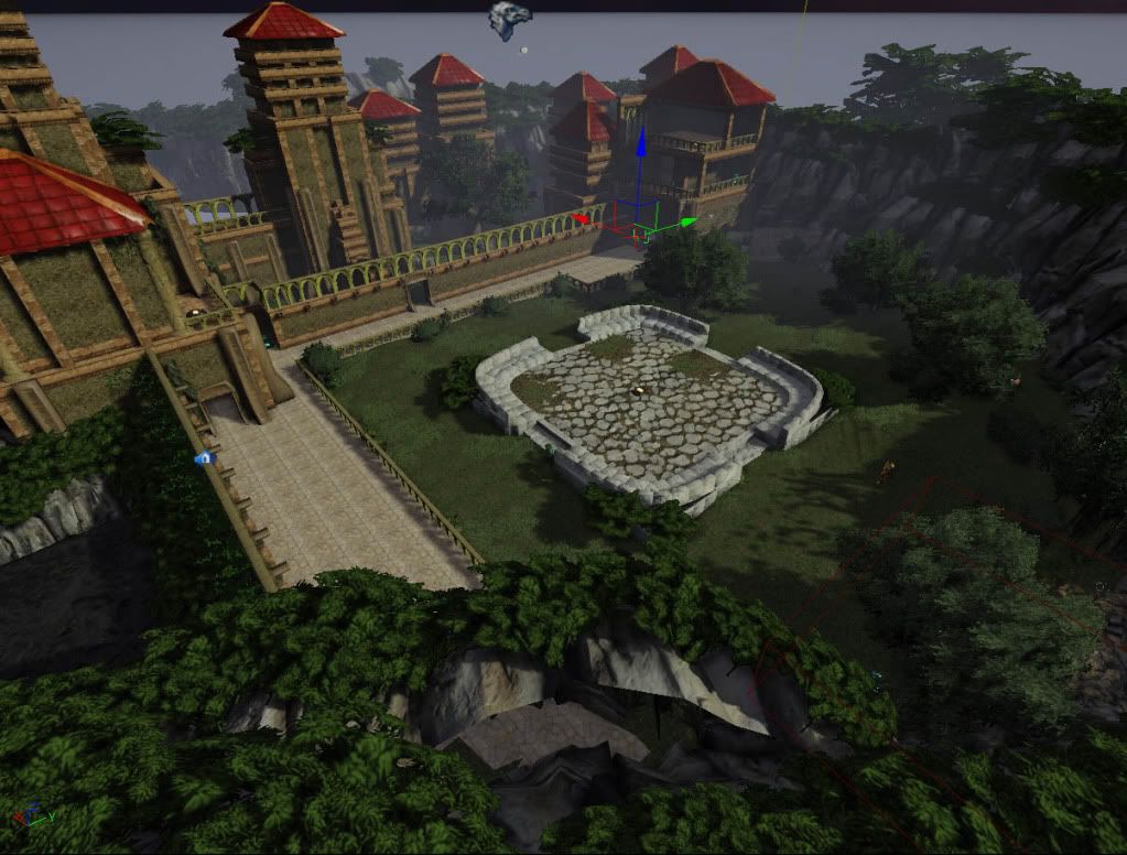
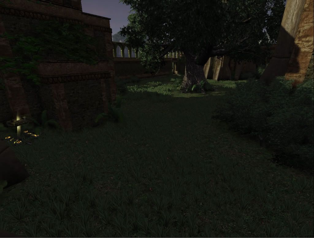
The outside on the other hand is going in the direction I want. I got a few archways that are going to be placed from the center piece towards the towers. I also noticed that I'll need some kind of pathway or something to break up to monotony of the grass.
Feedback is welcomed.
//Nanty
I'm currently working on a small Death Match level in UDK and I've come to the point where vision gets kinda blurry.
While I know where I want to go with the level, the general design of it is just too square, especially the rooms inside.
Now mind that this is the first level I've ever tried to build and that I'm more experimenting with the visuals of the environment rather then focusing on balance. (But any comments on that are welcome as well


Now I haven't really started working on the interior as you can see, but the plan is to add pots, torches and some benches in there, as well as some wall decorations. But what else? How do you break up the squareness of a room?
The outside on the other hand is going in the direction I want. I got a few archways that are going to be placed from the center piece towards the towers. I also noticed that I'll need some kind of pathway or something to break up to monotony of the grass.


Feedback is welcomed.
//Nanty
Replies
The interior is gonna look nice with some torches and stuff, I think you should get the look of the towers done better first. Their structure is good, but I think you can improve them even more, and add stuff like flags, balconys, vines and stuff would fit in nice in this piece.
Good work, keep it up!
Yes windows and balconys would be a great addition. But I think it would a slight problem to add them to the interior right now. The walls that would look good with windows are in the directions of nothingness. While I would love to add some extra landscape surrounding the map, I don't feel i have the time to do so right now.
But adding closed windows to the towers would be a great way to get some more interesting lights up there.
Cause right now my lighting sucks...
Things done since last time:
Added a few more props.
Fixed the mountins mesh abit.
Started to toy around with lights.
What needs to be done:
Better lighting.
Fix UVs on some of the building blocks.
Textures for the stairs
and Windows.
There's no download available at the moment. And to be honest I'm not sure what to include to make the level playable. But I'll look into it and see if I can get a download up.
@Apophis3d
Well, I guess the inside of the towers are still counted as blocked out considering what shape they are in. But yeah, I used the BSP stairs since they were available.
I'll add them to my To Do list.
Hmm, UDK also started to complaining about my package size. Now i guess this is a bad thing, but what is it that determins my package size? And how do I deal with it?