Home 3D Art Showcase & Critiques

Patrick Svensson´s 3D Thread

Patrick Svensson
polycounter lvl 14
Offline / Send Message
Patrick Svensson polycounter lvl 14
Time too start going some more art! So starting a thread that I can dump my shit and you all can look and crit! :) First up a quick and small box

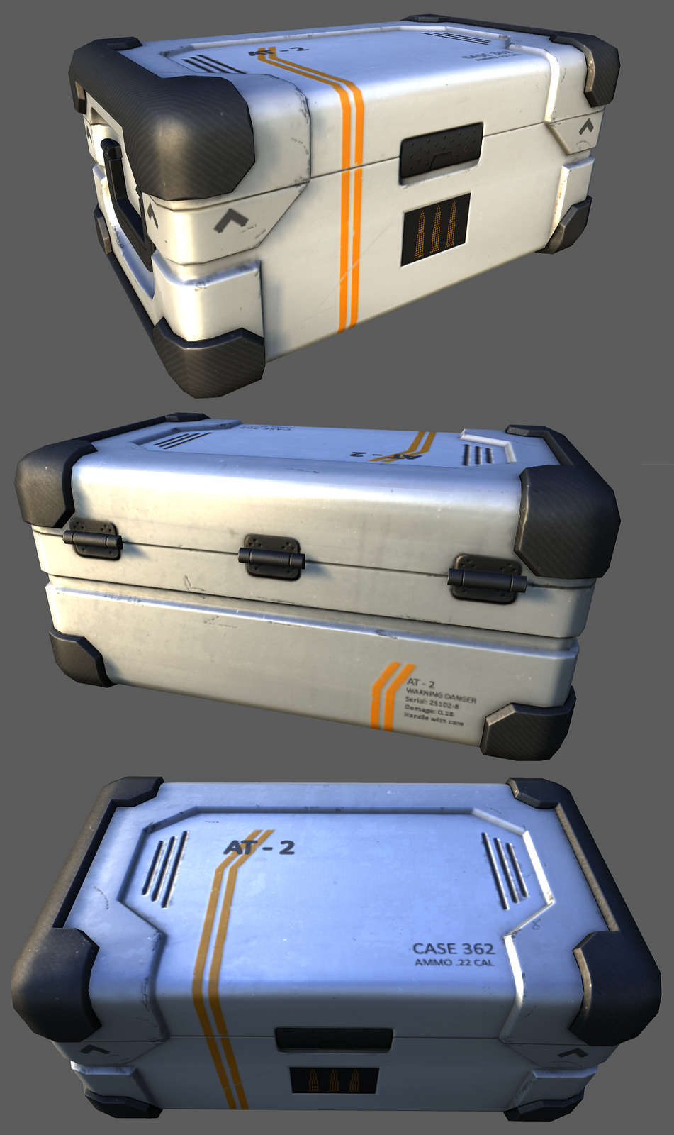
EDIT: Forgot to show the Textures

sci-fi_box.png

Replies

  • Darkmaster
    Options
    Offline / Send Message
    Darkmaster polycounter lvl 11
    I think for one, this box doesn't have enough abuse to it. Every detail that I see you have added would not read from more than teen feet away in game space. If you want a player to be running through a level and say "wow, what a sweet sci fi box!" then your details have to read better from a distance. The design is good but I think you could afford to really push the destruction. Maybe have the base of the box have dust or dirt accumulation, and the corners show more scratches as well as deep cuts where it may have been dropped or maybe shifted in transit. I think that this has the potential to be a good standalone prop, but compared to the other assets on your website this seems rather simplistic. I mean that in a good way I promise! Keep pluggin away at this and maybe some some variations of the texture, feel out some different colors pallets so that they could be instanced throughout a level! Awesome work man, keep it up
  • StrangeFate
    Options
    Offline / Send Message
    StrangeFate polycounter lvl 18
    He'll do great by doing the opposite of that advice.


    The suitcase is fine as it is. Adding more stuff will just read as noise in game. Adding more scratches along all edges (which I know a lot of people like to do) looks terribly noisy, unrealistic and makes the whole object harder to read, not easier.

    You don't want single scratches to be readable at a distance, if every object and texture is made with that premise, you'll end up with a very noisy scene where the actual designs, details and shapes are overpowered by random ugly noise.

    At a distance, you always want the object itself to read clearly, without moire effects or color/detail choices that look like a mess from afar.

    Right now it looks like a used case that hasn't been chewed by a T-rex. The clean and simple color patterns will be easy to read at any distance.
    Personally I'd keep it like that.
  • teaandcigarettes
    Options
    Offline / Send Message
    teaandcigarettes polycounter lvl 12
    I disagree with Darkmaster and would say that when it comes to damage the box is perfectly fine.


    Darkmaster: I feel that what you have described would be actually undesirable in a game. Overly busy props tend to distract the players from their objectives so unless you're modelling something that is meant to be used by the player and not a random part of the environment I wouldn't go overboard with details. I swear, even AAA games can be terrible at that; I can even remember how many times I felt completely lost in a level because someone decided to put greebles/scratches/dirt everywhere (or a combination of them all):poly142:

    Patrick: I like it :) Those corners look a bit too smooth for my taste; if you could add this striped pattern into your normal map I think it would look a lot more appealing. Those kind of corners usually have thin ridges protruding out of them to improve friction. Kind of like here:

    p1_uierheilt_so.jpg

    Another thing; those letters are a bit blurry. If you increase their size in photoshop, so they take up more space on the texture, they will look a lot better.

    I hope that helps :)
  • IchII3D
    Options
    Offline / Send Message
    IchII3D polycounter lvl 12
    Nice clean model and texture work sold by small details. Currently I would say the corners are the weakest part of the texture, I'm not really sold on what material they are supposed to be. Apart from getting a hint they might be carbon fibre from the threading in them.
  • mrturtlepaste
    Options
    Offline / Send Message
    yeah, I'm with IchII3D. I'm wondering what kind of material the corners are as well. If it is something like a carbon fiber, maybe you could play with the pattern a bit in your specular to give it a little more definition?
  • Patrick Svensson
    Options
    Offline / Send Message
    Patrick Svensson polycounter lvl 14
    Wow! Many respone! Fun fun!

    Been doing changes, and getting there, I hope. :) I have made the corners a bit more material feeling. And some more dirt have been added. And Im trying to get a bit glow for the ammo display, but its bugging or something so its look strechy right now.

    And... I will try to get my stuff in UDK. God or bad idea? Marmoset (1.0) is better?
  • teaandcigarettes
    Options
    Offline / Send Message
    teaandcigarettes polycounter lvl 12
    For simple props like this I would just use 3PointShader, or Xoliul's Shader. No point in bringing it into UDK; in fact, your model would just suffer from the texture compression.
  • Patrick Svensson
    Options
    Offline / Send Message
    Patrick Svensson polycounter lvl 14
  • Patrick Svensson
    Options
    Offline / Send Message
    Patrick Svensson polycounter lvl 14
    Time for guns again! Wee!

    I have started working on a NERF Longshot
    nerf_longshot_19_3_of_3_by_bcjfla76-d38irwc.jpg

    longshot_wip_3.png

    Right now I have been working from the back and forward, so the front is not done to much details. And Im trying to have this as the toy gun, 2 diffrent parts (sniper, assault rifle) and even 2 diffrent kind of magasin and 1 or 2 scopes/reddots..

    PS. is there anyone that have a good tutorial of how do make a the highpoly pictures a bit more intressing.
  • Samfisher84
    Options
    Offline / Send Message
    Samfisher84 polycounter lvl 9
  • Kawe
    Options
    Offline / Send Message
    Kawe polycounter lvl 8
    Correct me if I'm wrong but the texture on new the box looks like it has been sharpened to death.

    I liked the old one cause the material was nicer. Metallic sweetness. New box looks like a dirty plastic thing.
  • Patrick Svensson
    Options
    Offline / Send Message
    Patrick Svensson polycounter lvl 14
    @Samfisher84: Thanks :)

    @Kawe: Yeah you right. I have been thinking about doing some changes on the box textures. Some day I will! :)
  • Patrick Svensson
    Options
    Offline / Send Message
    Patrick Svensson polycounter lvl 14
    I think I just finish my highpoly on this pistol!

    It is a combined concepts from a friend of mine, Axel Torvenius Concept 1 Concept 2

    This is the result: sci-fi_pistol.png
  • Patrick Svensson
    Options
    Offline / Send Message
    Patrick Svensson polycounter lvl 14
    Lowpoly and bakes done! Trying to get some sweet colors in there.. what do you guys think? Too odd with the wood or just a cool combine with a bit of old stile and sci-fi design? Right now is just a quick diffuse and a quick specular pistol_color_test.png
  • ShootandRun
    Options
    Offline / Send Message
    I really like the design!
    I think a rubber grip would suit this pistol, but I could be wrong

    your pistol reminded me of this gun :P

    deus-ex-human-revolution-revolver.jpg
  • Patrick Svensson
    Options
    Offline / Send Message
    Patrick Svensson polycounter lvl 14
    Thanks ShootandRun! I will do both a good try, one rubber and a wood grip. :)

    Wow that gun is awsome, havent seen that before!
  • Patrick Svensson
    Options
    Offline / Send Message
    Patrick Svensson polycounter lvl 14
    Update time,

    Just a quick specular. Need some more work on the diffuse, but Im thinking Im doing some progress

    gun.png
  • Lucas Annunziata
    Options
    Offline / Send Message
    Lucas Annunziata polycounter lvl 13
    I was really digging the wooden grip. I'm a huge fan of mixing different styles together, and I think that the wood will give you a more interesting result.
Sign In or Register to comment.