Home 3D Art Showcase & Critiques

WIP: Modular sci-fi set

ScottJ
polycounter lvl 13
Offline / Send Message
ScottJ polycounter lvl 13
I am currently working on some modular sci-fi parts to support research I am doing (found here http://www.polycount.com/forum/showthread.php?t=78444) and am in need of some opinion, it is currently a WIP and the smaller detail like bolst etc. has yet to be added.

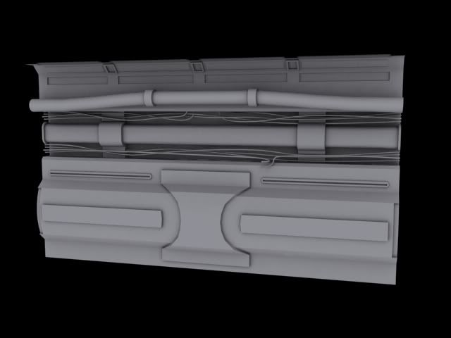
The wall style I am not sure on, to go heavy detail, medium detail or low detail walls, I want this area to feel like an industrial / mechanical / dirty functional area, there will be a simple look that will be used for living areas, will post these up later when I have done.
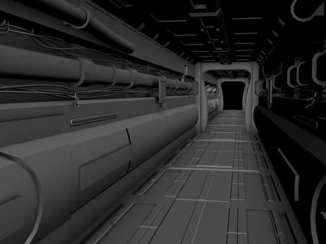
render2-1.jpg
Overall feel of this modular set

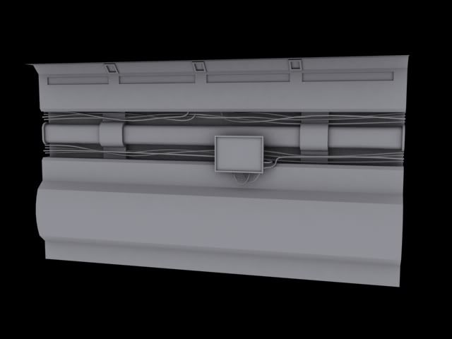
4.jpg
Simple wall with monitor
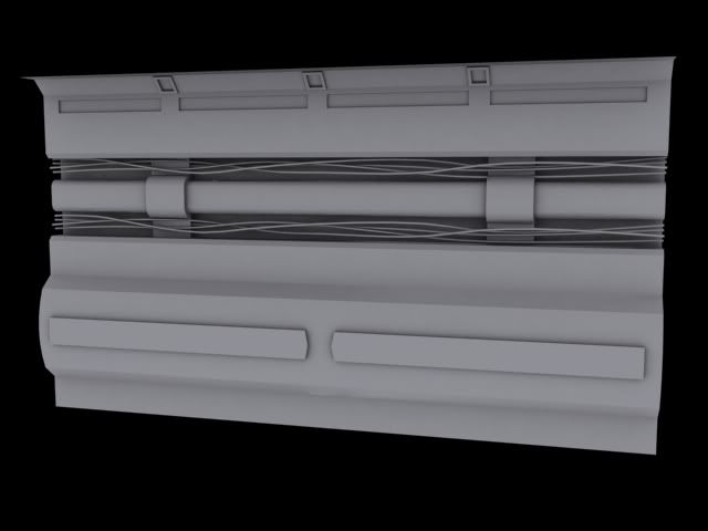
1.jpg
slightly detailed wall
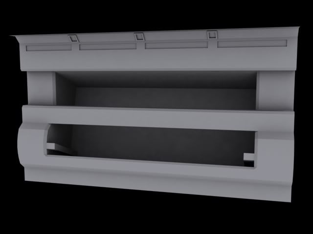
2.jpg
Large fan unit for air con
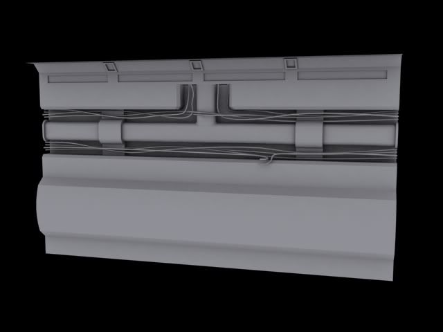
3.jpg
T-Junction pipe & wires
5.jpg
Heavily detailed wall
6.jpg
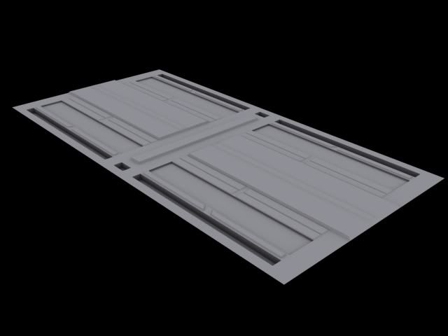
Floor
7.jpg
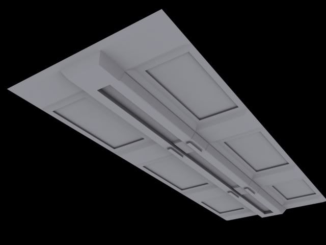
Roof
8.jpg
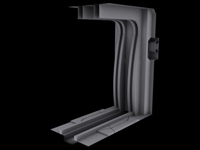
Bulkhead with emergency door (hidden atm)

Replies

  • Snader
    Offline / Send Message
    Snader polycounter lvl 15
    Make the wall just that - a wall. Make the monitor and the boxy shapes on the bottom of the wall a separate object, so you can throw those around anywhere you want. Along the same lines, you might consider making the wire-sets and pipe-sets separate too.
  • passerby
    Offline / Send Message
    passerby polycounter lvl 12
    y like the direciton it is going in but i do got to agree with snader to make the screen and pipes separate that will make it much more flexible and easier to add variation.
  • ScottJ
    Offline / Send Message
    ScottJ polycounter lvl 13
    thanks for the feedback so far, the plan was to make them seperate parts, at least the monitor and the wire and pipes, I am more after the extra pannels on the high detailed wall, do they look good, too many, too big, strange shape etc?

    i still need to do a door way, corners, few extra add-ons for this set.
  • passerby
    Offline / Send Message
    passerby polycounter lvl 12
    i like the upper few since the extra detail on the last one will get kinda repetitive looking when tiled. i think it will really come to life once some materials are made
  • ScottJ
    Offline / Send Message
    ScottJ polycounter lvl 13
    Here is set number 2, living area, this is supposed to give a clean and spacious/open feeling I need to fix a little part on the bulkheads meeting the floor, looks a little odd atm.
    1a.jpg
    Overall feel
    2a.jpg
    Window curved beams
    3a.jpg
    Window block beams
    6a.jpg
    Wall
    4a.jpg
    Wall open pannel
    5a.jpg
    Door
    7a.jpg
    Bulkhead
    9a.jpg
    Floor
    8a.jpg
    Roof
  • Mike Yevin
    Offline / Send Message
    Mike Yevin polycounter lvl 11
    are these all of your high poly objects that your showing? if so i would recommend taking some time to smooth out those sharp edges you have going on. i understand your not trying to go over the top with details, or id be saying that they look pretty bland, but sharp edges wont read all that well on any future normal maps
  • Alberto Rdrgz
    Offline / Send Message
    Alberto Rdrgz polycounter lvl 15
    Yeah I Agree with Mike, I would consider creating High Poly with more interesting detail to make those models pop a bit more.
  • ScottJ
    Offline / Send Message
    ScottJ polycounter lvl 13
    these are mid poly, they are ready to be taken into zbrush or photoshop, possibly work with max more, currently they are the geometric shapes that will give the feel of the area, high poly will come later with more detail being pushed in as much as I can. basicly low poly un-opimised ready for subdevision.
  • Alberto Rdrgz
    Offline / Send Message
    Alberto Rdrgz polycounter lvl 15
    i would start with High Poly, it's just better for your work flow.
  • ScottJ
    Offline / Send Message
    ScottJ polycounter lvl 13
    I am still working out the best way of doing things, so is everyone to a point getting better / faster etc, though atm I am follwoing Epics kevin Johnstone's method (not intentionaly) of modeling http://www.polycount.com/forum/showthread.php?p=678052, I tend to do something one way that I am confortable and see if its any good, atm the way I am doing stuff is serving its purpose.

    Edit*
    Also going to atempt to do similar to philip K aswel with photshop
    http://www.philipk.net/tutorials/modular_sets/modular_sets.html
  • ScottJ
    Offline / Send Message
    ScottJ polycounter lvl 13
    I am after some opinion on the dimentions of the hallway, been bugging me for a bit now and tried severel different things, thought about opening up to opinion now as I am still not sure.
    UDKissue.jpg

    UDKissue2.jpg

    I want this hallway to feel spacious however the height feels wrong when ever I play it in game, UDK has a high camera it feels like

    UDKissue3.jpg
  • ZacD
    Offline / Send Message
    ZacD ngon master
    The ceiling needs to be high enough that you can jump to feel comfortable.
  • ScottJ
    Offline / Send Message
    ScottJ polycounter lvl 13
    Thanks for the reply will keep that in mind
    I have another issue, this one I have tried and tried and tried to fix, it came from this issue originaly http://www.polycount.com/forum/showthread.php?t=76476&highlight=modular
    To fix this I made the floor a tile, this fixed the shadow issue however I now get some strange effect between them in the distance, initialy this was showing up near the camera until I masked off the edges from the reflection.
    below is the problem, looking at the top of the floor there are blue pixels showing in the gap when this shouldnt be.
    I have padded the UV's, padded the model itself incase it was some sort of edge effect I was getting, padded the material around the edges more, while this works to a point, it never gets better than what is shown
    UDKproblem2.jpg
    with extra padding (notice the reflection vut of a fair bit into the tile)
    UDKProblem2b.jpg
    No padding its worse
    UDKProblem2c.jpg

    This is the material I set up
    UDKproblem2d.jpg
Sign In or Register to comment.